new posts in all blogs
Viewing: Blog Posts Tagged with: Architecture, Most Recent at Top [Help]
Results 26 - 50 of 189
How to use this Page
You are viewing the most recent posts tagged with the words: Architecture in the JacketFlap blog reader. What is a tag? Think of a tag as a keyword or category label. Tags can both help you find posts on JacketFlap.com as well as provide an easy way for you to "remember" and classify posts for later recall. Try adding a tag yourself by clicking "Add a tag" below a post's header. Scroll down through the list of Recent Posts in the left column and click on a post title that sounds interesting. You can view all posts from a specific blog by clicking the Blog name in the right column, or you can click a 'More Posts from this Blog' link in any individual post.
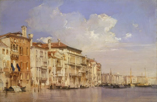
This painting of the Grand Canal in Venice by Richard Parkes Bonington (1801-1828) looks immensely detailed and at first it looks like it would have taken a long time to paint.
But he used a time-saving method that works really well for both plein-air and studio paintings of architecture.
The trick is to paint the large areas of the building fronts in opaque paint with big bristle brushes. Then let that dry completely. This might take 24 hours or several days, depending on whether there's a drying agent in the paint, such as Liquin or a drop of cobalt drier.
On the second day's session, you can go back over those big areas with a smaller brush to subdivide the building fronts. A straightedge can help you find the vanishing points and keep the horizontals in perspective and the verticals true. Note that underneath the vertical strokes of the big windows above, he lightly marked the spacing of the windows in burnt sienna before actually painting them.
Not all of the strokes are dark. You can also pick out some light accents, such as the light stones and the insides of the windows catching light on the brown building at left.
Here's another Venetian painting by Bonington. This one is on millboard, 14 x 18 inches, and was painted on location in 1826. It uses a similar technique—and it's also similar to the technique used by the master of Venetian architecture,
Canaletto. You can
read more about this image and about Bonington at the website of the Kimbell Art Museum, which owns this painting.
If you're painting on location in oil, these two-day paintings take some planning, and you have to be staying somewhere for a while. You can start several paintings one morning, then put them aside and go back to that spot a day or two later to finish them up. But if you're painting in gouache, acrylic, or casein, you can use this method all in one sitting. The mantra is "Large shapes first, small shapes last."
The first painting is from the
Yale Center for British Art in New Haven, Connecticut.
Richard Parkes Bonington on Wikipedia
We were thrilled to see the announcement this week that architect Shigeru Ban has won the Pritzker Architecture Prize, one of architecture’s most important awards. Ban is notable not only for his inspired and gorgeous designs but for his humanitarian work using innovative architecture and renewable resources to help refugees and those affected by both man-made and natural disasters. Take a look at his paper tube school in China, featured in our book Dreaming Up:
Teachers and students helped construct this temporary school out of plywood and recycled heavy-duty paper tubes after an earthquake destroyed many buildings in China’s Sichuan Province. Dreaming Up author and illustrator Christy Hale shares why she chose to include Shigeru Ban’s work in her book:
In selecting the architects and structures featured in Dreaming Up: A Celebration of Building I began by considering children’s building play. What materials do they use? Children do not need prepackaged toys; they can build from whatever is at hand. In fact using recyclables encourages two qualities enormously important in creativity: resourcefulness and flexibility—essential for the problem-solvers of tomorrow. After developing my list of children’s construction activities, I then looked for architects working with visually similar materials and design challenges. This is how I made my pairings.
The new Pritzker Architecture Prize-winner, Shigeru Ban said, “Anything can be building structure material.” Ban creates elegant designs from humble materials. He is famous for upcycling industrial strength paper tubes, shipping containers, and even tea bags!
I thought my young readers would particularly like his Paper Tube School in Chengdu, a temporary school built in 2008 with the help of teachers and students after an earthquake destroyed many buildings in China’s Sichuan Province. I also wanted to showcase Ban for his humanitarian work. His architecture efficiently serves the pressing needs of disaster victims while simultaneously honoring them with beauty.
Shigeru Ban’s approach to architecture makes a great entry point when introducing young people to the art form. Use these teaching resources along with Dreaming Up to inspire next generation of architects:
Recycled Building Hands-On Classroom Activity
Great Teaching Ideas for Dreaming Up from The Classroom Bookshelf
LEGO’s Read! Build! Play! Summer Reading List and Activity Guide
Filed under:
Curriculum Corner Tagged:
architecture,
dreaming up,
lesson plans,
Pritzker Prize,
Shigeru Ban,
teaching resources 

Here's a painting of a door in Friburg by Pennsylvania artist Charles E. Dana (1843-1924). He studied architecture in Munich, and then went to Paris to learn from Gérôme and Bonnat.
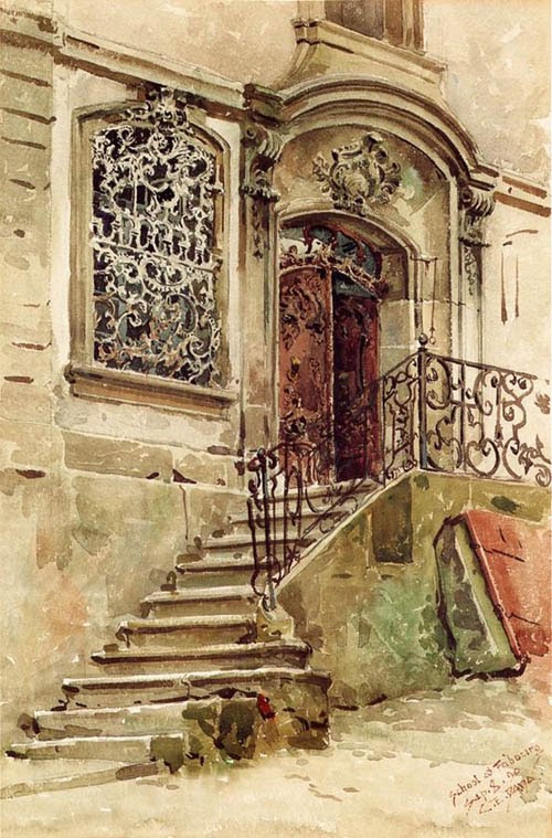
The iron grille in the window, with rectangular mullions behind it, would have taken considerable patience and skill to record in the subtractive medium of transparent watercolor.
A
1915 article described him "as a student always, living much in the past, searching out the works of old craftsmen. It is only natural that his subjects should have been for the most part along the lanes and by-paths where these interests led him. So we find his work quite removed from that of the painter of moods, and his pictures depicting and recording certain real things which were in themselves the expression of the artist-craftsmen of a bygone period."
Left: A street in Cairo by Charles E. Dana


By:
[email protected],
on 3/2/2014
Blog:
Perpetually Adolescent
(
Login to Add to MyJacketFlap)
JacketFlap tags:
sustainability,
children's picture book,
engineering,
Little Steps Publishing,
Dimity Powell,
Book Reviews - Childrens and Young Adult,
Player Profiles,
Andrew King,
Doodles and Drafts,
Engibear's Dream,
Romancing the Stars,
design,
Environment,
Author Interviews,
architecture,
Book Links,
Add a tag
A week or so ago I rubbed shoulders with some of Kids’ Lit most illuminating talents at the Book Links’ QLD (The Centre for Children’s Literature) third Romancing the Stars event. The objective of these evenings is to meet and listen to as many authors and illustrators wax lyrical about their latest publication as possible in a frenzy of succinct deliveries and rotations – rather like speed dating, but with books and ultimately more satisfying.
Amongst them was, rising star, Andrew King. I first met Andrew and Engibear, both instantly likeable fellows, last year when Andrew and I were amongst the ‘daters’. I confess the first time I laid eyes on his non-typical picture book, I baulked at the complexity of its design and presentation. Perhaps it is the poor mathematician in me, but there seemed too many labels and numbers and graph grids! The detail overwhelmed me and the thought, ‘too much’ flickered through my mind like an wavering light bulb.
 But Andrew’s compelling fervour for his work convinced me to look more closely. So I did, and fell in love with what I saw. Engibear’s Dream is neither too busy nor over-detailed, but rather a masterfully thought out and delivered tale of simplicity and perseverance. Engibear’s life is too full to pursue both his dreams and work. He needs help and being a clever engineer like his creator, sets out to design a Bearbot to help him achieve more. But grand schemes are rarely realised first time round. It takes Engibear several attempts to ‘get it right’ but he never gives up on himself or his Bearbot.
 More than just a cute rhyming counting book about the rigours of planning and design, Engibear’s Dream covers the themes of sustainable living, finding balance in a world of progress and change and being innovative and tenacious in the face of failure. Mighty issues for small minds, but ones they will assimilate as they follow Engibear’s attempts to succeed, all superbly illustrated both schematically and in explosive colour, by qualified architect Benjamin Johnston.
I needed to find out more about the man behind the bear, behind the robot. So this week I have a bona fide, qualified engineer behind the draft table. Here’s what he had to say…
 Q Who is Dr Andrew King? How would you best describe present self?
A 48 year old mixed bag: self, husband, dad, son, brother, relative, friend, engineer, co-worker, band member, aspiring author, committee member, community member, etc…
Fortunately, from my perspective, I have been very lucky and the mix has been good to me – I am trying to be good back.
Q Describe your 10 year old self. Did you have any concept then of what you wanted to do or be when you grew up? If so, what?
A 10 year old mixed bag – just a bit less in the mix – son, brother, relative, friend, school student, footballer, etc…
Fortunately (again) I had a very pleasant and carefree childhood. So carefree that I don’t think I had any real idea of what I wanted to do when I grew up. Interestingly though, I remember that a friend and I were writing and illustrating small books of jokes back in grade 6 and trying to sell them (for about 2 cents each). It has been more than 30 years since I last tried but I am now trying to write and sell books again.
Q Writing for children is not your first chosen occupation. Why take up the challenge now?
Kelly and I have been writing and drawing with our kids for years. We ended up developing characters like Engibear and the Bearbot and writing about their adventures in Munnagong. A few years ago my daughter, Marie-Louise, suggested that we should write a book.
Q Engibear’s Dream is your first picture book for children. What are you trying to impart with this book and why choose the picture book format?
The book started as a way of making engineering more accessible to young children. However, we wanted to make the book something more than an instruction manual. Therefore, we included a storyline (in this case a story about perseverance) and tried to include humour. We have also added numbers so that it can be used as a counting book.
To me drawing is a very powerful communication tool. The combination of words and pictures used in engineering drawings is a particularly useful way to communicate design ideas. The opportunity to include these types of diagrams and images of Engibear and the Bearbot meant that the book had to include pictures.
Q What sets Engibear’s Dream apart from other picture books currently on the shelves?
Engineering – in two ways.
Firstly, having a character that is an engineer, there are very few engineers in children’s literature. To me this is surprising as children seem to be very interested in the things that engineers do. Engibear provides a “friendly face” of engineering and therefore a way to introduce engineering to young children at the right level.
Secondly, including detailed engineering drawings. Ben Johnston is an architect who is used to working with engineers. Ben has created loveable characters and has also been able to contrast them with fantastically detailed design drawings of Munnagong, Engibear’s house and workshop, the Bearbot and its working parts. I think this combination of drawing styles allows children to enjoy the characters and the story and then also spend time thinking about how things work and making things (engineering).
 Q How long from conception to publication did it take to realise Engibear’s Dream?
Building Bearbot was an early family story that is about 10 years old and was the basis for Engibear’s Dream. It sat in the cupboard for a long time. However, once we decided to write a book and chose this story it took about three years to get to publication.
Q It takes Engibear up to 10 types from prototype to final version before he engineers the perfect Bearbot. Does it take engineer Andrew the same number of attempts to design something new before getting it right?
If it is a book, yes – easily!
 Depending on the complexity of the project I think engineering design can also take a lot of work. However, engineers have developed systems such as standards, computer modelling and design reviews to help make the design process robust.
Q Engibear’s dream is to have a life less strenuous with more time for enjoying the simple pleasures. What’s the one thing on your non-writing wish-list you’d like to tick off /achieve / produce?
I would like to read more fiction.
Q Do you have other writing dreams you’d like to fulfil?
I have a series of Engibear books planned. Munnagong is a busy place; there is a lot of engineering going on and a lot to write about.
Q Engibear is written in quatrain rhyming verse. As a first time author, did you find this difficult to pull off? Why did you choose to tell the story in this way?
We wrote the book in quatrain rhyming verse because this is how we made up verses when my children were younger – it just seemed to be a natural way to rhyme. However, while this worked for family stories, it was very difficult to do it properly. As an engineer I have some technical writing skills but I had to learn a lot about writing verse. Therefore, I did a course with Dr Virginia Lowe at Create a Kids Book and Virginia then mentored me.
Q You chose to publish your book via a partnership publishing company (Little Steps Publishing). Why? What other publication avenues did you explore if any?
I did contact some traditional publishers and received very polite rejections. I thought that rather than keep going down that route it would be better just to get on with it – self publishing seemed to be the answer.
Q What is on the design board for Andrew? What’s your next ‘writing’ project?
We have been making models of the characters in Engibear’s Dream and we have created a rsk based engineering game. I am also working on the next planned Engibear book “Engibear’s Bridge”. This book is about construction of an iconic “green bridge” near Munnagong State School which will be opened as part of the Munnagong Festival.
 Brilliant Andrew! You know I can’t wait to meet your new characters and see their designs.
Like the most enthralling kids’ movies, Engibear’s story doesn’t just end with a ‘happily ever after’ moment. Keep page turning and be fascinated by full page project drawings of BBT-10, the Final Version, resplendent with some side-splitting specifications. My young miss could not go past the line drawn end pages detailing Munnagong, home of Engibear either. A fascinating read.
Designed for 3 – 8 year olds. Also riveting for boys, those with inquisitive minds, budding designers and anyone who likes to dream big.
Little Steps Publishing 2012

So, in my last post I showed you some food from our trip to Oaxaca, and here I wanted to show you a little of the town and surroundings. Excuse me if I’m a little picture happy. It was hard to choose.
Above is a street in Oaxaca, to give you an idea of the town. This street happens to be a pedestrian only zone, though I guess bench-sitters get a pass, too. Hey, if I could sit on a comfy pink bench on this street right now, I would.
Below is the Santo Domingo church. Georgeous. Love the landscaping out front, too.

And I’ve fallen hard for the church’s stone walls. The subtle color variations (and size variations, which you can see less well) are making me so, so happy. I think I’m going to have to use that colorway and grid pattern somewhere.

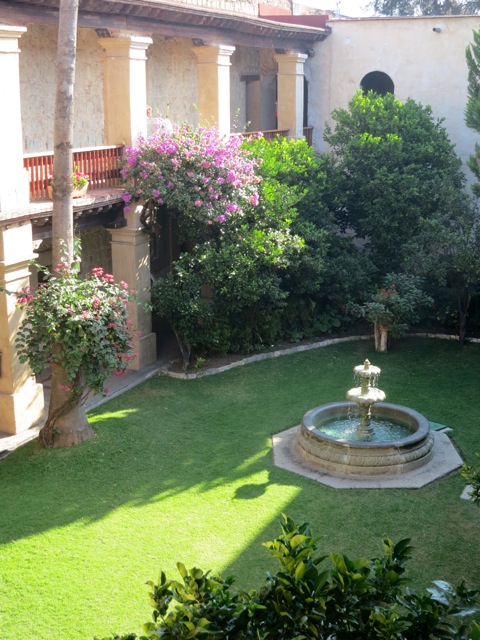
Up next, a convent-turned-hotel. The walls are literally three feet thick. It’s a total dream. I have a thing for thick walls and courtyard gardens.
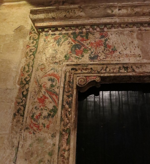
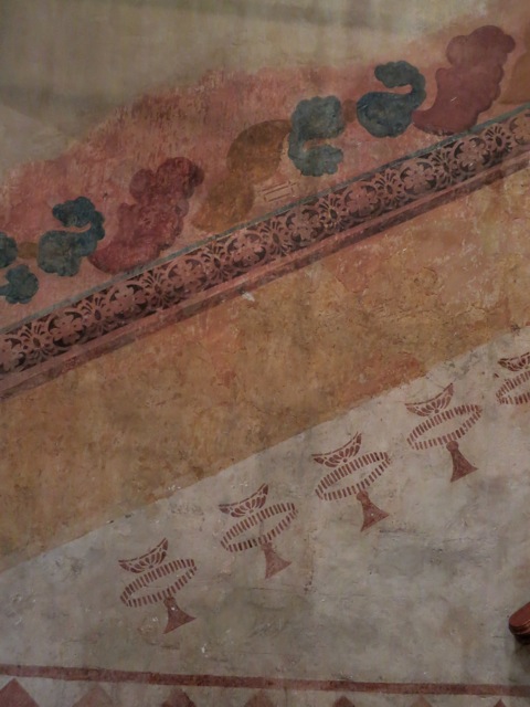
Here and there, on the former convent walls, you’ll see little bits of painting:
And lastly, just outside Oaxaca are the pyramids of Monte Alban. From the top, the view of the area is breathtaking.


I’d love to show you some of the handicrafts Oaxaca is famous for, but I think I’ll have to show you after Christmas, since several that I bought are gifts for others.
Up next, hopefully I’ll have time to post a few Christmas-themed items. I’ve been trying to be really nose-to-the-grindstone on my writing projects. Back to work for me! Be well.


Image source: Wikimedia Commons
I’ve written about this book before:
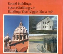 “Round Buildings, Square Buildings, and Buildings that Wiggle Like a Fish
 by Philip M. Isaacson. Twelve years ago, this children’s book was my introduction to the study of architecture. I’ve never looked at buildings the same way since.
“Isaacson takes the reader on a leisurely, respectful tour of buildings around the world: churches, houses, museums, lighthouses, all kinds of structures, from the humble to the magnificent. In simple, straightforward prose he discusses various architectural concepts such as the impact of building materials, the interplay of light and color, and the significance of roof shape. His stunning photographs turn even the roughest earthen hut into a work of art. His lyrical text helps us see in the pictures what we might otherwise have missed:
‘These buildings are part of the Shaker Village at Sabbathday, Maine. On an afternoon in late winter they are warm and creamy, but in December, shadows thrown at them make them look haunted. A building only a few yards away fades into the land on a hazy morning.’”
—Originally posted March 11, 2006: “The Poetry of Walls.”
Round Buildings, Square Buildings was edited by my first boss in publishing, the great Stephanie Spinner. It was near completion by the time I came on board; I don’t think I did much more than look over galleys and jacket copy, and probably put through the request for Mr. Isaacson’s author copies. It’s one of those books I sat at my desk reading, unable to believe my good fortune: This is my job now; I’m getting paid to read.

Before Round Buildings I hadn’t done much real seeing of architecture. There were buildings I loved: the sandstone administration building (formerly a convent) of my first college, Loretto Heights, with its red tower soft-edged against a blue sky, and inside, a gorgeous mosaic floor—tiny tiles set into place by wagon-training nuns, so the story went. But even there, I was drawn more to story than to form. Most of the buildings that captured my imagination, pre-Isaacson, lived in books: Green Gables, the House o’ Dreams, Jane’s Lantern Hill house with its “lashings of magic.” The Muskoka cabin. (No one does houses better than Montgomery.) Plumfield. Juniper’s cottage. Miss Suzy’s tree-house with its acorn cups. Vicky Austin’s grandfather’s house-in-a-converted-stable with the stalls full of books. A great many English houses in a great many English novels.
But most of the time, my eye was drawn more to nature than to man’s edifices. I had next to no vocabulary for understanding architecture. Isaacson changed that in a paragraph with his description of the creamy walls of the Taj Mahal changing colors as the sun moved across them—the very passage I read with Beanie and Rose this morning. He writes about harmony and you find yourself looking for it everywhere you go. He made me see my world differently—just as John Stilgoe’s Outside Lies Magic changed how I looked at just about everything else: power lines, rain gutters, a sculpture garden, the line at the DMV. The way Betty Edwards’s Drawing on the Right Side of the Brain changed the way I see faces.

Clicking through these old posts, I see I’ve made a connection between these three books before. They’re transformative, all three.
Funny also to see in the old Stilgoe post I linked above, “Way Leads on to Way,” that I’d been reading Fifty Famous Stories Retold* to Beanie that year—in March, 2008, when she was seven years old. And now here’s Rilla seven, and I’m reading it to her. (Today’s tale: Androclus and the Lion. It drew cheers, and a narration with gusto. Because LION.) I have to laugh: way doesn’t just lead on to way; sometimes it leads right back full circle. I didn’t choose Round Buildings for the older girls and Fifty Famous Stories for the seven-year-old at the same time—again—on purpose; I guess it’s just that I’ve been doing this long enough now that I know what works for us, and these things have worked time and again. It did strike me this morning, reading the Isaacson, that the Stilgoe might be a satisfying read for Jane and Rose right about now.
*free on Kindle
**Also wonderful: Isaacson’s sequel, A Short Walk Around the Pyramids and Through the World of Art
The cover art for the upcoming entry in the Imagination Station series.
Bunnicula was one of my favorite books from when I was eight. I got the opportunity to create my version for a theater poster.
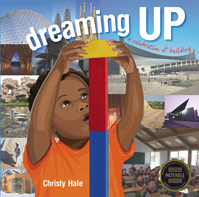
Dreaming Up: A Celebration of Building
by Christy Hale
Lee & Low Books Inc., 2012
ISBN: 9781600606519
Grades K-4
The reviewed received a copy of the book from the publisher.
The winners of the 2013 Boston Globe-Horn Book Awards were announced recently. The nonfiction winner this year was Electric Ben. Two books were name nonfiction honor books: Dreaming Up: A Celebration of Building and Hand

In the late-1930s, Walt Disney enlisted German architect and industrial designer Kem Weber to design a state-of-the-art animation studio from scratch. Weber oversaw every detail of the new Burbank studio from the exterior architecture of the buildings to the Streamline Moderne design of the furniture, desks, and appliances, to the custom typeface used on the studio’s signage.
Yesterday, Hans Bacher posted a fantastic series of images I’d never seen before that show Weber’s layouts of the different spaces in the Burbank studio. You can also see some of Weber’s furniture at the Blue Sky Disney blog.

The Burbank studio wasn’t the smashing success that Walt had envisioned, however. It felt cold and sterile to the artists who were accustomed to the cramped and comfortable charms of their old Hyperion digs. Animator Fred Moore complained to Ward Kimball one afternoon shortly after moving into the Burbank studio, “No distinction in the rooms.”
But more than the lack of charm, the Burbank studio’s ostentatious in-your-face luxuriousness suggested a certain tone deafness on Walt Disney’s part. It rankled the hundreds of artists who were struggling to get by on $15-per-week salaries, and who now realized that the company cared more about its films than the well-being of its rank-and-file employees. It hardly mattered to the artists that Walt had had to borrow money from the banks to pay for the construction of the studio. Labor tensions began to escalate just months after artists moved into the studio, and within 18 months, the nasty Disney strike that threatened to destroy the entire studio had begun.
Walt had miscalculated the desires of his artists. He thought they wanted a state-of-the-art facility to create animated films. The average Depression-era artist, however, would have been happier with a few extra bucks per week so that he/she could afford food and housing. Managing the competing interests of studio owners and artists is still a struggle in today’s animation industry, which is why the construction of Disney’s Burbank studio remains an especially instructive moment in the art form’s history.


The first-ever comprehensive exhibition of the landscape paintings of Martin Rico y Ortega (Spanish, 1833-1908) is currently on exhibition at the Meadows museum at Southern Methodist University in Dallas, Texas.
The exhibit features 106 works of art, including paintings, drawings, and sketchbooks, with sparkling views of Paris, Venice, and Madrid. According to the
museum, "Rico championed the technique of painting en plein air, famously painting while stationed in gondolas throughout the Venetian canals."
(
Video link) The show is the fruit of a longstanding collaboration between the Meadows museum and the Prado in Madrid. It will continue through July 7.
----
"Impressions of Europe: 19th-Century Vistas by Martín Rico"

By: shelf-employed,
on 2/8/2013
Blog:
Shelf-employed
(
Login to Add to MyJacketFlap)
JacketFlap tags:
poetry,
imagination,
book review,
nonfiction,
architecture,
building,
concrete poetry,
STEM,
STEM Friday,
Add a tag
On Fridays, you may find many bloggers participating in STEM Friday or Poetry Friday.
Here is a book that covers both bases.
Hale, Christy. 2012. Dreaming Up: A celebration of building. New York: Lee and Low.
As a youth services librarian in a public library, I don't have the same type of interaction with children as a teacher or school media specialist might. I see more preschool than school-aged children, and though my goal is to "teach" the love of reading and the power of information, children and parents often come to the library seeking pleasure and entertainment. Teaching and learning moments are offered in the form of story time programs, book clubs, or crafts.
That's why a book like Dreaming Up is so perfect! Imagine a book that "teaches" architecture, concrete poetry, design, and the power of imagination. Now imagine that book is suitable for preschoolers up to grade 4, that it sparks opportunities for imaginative play, that it is factual (Architecture, DDC 720), that it is properly sourced, that it is multicultural, and yes - it's attractive, too!
On the page facing each illustrated poem is a photograph of the famous or architecturally significant structure which inspired the poem. Featured buildings are from locations around the globe and include the Guggenheim Museum Bilbao in Spain, Petronas Twin Towers in Kuala Lumpur, Malaysia, and Frank Lloyd Wright's Fallingwater in Pennsylvania. Back matter includes information on each of the fifteen structures as well as biographical information on each building's architect.
No need to dream; there is such a book and it's Dreaming Up: A Celebration of Building. Go. Read it. Share it.
Get out some boxes, and blankets, and pillows, and playing cards, and Popsicle sticks and building blocks. Encourage the young people you know to "dream up."
STEM Friday may always be found at http://stemfriday.wordpress.com/ - use it as a great resource for children's books featuring Science, Technology, Engineering and Math.
Join STEM Friday!
We invite you to join us!
- Write about STEM each Friday on your blog.
- Copy the STEM Friday button to use in your blog post.
- Link your post to the comments of our weekly STEM Friday Round-up. (Please use the link to your STEM Friday post, not the address of your blog. Thanks!)
I need to tell a little story about the pictures in this blog's header, particularly the one on the right.
When I first selected it from a collection of pins on Pinterest marked "Libraries", I did not realise that each pinned picture in the collection corresponded to a whole article on the library in the picture.
Talking to someone the other day about this, I went back to my note in the sidebar to check where both shots came from and clicked right through to a brilliant article at Dezeen, an architecture and design blog now in its seventh year.
The article carries several more shots of the Liyuan library, designed by Li Xiadong. It was like opening a door.
Here is the outside of the library, on the outskirts of Beijing:

This next shot shows the rest of the library travelling back from the window shown in my header:

It is rather stunning. The whole library is covered on the outside with firewood, so that it blends in with the nearby village.
Read more at Dezeen: there's also a newer article on this library. Then, enjoy clicking through all their pins on Pinterest devoted to libraries to read other articles, or follow their library tag for some very attractive bookish spaces.
Honored to have this book cover I did selected for the Society of Illustrators Annual 55 (whoo-hoo!)
The opening reception was
last Friday and runs until March 2nd 2013.
Unfortunately my work schedule means that I won't be able to check out the show in person, but if you do go, please drop me a line (and maybe a photo?)

The Flintstones have been duly celebrated throughout the years, but one part of the Hanna-Barbera series that hasn’t received much attention is its iconic architectural setting: those brilliantly appealing and organic circular ranch houses topped with pancaked granite slabs.
The designer of the prehistoric Flintstones universe was a man named Ed Benedict (1912-2006), the same man who designed the show’s characters.

Benedict dreamt up the Flintstones homes almost entirely from imagination. He was once asked if he used any reference to design them. He replied, “No, with the exception of on the interior of one of the samples I made, I did look up some prehistoric stuff—cave paintings. I just looked up in there and got the old typical buffalo looking thing running across a wall, just to get the flavor of it.”
Benedict had had a bit of practice with this kind of work. He had designed cavemen and cavehomes once before for the 1955 Tex Avery short The First Bad Man:

The cave homes in The First Bad Man, built into the sides of rock formations, look uncomfortable compared to the domesticated setting of the Flintstones, replete with garages, front yards with flower beds, swimming pools and living rooms with couches. Benedict probably didn’t come up with the original idea of allowing the Flintstones all the creature comforts of suburbia, but the credit for making the idea work visually belongs to him.
The Flintstones designs in the image gallery below were created by Benedict for the original network presentation. These pieces established the general look and feel of the Flintstones universe and served as a guide for the layout artists who were charged with building out the world in each episode. A rare photographic print set of these drawings is currently being auctioned on HowardLowery.com.


After considering the
Parthenon and
Leonardo Da Vinci, let's see if we can continue taking a rational look at the claims about "phi," (or the "golden mean" or "golden ratio") that has been so popular with artists.
The story gets more complex in the nineteenth and twentieth centuries as artists begin to consciously adopt it in their work, and so it gets harder to separate fact from fiction. Let's start with what we know for sure.
One of the nineteenth century champions of the golden mean was German psychologist
Adolf Zeising (1810-1876) who found the golden mean in nature, especially in branching patterns, leaves, and seed patterns. These manifestations of the ratio are acknowledged by even the most skeptical scientists.
Over the years scientists have found other places where the golden mean turns up. In 2010, the
journal Science published a paper about how these numerical patterns appear in crystals at the atomic scale.
The golden mean appears most often in terms of numerical relations, such as the
Fibonacci numbers that appear in flowerheads, seeds, and shells.
Zeisler promoted the idea that the golden mean could be found in the Parthenon and the works of Leonardo. He made broad claims that the golden ratio was:
"the universal law in which is contained the ground-principle of all formative striving for beauty and completeness in the realms of both nature and art, and which permeates, as a paramount spiritual ideal, all structures, forms and proportions, whether cosmic or individual, organic or inorganic, acoustic or optical; which finds its fullest realization, however, in the human form."
Whether or not Zeisler's ideas had a solid grounding in observable fact, they caught on with artists and mystics.
A group of painters led by Jacques Villon and called "Section d’Or," (French: “Golden Section”) held exhibitions in Paris between 1912 and 1914. They included Juan Gris, Robert Delaunay and Giro Severini and several others, though not all used the mathematical principles. Later artists such as Salvador Dali also claimed to use golden mean principles.
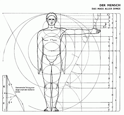
Above: Architects' Data (
German: Bauentwurfslehre) First published in 1936 by
Ernst Neufert,
Golden mean principles were adopted in extremely different quarters in the twentieth century. Many readers of this blog are acquainted with them in the context of contemporary realist ateliers.
The methods were also embraced by the
Bauhaus school (literally "House of Construction"), founded by Walter Gropius in Germany between World War I and II, and run by influential architects such as
Ludwig Mies van der Rohe.
The Swiss architect
Le Corbusier, who championed the international style of building design, used the golden ratio and the Fibonacci series as a central tenet of his teaching. He described the patterns as:
"rhythms apparent to the eye and clear in their relations with one another. And these rhythms are at the very root of human activities. They resound in man by an organic inevitability, the same fine inevitability which causes the tracing out of the Golden Section by children, old men, savages and the learned."
Many Bauhaus teachers emigrated to America, where their ideas about the golden section became incorporated in university art educations, where they are taught to this day.
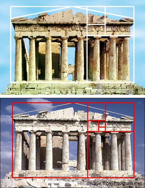
In architecture and design schools, it's common to hear the claim that "golden mean" geometry was used in the design of ancient buildings, especially the Parthenon.

According to
mathematician Keith Devlin of the Mathematical Association of America, this is a groundless myth, with no basis in fact whatsoever.

The golden mean (also known as the golden ratio or the divine proportion) refers to the relationship of 1:1.618..., an irrational number also known as "Phi." The ratio is found in nature, and has been championed in the last two centuries, but many other claims are unfounded. Although Greek mathematicians knew about Phi, there is not a shred of evidence that any Greek architect used such a system as a design principle. Euclid's study of Phi occurred long after the Parthenon was already finished. Devlin says:
"The oft repeated assertion that the Parthenon in Athens is based on the golden ratio is not supported by actual measurements. In fact, the entire story about the Greeks and golden ratio seems to be without foundation. Numerous tests have failed to show up any one rectangle that most observers prefer, and preferences are easily influenced by other factors. As to the Parthenon, all it takes is more than a cursory glance at all the photos on the Web that purport to show the golden ratio in the structure, to see that they do nothing of the kind. (Look carefully at where and how the superimposed rectangle - usually red or yellow - is drawn and ask yourself: why put it exactly there and why make the lines so thick?)"
In the examples above, the placement of the golden rectangle doesn't agree from one diagram to the next. In the top example, the sides of the rectangle hug the columns, and in the next, they're touching the edges of the pediment. In some, the bottom of some rectangles correspond to the bottom of the columns, while in others, they're several steps down the base. In the middle example above with the white lines, the source photo itself seems to be stretched vertically by about 15%.
According to University of Chicago math professor Phil Keenan, it doesn't matter how you arrange the diagram, because the lines in the Parthenon aren't straight or parallel anyway due to
entasis and other factors. He says:
"One cannot define an exact rectangle on the front or back faces of the Parthenon. Even though the Parthenon is built to extremely accurate specifications, its curvature precludes rectangular measurements of any greater precision than about 1%. This built-in error precludes finding any Golden Mean rectangles, since the required accuracy is simply not attainable."
George Markowky elaborates:
"The dimensions of the Parthenon vary from source to source probably because different authors are measuring between different points. With so many numbers available a golden ratio enthusiast could choose whatever numbers gave the best result."
Keenan points out that, "the presence of the Golden Mean in the Parthenon was postulated by Adolf Zeising in the 1850s, and appears nowhere in ancient Greek architectural treatises."
Devlin concludes: "I am not convinced that the Parthenon has anything to do with the Golden Ratio."
Anticipating some questions and comments:
Does the golden mean appear in nature?
Yes, and I'll get to that later in the series.Is it a useful tool for composition or analysis?
Sure, if it works for you. Busting this myth doesn't take away anyone's candy.Do contemporary architects use it?
Bauhaus training has reinforced both the myth and the practice.
When I was 12 years old, Aunt Sophie gave me my first book on architecture: Sir Banister Fletcher's A History of Architecture on the Comparative Method. I think Aunt Sophie liked it because it was elegant and English. I liked it because it had 3,500 drawings. Originally published in 1896, running to 20 editions (Aunt [...]
"There is nothing in machinery, there is nothing in embankments and railways and iron bridges and engineering devices to oblige them to be ugly. Ugliness is the measure of imperfection," wrote H.G. Wells. One gets the feeling that Oregon master bridge builder Conde McCullough read Wells and took his exhortation to heart, because Conde didn't [...]
The new
ImagineFX magazine is on the newsstands in Britain, and soon will be in the States. It has an article that I wrote on sketching architecture on location.
Since ImagineFX specializes in fantasy, science fiction, and concept art, I emphasized how on-the-spot work fits into my imaginative painting, and how I sometimes give a surrealistic twist to what I observe.
The article has quite a few images that haven't been published before, and I hope it will be inspiring both to digital and traditional artists, whether you do fantasy or not.
The magazine includes work by the 2011
Rising Stars winners, Marta Nael, Jean-Sebastien Rossbach, David Gaillet, Eric Deschamps. And one more extra: The magazine comes with a free DVD with one of my painting videos on it. By the way, when you're at the bookstore or newsstand, look for the magazine in the computer section, not in the art section.
----
ImagineFX magazineVideo produced by IFX about the entire issue,

Architect and industrial designer Michael Graves, in an op-ed piece in the New York Times, laments the lost art of drawing in architectural practice. His thoughts have obvious parallels with the world of computer animation, though thankfully, drawing still plays a major role in many CG creations.
Grave doesn’t have a problem with computers “as long as it’s not just that.” He talks about the creative possibilities that are opened up through the act of drawing, and uses as an example a drawing jam session he once had with a colleague:
Our game was not about winners or losers, but about a shared language. We had a genuine love for making this drawing. There was an insistence, by the act of drawing, that the composition would stay open, that the speculation would stay “wet” in the sense of a painting. Our plan was without scale and we could as easily have been drawing a domestic building as a portion of a city. It was the act of drawing that allowed us to speculate.
As I work with my computer-savvy students and staff today, I notice that something is lost when they draw only on the computer. It is analogous to hearing the words of a novel read aloud, when reading them on paper allows us to daydream a little, to make associations beyond the literal sentences on the page. Similarly, drawing by hand stimulates the imagination and allows us to speculate about ideas, a good sign that we’re truly alive.
Cartoon Brew |
Permalink |
No comment |
Post tags: Architecture, Michael Graves

By: Alice,
on 8/31/2012
Blog:
OUPblog
(
Login to Add to MyJacketFlap)
JacketFlap tags:
design,
art,
fashion,
olympics,
graphic design,
Architecture,
symbols,
Olympic Games,
Summer Olympics,
Editor's Picks,
*Featured,
ceremony,
Art & Architecture,
Arts & Leisure,
london 2012,
Design Histories of the Olympic Games,
Jilly Traganou,
Journal of Design History,
modernity,
Pierre De Couberti,
Wolff Olins,
Add a tag
By Jilly Traganou
After attending the “Because” event at the Wolff Olins office on July 4th, I was once again reminded of the big disconnect that lies between designers and their public. Wolff Olins is the firm that designed the London 2012 brand, a multifaceted design campaign that included much more than the London 2012 logo. Readers may remember the numerous complaints that the logo generated. As my research revealed, this was caused partly due to International Olympic Committee (IOC)’s restrictions and the corporate unwillingness to allow for the full application of what might be seen as a “no logo” campaign.
Wolff Olins proposed an open-source framework that would integrate the public by providing a design language that could be shaped into new forms and messages. The designers’ intention was to “hand over some tools that would allow people to make everything they wanted.” Design would be “off the podium, onto the streets.” But neither the public nor the broader designers’ community were ready to accept that the Wolff Olins team showed no compliance to the usual set of corporate instruction and that what they were trying to achieve lied beyond the creation of beautiful forms.

London 2012 event. Photo by Gary Etchell. Used with permission. All rights reserved. http://www.flickr.com/photos/gary8345/557769058/
The designers’ goal was to evoke an effect similar to that of the Mexico 1968 design: a visual language designed by Lance Wyman that was not only appropriated by the counter-Olympic movement, but also marked future visual languages developed by local designers in Mexico. In a way, Wolff Olins’ design succeeded in its adaptability, even though its multiple viral deconstructed versions that appeared on the streets and online were meant to primarily express conspiracy and protest, or even a disdain for the very visual language that the designers provided (and which these “dissidents” are now using).
But why would designers today strive for openness and participation? And why should IOC, London Organising Committee of the Olympic and Paralympic Games (LOCOG), or the general public be indifferent or even hostile to these intentions? After all, are there any designs that would meet the aspirations of all stakeholders: Olympic organizers, designers, and their multiple publics? The Olympics, as indeed most public events, are complex platforms that bring to the surface deep social conflicts and generate heated debates about the notion of public good. The new temporary or permanent configurations that are designed for the Olympics express these tensions and often become the targets of opposing voices.
Everyone today recognizes that the modern Olympics only partly concern sports. Few, though, are aware of the multiplicity of the design engagements that are mobilized for their realization. Being characterized as something between urban festivals and quasi-religious events, the Olympics have a strong ceremonial character that design generates. Hundreds of designers are mobilized to create a series of objects (logos, posters, uniforms, mascots, souvenirs) that are indispensable for the Olympic ensemble. This may seem to some a contemporary distortion to the original 19th century idea of the modern Olympics’ founder, Pierre De Coubertin, but Coubertin was keenly aware of the importance of design for the identity of the Games. He designed what has been credited as the most recognizable logo in the word, the Olympic rings, and spent considerable energy in prescribing the ceremonial characteristics of the event, with writings on subjects that ranged from attention to lighting and decoration, to specifications on the architecture of the venues.

Photograph in newspaper (unspecified) of Richard Beck working on the design for the Olympic poster. This proto-version differs from the final design, particularly in its typography. Collection: Powerhouse Museum, Sydney, 92/1256–1/4. Used with permission.
The design for the Olympics has been an overlooked subject in the fields of design history and Olympic studies alike. Olympic design’s role as an instrument of modernity becomes obvious, for instance, in the way
British athletes’ uniforms were designed for the early Opening Ceremonies, expressing but also helping to shape the identity of modern Britain. The Melbourne 1956 poster designer, Richard Beck,
abandoned the neoclassical body of the male athlete that characterized earlier Olympic posters for a non-figurative composition along the tenets of modern design.
As it has become only too obvious with the current case of London, in late modernity the Olympics are also an opportunity for new infrastructure projects and major real estate enterprise, which leave a debatable legacy to the host-city. Planners, architects, and urbanists play a major role in this process, as well as those who sponsor, lease, or invest in the projects in the longue durée of the post-Olympic era. The design for the Mexico 1968 Olympics had significant ideological implications for the social segregation that marked the future of Mexico City. The architecture of the Athens 2004 Olympics is emblematic of ‘instant monumentality’ and a lack of legacy planning that has characterized many modern Olympics.
At the same time, the high visibility, budget, and scale of the Olympics have provided designers with opportunities to realize ambitions that are not possible through ordinary projects, and to envision ideas that are often too advanced for their times. Katsumi Masaru for instance insisted in compiling a design manual for the Tokyo 1964 Olympic Games (a set of prescriptions that would secure the unified application of the graphics, and thus a cohesive Olympic image), even though he knew too well that it could hardly be applied in the Tokyo Olympics per se. Indeed it was completed just before the start of the Games leaving nevertheless an important legacy for all forthcoming Olympics for which a design manual became a staple. Should we similarly expect that the “no logo” idea of the London 2012, with its openness and lack of corporate compliance, is signaling a new paradigm shift?
Jilly Traganou is Associate Professor in Spatial Design Studies at the School of Art and Design History and Theory, at Parsons The New School for Design in New York. She has published widely in academic journals, has authored The Tokaido Road: Traveling and Representation in Edo and Meiji Japan (Routledge, 2003) and co-edited Travel, Space, Architecture (Ashgate, 2009). She is currently working on a new book Designing the Olympics: (post-) National Identity in the Age of Globalization. Traganou has recently edited a special issue titled “Design Histories of the Olympic Games” for the Journal of Design History, where she also serves as Reviews Editor.
The new issue of the Journal of Design History titled “Design Histories of the Olympic Games” introduces the Olympics as a multifaceted design operation that generates diverse, often conflicting, agendas. Who creates the rhetorical framework of the Olympics, and how is this expressed or reshaped by design? What kind of ambitions do designers realize through their engagement with the Olympics? What overall purposes do the Olympics and their designs serve? ‘The Design Histories of the Olympic Games’ brings together writings by a new generation of scholars that cross the boundaries between traditional disciplines and domains of knowledge. Some of the articles look at the role of Olympic design (fashion design and graphic design) in representing national identity. Other articles look at the interconnected area of architecture, urbanism and infrastructure and the permanent legacy that these leave to the host city. You can view more on the Journal of Design History’s Design Histories of the Olympic Games Pinterest board too.
Subscribe to the OUPblog via email or RSS.
Subscribe to only art and architecture articles on the OUPblog via email or RSS.
Read more blog posts about the London 2012 Summer Olympic Games.


For fans of brutalist architecture, feast your eyes on this beautiful slice of Brasilian modernism conceived by architect João Filgueiras Lima. The Edifício Morro Vermelho complex, aka “Red Hill” housing. features a series of swiveling bright orange fiberglass panels that are not only pleasing to the eyes but also act as a functional shading device.

Photos via Seier + Seier
Also worth viewing:
Kurokawa Nakagin Capsule Hotel
The architecture of Gomorrah
Space age soviet architcture
Not signed up for the Grain Edit RSS Feed yet? Give it a try. Its free and yummy.
Share This
A Huge thanks to the Penguin Group for sponsoring this week’s RSS Feed!
©2012 Grain Edit - catch us on Facebook and twitter

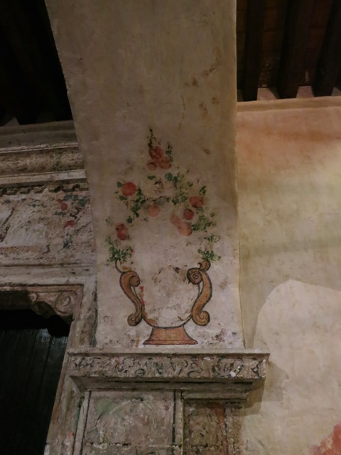
In the 19th century, several museums assembled collections of full-size plaster casts of architectural details, such as doorways and choir stalls. The philosophy was that "a replica of a masterpiece was superior to a mediocre original."
I made these pencil studies in the 1985 at the
Victoria and Albert Museum in London. At left is an ornate Celtic wood-carved ornament. On the right is a 15th century Spanish cloister doorway.
In an age when travel to Europe was a rarity for average Americans, cast collections gave everyone a chance to see masterpieces of architecture. They also provided architecture students with fine examples to study, especially when the original detail is high up or otherwise inaccessible.
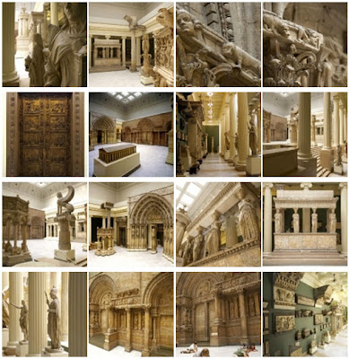
According to the Carnegie Museum, which has a fine collection, "In the 19th century, the demand for plaster casts skyrocketed. As centerpieces of the great international fairs, casts nourished nationalistic pride, while independent cast galleries served the Victorian fervor for education by providing instruction to both the amateur and the art student. Also, the dominance of historical styles in premodern architecture required that the architecture student study the outstanding buildings of the past; in this pursuit, plaster casts played an essential role."
Unfortunately, twentieth century trends conspired against architectural cast collections. Making casts from fragile originals is no longer possible. The study of ornament fell out of favor in architecture schools. Museums came to prefer originals over reproductions. And casts take up a lot of space in museums.
In 1949, the Art Institute of Chicago intentionally destroyed their cast collection, and many other museums and universities followed suit. In 2005, the Metropolitan Museum dispersed its architectural cast collection. Two of the lucky recipients were the architecture school of the University of Notre Dame in Indiana and the Institute of Classical Architecture in New York.
If you live near London, Edinburgh, Pittsburgh, South Bend, or New York, visit their collections with a sketchbook, and make sure you let the museums know that you appreciate them keeping their collection on view.
-------
More info and links:I just finished writing an article on plein-air studies of architecture for
ImagineFX magazine, so that will be out in a couple of months.
------
Victoria and Albert architecture collection/ History of the Cast CourtsCarnegie Hall of ArchitectureUniversity of Notre Dame Cast CollectionView the UND collection online via gigapan technologyInstitute of Classical Architecture and Art in NYCEdinburgh Cast CollectionGeorge Walter Vincent Smith Art Museum in Springfield, MassachusettsPrevious GJ post on figural plaster casts
This is the second image I created at the
Illustration Academy for the first project (for more details scroll down ever-so-slightly and check out yesterday's post). I probably created 50 different thumbnails for this because I wanted to ditch linear perspective and yet still give the viewer the sense they were above the guy on the stairs. Alas, it was a no go. Turns out you still gotta' use a couple vanishing points sometimes (but god bless
Brunelleschi for figuring it all out)
View Next 25 Posts


.jpg?picon=1009)


Thanks for bringing Christy Hale's book to our attention. <br />Your piece shares how it has such an inviting premise, to guide kiddos into a topic usually not covered in nonfiction. <br />Little children are natural builders but then as they grow up, so few go on to be architects & builders, especially girls. <br />This book incorporates visual art & the literary art of poetry with
This sounds wonderful. I find that boys and girls are interesting in buildings and architecture but there aren't many books that grab their attention. This one looks perfect! Will be hunting it down!