JacketFlap connects you to the work of more than 200,000 authors, illustrators, publishers and other creators of books for Children and Young Adults. The site is updated daily with information about every book, author, illustrator, and publisher in the children's / young adult book industry. Members include published authors and illustrators, librarians, agents, editors, publicists, booksellers, publishers and fans. Join now (it's free).
Login or Register for free to create your own customized page of blog posts from your favorite blogs. You can also add blogs by clicking the "Add to MyJacketFlap" links next to the blog name in each post.
Blog Posts by Tag
In the past 7 days
Blog Posts by Date
Click days in this calendar to see posts by day or month
Viewing: Blog Posts Tagged with: Art History, Most Recent at Top [Help]
Results 26 - 50 of 71
How to use this Page
You are viewing the most recent posts tagged with the words: Art History in the JacketFlap blog reader. What is a tag? Think of a tag as a keyword or category label. Tags can both help you find posts on JacketFlap.com as well as provide an easy way for you to "remember" and classify posts for later recall. Try adding a tag yourself by clicking "Add a tag" below a post's header. Scroll down through the list of Recent Posts in the left column and click on a post title that sounds interesting. You can view all posts from a specific blog by clicking the Blog name in the right column, or you can click a 'More Posts from this Blog' link in any individual post.
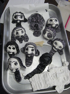
This was our last Art History project. The idea was to create a 40' x 46' mosaic of the Mona Lisa out of balloons. We create a grid using yard then started blowing up the 2,000 balloons.
Unfortunately, the weather did cooperate. The wind kicked in by afternoon, twisting our grid and popping our balloons. In the end we decided to dismantle. However, we may try again with a new approach...
Have you ever heard of Evaline Ness? She was an illustrator of many children’s books during the mid-20th century period. At a time when most illustration was still being done in a style of literal realism, Ness was among that group of stylistic pioneers whose work still influences the look of illustration today.
She also has the unusual distinction of having been married for a time to the famous FBI agent, Elliot Ness.
The Bloombury Auction House in New York has an upcoming auction featuring a collection of children’s books signed by Evaline Ness, her Caldecott medal for Sam, Bangs and Moonshine and some never before seen sketchbooks and dummies all of which come from her family collection.
The sale will take place at Bloomsbury Auctions New York on Wednesday, December 9th, but those who won’t be able to attend can view nearly a dozen pieces from the Ness collection in my Evaline Ness Flickr set.
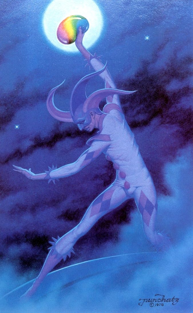
Larry Roibal alerted me this morning with this post on his blog to the death of Don Ivan Punchatz. Its always sad when a legendary illustrator pass away… but this passing is especially unfortunate when we learn that Punchatz’s widow is now burdened with massive health care bills due to the artist not having had health insurance.
For those who are unfamiliar with the name Don Ivan Punchatz, you may have seen his work for Playboy, Esquire, National Lampoon, Time, Newsweek, and a host of other magazines, countless paperback book covers, the first Star Wars film poster, the cover of the Doom video game… truly a giant. We will miss him.
Don was one of my profs at Syracuse ISDP during summer residency 2002 and in Fort Worth, spring 2003. He was a generous teacher, a gentle man and a sweet soul. I was fortunate to part of his life. He definitely will be missed.
Only two more sleeps ’til Hallowe’en, kiddies! If you youngsters need a little help drawing monsters, then Monsterman ‘Scary’ Harry Borgman can help.
Way back in 1974 Harry drew a little booklet called “How to Draw Monsters”. By then, Harry had been drawing cars, people, landscapes and just about anything else you can think of for more than three decades. Harry began his commercial art career in Detroit in 1946.
Harry’s varied career has given him a wealth of esoteric experiences. For instance, though he was never one of “Mad’s maddest artists” he was one of Sick’s sickest artists. The cartoon creeps below are a great example of his ’sick skills’.
Harry is now 81 and still going strong. In fact, he’s just celebrated the first anniversary of his blog. Drop by Harry Borgman’s Art Blog and you’ll see for yourself that this amazing illustrator can teach you how to draw monsters… and a whole lot more!
* I’ll be featuring a dozen scans from “How to Draw Monsters” on my own blog on Saturday October 31st, but you can preview them all ( and tons of other amazing Harry Borgman art) in my Harry Borgman Flickr set.
Bookmaker John M. Carrera meticulously restored thousands of engravings from the pages of 19th-century Webster’s dictionaries, and has compiled an extraordinary visual account of Victorian history.
In his introduction to the book, Carrrera suggests that the very juxtapositions of the illustrations tell a story:
The conceptual underpinning is that this book can act as a springboard for individual creativity. It was printed with a belief that the human compulsion to find meaning would lead readers to create stories that explain whole pages and perhaps even inspire some to derive unifying threads that might, in a Joycean fashion, enable a narration of the entire book.
It is a creative and romantic way to look at what amounts to a collection of images very purposefully arranged in alphabetical order, but he continues to admit the book is invaluable even just as pure reference:
The surface function of the book as a visual reference needs little explanation. The book contains many great examples of how to solve problems of illustration. … By virtue of the magnitude of engravings, their varying density and size, the book also becomes a study in design.
In this video I found on Vimeo, John Carrera gives us a detailed tour of the process, tools, and machinery used to print and bind the hand-made jaw-dropping deluxe edition of the book. It is nothing short of book-making porn:
The pricetag of this lovingly crafted tome? $4600.00.
But not to worry. The trade edition of Pictorial Webster’s is an affordable $35.
Lowell Hess is one of the forgotten giants of the mid-20th century cartoon art business. Among his many laudable accomplishments is a year-long series of tiny spots done for Collier’s magazine in the early 50’s.
These spots appeared regularly in a column called “48 States of Mind” and, although tiny in stature, they are huge in the excellence of their content. Brilliant character design, hilarious oddball concepts and meticulous execution make Hess’ tiny Collier’s spots well worth a closer look. You’ll find several more at Today’s Inspiration.
In the world of art history there is increasing attention being paid to caricature. A rather large bulk of the research seems to be getting done in French. For those interested in a blog full of links to resources and books and conferences on historical caricature, caricatures et caricature.com is just the thing – in French. However, the links work for English-speakers too ;-).
Dick Balzer’s collection of magic lanterns, zoetropes, thaumatropes, phenakistoscopes, and other optical toys is one of the finest in the world. He has been collecting “anything and everything invented before the movie camera that produces an optical effect” for 30 years.
The site’s boasts some new flash galleries which replicate some of the pieces’ effects (note: doesn’t seem to work in Safari).
An inspiring collection of Japanese graphic design images from the last half-century over at A Journey Round My Skull (which incidentally is an awesome blog). The above image is tagged, “Yoshitaro Isaka, 1966, ad”.
1 Comments on Japanese Graphic Design, last added: 8/28/2009
The Architects Journal blog has a neat Top Ten list of cities in comics (posted by Rory Olcayto). Because it is obviously written for people who know nothing about comics, it probably doesn’t go in-depth enough for comics experts on Drawn, but it does provide some interesting extras like this pairing of Marlinspike Hall with its inspiration, from Herge’s classic Tintin series. There are also some amusing picky comments from architects in the comments: “Just to be pedantic – you are mixing up Aztec and Inca influences and how Herge used them,” writes Tintin buff Chris Tregenza, who made this map of Tintin’s voyages.
2 Comments on Top Ten Cities in Comics – chosen by an architect, last added: 8/3/2009
MG is so good. I love this quote, “It’s a great benefit of being in the arts, where the possibility for learning never disappears, where you basically have to admit you never learn it.”
Maltin is a big fan of animated films and animation history and in 1994 he and the NFB put together this compilation of animated shorts he loved from the Board’s history.
0 Comments on Leonard Maltin’s Animation Favorites as of 1/1/1900
Walt Stanchfield:
You may recall me mentioning a tendency to straighten everything up in a drawing. You know, the crooked-picture-on-the-wall phobia. This tendency goes beyond straightening things up horizontally and vertically, but also depth-wise. That would be like taking the lines in Plate 1a and straightening them up like Plate 1b, which you can see, destroys all illusion of depth.
I am relentless in my crusade against this kind of seeing and drawing. You all have at least some knowledge of perspective, but sometimes the mind wanders and you fail to make use of what you do know. To further complicate matters — beyond just knowing the rules, you have to carefully observe (and feel) the pose so that you can put the two together. So much depends on perspective — not just what is called linear perspective (see Plate 3), which is a system for linear depiction of three dimensions, but also what I will call Spatial Perspective.
In drawing human or animal figures, which are loaded with complicated planes, there would be so many vanishing points you would need a computer to keep track of them. But take heart, there is a simpler method, thanks to Bruce McIntyre, former Disney Studios artist and subsequent drawing instructor. This method involves a few very simple rules which, once understood, are easy to apply, effective, and fun to use.
Here in Plate 2 are the six principles of perspective.
Take the hands first. They illustrate the second rule (see Plate 2), Diminishing Size . The hand farthest away being the smallest. Next, the left hand overlapping the forearm, the forearm overlapping the
upper arm, the shoulder overlapping the chest area, the front of the neck overlapping the far shoulder — all illustrate the fourth rule, Overlap . The way the forearm delineates the contour of the arm as it overlaps the upper arm, and the left shoulder follows the contour as it overlaps at the trapezius muscle, illustrates the fifth rule, Surface Lines. Plate 4b further explains the Surface Lines rule.
The last rule, Foreshortening, is present everywhere in every third dimensional drawing. It should be felt rather than diagrammed, although at times, a few perspective lines may help. Here Donald demonstrates how that particular perspective rule has been pushed to great extremes. This is called forced perspective and is universally accepted as normal.
Regarding foreshortening there is actually a three-dimensional drawing method, which doesn’t necessarily make use of it - it’s called military perspective.
bspence11 said, on 7/13/2009 1:01:00 PM
Both books look great, I’m going to buy them both.
adam_s said, on 7/15/2009 5:50:00 AM
CORRECTION this is not an excerpt from Volume 1, both posted excerpts are from Volume two, could this please be corrected as I bought the first one thinking so. Yes, I am a total pedant.
Like many of us, Jonny Quest was among my absolute favourites shows when I was a kid. It’s one of the few that still holds up (well, to a point anyway) over four decades later. Alex Toth’s and Doug Wildey’s stunning designs and storyboards, along with lush adventurous musical scores by Hoyt Curtin, put it in a class all its own. (And do not mention that “other” Jonny Quest show from the late 90s because la-la-la-la-la-la-la-I-can’t-hear-you!)
So I was delighted when a friend pointed me to this wonderful (fan-made?) Jonny Quest documentary. It’s a bit of a mystery exactly who made it, other than that it was “supposedly made for a one time screening at a private function.”
The whole video clocks in at about 2 hrs and 20 minutes, broken down into 27 short chapters on YouTube, and assembled into this single playlist (two chapters are missing). It’s the perfect way to spend next Saturday morning while you enjoy your Pop Tarts and coffee in bed!
If you’d like to create a single file, you can download all the clips from Chris Webber’s blog (he’s the fellow who posted the work on YouTube, but not its author) and assemble them together into a single file. (If you do, and manage to upload it somewhere to share with others, please let me know and I’ll add the info to this post.)
About the video, Chris says:
The original creators of the documentary have given me permission to share this unique documentary but ask once again that if you do download it and decide to copy it or share it, please do not sell it or in any way create profit with it. This was their sole requirement for posting it on YouTube and now here on this blog.
4 Comments on Quest: How the World’s Most Ambitious Animated Series Came to Television (or, “Quest File 0-37″), last added: 6/24/2009
It is uplifting / To see that some folks create / Sans dollars in mind
pandafresh said, on 6/22/2009 4:55:00 PM
i remember hearing Alex Toth absolutely hated this cartoon. i mean i like it, but the super limited animation is a bit annoying, especially when you take a look at his awesome character designs.
Luc said, on 6/22/2009 8:09:00 PM
The limited animation was necessary to fit the budget and schedules of the shows, as they explain in detail in the video.
Also, almost everything I’ve read about Toth points to him “hating everything.” For all we know, he was probably just an extremely outspoken person with a short fuse and not much patience with other people, thus anything he’d say probably got interpreted as though he hated everything or was a jerk. Most of us will never know either way.
Animation projects, being what they are, rarely manage to look better than the weakest links in the production staff and executives. The show still aimed higher than most ever had before, and higher than almost anything since. From my time in the industry, it’s something of an impossible miracle when a project DOES come through as beautiful and “good” from beginning to end. It’s nearly impossible to manage the hundreds/thousands of people necessary/available who work on any given animation project.
ThunderCat78 said, on 6/24/2009 10:11:00 AM
This was AMAZING!! The person who created this video clearly has a deep love for the Johnny Quest mythos. Thank you whomever you are!! I really enjoyed the whole series of videos, and for animation enthusiasts like myself it was a real treat. If only most DVD extras were this in-depth and created with as much love for the source material.
While the rest of the world is dizzy with Hope and Change (and believe me, we’re happy for you us), we here in Canada are stuck with the status quo and a conservative government determined to slash and burn the arts.
It was in this spirit last week that the government led by Stephen Harper quietly canceled long-standing plans for a National Portrait Gallery.
So Art Threat, the political art blog, taken matters into their own hands:
Since Stephen Harper canceled the National Portrait Gallery, we decided to create our own in his honour. We’re inviting artists to submit their portrait of Canada’s Prime Minister for inclusion in the Stephen Harper Portrait Gallery, and their chance to win (minor) fame and riches!
Please tell me what “slash and burn the arts” means. If you are a “true artist” you won’t need a government to support your endeavors. Just work your butt off and have something to say. That’s what art’s all about.
Huebner said, on 11/17/2008 5:30:00 PM
Hey, let the Americans have fun playing with a command economy for a change. I’m with dougtoney. If the guv can slash and burn your arts you’re not doing it right.
brineblank said, on 11/19/2008 7:35:00 AM
I really enjoy a lot of the items presented on drawn but sometimes you guys make me want put my head through a wall…While I’m not a big censorship guy at the same time there is a point where ‘the art’ movement gets absurd and if you want to be as such do it in your basement behind a curtain. I was listening to a radio show not too long discussing the NEA (tax-payer funded of course) and a group of art students from NY asked for funding to do classical training and to re-establish fundamentals with regards to human anatomy (aka known as a bit of life drawing)…response…denied…not cutting edge enough…it was great (and I mean that sarcastically) to learn that a woman did have her grant approved which allowed her to put her (by choice) aborted baby in a clear jar of red water to display in some art museum…if there weren’t so many kooks out there maybe the censorship might not be such an issue.
Well...I at least looked at the Illustration Friday topic and even doodled a few thoughts. But, this just isn't going to be the week to get something like that done.
Every other Wednesday throughout the school year about 30+ homeschooling families meet to share our gifts and teach classes to all the kids. I'm teaching an art class for kids 9 years to early teen that looks at how the portrait has been depicted throughout history. We started with Ancient Mesopotamia and the Abu Temple figures (known for thier huge eyes and stair-step hair and beards).
Today, after studying the style points and the color symbolism, they painted Egyptian-Style portraits on plaster tiles.
We only have an hour together and there's quite a variety of ages and abilities in the class, but I think they're all having fun and learning something at the same time - that's the main point, after all.
Maybe I'll be able to get to IF next week...
0 Comments on Kid Stuff Keeping Me Busy... as of 1/1/1900
Another beautiful example of public historical archives being returned to the people through the Internet.
The National Collection of War Art is composed of about 1,500 artworks, including portraits, battle scenes, landscapes and abstracts, depicting those who served New Zealand in times of war, and the arenas in which they served.
It includes both official pieces of war art, by artists formally commissioned by the New Zealand government, and other unofficial art works that were acquired by or donated to the collection.
The featured lithograph is called On the railways - engine and carriage cleaners, 1917 by by Archibald Standish-Hartrick.
(from the official site/link) They’re great!
they remind me of a mix of rosie the riveter
and the cccp propaganda posters.
all countries, in the time of war,
have a lot of their artists ‘propogate’!
A History of Western Art: From Prehistory to the 20th Century Author: Antony Mason Editor: John T. Spike Publisher: Abrams Young Readers ISBN: 0-8109-9421-6 EAN: 9780810994218
The publishers aren’t exaggerating when they write that this book is lavishly illustrated. Each page is sumptuously, decadently illustrated with amazing works of art. It’s a visual feast as well as an informational one. The book is set up in format that makes it the subject easy to understand. There are well-defined descriptions of not only the art depicted but in some instances, of the process involved in creating it. I loved simple, yet clear arrows pointing from a description or a process or symbology of a particular piece of art to the section of work that it’s describing. I found the descriptions of how mosaics were made particularly fascinating.
I loved that this book depicted time periods and movements in art like Surrealism or Rococco. I had a lot of fun teaching my grandchildren about sculpture or architecture which is Jasmine’s favorite part of the book. She loves how the illustrations of the buildings like the Guggenheim have a slice taken off so that you can see the inside. I find it remarkable that a five-year old is this keenly interested in Frank Lloyd Wright and I attribute her interest in a large part to this excellent book with its friendly style.
This is a book that spans age groups. I get so much out of it each time we open it to another page and the grandchildren, ages 2 and 5 find so much to love about it. They ask me to pull it down from the shelf again and again and each one has pages that they just love to touch and point at. I on the other hand am entranced by the quality of the paper, the illustrations and photographs of the artwork and can gaze in awe of the David Hockney collage for hours on end.
I wish our schools could have copies of this book in every classroom for every student. I think this book and books like this are timeless and should be every child’s right. Art is so very important and this book does so much to educate about it. You can’t help but fall in love with art after reading this and it inspires the creativity within. I know that for me, its shown me new meaning to a painting I’ve loved and lit a spark in me to find out even more. Books that fuel the thirst for knowledge are treasures.
Highly, highly recommended for anyone of any age.
Book Description from publisher:
Lavishly illustrated with more than 250 full-color reproductions of artworks, details, photographs, and documents, this informative book provides a sweeping overview of Western art. The book begins with the cave paintings at Lascaux, France, and continues on with the art and architecture of ancient Egypt, Greece, and Rome through Early Christian, Byzantine, and medieval art and on to the Romanesque, Gothic, Renaissance, and Baroque periods. Then it proceeds from Neoclassicism, Impressionism, Post-Impressionism, and Modernism up to the art of the late twentieth century. The book is filled with paintings, sculpture, mosaics, and architecture by such renowned artists as Paolo Uccello, Jan van Eyck, Filippo Brunelleschi, Leonardo da Vinci, Rembrandt, Gainsborough, Goya, Turner, Monet, Renoir, Auguste Rodin, Georges Braque, Edward Hopper, Jackson Pollock, David Hockney, and Andy Warhol.
An essential tool for classrooms and libraries as well as a wonderful gift for young people interested in art.
About the author
Antony Mason is the author of more than sixty books. In addition to more general histories of art, he has written biographies for children on Leonardo da Vinci, Rembrandt, Monet, Cézanne, Matisse, Picasso, and Chagall. He lives in London, England. John T. Spike is an internationally recognized art critic, curator, and noted historian of Italian art of the fifteenth through eighteenth centuries. He was born in New York City and resides in Florence, Italy.
0 Comments on A History of Western Art: From Prehistory to the 20th Century as of 1/1/1900
I love, love, love these cartoonish studies of “the costumes of the Portuguese” from an album of sketches dating back to 1836. I spotted these over at the mighty BibliOdyssey. The high-res versions can be found at the National Library of Portugal.
These are so cool and weird. I love the fact that they remind me of Spirited Away and the gods of the Bath house. At this time in England our toys were spinning tops, wheels and sticks, or tin trains! We were so far behind!
Matt said, on 3/17/2008 10:26:00 AM
yeah, these images are a goldmine of inspiration.
Melissa Kojima said, on 3/19/2008 2:55:00 PM
I agree with almilway. These do remind me of Spirited Away. I’d love to get my hands on some of the actual toys. Does anyone know if any of them were made? Or are they only the designs?
Over at Pink Tentacle you can check out a collection of bizarre-looking illustrations from a 16th Century book of Japanese medicine. They look, surprisingly, not much different from the type of cartoon viruses, bacteria, and parasites I might have drawn in my schoolbooks as a kid.
Long ago in Japan, human illness was commonly believed to be the work of tiny malevolent creatures inside the body. Harikikigaki, a book of medical knowledge written in 1568 by a now-unknown resident of Osaka, introduces 63 of these creepy-crawlies and describes how to fight them with acupuncture and herbal remedies. The Kyushu National Museum, which owns the original copy of Harikikgaki, claims the book played an important role in spreading traditional Chinese medicine in Japan.
This ambitious animated short uses ethnic foodstuffs to re-enact the history of armed conflict since the Second World War. For example, the chapter on the Cold War shows a Big Mac rattling sabres with a pile of Beef Stroganoff and then skulking off-screen defeatedly.
Food Fight is an abridged history of war, from World War II to present day, told through the foods of the countries in conflict. Watch as traditional comestibles slug it out for world domination in this chronologically re-enacted smorgasbord of aggression.
I just watched Helvetica: The Documentary Film, which is now out on DVD. An entire film about a font. It’s absolutely wonderful.
The film tells three stories at once:
The history of typography since the 50s
The history of design since the 50s and
The history of Western culture since the 50s
And it achieves all this without one image of a dancing hippie or a stock-shot of the Vietnam war.
The film toggles between designers who love the simplicity and clarity of Helvetica and designers who hate the homogeneity and soullessness of the font. Everyone has a compelling argument why Helvetica should be ubiquitous or should be banned.
Here’s a clip of designer Erik Spiekermann telling us why he thinks Helvetica sucks:
In the liner notes to the DVD, filmmaker Gary Hustwit says, “I couldn’t believe that some of these designers had created 50+ years of work that we see every day, but that no one had ever interviewed them on camera about what they do.”
There are simply not enough documentary films about graphic art and design but Helvetica begins to fill this huge void.
It’s an excellent film. I’ve watched it twice already and could watch it a dozen more times.
How I wish advertising were still this fun! Paint sold kind of like Wonderbread….
I moved to a new house recently. Or rather, it’s an old house, but new to me. Way, way up in the rafters of the garage, we found about 30 old point-of-purchase display ads from the 1930s and 40s, for Canadian brands and multinational ones like Eveready. All illustrated, some signed by Canadian artists. This is one of them. WoW! What are the chances of a forgotten hoard of graphic art being found by a graphic art historian??!
As it happens, I am co-editing a collection of articles for an upcoming issue of the Journal of Canadian Studies. That is, I HOPE to be editing it… it all depends on how many submissions for articles we get. I’m posting this here on the off-chance someone reading this has something to share on the topic.This will be the first time a survey of graphic art (not fine art printmaking! dammit!) history in Canada will be gathered together. Graphic design, illustration, comics… if it was in print, it’s probably good.
Since it is my research specialty, I’m hoping it will kick off a really nice little cohort of colleagues who will continue to share ideas and research. Feel free to email me for more details: [email protected].
Have you heard the one about the famous nun graphic designer? Me either, until I recently stumbled upon this book, entitled “Come Alive!: The Spirited Art of Sister Corita”. I wondered who this “Sister Corita” was. Clever moniker? Kooky pseudonym? Nope: actual nun. Née Frances Elizabeth Kent, Sister Corita:
(…) was the most famous nun of the 1960s and one of the most famous graphic artists in the US, yet she is rarely mentioned in the grand history of graphic design.
Born 1918, in Fort Dodge, Iowa; Frances Kent moved with her family to Vancouver in 1920 and Los Angeles in 1922. She entered the Sisters of Immaculate Heart of Mary in 1936 as Sister Mary Corita, attended Immaculate Heart College, and received her Masters Degree in Art History from the University of Southern California in 1951. From 1946 to 1968, Sister Corita taught art at Immaculate Heart College; often using unconventional methods: looking a work without blinking, staging happenings, etc. As the chair of the Art Department, the known and unknown visited her classes: Buckminster Fuller, Charles and Ray Eames, Ben Shahn, and Daniel and Philip Berrigan. (via Speak Up)
Sister Corita had been “nuts about words and their shape since [she] was very young” and during the mid-1960s her work shifted from silkscreened, liturgical images reminiscent of Ben Shahn to Pop Art appropriations of consumer-product typography and slogans. In her view, Wonder Bread corresponded with the Eucharist, Joy detergent was a sacrament, and SafeWay was a metaphor for the Faith.
She felt there was much to learn from television advertisements. In a 1967 Christian renewal symposium she postulated if the medium is the message; then perhaps if Christ lived today, his sermons would take the form of commercials. All the poetry of a painting is diminished by those who do not see it, so to care about communication is to care about form. (ibid.)
I’m not touching that last paragraph with a ten-foot pole.


.jpg?picon=1621)


 I just watched
  How I wish advertising were still this fun! Paint sold kind of like Wonderbread….

i hate how the weather would blow the balloons away. why weather, why?