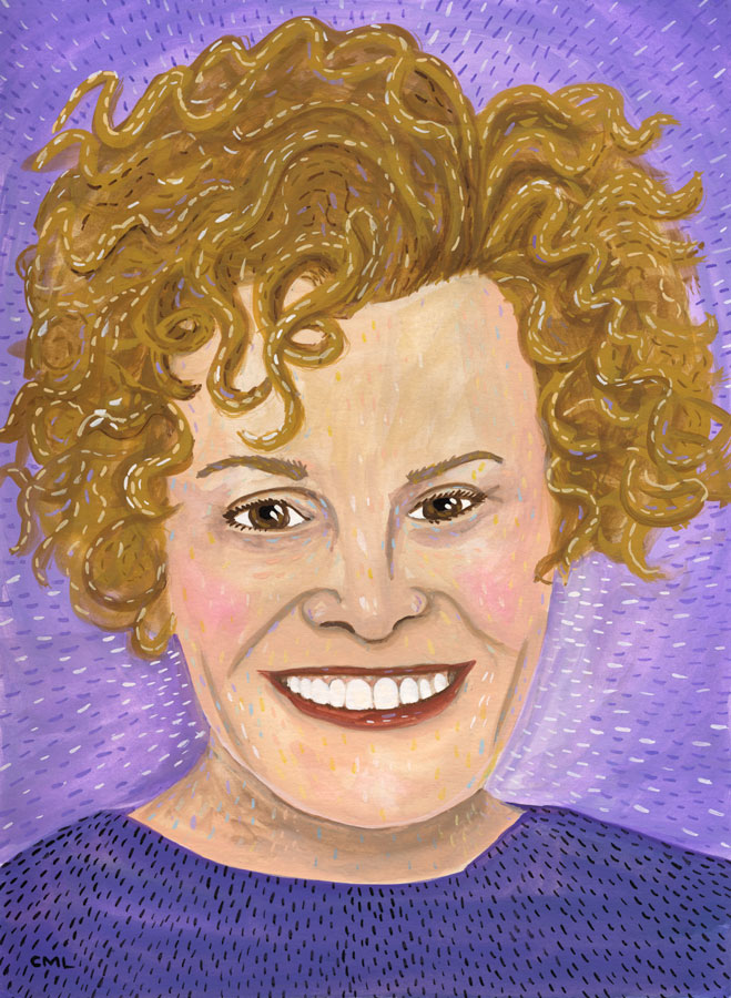
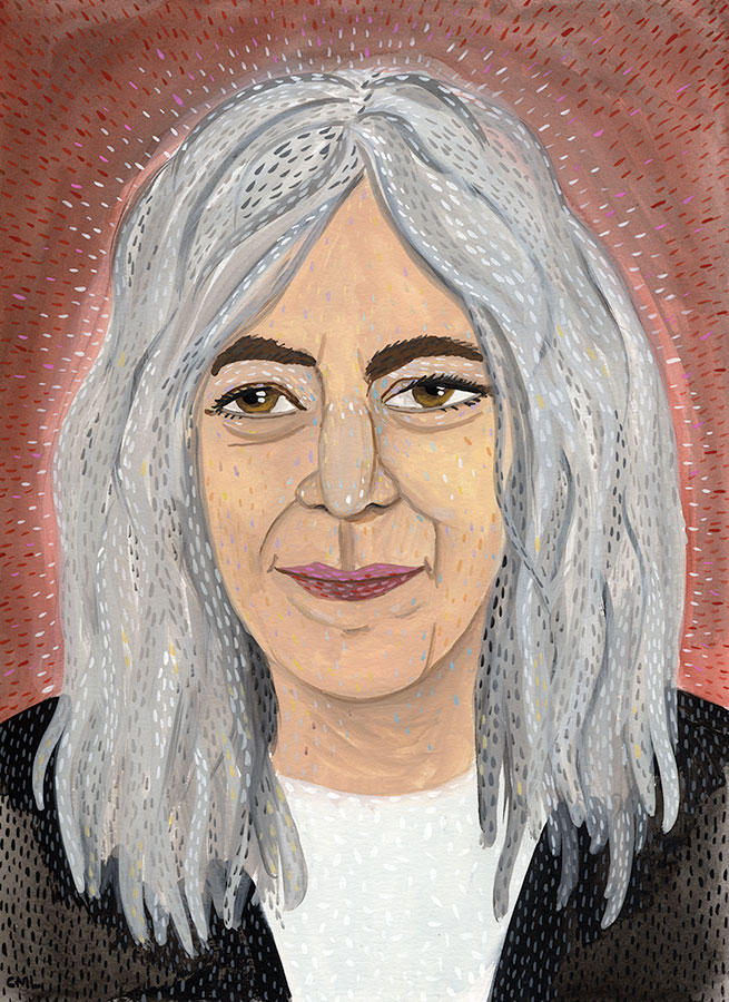
This week's portrait for the Seattle Review of Books is Judy Blume.
Add a Comment
.jpeg?picon=2456) By: Christine Marie Larsen,
on 2/11/2016
By: Christine Marie Larsen,
on 2/11/2016
By: Christine Marie Larsen,
on 2/11/2016
By: Christine Marie Larsen,
on 2/11/2016
By: Christine Marie Larsen,
on 2/11/2016
By: Christine Marie Larsen,
on 2/11/2016
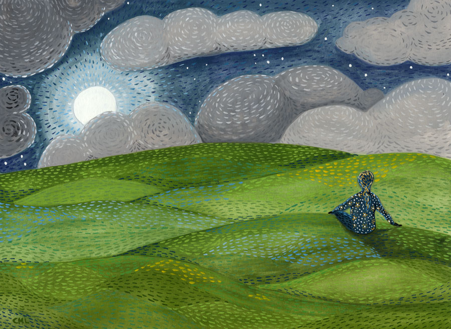
Here's a recent commissioned piece. The simple brief: a landscape of hope, meditation, emergence.
Add a Comment.jpg?picon=1009) By: James Gurney,
on 2/5/2016
By: James Gurney,
on 2/5/2016
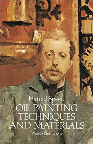
 Today we'll start Chapter 9: "Painting from the Life" from Harold Speed's 1924 art instruction book Oil Painting Techniques and Materials
.
I'll present Speed's main points in boldface type either verbatim or paraphrased, followed by comments of my own. If you want to add a comment, please use the numbered points to refer to the relevant section of the chapter.
The chapter on "Painting from The Life" takes up a major part of the book, so let's break it down into parts, starting with the introduction and Painting from the life in two colors.
 2. Why it's good to paint from casts before painting from a live model.
 Next week—Chapter 9, "Painting from the Life," continued.
By: Christine Marie Larsen,
on 2/4/2016
By: Christine Marie Larsen,
on 1/27/2016
Next week—Chapter 9, "Painting from the Life," continued.
By: Christine Marie Larsen,
on 2/4/2016
By: Christine Marie Larsen,
on 1/27/2016
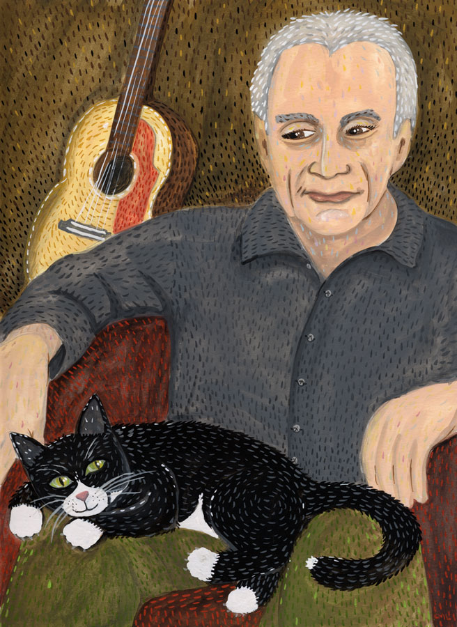
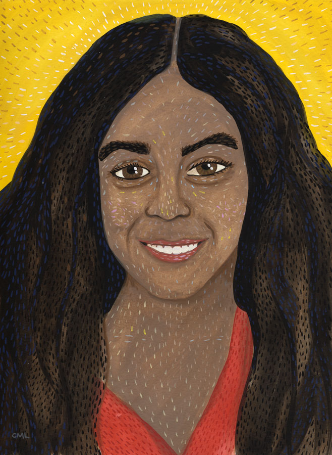
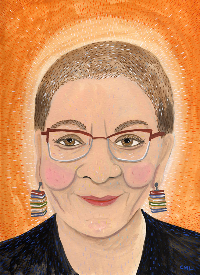
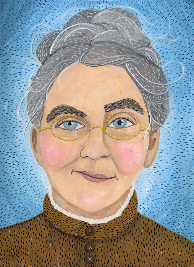
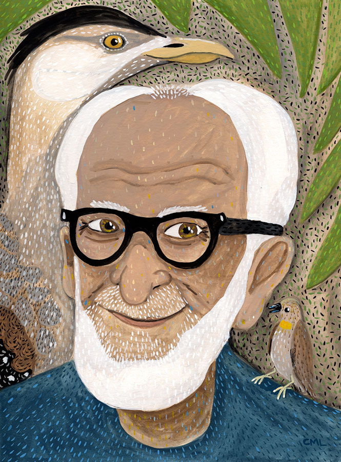
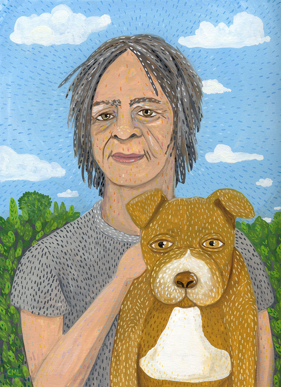
Each week I feature a different author portrait in this Seattle Review of Books column "Portrait Gallery."
Add a Comment By: Brian Bowes,
on 1/16/2016
By: Brian Bowes,
on 1/16/2016
After seeing some fan art in a comic book, I decide to do some of my own of the Kevin Cross' character Monkey Mod.
via Studio Bowes Art Blog at http://ift.tt/1OxCYr0
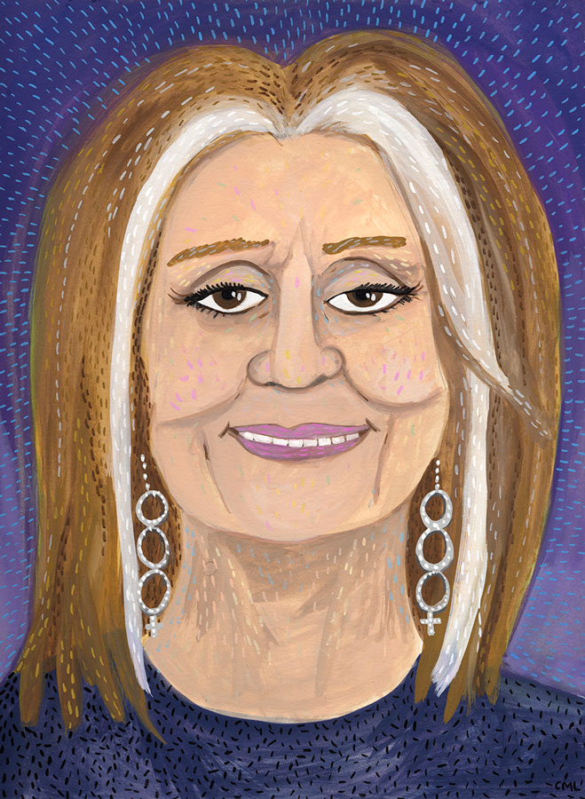
By: Christine Marie Larsen,
on 1/12/2016
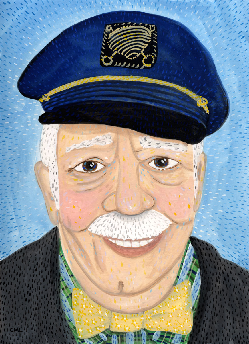
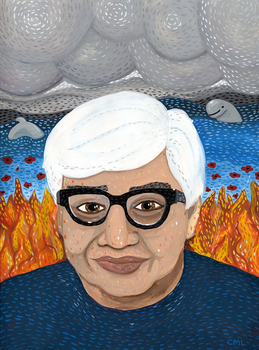
Each week I feature a different author portrait in this Seattle Review of Books column "Portrait Gallery."
Add a Comment
By: James Gurney,
on 1/10/2016

 By: James Gurney,
on 1/8/2016
By: James Gurney,
on 1/8/2016
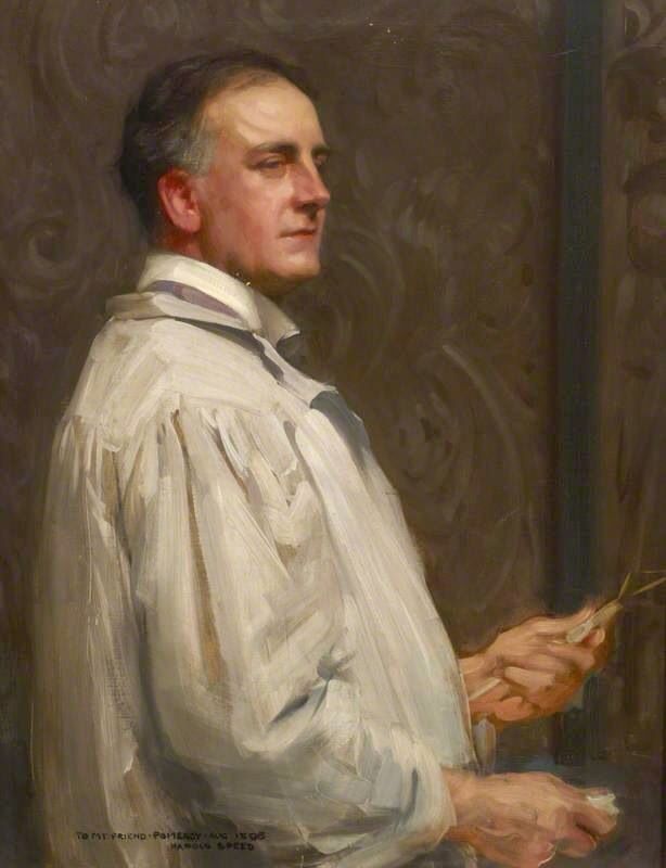
Today we'll take a look at Chapter 7: "Colour" from Harold Speed's 1924 art instruction book Oil Painting Techniques and Materials.jpg)

 |
| Johann Wilhelm Schirmer, 1836 (Dusseldorf School) |
 |
| Painting by Harold Speed |
 |
| Childe Hassam |
Next week—Chapter 8: Colour: Practical
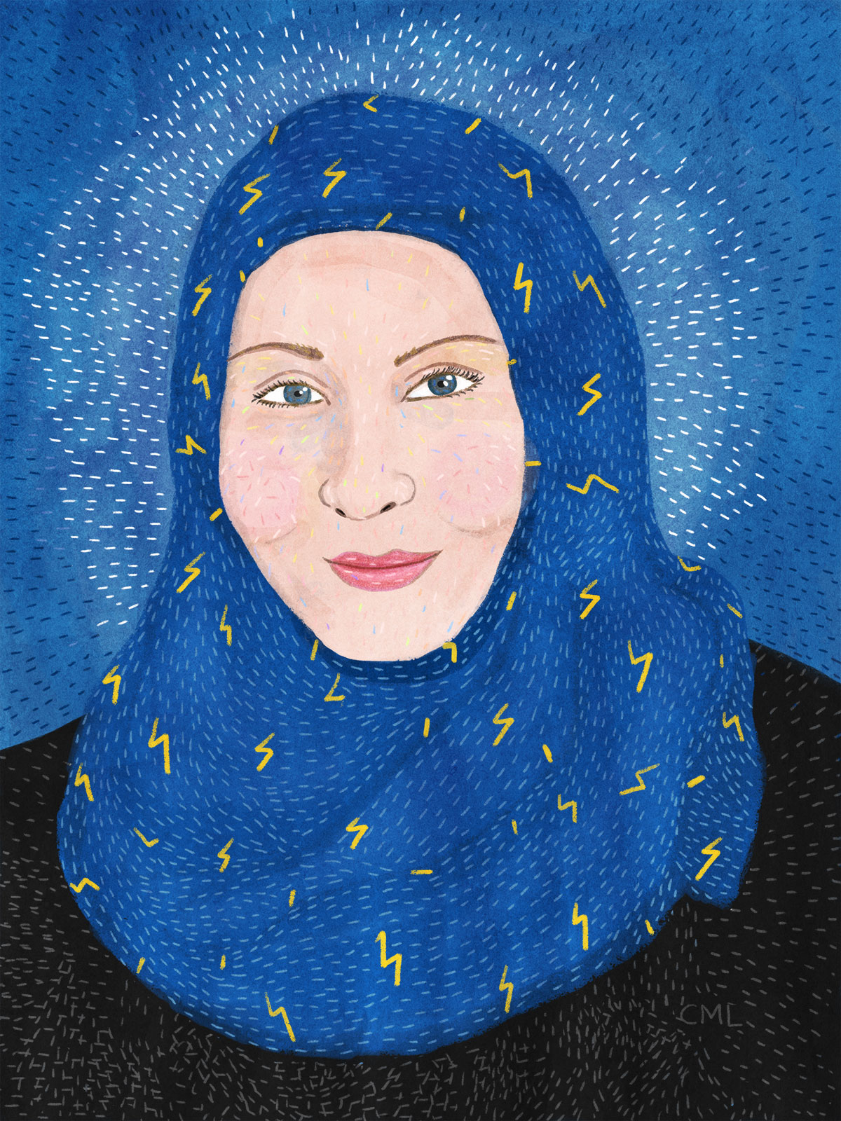
By: Christine Marie Larsen,
on 12/10/2015
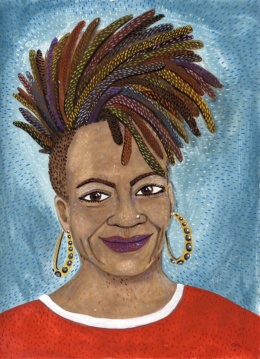
Each week I feature a different author portrait in this Seattle Review of Books column "Portrait Gallery."
Add a Comment
By: Christine Marie Larsen,
on 12/3/2015
Each week I feature a different author portrait in this Seattle Review of Books column "Portrait Gallery."
Add a Comment
By: James Gurney,
on 12/3/2015
 |
| Ivan Shishkin (1832-1898) |


 |
| Ivan Shishkin and A. Guinet in the studio on the island of Valaam |
By: Christine Marie Larsen,
on 12/2/2015
Each week I feature a different author portrait in this Seattle Review of Books column "Portrait Gallery."
Add a Comment
By: James Gurney,
on 11/22/2015
The folks at Vasari put together this video showing what happens to cadmium yellow lemon (opaque) and Indian yellow (transparent) when you mix them with reds and whites. The factor of transparency greatly affects the value and chroma of the mixtures (Link to YouTube).
If you want to make such tests yourself, you can use a palette knife on glass with a black backing, or you can mix them in the form of a chart in a canvas paper pad.
-----
Vasari oil colors
Color and Light: A Guide for the Realist Painter
By: Christine Marie Larsen,
on 11/12/2015
 By: Christine Marie Larsen,
on 11/5/2015
By: Christine Marie Larsen,
on 11/5/2015
Each week I feature a different author portrait in this new Seattle Review of Books column "Portrait Gallery."
Add a Comment By: Chloe Baldwin,
on 11/3/2015
By: Chloe Baldwin,
on 11/3/2015
Post by Chloe


Daniel Arriaga is an illustrator based in the USA whose work often tells a narrative, depicting fun characters. He has worked in various departments at Pixar, and also Disney. He has helped to produce films such as Wall-E, Up!, and Wreck-It-Ralph. Arriaga combines digital art with a subtle painterly style to bring his work to life, and his clever colour palettes create a nice ambiance in all his work.
If you’d like to see more illustrations by Daniel Arriaga, please visit his portfolio.
 By: Carter Higgins,
on 10/31/2015
By: Carter Higgins,
on 10/31/2015

by Keith Negley (Flying Eye Books, 2015)
Heads up, email subscribers: my blog took a bit of a tumble so I’m reposting what was lost in the shuffle. Apologies, and thank you for reading!
The kind folks at Flying Eye sent over a preview of this book, thinking it was right up my alley.
It’s right up my alley.
The theme: yes. The design: yes. The snappy, bold, in-your-face look at tough guys plus the snappy, bold, in-your-face look at feelings: yes.
I chatted with Keith Negley, and learned a lot about this debut effort. I hope there’s more from him, and I hope you enjoy this peek into the brain of a picture book creator.


Hi Keith! Can you talk about where this story came from? And what the process was like for its creation?
It all started when my son Parker who was 6 at the time stole a soccer ball from a friend during soccer practice and his friend got upset and they fought over it. Parker was angry at first, but then felt embarrassed and ashamed because he knew he did something wrong. I could tell he was struggling with how to handle all these new emotions that were happening to him at the same time. He walked away from the group and sat down to be by himself because he didn’t want anyone to see him cry. Later that night, I explained to him that it was totally natural to cry and that everybody does it. I told him sometimes even I cried, and he looked up at me and asked, “grown ups cry too?”
It blew his mind that even adults cried because he thought it was something only kids did. I wished I had a book I could read to him that let him know that frustration and crying is a natural thing not to be ashamed of. The next day the idea for the book popped into my head.
You’ve done a lot of editorial illustration, but this is your first children’s book. Can you tell us the how and why you got into books?
I always liked the idea of making picture books for children, but it wasn’t until I became a parent and started reading a ton of picture books to my son did I realize there was a lack of the kind of books we enjoyed. Honestly the books I’ve been working on were born out of necessity because I wanted to read them and no one else had made them yet.
Your tumblr tag line is spectacular: part man, part negative space. Can you explain where that came from and why it represents you so well?
Ha, I find tragedy to be the greatest muse. The subjects I enjoy working with the most are the ones that break my heart. It’s cathartic somehow, and I feel like I really get to put a piece of me into the work. What ends up happening is I have a portfolio of rather depressing subject matter. But I’m always striving to create beautiful images with it. That juxtaposition is challenging and rewarding for me.
Add to that I tend to utilize negative space as a compositional tool fairly often and so I thought it tied the content in with the image making nature of the blog.
 Who are some of your story heroes?
I’ve been a huge fan of Lane Smith for years and years. Jon Scieszka is another one. Ezra Jack Keats. Jack Kent’s Socks For Supper is one of my all time favorites as a kid and it still holds up today.
What do you remember about picture books from your childhood?
I remember my mom reading them to me and how she would make different voices for all the characters. I try to do that for Parker but he’s not into it at all unfortunately.

What is your favorite piece of art hanging in your home or studio?
Not sure if this counts, but I like to make music in my spare time and I’m a huge nerd for vintage synthesizers. I currently have a 1979 Korg 770 sitting in my studio and just looking at it makes me very happy. I consider them works of art.
What’s next for you?
Trying to schedule some reading events for the fall/winter and I’m in the middle of working on my second book for Flying Eye which should be out in time for Father’s Day next year!

Thank you, Keith! And vintage synthesizers totally count as works of art.
PS: Congratulations to the winner of the The Story of Diva and Flea giveaway, Ashley! And thanks to Flying Eye for the images used in this post.

By: Christine Marie Larsen,
on 10/29/2015
Each week I will feature a different author portrait in this new Seattle Review of Books column "Portrait Gallery."
Add a Comment
By: Christine Marie Larsen,
on 10/29/2015
Each week I will feature a different author portrait in this new Seattle Review of Books column "Portrait Gallery."
Add a Comment
By: Christine Marie Larsen,
on 10/29/2015
Each week I will feature a different author portrait for this Seattle Review of Books column "Portrait Gallery."
Add a Comment
By: Christine Marie Larsen,
on 10/29/2015
Each week I will feature a different author portrait in this new Seattle Review of Books column "Portrait Gallery."
Add a Comment By: Jessica Lanan,
on 10/21/2015
By: Jessica Lanan,
on 10/21/2015
Welcome to part four of my series on the making of The Story I’ll Tell. (Read down to the end of the post for the first print giveaway!) And now: color.
The Story I’ll Tell weaves a lyrical tapestry of fantasy and reality, and I wanted the palette of the illustrations to match the lush, dreamlike quality of the manuscript. I noticed early on that the story alternated between daytime and nighttime scenes, and I knew this would become an important element in the illustrations.
Reference images were the starting point. These Ukiyo-e prints were the inspiration for the blue nighttime pages. Matching the color was not a priority so much as capturing the mood of the image. I tied to imagine how it might feel, physically and emotionally, to step into these peaceful nighttime scenes.

Left: "Moonlight, Soochow," Elizabeth Keith, 1924. Right: "Moon at Arakawa River," Hasui Kawase, 1929.
Once I knew what I was going for, I made a detailed color study for each image Photoshop. I find this useful for getting the value range correct. (For those not familiar with art terminology, value is the measure of how light or dark something is. Not to be confused with saturation, which is a measure of how vivid the color’s hue is.) Ideally I want the illustrations to read just as clearly in black and white as they do in color, and good value organization is essential. Coloring an image in Photoshop is such a mindless activity that I listened to quite a few audiobooks during this phase. Then I made a full-color, printed dummy.

I ended up lightening the value of the background for the final art in order to make the figures more visible.
Finally, I painted color studies and chose an overall palette for the book. I wanted to use similar pigments throughout the book, and I needed a blue that could work either with a warm (daytime) or cool (nighttime) color palette. I tried quite a few combinations before I settled on Holbein’s French Ultramarine, Cadmium Yellow light, and Winsor Red, with other colors as needed. I went through a tube and a half of blue.

Experimentation is key
Okay, you’ve been waiting for it: it’s giveaway time! Leave a comment for a chance to win a giclée print from the book. (It has to be a real comment. If it’s about Louis Vuitton handbags or search engine optimization, I’ll delete it.) Winner will be announced this Friday, October 23. And if you don’t win this time, you’ll have another chance next week with my final installment in the series.

By: Carter Higgins,
on 10/21/2015
by Keith Negley (Flying Eye Books, 2015)
The kind folks at Flying Eye sent over a preview of this book, thinking it was right up my alley.
It’s right up my alley.
The theme: yes. The design: yes. The snappy, bold, in-your-face look at tough guys plus the snappy, bold, in-your-face look at feelings: yes.
I chatted with Keith Negley, and learned a lot about this debut effort. I hope there’s more from him, and I hope you enjoy this peek into the brain of a picture book creator.
Hi Keith! Can you talk about where this story came from? And what the process was like for its creation?
It all started when my son Parker who was 6 at the time stole a soccer ball from a friend during soccer practice and his friend got upset and they fought over it. Parker was angry at first, but then felt embarrassed and ashamed because he knew he did something wrong. I could tell he was struggling with how to handle all these new emotions that were happening to him at the same time. He walked away from the group and sat down to be by himself because he didn’t want anyone to see him cry. Later that night, I explained to him that it was totally natural to cry and that everybody does it. I told him sometimes even I cried, and he looked up at me and asked, “grown ups cry too?”
It blew his mind that even adults cried because he thought it was something only kids did. I wished I had a book I could read to him that let him know that frustration and crying is a natural thing not to be ashamed of. The next day the idea for the book popped into my head.
You’ve done a lot of editorial illustration, but this is your first children’s book. Can you tell us the how and why you got into books?
I always liked the idea of making picture books for children, but it wasn’t until I became a parent and started reading a ton of picture books to my son did I realize there was a lack of the kind of books we enjoyed. Honestly the books I’ve been working on were born out of necessity because I wanted to read them and no one else had made them yet.
Your tumblr tag line is spectacular: part man, part negative space. Can you explain where that came from and why it represents you so well?
Ha, I find tragedy to be the greatest muse. The subjects I enjoy working with the most are the ones that break my heart. It’s cathartic somehow, and I feel like I really get to put a piece of me into the work. What ends up happening is I have a portfolio of rather depressing subject matter. But I’m always striving to create beautiful images with it. That juxtaposition is challenging and rewarding for me.
Add to that I tend to utilize negative space as a compositional tool fairly often and so I thought it tied the content in with the image making nature of the blog.
Who are some of your story heroes?
I’ve been a huge fan of Lane Smith for years and years. Jon Scieszka is another one. Ezra Jack Keats. Jack Kent’s Socks For Supper is one of my all time favorites as a kid and it still holds up today.
What do you remember about picture books from your childhood?
I remember my mom reading them to me and how she would make different voices for all the characters. I try to do that for Parker but he’s not into it at all unfortunately.
What is your favorite piece of art hanging in your home or studio?
Not sure if this counts, but I like to make music in my spare time and I’m a huge nerd for vintage synthesizers. I currently have a 1979 Korg 770 sitting in my studio and just looking at it makes me very happy. I consider them works of art.
What’s next for you?
Trying to schedule some reading events for the fall/winter and I’m in the middle of working on my second book for Flying Eye which should be out in time for Father’s Day next year!
Thank you, Keith! And vintage synthesizers totally count as works of art.

PS: Congratulations to the winner of the The Story of Diva and Flea giveaway, Ashley! And thanks to Flying Eye for the images used in this post.
Add a Comment