
I have this habit of buying vintage for a bargain (because pieces are damaged, ill-fitting, etc.) and taking forever to getting around to making repairs and thus wearing said items. But I’ve made the commitment to change this bad habit into a good one and I’m working my way through my to do pile. This is the first post of my vintage dress parade and I’ll detail the fixes and tweaks I’ve made for each one. I’ll try to remember to include “before” shots next time, hee hee.
The above late 1930s or early ’40s dress was quite the steal as it was falling apart in various places, had a motley crew of ugly buttons and was an unflattering mid-calf length. My fixes:
- Changed the buttons to clear glass ones with faceted edges; I figured this would work well both in the light-colored printed (and flocked!) fabric as well as the navy blue organza. (My camera died before I could get any close up shots.)
- Added bust darts for a better fit.
- Trimmed the flutter sleeves for a little bit more modern look. (I felt like I would fly away before I narrowed them down!)
- Hemmed the skirt by a few inches. Each tier in the skirt was a little bit wider (taller?) than the proceeding one, from waist to hem. Instead of hemming just the bottom tier (and messing up the sequence) or hemming each tier (too much work!), I hemmed the second navy blue tier to match the width of the first one. This way there is still some order/design to the width of the tiers.
- Used the piece I trimmed off the skirt and turned it into a sash (original belt was missing). I can see here that the sash could stand to be shortened (that’s the beauty of taking photos of your projects - you see things you might miss in the mirror!).
- Made other minor repairs like loose seams, wonky tiers, etc.
Next: I love wearing this ’50s dress. I found it soon after seeing (500) Days of Summer and thought it looked like something Zooey’s character might wear. I bought a pale grey-blue crinoline just for this dress. I’m also wearing the same pale blue slip I’m wearing under the dress above. I considered going dark but then you wouldn’t be able to see the print on the sheer fabric very well. Anyway, here’s what I did:

- Removed the sleeves: this dress had half sleeves with quick and dirty hems that were not so great. Since I don’t like fixing/sewing sleeves I just took them off and finished the openings by simply folding under the edges (which doesn’t always work due to the curves but luckily it did in this case).
- Let the waist out: the wearer before me had a tiny waist and had taken it in in several spots around the ruched waist panel.
- Hemmed the skirt. (I will almost always do this!)
- Repaired little holes and opened seams.
- (I thought about pinning on that dark blue rose that I’m holding at the waist along with a ribbon sash but the flower is a bit dark and I think the dress looks nice unadorned.)

Hope you enjoyed this little dress tour!
(By the way, thanks for the Lucy love from the last post - it made her blush!)

I knew I was going to check out the Liberty of London stuff at Target this past Sunday. I also knew I was not going to wake up at 6am (ON A SUNDAY) to get there before the store opened, especially with the time change (side note: Yahoooo!!!). I wanted to avoid the mad rush and figured if there was nothing left for me when I got there at 11, then it wasn’t meant to be.
When I arrived, I first headed to the women’s section. Not unexpectedly it was a bit of a mess and I could tell my size was virtually sold out. There was one dress left and while it fit, I put it back because it was polyester. I’m not a fabric snob but I was hoping for cotton.
Then I went to the girls’ section: score! Cute and cotton dresses aplenty and this was one of those times that I was glad to be petite. The smock dress above is my favorite. The color is not something I would normally pick out for myself but it goes well with my skin tone and the length is just right.
I also snagged these darling gardening gloves (the ones on the right). I actually needed a pair:

OK, here’s where the decision-making comes in. I don’t know if I should keep the following:

I love the sweet pea print of this top, but is it too juvenile for me?

Same question goes for this sundress (called a cover up on the tag; I guess it supposed to go with the swimsuits). I love the almost psychedelic print. I don’t normally wear such loose styles and do I really need these? But wouldn’t these be great for late summer when the weather is really warm? Could these transition into mommy-to-be wear? (I’m not a mommy-to-be, by the way!)
I don’t know, any thoughts? Did you pick up anything Liberty at Target?

5 Illustration Voices Examine the Concept of Style
In the short time that I’ve been involved with Escape From Illustration Island, I’ve noticed that certain topics seem to come and go in waves, at least in the online Illustration community. For example, it seems that within a short span of time, different bloggers, podcasters, and other content creators will all be talking about similar subjects around the same time. My favorite part about this is that each of us offers our own voice, our own angle, on a given topic.
Today I thought I’d highlight the latest subject that I’ve been noticing being discussed, which is STYLE.
Here’s a look at the ways that 5 different online content creators in the Illustration community have been exploring the concept of style in the recent past:
 Nate Williams – In a recent blog post, Illustrator Nate Williams asked the question: “Does a professional Illustrator need a style?“ Rather than stop there, he goes on to paint an incredibly thorough picture of what style is, how different illustrators approach it, and what it means for the working artist. What makes Nate’s post so rewarding to read is how clearly he presents the concept of style with case studies, an outline of the basic creative process, and a look at some of the related opinion polls he has conducted at Illustration Mundo in the past.
 Big Illustration Party Time - Friends of EFII and fellow Podcasters Kevin Cross and Joshua Kemble of the Big Illustration Party Time Podcast recently tackled the elusive topic of style on Episode 40 of their show, which focuses on freelance Illustration and cartooning. Their discussion was in reaction to a listener question regarding the benefits and risks of working in a distinct style, as well as tips for Illustrators who wish to work in a variety of styles.

Jonathan Woodward – In another rich and rewarding exploration of style, Jonathan Woodward treated readers of his blog, Zero 2 Illo, with an investigation into the question, “Does an Illustrator Choose Their Style, or Does it Choose Them?” As proof of the fact that every artist has a unique perception
 Escapee Speaks:
How to Find Your Own Style
Do You Take Enough Chances?
Or, do you find yourself working from a place of fear when creating an Illustration or a Painting? Are you afraid of making mistakes, bad choices, or wrong turns?
If so, today I encourage you to take renewed ownership of your work, and steer it in any direction you choose. Remember that it all comes from you. Remember that you only have this moment to create the way you have always dreamed of creating. Give yourself and your art the greatest gift of all by taking chances, pushing limits, and breaking rules.
Be reckless.
Be bold.
Be brave.
After all, that is how personal styles are truly created.
By declaring yourself an explorer, you will allow yourself the freedom to live within your work, and to let your personal truth rise from it in the form of inspiration and beauty.
Nothing will please you more.
Escapee has spoken.
Related Posts:
Be Willing to Destroy Your Work
Creating for You
How to Do Anything You Want
Fear of Failure
Read More Escapee Speaks Creativity
Who is this Escapee guy anyway?


By: Megan,
on 8/3/2009
Blog:
OUPblog
(
Login to Add to MyJacketFlap)
JacketFlap tags:
Reference,
writing,
Science,
style,
Mondays,
Medical,
of,
AMA,
Manual,
Brenda,
Gregoline,
A-Featured,
Medical Mondays,
Online Resources,
Brenda Gregoline,
JAMA,
AMA Manual of Style,
Add a tag

Brenda Gregoline, ELS, manages the copyediting team for 5 of the Archives Journals, and is a member of the committee that writes and updates the AMA Manual of Style. She is a member of the Council of Science Editors and has worked in scientific publishing for nearly 15 years. In this 3-part series, she reports on the most frequent mistakes authors make when submitting manuscripts to JAMA and the Archives Journals, and lets us in on what drives copy editors crazy. Read part one here and part two here.
It’s impossible to expect authors to absorb all the information in the thousand-page AMA Manual of Style–they’re just trying to get published, and it’s our job to help them. Here, in classic top-10-list reverse order, are the top 10 editorial problems we see in our submitted and accepted manuscripts, compiled by committee and editorialized upon by me. In Part I we discussed filling out author forms, omitting “behind the scenes” stuff, and generally making life difficult for the copy editor. In Part II we discussed common punctuation and style mistakes, errors of grandiosity, and wacky references. Today we discuss the final 4 in our top-10 list of most frequent mistakes.
4. Duplicate submission. In scientific publication, it is not acceptable to submit a report of original research to multiple journals at the same time. Journal editors are likely to be more disturbed by this if it looks deliberate rather than like a simple mistake (not realizing that a foreign-language journal “counts,” for example) or if the case is debatable (a small section of results was published in another paper, but the new paper adds tons of new material). Remember those forms from the 10th most common mistake? One of them asks about previous submission or publication. We need authors to be up-front about any other articles in the pipeline, even if (especially if) they’re not sure if they might constitute duplicate publication.
3. Failing to protect patient identity. Yup, there’s a form for this too! Any time a patient is identifiable, in a photograph or even in text (as in a case report), authors must have the patient’s consent. (Contrary to popular belief, the gossip-mag-style “black bars” over the eyes are not sufficient to conceal identity.) Usually we hear complaints about this, because studies are written long after patients are treated and it can be hard to track people down, but them’s the breaks. If it’s really impossible to obtain after-the-fact patient consent, editors will work with authors to crop photos, take out case-report details, or whatever it takes to “de-identify” patients.
2. Not matching up all the data “bits.” In the abstract, 76 patients were randomized to receive the intervention, but it’s 77 in Table 1. There was a 44.5% reduction in symptoms in the medicated group in the text, but later it’s 44.7%. Sometimes this is because the abstract is written first from the overall results, while the data in a table are more precisely calculated by a statistician; or maybe the number of patients changed along the way and no one went back to revise the earlier data. Either way, it drives copy editors crazy.
1. Not reading a journal’s Instructions for Authors. These days almost all scientific journals have online submission, and almost always there is a link to something called “Information for Authors,” “Guidelines for Manuscript Submission,” or something similar. Judging by the kinds of questions editorial offices receive almost daily, authors rarely read these—but the publication process would often go so much more smoothly if they would.
We are proud of our style manual here at JAMA/Archives, although we realize it isn’t the last word in scientific style and format. There can never really be a “last word” because some editor will always want to have it! Anyway, without authors there wouldn’t be anything to edit, so we would never hold any “mistakes” against them. No matter how grievous a manuscript’s misstep, an editor will be there to correct it, because it’s our job. (But mostly because we can’t stop ourselves.)

By: Megan,
on 7/27/2009
Blog:
OUPblog
(
Login to Add to MyJacketFlap)
JacketFlap tags:
Mondays,
A-Featured,
Medical Mondays,
medical,
Online Resources,
of,
AMA,
Manual,
Brenda Gregoline,
JAMA,
Brenda,
Gregoline,
Reference,
writing,
Science,
style,
Add a tag
Brenda Gregoline, ELS, manages the copyediting team for 5 of the Archives Journals, and is a member of the committee that writes and updates the AMA Manual of Style. She is a member of the Council of Science Editors and has worked in scientific publishing for nearly 15 years. In this 3-part series, she reports on the most frequent mistakes authors make when submitting manuscripts to JAMA and the Archives Journals, and lets us in on what drives copy editors crazy.
It’s impossible to expect authors to absorb all the information in the thousand-page AMA Manual of Style–they’re just trying to get published, and it’s our job to help them. Here, in classic top-10-list reverse order, are the top 10 editorial problems we see in our submitted and accepted manuscripts, compiled by committee and editorialized upon by me. In Part I we discussed filling out author forms, omitting “behind the scenes” stuff, and generally making life difficult for the copy editor. Today we discuss the next 3 in our top-10 list of most frequent mistakes.
7. Common punctuation and style mistakes (not an exhaustive list). Most frequently we see authors fail to expand abbreviations; use different abbreviations for the same term throughout a manuscript; use commas like seasoning instead of like punctuation marks with actual rules of deployment; and overuse the em dash. However, I’d like to tell any authors reading this not to fret, because that’s the kind of stuff we’re paid to fix. Plus I can’t really throw stones—being a fan of the em dash myself.
6. Errors of grandiosity. Sometimes a perfectly nice and valid study will go hog-wild in the conclusion, claiming to be changing the future of scientific inquiry or heralding a sea-change in the treatment of patients everywhere. Or authors will selectively interpret results, focusing on the positive and ignoring the negative or neutral. It’s natural to want to write an elegant conclusion—it’s one of the few places in a scientific manuscript where one can really let loose with the prose—but it’s always better to err on the side of caution.
5. Wacky references. All journals have a reference citation policy, and across scientific journals it is fairly standard to give reference numbers at the point of citation, cite references in numerical order in the text (as opposed to only in tables or figures), and retain a unique number for each reference no matter how many times it’s cited. However, we still get papers with references handled in all kinds of odd ways (alphabetical, chronological, or seemingly inspired by the full moon). References that include URLs can mean big problems. Often the URL doesn’t work or the site is password-protected, subscription-only, or otherwise useless to the reader. Also aggravating: references that are just the result of the search string for the article and not the URL for the article itself.
Authors and aspiring authors: stay tuned for the final 4!


By: M. Andrew Sprong ,
on 3/31/2009
Blog:
The Electric Mystic of Honesdale
(
Login to Add to MyJacketFlap)
JacketFlap tags:
Harry Potter,
Children,
book,
Writing,
Style,
The Cat in the Hat,
Tolkien,
The Hobbit,
Rowling,
Cannonball Simp,
Writing Experience,
Add a tag
When writing stories for children the writer must be careful to not write down to them. Children may be inarticulate but they are not stupid. Theodor Geisel knew this fact when he wrote “The Cat in the Hat” under the pen name Dr Seuss. It is full of sophisticated concepts, which a child can grasp but often not speak. At the same time, we must avoid throwing too many esoteric facts in their direction without providing an active backdrop. When you were working nine-to-five as an office temp, it wasn’t any fun reading through a list of facts, and that’s true for children as well. In truth, the child’s voice in your writing is not a tightrope to walk upon, but a very fat pipe. There is plenty of leeway in either direction before the bulk of your children get bored or snowed.
J. R. R. Tolkien wrote on the sophisticated end of the age group, but his works appeal to one of the widest age ranges in the fantasy genre. He pulls characters from a quasi-mythological hat without hesitation and sprinkles the stories with concrete elements the children can hang onto. Boil down “The Hobbit” to just hobbits, dwarfs, elves, and goblins and you leave out the one thing which binds the whole series together – the ring. Tolkien didn’t start off with the intention of making the ring the central element in his stories, it just happened when he discussed “the Hobbit” with his young readers and discovered what they liked the most about the book. You may have to do this with your own books. The ring rises in prominence because every kid would like a ring which can make them invisible. Think of all the mischief you could get into if you wore such an item, then think of the draw to a child’s active mind. Bullies revenged, candy acquired, peril escaped, are just some of the many uses for which such an item might be employed. When you hear youngsters talking about their favorite movie, novel, or comic, listen for the things and events which they talk about the most. Was it the Deathstar or Lord Vader, which gathers the greatest thrill? Those key elements in the story, which survive the test, future works may refer to in ways that are more sophisticated. J. K. Rowling would know all about that. The invisibility cloak Harry Potter employs follows a similar route of discovery as Tolkien’s ring with the exception of the item’s demise. Jo decides to break the concept into three items in the end so one may be lost, one may be buried, and the best of them all, retained.
The key is to the child’s voice is to know when to show and when to tell. Suspense is a key factor as well. Too much revealed in the beginning takes away from the surprise ending, but with children you have to reveal important plot elements on a regular basis as well. In “Harry Potter and The Sorcerer’s Stone” Harry is a bullied and badgered boy who lives in a terrible situation, but by the end of the first chapter enough is revealed to indicate that things might change for the better. Now if you’ve read the whole series, you would know that this in fact not the case. His life changes, some things get better but others much worse. The author does not pull any punches, and doesn’t talk down to the reader, which children and adults alike appreciate when they read it. At the same time, she doesn’t ramble off a bunch of gobbledygook. If the details are too sophisticated for your children readers, make sure to introduce them without the more esoteric aspects, but instead reveal those details throughout the story in bite-sized chunks. Dialog and circumstance should allow the child to discover things right along with the protagonist, instead of having some talking head come along and tell them everything. If Gandalf had described all of the things he knew about Bilbo’s duties in the book “The Hobbit”, the reader would have been left with very little suspense. No, Bilbo experiences these things as they come, and the reader does so vicariously as well.
If you might think picture books lack sophistication then you haven’t read “Cannonball Simp” by John Burningham. It appeals to the smallest children, yet speaks about the issues of animal abuse and neglect, and introduces unconditional love. While some editors insist on “Keeping it Simple”, many of the books in a publisher’s backlog aren’t selling because they took the assignment too far.
Anyways, do you use simple elements to construct your stories, grow suspense, and distribute clues, but don’t talk down to your audience. Kids aren’t stupid, so don’t write that way.

By:
David Billings,
on 3/22/2009
Blog:
Sparky Firepants Art Blog
(
Login to Add to MyJacketFlap)
JacketFlap tags:
art job,
creative director,
hire,
illustrator,
marketing,
scbwi,
tips,
work,
publishing,
business,
style,
children's book,
portfolio,
art director,
freelance,
Add a tag
Here’s a question that comes up quite frequently when artists talk about their portfolios:
Should I include all my different styles or just one style?
It’s an excellent question without a hard and fast rule as an answer. Here’s why.
When you’re prepping any art portfolio, the first question you need to answer is, “Who is my audience?” The answer to that question is going to narrow down your options of what samples to include.
The business of art is a widely varied marketplace. If you’re selling retro Japanese-style killer robot art, then the creative director of Mother Earth is probably not your best bet. If you sketch cuddly critters in pastel fields of love and rainbows, the hiring manager of RazorbackKillerz Graphic Design Studio is going to look at you a little funny. There may be laughing after you leave.
Very simply, you need to structure your portfolio toward the industry and type of work you’re trying to get.
I had a great conversation about this with Richard Miller of Calyx Design. We’ve both been in the position of having to hire artists and we’ve both been equally frustrated when we saw awesome talent that we couldn’t hire.
In the animation world I once had the responsibility of bringing in a new storyboard artist. A week after posting an ad, I sat in the office surrounded by over 100 portfolios and demo reels. Several times I pulled one out of the pile and marveled over the amazing artwork in front of me. Incredible stuff. Sometimes I brought in producers and other directors to gaze in wonder at the mind-blowing talent and beauty that lay before us. I think we even wept. There may have been fainting, it’s a blur.
Couldn’t hire them. Sorry. No can do. Throw another ‘folio on the barbie, mate.
I looked at gorgeous oil paintings that I would have loved to hang in my home, but what I needed was an artist who could quickly sketch an idea in a fast-paced story meeting under pressure of producers, directors,writers, and designers. I needed to see sequential drawings. I ached to see that the artist knew the language of film and how to visualize a script.
Think about that.
Your portfolio may be awe-inspiring but if it’s not appropriate for the person or company you sent it to, it’s a complete waste of time.
Do not waste your time. Do not waste someone else’s time.
So you have lots of different styles and mediums and skills. What to do?
Take a close look at the kind of work the company you’re targeting produces. Do your homework. If you think you have something that fits, then show 8-12 examples of your work that’s closest to it. Better to show fewer that hit the mark than more that confuse the viewer.
If you feel strongly that your alternate style is just so outstanding that it must be seen, then include it – but put it in the back of your book with a short note explaining that you understand it’s different. This shows that you’re paying attention and if it’s truly good work, you might make an impression.
Can you tell that I hate hard and fast rules? You know, I just don’t think they exist. For every artist that’s heard, “you shouldn’t show two styles,” there’s another that shows four styles and always gets work.
It’s not a science, it’s an… well. It’s an art. And it’s just good marketing.
The only time I would say that you should blanketly include a little of everything you do is when you’re applying to a school. The reason is that the whole purpose of an art school (a good one) is to guide you in a direction based on your skill and talent so you can have a successful career. A Career Counselor’s job is to review the work you’ve done and help you decide where to apply your strengths. They want to see that you’ve been using your skills (so they know you’re not there on a whim), but showing something that isn’t well-developed isn’t seen as a weakness; it’s a window to your potential.
It’s quite different in a professional setting. It’s brutal and no one is there to guide your career. People want to hire artists that can do the appropriate work without any doubt. Period.
Now let me show you something really cool and more fun than that last sentence.
In the world of children’s literature, Richard Scarry is very well-known (to understate the case). He’s known best for his Busy People books, with silly characters like Huckle Cat and Lowly Worm. Take a look at this.

These are three very distinctly different styles from different periods, all done by Richard Scarry. The thing to take away is not that cramming all your styles into a portfolio is suddenly okay because a famous illustrator did it. Nope-i-tee nope-i-tee no.
Take a look at the work here. Richard Scarry mastered these styles. They are all beautiful and finely illustrated in their own right.
What’s important to learn from this is to not limit yourself because you think developing different styles is inherently bad. You’re an artist, your job is to create art in the way you see the world. Never bend to the voices that tell you it’s wrong. Do it! You have to love your work or there’s no point.
But if you’re going to show it to get work, make sure you’ve mastered it first. If you look deep inside yourself with honesty, you’ll know when that is. If you’re still doubtful, find a group of trusted pros to give you feedback.
If you have questions about what to include in your portfolio, I’m happy to steer you in the right direction. Send an e-mail to sparky [at] sparkyfirepants [dot com] with the subject line, PORTFOLIO HELP. Include a link to your online portfolio if you want and I’ll check it out. Write a short note about the industry or field where you’re trying to get work. I’ll reply as soon as I can, largely depending on how many e-mails I get after this post. It’s a first-come, first-served kinda thing.
If you’re feeling bold and fearless, you can do the same in the comments here and I’ll answer you publicly. I also invite others to join in, but I caution you that nasty, hateful comments will be deleted at my discretion. Please be constructive and say something positive. If you can’t think of anything positive, then remember what Mama said and don’t say anything at all.
David Lee King shares his digital branch’s style guide. A little long, but all recommendations are simple, clearly explained and sensible. Oh look, they spell email just like normal people do, yay! Style guides do more than just help you be consistent, they also set a tone for best practices for people who don’t know as much about the online environment as others. Nice job, David.

By: Sevensheaven.nl,
on 10/26/2008
Blog:
Sugar Frosted Goodness
(
Login to Add to MyJacketFlap)
JacketFlap tags:
illustratie,
experiment,
dutch,
europe,
dessin,
illustrierung,
illustracion,
illustraties,
nederland,
illustration,
man,
illustrations,
style,
metin seven,
sevensheaven,
Add a tag

Style experiment.
More at Sevensheaven.nl

My son and I were going back through the pages of my sketchbook as I am just a few pages from filling it. I really enjoyed my time drawing and painting in this past year, and it's been pretty difficult to find the time lately (or the motivation when I do have the time). But, such is life right now...
I did recently do some sketches of various characters. I've only pictured one of them here (guess I forgot to photograph the other - baby brain). While it's Li'l Red Riding Hood-ish, that's not what was motivating me. I can really get in a rut, drawing things in the same way all the time, so I just wanted to play around and try to do something with a little different "feel." I don't know if I was successful - I don't think I can divorce myself completely.
The figure is always a challenge. I'll do something that I sort of like, and then I'll see other people's work that is different (and impressive), and it makes me want to try a different angle. I guess that goes back to my desire not to pigeon-hole myself by limiting my style. In the long run, I don't know if that's a good thing (I'd like to think it is). But, I think I'd go nuts if I was simply drawing illo after illo in the same style. Exploring and inventing are half the fun!
Anyway, today was a very special day because my youngest turned 6 years old! HAPPY BIRTHDAY JOLEY!
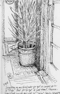
I was thinking that sometimes as an illustrator you get so caught up in a style that you forget to just draw. You forget to draw what you see, and not in the "look" that you've developed for your work.
I wasn't trying to make any sort of a good drawing while I was doing this sketch-- in fact, I didn't care how it turned out. I just wanted to observe the forms and the distances and get them down on paper. It was very refreshing not to have that little critical voice perched on my shoulder!
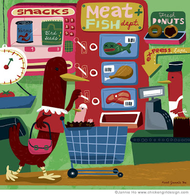 This is my submission to Revista Colectiva, The Supermarket issue.
(Thanks, Juancho for the invitation!)
I'm happy with the way this turned out...doing these personal pieces frees me up. When I know I am not doing something specificly for the children's market, which have many restrictions in a way (especially in textbook publishing and in the US.), I can play a little more. Or maybe its just all in my head. My sketchbooks use to be filled with alot more wacky-ness. Now its just all stuff for work.
Anyways, thank you for everyone's comments regarding my last post on STYLE. I agree with Zime that concept and the voice of the illustrator is part of the style and is what I am usually drawn to. And Bravo to those of you who can work in many styles! Personally, I am ok with working in one style BUT it is constantly changing and evolving...which means experimenting and working out of your comfort zone.
Alrighty, let me get off my soap box for now. Until next time, folks.
By:
crystal driedger,
on 1/16/2008
Blog:
Scribbled Business
(
Login to Add to MyJacketFlap)
JacketFlap tags:
puppy,
sand castle,
kid,
children's book illustration,
fun,
dog,
summer,
beach,
arts,
children's illustration,
kid,
puppy,
sand castle,
agent,
style,
Add a tag
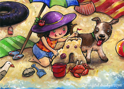
This is another illustration I've completed in the efforts of building more samples of children in my portfolio. This was much faster than the "Summer Fun" image I completed early January and was tremendous fun as well. Looks like I'm in for a great month!
By:
crystal driedger,
on 1/15/2008
Blog:
Scribbled Business
(
Login to Add to MyJacketFlap)
JacketFlap tags:
adobe illustrator,
crystal driedger,
grizzly bear,
bear,
black bear,
Royal Alberta Museum,
illustration,
style,
vector,
bear,
crystal driedger,
adobe illustrator,
Royal Alberta Museum,
grizzly bear,
black bear,
Add a tag

If there's one wonderful aspect having a part-time job, it would be the ability to diversify yourself. While it's nice to be able to see people other than your family on a 24 - 7 basis, this is not the biggest benefit I've discovered by working at the Royal Alberta Museum. While my job is primarily graphic design in nature I have been able to complete the odd illustration here and there. To top off this bunch of pure goodness, it's usually different stylistically than I do during my business hours as an illustrator. This really gives me the chance to experiment, which is very needed in this business of illustration.
The bears above were for a board game that the education department uses to educate children about grizzlies and black bears. It's more of a simple, sihouette approach and yet I found it fun (sort of like a puzzle).
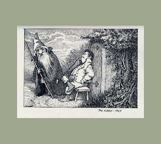 Recently A Forest For Christmas was reviewed in the Montreal Gazette. Susan Mitchell of Sweet Pea told me about it as the Gazette isn't available here. I was really happy about this, in Canada, Montreal is really the cultural centre. In the article one of the pictures from the book was published next to two well known, accomplished illustrators. I found my work looked a little shabby. I thought my picture looked really good, but shabby. I started thinking again about that Maurice Sendak quote that I posted some time ago : " The more styles you have, the better. So develop a fine style, a fairly slim style and a rough style. " Whenever I finish a big project I start thinking about what needs to be done about my art work, what needs to be improved, things like that. I think I need to work on my fine style more. And my other styles. That's my new book resolution ; to make all my styles better. Shabby's not terrible, but I could stand to clean things up a bit. The above picture is from Mr. Sendak's unfinished version of the Hobbit, by Tolkien. Sadly this book was never finished as Mr. Sendak became quite ill at this time. That would have been a great book.
 When will people start treating the most talented bloggers like real literary figures?
The journal n+1 has a smart look at the rise of the website Gawker, giving each of the founding authors a critique that would make any literature professor proud. It's a valuable lesson on the evolution of webby style of bloggers like Choire Sicha:
"Like a Method gossip, Sicha had a natural fluency in spin and slipped almost lyrically into the voices of the subjects he intended to critique. When he felt that these subjects, out of restraint or lack of imagination, hadn’t pushed their blurbs far enough, Sicha obligingly did it for them ... At times his insults and his humor, in the language he imitated, were so subtly placed that they could be missed completely."
Still, not everybody can be as mean as they are. Myself included. Dan Blank has an interesting article about a kinder, gentler model for web writing, the enthusiasm-driven approach.
He uses stereo equipment writers as his model, showing how amateurs and experts share the stage in this bustling web community. Check it out:
"Never lose site of the key elements that the audience is passionate about. To build community, start small and focus on the one item that gets people excited. For all the time I spend with my stereo “hobby,” it is still all about the music." (Thanks, Chris Webb)


Style experiment between 2D and 3D.
More stuff at Sevensheaven.nl

Kari at
Artsy Mama's is having an Artful Blogging party in celebration of
Stampington's new Artful Blogging magazine. I'm joining Kari's party with an illustration created in my own vintage-modern style. I always love a good party and hope you'll join in the fun too! Mind if this fellow joins the party to help serve up the cake and treats~we ladies need to be pampered don't we? And for all those who have a birthday this month,
Happy Birthday to you!
If you'd like to see more of my work visit my
Flickr account.
Today I opened the most incredible package from the "Queen of Treasures",
my Mom. I haven't even had a chance to photograph everything but I can tell you I was just squealing with delight. Vintage, antique, heirloom, you name it! Thank you so much Mom, I can hardly wait to start working with everything. In the bottom of the box was a beautiful white cotton chenille George Washington bedspread. I've already put it on the bed and it looks simply gorgeous!
Ok, get out your query letter.
Print it out if you're querying electronically.
Set it down here in front of you by the keyboard.
Now, read along with me.
Find the spot where it says "my novel is"
if the next word is "about" skip to the next place you find "my novel is".
What we want is the place where you're telling me about your novel.
Here are the things that should follow "my novel is"
1. word count
2. genre
3. finished.
Does yours say anything like "charming fluffy funny piquant hot sexy cool"?
Take it out.
Strip it out right now.
If you're telling me you're cool, you aren't.
That's just a fact.
You know it too if you think about it.
The people you want to work with are rarely the people who tell you how easy they are to work with.
The ones who make a point of telling you how busy they are aren't so busy they can't stop to tell you how busy and overworked they are.
Same with your query letter.
SHOW ME you're cool.
Show me you're hot.
Show me you're sexy (pictures are not involved here)
The truth is I've learned in my perambulations through the query letter heap o'love that the people who tell me what their novel "is" are most often wrong. The people who can SHOW me get my attention.
I'm pretty sure which one of those you want to be.
Dear Ms. Snark,
Recently an army of writers attacked my manuscript. One of them mentioned that I had a tendency to use a ton of passive verbs. I checked my manuscript at several Internet locations, and found that my passivity rate hovered about 32%. After two weeks of sleepless nights, I managed to removed over 300 occurrences of was/were, should/could, etc. Needless to say, I felt darn excited.
But alas, I decided to check passivity rate among some popular published authors. I scrounged up full chapter excerpts and plugged them into the good, ol' passivity reader, and found that most of the authors had verb passivity rates over 25%, with most coming in around 32%.
Did I just waste 50 hours of my valuable time turning simple, easy to read sentences, into complex piles 'o junk?
Chapter 1 of Daughter of the Blood, by Anne Bishop, comes in at 32% passivity. The first chapter of Faulkner's The Sound and the Fury lands home with a 31% passivity rate. I even found the Wizard of OZ, and a Stephen King excerpt, to have a 56% passive verb percentage.
http://www.readability.info/uploadfile.shtml
Please help us understand. Are passive verbs bad? If so, why are most published books crammed full with 33% passive verb sentences?
Passive verbs are what they are.
Like handguns, they're only dangerous if you don't know how to use them or you fire them off in a crowded sentence cause you don't know any better.
I don't run your pages through a passive voice meter or any other kind of litmus test. I read it. If it sounds slow and turgid, I don't analyze why, I say "this sux" and send you a form letter.
I find it hilarious that you picked the first chapter of The Sound and The Fury for comparison. Have you read it? Faulkner I mean. I'm going to assume you've read your own work. Did you remember it's in the first person point of view of "
an idiot" ?
Perhaps you meant to be humorous (or if you were Bella Stander-humerous). We could be amused but at this point, passive is our position of choice.


.jpeg?picon=2420)


.jpg?picon=696)


.jpg?picon=1621)


.jpg?picon=479)


OMG,I love Augustine!! Even his name is cute! :o)
Yes, very distinct styled indeed. Wow, not an easy thing to do. I have to get me that book. It's too cute for words. You know me.. I can't resist cute!
I had a feeling you would like Augustine Ali!