

Yes, I have managed to make some progress...somewhat slowly and painfully, but progress nonetheless. I've drawn the beginnings of several pencils for the book dummy...these ARE only beginnings- there are many improvements and additions to be made (some of my post-it remarks and suggestions to myself are still visible on the scans)(which I've darkened a bit, since they are only pencil).


Blog: horror vacui (Login to Add to MyJacketFlap)
JacketFlap tags: Add a tag
...well, what I have really discovered is that the very act of deciding that now is the time to do certain things that I am, for whatever reason, either putting off or hesitant to begin (i.e. dummy pencils) may actually result in my instead completing OTHER things that have long languished unfinished (i.e. yet ANOTHER page of my picture book that has been awaiting completion for some time now):
Blog: horror vacui (Login to Add to MyJacketFlap)
JacketFlap tags: Add a tag
....not that it was completely executed in its entirety since the last post...I've been extremely busy with my job recently (which is, by the way, sadly, completely unrelated to art and/or illustration, but happily, related to another of my interests). Although nearly completed months (?how many?) ago, I somehow managed to put off finishing it (partially due to a fear of ruining all of my so-far-satisfactory work with an unsatisfactory final touch?). Enough was enough- in my zeal to update my site with newer work, I decided that it had to be finished. You may remember having seen this at some point:

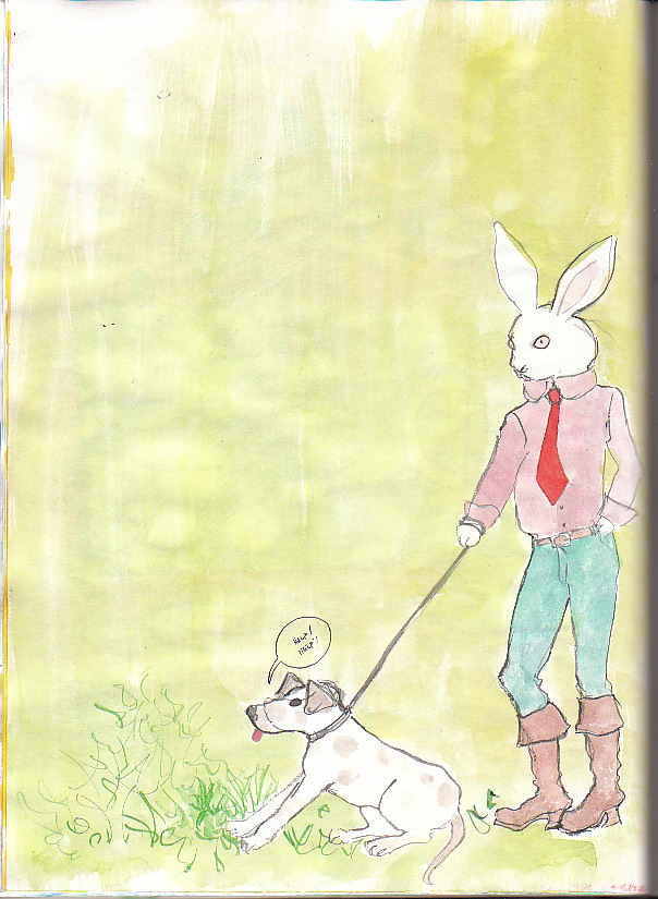
This is the first page of my book. The rungs of the crib are cut off by this scan, but I didn't feel like paying to have a scan done at the local copy place (until I need a high-res version to send out, that is). I'll get back to working on the dummy drawings tomorrow. I'm hoping to get at least a few good pencil drawings done for the dummy over the next week; maybe Illustration Friday if I have time (and find the theme inspiring).
I'm planning another postcard mailing- I've had quite a good response to the 'Spring' image; that may be the one to go with, although that won't be suitable for mailing to the children's market- I'll have to come up with something else for that (cue ongoing inner dialogue of doubt as to suitability of work for that market, etc.).
Blog: horror vacui (Login to Add to MyJacketFlap)
JacketFlap tags: Add a tag

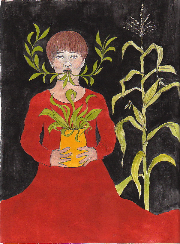
Here it is, finally, for your viewing pleasure, the painted-in-colour sketch for 'Autumn'. (So, in my mind, apparently, autumn is blood-red and wine coloured [and pomegranates look rather like beets], while summer is black and orange and spring is bright yellow and green.) Still, on the whole I'm mostly pleased with these...I'll get to making 'good' drawings of summer at the very least (a bit of a mess) and perhaps others too (I used cheapo paper and it is quite buckled...not the best for a high-res scan even if I decide that the sketch IS acceptable- that's a big IF-) sometime soon. 'Winter' I might redo. I quite like the pose but the pseudo-crystalline formation? Ugh...not quite what I had in mind. Surely something better can be done with the idea. Well, in any case you'll see updates on this at some point in the near future.
What else? Well, I went to another burlesque-themed drawing session yesterday; here are a few sketches that are okay- no more, no less. Not a spectacular session for me but fun nonetheless...:


Blog: horror vacui (Login to Add to MyJacketFlap)
JacketFlap tags: Add a tag
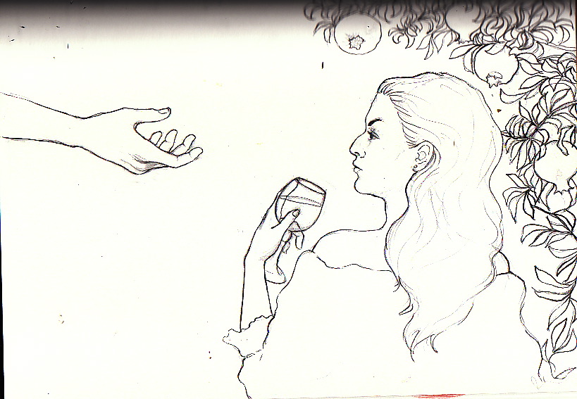
This is just a quick update, a tiny little post before I go away for a couple of days. Here is a sketch for 'autumn', the final season- I'm not yet sure whether I'm satisfied with this idea. Something about the woman's expression, combined with a certain other something about the way she's holding the glass reminds me of Aubrey Beardsley- this pleases and amuses me (although I hope that I'm not copying one of his drawings without realizing it!). I'll finish painting it when I return; in the meantime some sketching may transpire, and I'll consider a colour scheme- but I'm not bringing my paints, not for three (likely very busy) days away. I'll be back soon enough...!
Blog: horror vacui (Login to Add to MyJacketFlap)
JacketFlap tags: Add a tag
Here is my entry for IF this week; the theme was 'bottled'. This is obviously just a quick sketch, nothing more than silliness and the first thing that came to my mind (they're not even in a BOTTLE, it's clearly more of a JAR). This fast and associative idea-generation seems to be the best way for me to get something done for Illustration Friday these days instead of agonizing over it- I mean, it's really just for fun- if I do indeed come up with something that I like- e.g. 'cultivate' a couple of weeks ago (which prompted me to rename it 'summer' and do a 'seasons' series), all the better. Back with more soon- the final season still to come.

Blog: horror vacui (Login to Add to MyJacketFlap)
JacketFlap tags: Add a tag
Well, here I am, fully a week later, and yes, once more I have completed a rough drawing for another season and little else besides- general busy-ness being once again the excuse. Ah well. By this time next week I want to have finished not only the final season (several sketches/ideas for it, at least, if not a reasonably completed drawing-sketch) as well as an entry for this week's Illustration Friday.
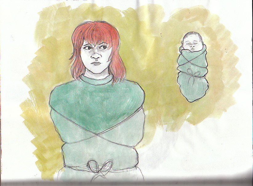
This week's season is Winter. I'm reasonably pleased with it- particularly because the 'annoying' sketches that I mentioned last week were 'winter'. (They are still too annoying to post- but I will mention that I was thinking more along the lines of a woman curled up, rather than stretched out.) I'm still not sure about my attempts at a 'crystalline' formation around her- this could be better executed.

Well, that leaves Autumn....I have some thoughts.
Blog: horror vacui (Login to Add to MyJacketFlap)
JacketFlap tags: Add a tag
I always intend to post more frequently. I recently realized that one of the factors in my failing to do so is my tendency to put it off until I have 'more' or 'enough' material- be it news, sketches or interesting thoughts. The past couple of weeks have been extremely busy, and I haven't had a lot of time to work on projects, alas. I did do some more sketches, though, developing the idea of depicting the four seasons symbolically (inspired by the IF drawing in the last post, which suggested to me an interesting embodiment of 'summer'). I completed a sketch of 'spring' that I'm quite happy with, and did a few for 'winter' that I'm completely annoyed with. Typically, I am tempted to wait to post an entry until I have that elusive 'more'- in this case, another sketch that I like. I am not, however, going to wait as I so often do- in spite of the nagging inner voice that says 'that's not enough, only one drawing? that's not very interesting' etc., I'm going to post the one thing that I'm willing to show. Here it is, 'spring':

Blog: horror vacui (Login to Add to MyJacketFlap)
JacketFlap tags: Add a tag
I quite like this idea that I came up with for this week's IF; it's very quickly executed in my terribly swollen (and quite difficult to make scans from) sketchbook, but I'm thinking of doing a better version of it. It might not be a bad idea to make this into a series of four seasons- this being the summer. I like the strangeness of it.
Speaking of strangeness...sometimes I wonder whether I'm just kidding myself. Is there really a place in kiddie lit for me? Is that, in any case, what I'd really like to do? Ideally, I know that I'd rather illustrate picture books for teenagers and adults...yeah, that's a lucrative market- lots of THAT kind of stuff around... I often feel as though my style is unfortunately between markets- too weird/creepy/non kiddie for the kiddie market, too naive,not slick (or sophisticated or collage-y or urbane or whatever, depends on the moment) for the editorial market. It seems as though I'm just missing the mark everywhere... but what to do? What I do is what I do...and it seems to me that to be myself is the only way to proceed. Some people will like it- it's just a matter of finding those people.
My focus for the next little while is going to be developing new pieces for my portfolio. I feel as though I haven't changed things around for a while- not that I haven't been doing anything, it's just that so few things have, shall we say, 'made the cut'. I'm pretty happy with a number of the ideas that I've come up with recently just playing around and sketching (this IF being a good example). Here is another recent sketch:

Another that I'm considering doing a 'good' version of:

Well, that's all the news of note for the moment. I am continuing my valiant (if insufficient) attempts to augment my online presence- I'm considering joining either lunarize (their winter 'publisher' gallery was sold out) or hire an illustrator (in order to further the aforementioned presence online). I must follow up on mailings. Oh, and do some more DRAWING, too... further sketching for client, pencils for dummy, pieces for portfolio. Bonne semaine!
Blog: horror vacui (Login to Add to MyJacketFlap)
JacketFlap tags: Add a tag
...And so I have returned from a short trip to Florida, rested, relaxed and more ready than ever for spring. My 'perruche' postcards have arrived, and I'm very pleased...tomorrow, the mailing will commence...
I haven't participated in Illustration Friday for a while now, much to my chagrin. Yesterday, though, I began to make amends. Here is my take on 'warning':
I'm also starting work on a new private commission that seems as though it will be fun- I've just done several VERY rough sketches (really to rough to show, sorry, although I may change my mind later), too rough to show the client at this point. I'm going to do some more passable sketches to email to her tonight. I'm really looking forward to this project- she seems very open to ANYTHING, but has given a few guidelines ('anything' without ANY guidelines can be hard). I will be posting more on this at a later date... and work continues on completing my book in book-dummy form. Lots to do...
Oh yes, I'm still doodling pointlessly for my own amusement. For your perusal:

Blog: horror vacui (Login to Add to MyJacketFlap)
JacketFlap tags: Add a tag
Well, I've completed the second side of my new promotional piece:

However, I'm not completely satisfied with my handpainted contact information...it's a little irregular...Luckily, I scanned this before painting in the contact information, and added in the same information using photoshop- I'll use that for my cards. (Here, once again, is the other side:)

I'm somewhat annoyed with myself, though, for not having checked the 'oversized' postcard template (vistaprint) before- it's a little more vertical than the standard, alas. I'm unwilling to crop either image, but I'm not sure that the standard side will show the contact information sufficiently (it can't be too small; we don't ALL have eyes like microscopes!). I'll have to do a test; if it's not clear enough, I'll consider either a) adding the contact information to the 'girl' side (just superimposing on the image) or b) painstaking photoshop additions. This will not be easy on the 'girl' side (for this side, a 'frame' of another colour might make more sense), but fairly easy on the 'poster' side. We shall see. (And that'll learn me to check sizing details ahead of time!)
Finally, some more doodling. Argumentative rival teas! Once again with the floating heads! Accusatory coffee!


Blog: horror vacui (Login to Add to MyJacketFlap)
JacketFlap tags: Add a tag
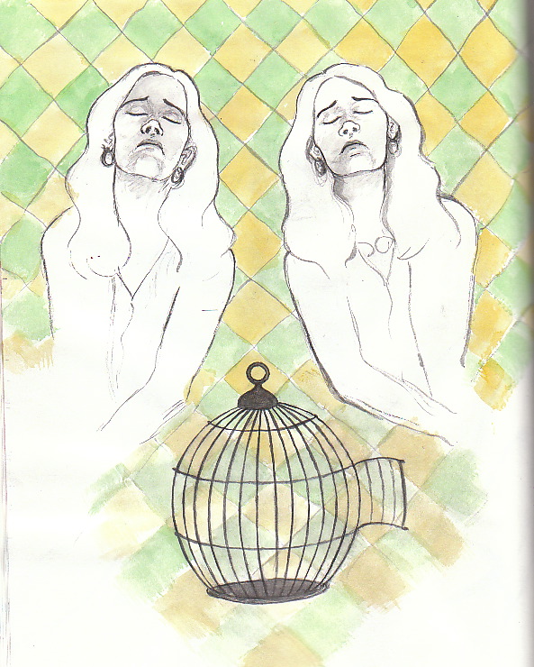
As I promised myself that I would, I've been taking it easy and drawing more for FUN and with less self-imposed pressure- it's been good. I can feel my mental muscles loosening... Here are a couple of the....um, things... that I drew over the last several days:


the above faces the next:

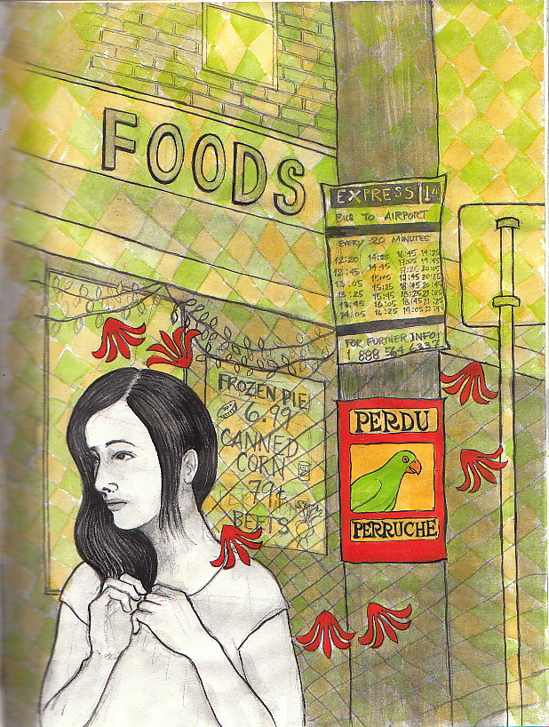
I did also finish another drawing that is a possible 'front' for the 'perruche perdu' card- I've painted a tiny version of the poster here; I plan to do the full-size version of the poster itself next. I used the same background pattern here as I used in the piece with the two women...I may incorporate the pattern into the poster somehow, too- perhaps something similar to what I did here- just a simple black outline. I'm working on NOT overindulging in detail overkill...

(hmmm...perhaps the pattern could stand to be a bit darker? )
As part of my recent campaign to relax and enjoy what I'm doing more, I indulged myself in a leisurely visit to the Grande Bibliothèque, where I found a beautiful and inspiring collection of the work of the early 20th century French collective, 'Le Pou qui Grimpe'(link en français only-sorry, didn't find such a thing in English)...here are a few pages:


More to come...
Blog: horror vacui (Login to Add to MyJacketFlap)
JacketFlap tags: Add a tag
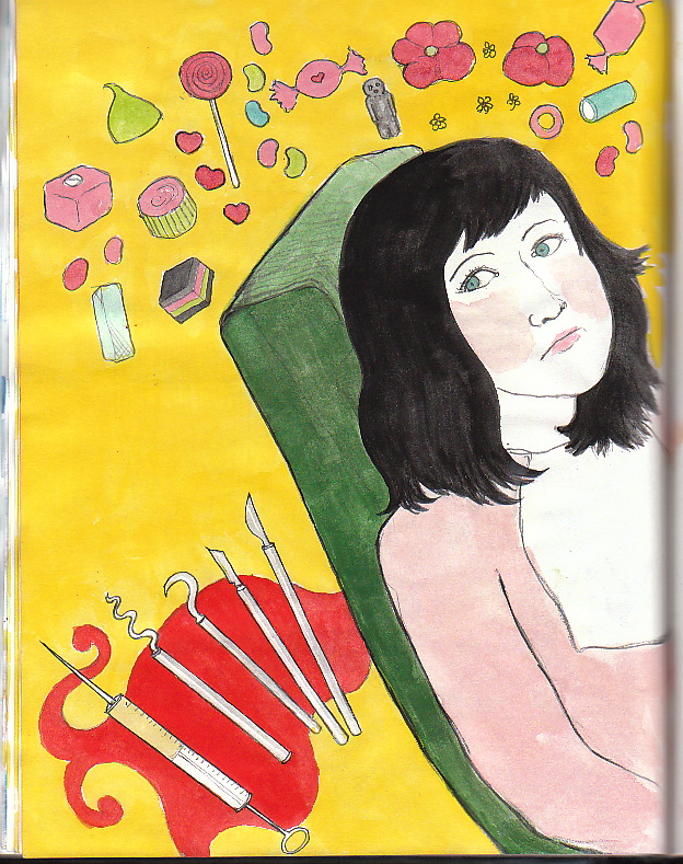
I finished the 'perruche perdu' piece that I was working on...s'alright; I'm not thrilled but perhaps am just not receptive to a work-based thrill at the moment. I plan to continue with my idea of a 'series' for the next promotion- 'pieces' rather than a single image- soon.
I've been particularly frustrated recently (as mentioned in the post previous to this one) with setbacks on the 'flying' book project, and decided to NOT continue working on it in that particular state. Instead, I've been working on... whatever comes to mind, just for fun. Here is one such thing:

What is it? What does it mean? What is it for? I don't know...but it was enjoyable.
..Here is the 'perruche perdu' piece:

I'm planning to work next on the 'flying' pages that I've ALMOST completed, which will give me more to add to my online portfolio (one point on which I feel a nagging self-induced pressure/anxiety). I'll also work on a purely pencil dummy- Diane Dawson Hearn suggested on the PBdummy chat that doing more than TWO finished pieces in a book dummy would give the editor(s) the impression that you would be resistant to change. (Thanks Diane! I wouldn't have thought of that myself!)
Ok...that 's all for the moment. Back soon.
Blog: horror vacui (Login to Add to MyJacketFlap)
JacketFlap tags: Add a tag
Hello all.... I've been working but have little satisfactory finished work to show for it. Yes, yes.... I will tell you my tale of woe...which comes, incidentally, complete with what I am trying to see as a positive outcome. (Oh, it is, it is....it's just hard for me not to want things to work out perfectly, every time, and for everything that I do to be the BEST THING I've ever done, etc....).
So...I've been working on a page for my book...rather desperate to complete ten pages for the SCBWI grant contest as mentioned in the last post. ( I'd really wanted to have completed two new ones already! ) I have long had in mind what I wanted to do.... here are a couple of sketches:


...and here is the pencil drawing before I began to paint:

Well, it turned out...not well. And it wasn't that I made any particular errors....it was difficult for me to put my finger on exactly what I was not pleased with. This led to a fairly miserable mood in which I thought of other pieces that I've worked on recently that I had also been less than pleased with....and they had something in common. But what was it? And then I realized... that sometimes, my penchant for DETAIL is sometimes too much.... too much detail, on too similar a scale, is not as successful as if I were to use it sparingly or in greatly differing scale, if that makes sense. I realized that that I had made that very error recently in the pieces that I consider to have been less successful. My "Heidi" piece, while not terrible, used allover detail (sky and 'grass/flowers') on about the same scale, and the figures were detailed on a similar scale. Same with the cover that I did for Crow Toes... Hmmmmm....
So, I decided to minimize colour... in this version, I planned to 'grey/blue' out the buildings and just keep them lightly outlined...and to do a black outline of a pattern in the sky (didn't get to that point here):

...somewhat better, yes? But then I was able to pinpoint a final criticism of the earlier pieces... again, related to scale. I really am more effective at tight scenes, not crowd scenes, not 'pulled back' scenes. A wide perspective isn't what I do best... particularly since I have the aforementioned tendency to detail everything. Of course, these are things that I can work on... but another consideration is that I hav
Blog: horror vacui (Login to Add to MyJacketFlap)
JacketFlap tags: Add a tag
It's about time for me to plan, execute and send out another promotional mailing. In the past, this has taken the form of postcards- colour image on the front with b&w printed contact info/email address on the back. However, for this next one, I may spend a little more money and print both sides in colour- in fact, I'm considering the possibility of doing two or more versions and sending them out as a series. It won't cost TOO much, I'm sure...the magic and wonder of Vistaprint never cease to amaze.
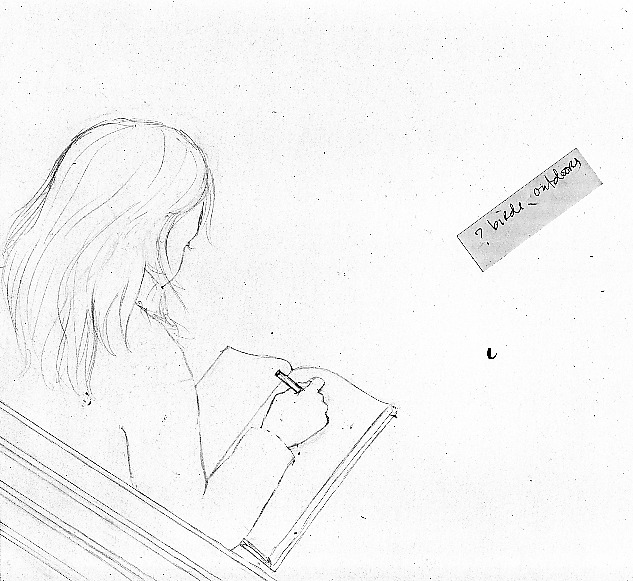
The idea is to make the 'info' side look like a poster- a poster for a lost bird; my contact information will appear where the contact information for the bird's owners would be. The poster/info side will remain constant even if I do several variations on the front. The front will feature various people whose connection to the lost bird are vague and open to interpretation- a story of sorts, but one that is lacking a certain amount of information and so is prime for speculation. I saw such a sign in my neighborhood and found it fascinating! (I also kept thinking about how I might improve the poster- how I would do it if it were MY lost perruche!)
Here are some of the sketches- please keep in mind that these are REALLY VERY SKETCHY- I don't think that I've ever posted anything quite so sketchy before- to be honest, I feel a little strange about it- as though I were posting some kind of lurid and probably undesirable tell-all confessional.
These first two images were my first impression- I hadn't developed the idea in any particular way yet. I imagined a woman passing the sign appearing very emotional, and I just quickly sketched the sign so as to remember what it looked like, more or less:


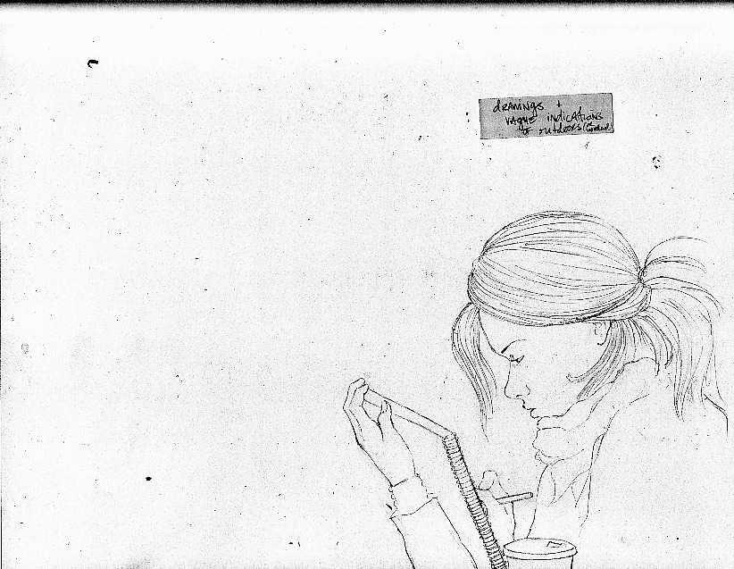
I developed the idea a little bit more (i.e. at all!) here:
Here are a few sketches of other possibilities- much less developed:
(I'm kind of partial to this one, though!)
(alas, it is not clear that the patinaed man is supposed to be a statue. He is.)
Blog: horror vacui (Login to Add to MyJacketFlap)
JacketFlap tags: Add a tag
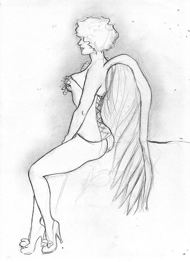
Hello all! Hope that you all had a wonderful holiday. This will be my first of two posts covering my art-related activities over the last couple of weeks. First, Dr. Sketchy! I had long been aware of the existence of a Dr. Sketchy's group en vigeur here in Montreal, but for one reason or another (that reason usually being work), I had never been able to attend. (For those of you who have not heard of Dr. Sketchy, it is, in short, an essentially burlesque-themed drawing session held in numerous cities around the world. For more information, here is the main site. )
Finally, a couple of weeks ago, I went to a Dr. Sketchy session for the first time (and this was my first life drawing class of any kind for many many years, too!). The theme was 'A trailer park X-mas' and the model was costumed and adorned with much dollar-store and liquor-store paraphernalia, and surrounded by the likes of a tiny plastic x-mas tree festooned with crushed beer cans. Campy psychobilly 'redneck-ized' versions of various Christmas songs were played throughout the session. I enjoyed myself immensely. I am definitely going to go to the next session next Saturday (January 8th). I think that I need to buy some markers for quick colouring in these kinds of situations- paint not so convenient.
Here are a few of my drawings:


Ok, that will be all for the moment. I will be back with another post later today. Stay tuned for exciting revelations concerning sketches for my next self-promotion endeavor! Another SCBWI contest! And my upcoming participation in a book dummy creation challenge! More later today.
Blog: horror vacui (Login to Add to MyJacketFlap)
JacketFlap tags: Add a tag
Oh, the intrigue! The drama!
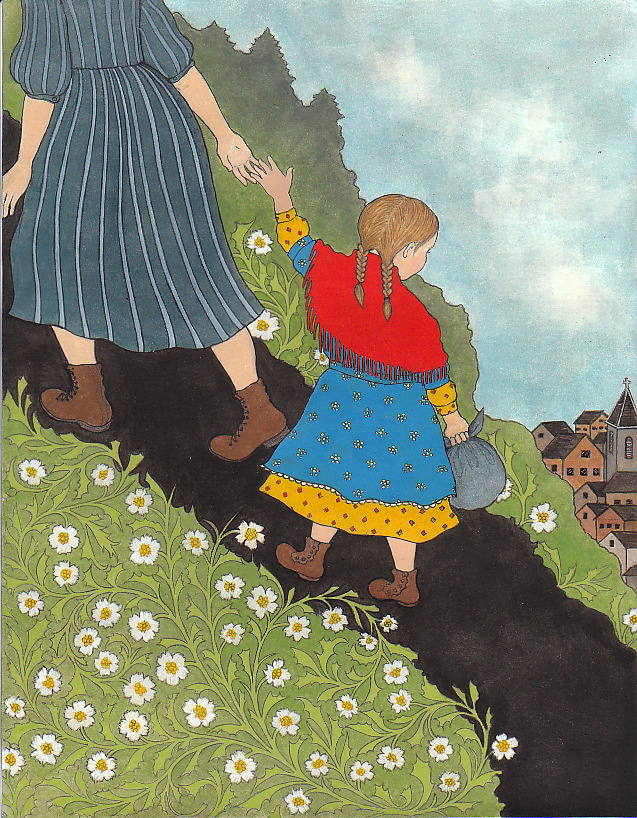
I have completed my piece for the T. de P. award.... well, in any case, I'm done with it. I had been considering the possibility of re-doing it completely with a different colour scheme, about doing it again in a different style... but in the end, I wound up fussing with it so much, I couldn't tell whether it was good, trite, dull, a mess, abysmal, an insult, what have you... but I really wanted to move on to something else. I went to the SCBWI site to check out the entry process...reread the passage selected...and realized, to my horror, that, although I HAD read the passage, I had rather inconvienently forgotten one of the few indications of any kind of specific colours to be used in the composition. I had made her scarf blue, when it was specifically noted in the passage that it was red. I had made one of her dresses red. And so, work continued... and I have learned a valuable lesson. Do not trust that you 'know what it says'...even if it IS something that you have read more than once or twice...print it out. Sigh. Repainting over gouache is not the best thing...but think that this colour scheme is perhaps better than the original- it's not actually much different, although the blue of her dress is brighter than the original blue of her scarf; I like it more.
And so... for your amusement-
First, a cropped scan of the pencil drawing. (As you will see, I am still not sure where to 'cut' this piece)- looking at this crop again, maybe this would be the best? Hm...

And first the WHOLE page, and then a few different crops of the final painted piece (original colour scheme) (sorry, didn't make any scans in the interim!):

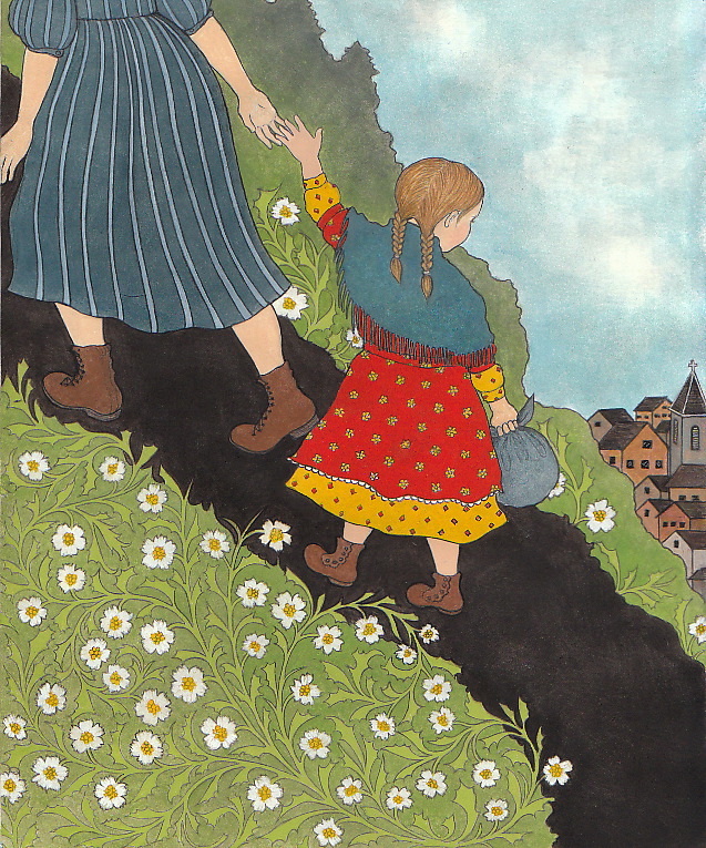


...and now, after the colour adjustment:
Blog: horror vacui (Login to Add to MyJacketFlap)
JacketFlap tags: artist, SCBWI, children's illustration, pattern, gouache, page, mountain, Tomie de Paola, Johanna Spyri, Breaking into freelance illustration, mail me art, illustration contest, Add a tag
I am somewhat hesitant to post all of my work in progress for my entry- can't decide whether this is reasonable or paranoid. A little of both, mayhaps? I really got down to work this week, believing the deadline to be the 5th of December, not the 15th- which, as I discovered today, is the actual deadline. Deadlines really work for me... when I have a deadline, I make decisions, I get things done- not that I don't without a deadline, but I somehow find a way to prolong things...not through any lack of motivation or effort. My book, for example- I fuss and fiddle and put things aside so that I can 'think' about them and ostensibly find the 'perfect' solution...and I never, ever manage to just bang out a page within a day, or two days the way I can if I HAVE to. I don't really know how to make my self-imposed deadlines as REAL to me as an externally imposed deadline, I really don't... Anyone else have this problem? Any suggestions would be muchly appreciated!
In any case, I am quite pleased with my progress thus far. I am going to incorporate a pattern, surprise surprise... I envisioned what I realize are actually quite eastern european flavoured floral-botanical patterns, although Heidi is set in the Swiss Alps, I still think that it works...here are some of my pattern experiments:

I tried turning this into a regular repeat; this attempt shows just the framework and no petals, leaves, etc.:

However, I realized that this was too 'regular', not quite what I had envisioned. I want to use this pattern ON the mountain they are ascending, so I wanted it to look a little more like actual plant life... something more like:

That was more like it... but finally I decided to go with this one:

I've since transferred it to the drawing...which no, sorry, I've decided I'll wait to show you in its various stages only after it's all finished and sent in. That will be soon enough; I'm ready to make with the gouache. I'm going to (try to) pretend that I don't realize that the deadline is actually the 15th. I'm having fun with this; it's going well.
Blog: horror vacui (Login to Add to MyJacketFlap)
JacketFlap tags: Add a tag
So...as you can see, I'm posting once again on my OLD blog... it doesn't seem as though I'm getting quite the same traffic on my new blog attached to my website...but if you want to read the posts that you've missed AND subscribe to/bookmark my 'new' blog, here is the link: NEW BLOG (and I will be unspeakably pleased as well!)
What has been going on? Well, I’ll start where I left off- I was anticipating my visit to the Otto Dix exhibit now up at the Montréal Museum of Fine Arts. This is a show that I have been waiting and hoping to see for twenty years, and it was as good as I was hoping it would be. I was happy to see several luminous and beautifully detailed not-quite caricature portraits that I had never seen in reproduction, and I was particularly impressed by a striking series of etchings inspired by Francisco de Goya’s Los desastres de la guerra (and, more importantly, by own experiences during WWI). VERY good show; I will certainly go back for another look. I have always loved Dix, I admire his astonishing talent too much to even be able to be envious of it.
Then… I was off to Windsor and Detroit to run the Detroit Marathon (no, no, du calme…I did NOT win)…however, it was a great experience and I’ll certainly do it again. Besides the run, though, I had a great time as a tourist in Detroit- the day before the race I was able to go on a tour of my very favourite building in the world, the Union Trust Guardian:


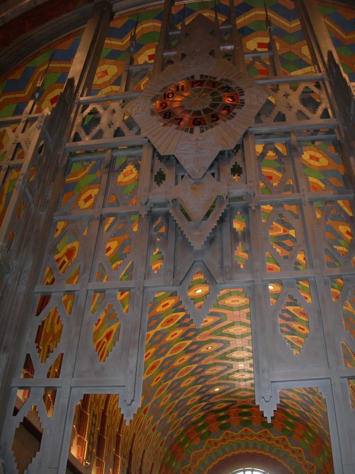

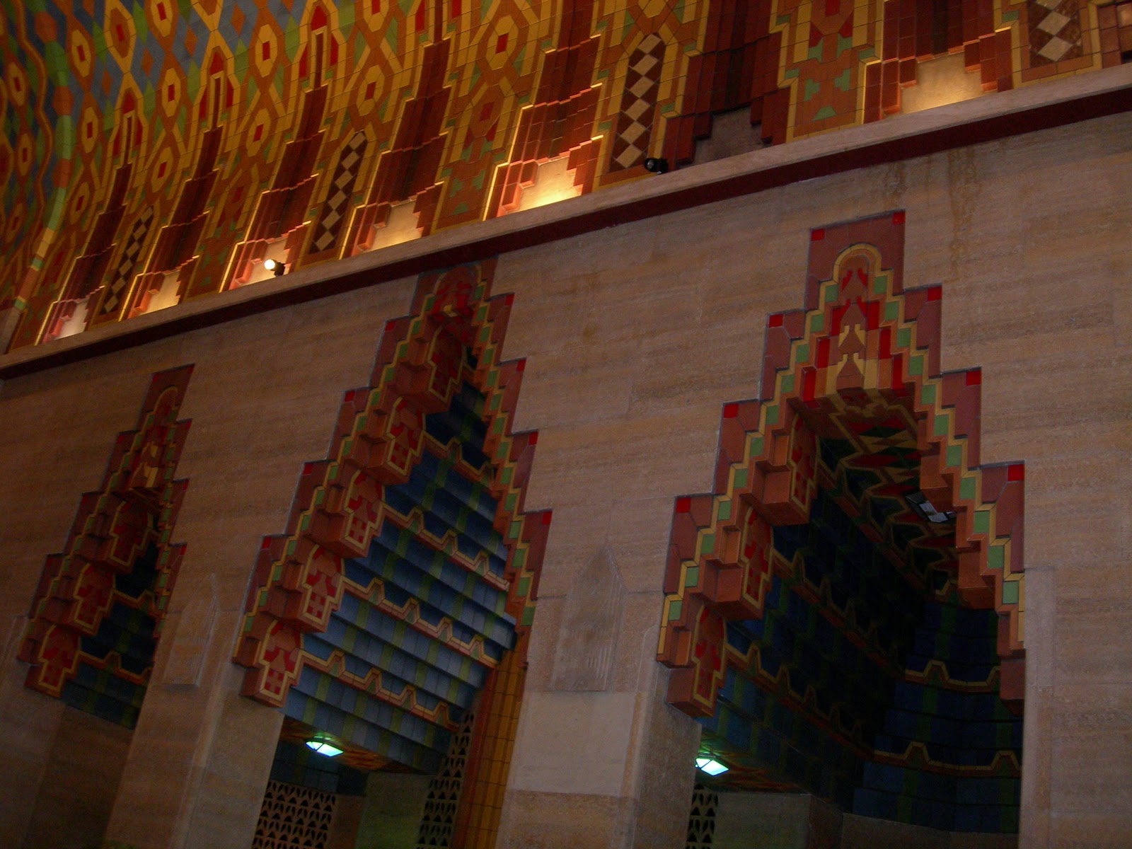

…and here I am with the enthusiastic, witty, charming and knowledgeable head concierce of the Guardian Building, Mr. Christopher Roddy:
Blog: horror vacui (Login to Add to MyJacketFlap)
JacketFlap tags: Add a tag
The past couple of weeks have been busy, busy, busy...have started a new (day) job whilst still employed at the old one; seems pleasant enough so far but am suffering a bit of mental overload due to lack of time available to devote to illustration projects, i.e. my REAL work. Nonetheless, I am finally posting another couple of sketches that I managed to execute:


Blog: horror vacui (Login to Add to MyJacketFlap)
JacketFlap tags: Add a tag
Hi all! It's been a hectic couple of weeks, what with moving preparations. Happily, our stuff is now in our new (brighter!) apartment, but we've had to vacate for a few more days while our floors are sanded and varnished. So work has been on some kind of hold for a bit...still, I did manage to make a few sketches for my "Montréal card' project...
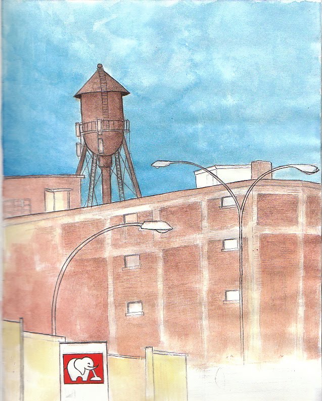
This is just a quick one of the warehouse water tower at the Van Horne underpass.... but I still want to fiddle with it a bit...I want the water tower featured prominently, but also the 'La Maison de l'Aspirateur' sign which is one of my favourite signs in the city...

...more like this, though this is even sketchier, complete with notes and sketch-within-a-sketch etc... I think that I'll wind up placing the water tower farther over to the left and making it smaller, leaving a larger sky area (which I'll pattern somehow interestingly).
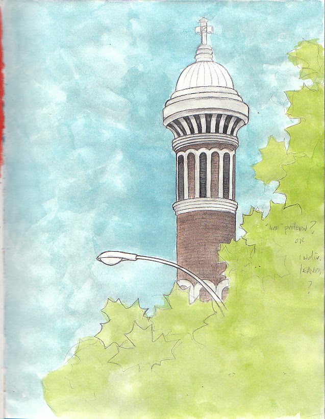
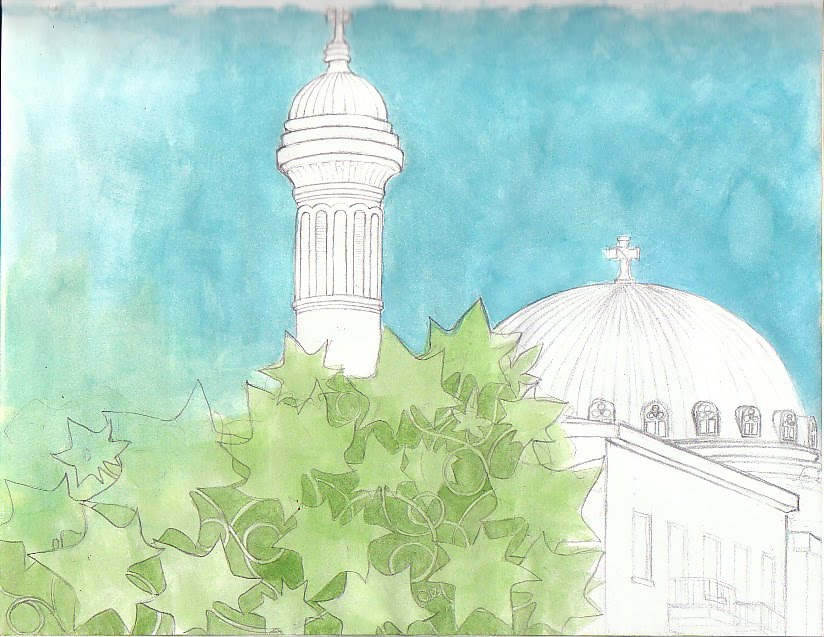
This one is a winner- I think that I'll do this, the 'minaret'/bell tower of St. Michel's church, almost exactly this way. I'll position it so that there is more sky area- and again, sky patterned interestingly. I did another sketch of this church, from the other side...I like this version more (more interesting, unusual vantage point) but I'll show the other because I used it to work out a possible leaf/ivy pattern that I will likely use on this one:
... a few more ivy and leaf sketches...:

And another that I like, but will adjust somewhat- an example of the beautiful cornices that are to be seen in great variety throughout Montréal:
Add a Comment
Blog: horror vacui (Login to Add to MyJacketFlap)
JacketFlap tags: Add a tag
So sorry about my rather protracted absence. First, a little news...My new site is now up and running, and I have a new blog there. I've transferred all of my extant posts from this blog to the new blog's archives. As I have some followers here who may not immediately be aware of the switch (and also because it will take me a while to change over my 'networked blogs' etc., I'm going to simultaneously post on both blogs for a little while....To all of my lovely followers! Please come and look at the new site. (I would invite you to subscribe to my rss feed on my new blog, but I've not yet succeeded in placing the 'feed' button satisfactorally. ) (arrrrgggh!) (It is registered on feedburner, though, as AmandaCrawfordIllustration!) The new blog is here!
So-this post is the essentially the same post as the first post to appear on my brand-new blog which is now part of my website, which I won’t say is finished yet…but all of the general components are there. Oh, it has been quite a new experience, to say the least. I’m getting tired of fussing with it, but the closer I get to ‘completing’ it, the more things I find I would like to change just a bit…if only these little things were as easily done as said! Maybe for some, but not for me- not yet, anyway. It’s quite like working on a drawing or painting- the last 20% is really 80%, if that makes any sense. I have yet to add analytics codes to all of my pages, add (in a way that seems pleasing and harmonious, no white boxes please!!!!!argggghh) social media icons and an rss feed icon to my sidebars, move my tagline over just a little bit (the urgency of this diminishes by the minute, though!), adjust my gallery of thumbnails so that I can add individual url links to each image (this may necessitate re-doing the gallery AGAIN!, so I’m making it a low priority!)…oh, there’s more. I just can’t think of the rest right now. Add to that list the task of looking up how to do all of those individual things….computer programming genius, I am not that. I’m pretty pleased with the site, though- I have ‘contact me’ forms now, the lack of which is what started me thinking that a more customizable site might be necessary, and the design is nice and simple and clean. I’ll continue to play with it but for now I’ve had just about enough…
I’m finally starting work on a project that I’ve wanted to begin for quite some time now- my ‘Montréal cards’ project. In fact, in the plan that I wrote for an earlier week of the 12-week challenge, I’d planned to have it done by now. (Unfortunately, I did not factor into my plans completing the various tasks of the 12-week challenge!) So, I’ve taken some photos, and I’m starting drawing this very evening. I’m quite excited about this project, and have come up with some other, similar ideas that I’d like to do…please let me know what you think of these ideas! The first is a series of prints/cards depicting my favourite overpasses of the 401. The other is a series depicting Windsor scenes. Like the Montréal series, these have a fairly ‘local’ appeal…but more so, I think… Anyhow. I will post sketches of the Montréal series very soon.
Blog: horror vacui (Login to Add to MyJacketFlap)
JacketFlap tags: Add a tag
...and oh, such a taxing of my brain! I'm beginning to 'get it'...I think. CSS code is even starting to make some kind of sense... not that I can make it do what I want most of the time, but....even so. Still, progress has been made: Here is a new logo that I made for my new site (I'm thinking that it will work well too on the reverse side of my new business cards!):

It's far from being finished, but I've made great progress over the last couple of days. I won't bore you with the details of my agonizing struggles, but I've found that what I would have assumed to be the simplest things to do are actually quite complicated to make happen. For example, I've spent a LOT of time trying to centre my image gallery on the home page. I've followed several pieces of coding advice to the letter, only to wind up with a left-justified column of thumbnails. I've put them back in a table, but I'll keep working on finding the solution. At least the column is gone! (I was somewhat relieved to see that many people in the Headway forum had the same problems!) Arrrgh.... enough with slaving over a hot computer, already. Back with more progress soon!
Blog: horror vacui (Login to Add to MyJacketFlap)
JacketFlap tags: Add a tag

Blog: horror vacui (Login to Add to MyJacketFlap)
JacketFlap tags: Add a tag

View Next 25 Posts
Ahaha! "Accusatory spoons"? Love it! :D
(I'm also a big fan of your work method - a bit at a time, as needed.)