new posts in all blogs
Viewing Blog: light night rains, Most Recent at Top
Results 26 - 50 of 721

Illustrator, Corey Godbey
Statistics for light night rains
Number of Readers that added this blog to their MyJacketFlap: 12
Previous entries in "Hobbit week."
____________________________________________
 |
| The finished piece. |
 |
| Bilbo, detail. |
All of this leads us to the finished piece. I had such a good time on this project. But wouldn't you know it, just like so many good adventures, I wasn't finished yet.
. . .
There was room in the budget for a piece for the back cover. And what a back cover. It's scene I have imagined again and again ever since I first read the book in high school. Tomorrow's post will cover this back piece in detail but until then here's a teaser:
 |
| Fire and water. |
For the actual color work on this cover I did things a little differently. Each piece, each project, each series I work just a little differently. I'm constantly refining my method and tinkering with the process.
Things were especially different in that I was under a time crunch to get this and Archaia's Free Comic Book Day Labyrinth story done at the same time. Also I was obliged to be out of my studio and work on the road. I ended up getting a MacBook Pro to work on the go (and it's turned out to be one of the best things I have ever gotten.) Yes, things were done a little differently this time around.
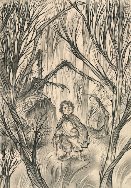 |
| Finished drawing. |
Some of the difference shows up in the coloring progress and textures. I tried a few different methods of flatting and blocking in shapes.
 |
| Flatted color. |
This lead to some interesting (and strange) textures when a few of the other layers were turned off.
 |
| Textures! |
____________________________________________
One thing that you are especially not supposed to overlook in Tolkien are the details. The books are all details so you have no excuse to not know how a particular character is dressed, what they just ate, what phase the moon is in ... the list goes on. All that to say, when dressing Bilbo I forgot his vest! Vest missing the little brass buttons. I drew it seperately and photoshopped it into the drawing before I began the final cover.
____________________________________________
Hobbit week.
Illustrating anything from Tolkien's writing, in any official capacity, has always been a dream of mine.
I once got to illustrate one of his poems for
Highlights, the most recognized and respected kids' magazine in the galaxy.


____________________________________________
If it's not my all-time favorite book (and yes, it probably is) The Hobbit is surely one of the greatest, most charming, most delightful, frightening, and exhilarating stories ever told by a human. And the chance to illustrate any scene from it is an illustrator's dream come true.
For this project I got to work again with Barbour books. They've always been a great, collaborative client. In my experience, they're one of those great clients who art direct really well and know why they've hired you.
The initial idea was to show Bilbo displaying a little grit, some kind of determination. I knew would best suit that request was the moment after killing the spider, by himself, in Mirkwood. Even so, I wanted to explore.
Here's are the thumbnails as well as the thoughts I sent to the AD.
____________________________________________
Overall I tried to keep close to actual moment in the book as well as nail the tone for the cover that we talked about perviously.
A. A moment in Chapter 8 where Bilbo climbs to the top of tall tree to see where exactly he and the dwarves are in the forest. He's struck by the beauty and sunshine. It's the first time he's seen the sun for a long time (as they have been traveling through Mirkwood for quite some time). I've always loved this and I think it could do well for the cover. This small moment of joy in the midst of the deep dark of Mirkwood.
B. This one is my personal favorite and the strongest of the three, emotionally, and I believe it comes the closest in tone with the original ideas for the cover. The turning point in Bilbo's journey was killing the spider all by himself. To quote,
"Somehow the killing of a giant spider, all alone by himself in the dark without the help of a wizard or the dwarves or anyone else, made a great difference to Mr. Baggins. He felt a different person, and much fiercer and bolder in spite of an empty stomach as he wiped his sword on the grass and put it back into its sheath."
This I believe would be the first moment in the book where we would see a look of determination on Bilbo's face (all before he was always thinking about breakfast). A look like that at any other time doesn't work, I think. I think this is the right moment. However, I would understand about not exactly wanting to show a big dead spider on the cover. I would handle the spider without any blood, and the leg shapes would look tree-like, mixed in the trees in the foreground and background. Almost as if you wouldn't notice the spider at first, but only on a second look would you realize what's in the background. The focus would be on Bilbo and his new found courage and determination. It would be tasteful and not too dark. And with the title and text laid on that would further obscure the spider, drawing even more attention to Bilbo. Plus, the faint, pale blue light coming from the sword could look amazing.
C. This one is a little more simple, Bilbo wandering through Mirkwood by himself. At this point in the story he would have already killed the spider and lost the dwarves, though he'd be wearing the ring (so he'd be invisible, but I could take some artistic license!) After he killed the spider he went looking around so that would be this moment and one where he would look determined, or at least cautious.
 |
| The other ideas. |
Ultimately we went with B. Good for the tone but also this afforded me the chance to draw a giant spider.
 |
| The working thumbnail! |
____________________________________________
From there I took the drawing to finish.
 |
| The finished drawing! |
Next time, color!
____________________________________________
Hobbit week.
A little while back I got to do cover for a new book about The Hobbit. If you can't do a cover for your favorite book directly, a book about the book is the next best thing.
This week I'll be walking through my process for the cover (with a grand, old surprise on Friday!)
Enjoy!
 |
| Bilbo in Mirkwood! |
 |
| Bilbo, detail. |
_______________________________________________
 |
| The final cover. |

By: Corey Godbey,
on 9/28/2012
Blog:
light night rains
(
Login to Add to MyJacketFlap)
JacketFlap tags:
Add a tag
It's been a good long time since I've ever posted to IF, a couple years maybe! I used to post every Friday back in the early days of my blog. Well, I'm pleased to make a contribution once again.
"Book" brought to mind this recent piece from Menagerie, the gryphon with the troll kids.
I'm sorry (but a little pleased?) to say that the first print run of
Menagerie has just sold out but I just released a
series of prints from the book.
Thanks for taking a look!

By: Corey Godbey,
on 9/20/2012
Blog:
light night rains
(
Login to Add to MyJacketFlap)
JacketFlap tags:
Add a tag
Finally! I've got a ton of new work to share.
All of these new pieces are from my 2012 sketchbook, Menagerie. Enjoy!
Note. Some are available as matted 8" x 10" prints (total size 11" x 14") others as both a decoratively matted 8" x 10" OR miniature. Some are only available as miniature. All sizes are noted and linked below.
There is also one special charity art print I hope you'll see at the bottom.
Thank you for supporting my work! To visit my shop and see everything that's available, prints and sketchbooks alike, you can visit here.
* * *
* * *
* * *
Two sizes available.
A decoratively matted 8" x 10" or a miniature 4" x 6" print.
 |
Tiger, profile.
8" x 10" print
All proceeds from the sale of this print will be donated to
the World Wildlife Fund's Save Tigers Now campaign.
Over the course of reference gathering for this project
I came across a statistic that I couldn't ignore.
A hundred years ago there were 100,000 tigers in the wild.
Today there are as few as 3,200.
NOTE: Print appears without logo and text. |

By: Corey Godbey,
on 9/18/2012
Blog:
light night rains
(
Login to Add to MyJacketFlap)
JacketFlap tags:
Add a tag
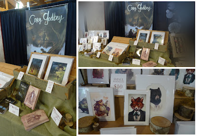 |
| My sprawling set-up. |
Once again the
Indie Craft Parade has struck the heart of downtown Greenville, SC with a fierce
↓, ↘, → punch!! of a variety of handmade media.
Whether felted things, ceramics things, drawings things, the third annual ICP gathered together some of the best working artists in the southeast.
As you might know, this event is my
wife, Erin's largest yearly project. As such, in exchange for my name going on the sponsor list, I end up doing a lot of hand lettering and illustration for the event.
Here's a look at some of newest work.
 |
| The Illustrated Elephant. |
 |
| Oh gosh, and now it's spread to shirts. |
 |
Hey! A billboard.
(Alternate hand drawn text.) |
I debuted the most new work to-date at this show. I think 10 new prints in all. I'll be making them available online this
Friday, September 21st in
my shop!
Here's a peek at what to expect.
 |
| Many new things. All creatures. |

By: Corey Godbey,
on 9/17/2012
Blog:
light night rains
(
Login to Add to MyJacketFlap)
JacketFlap tags:
Add a tag
Here's something that I've been really looking forward to seeing in print.
The first time my work has appeared in Imagine FX, the premier digital art magazine. I was in touch with them a while ago and I'm indescribably pleased to see this feature in the magazine.
A huge thanks to everyone involved, especially Beren!
Here's to the next one. I'd love to do a cover for you guys!

By: Corey Godbey,
on 9/14/2012
Blog:
light night rains
(
Login to Add to MyJacketFlap)
JacketFlap tags:
Add a tag
Man, it's been some time here! It's a shame to let a blog lie dormant. It's a blog for gosh's sake! These things are meant to be watered regularly and turned towards the sun!
The third quarter of this year has been packed with travel, conventions, speaking engagements, and client work. I've been slammed and this poor blog has been the main causality. Time to water.
I'll be back next week with a full blogging schedule: catching up on past engagements, new projects, and future work. Also, a better-late-than-never giveaway!
* * *
Until then here's a peek at some of the new work I debuted at the 3rd annual
Indie Craft Parade.
 |
| New prints! I sold out of several but I'll be reprinting and listing on my shop. |

By: Corey Godbey,
on 8/13/2012
Blog:
light night rains
(
Login to Add to MyJacketFlap)
JacketFlap tags:
Add a tag
And the final stage of this small watercolor painting for Ruel Pascal's recent "A Moment Of..." group show.
I really enjoyed my time with this one. I hope to create a dozen or so more small watercolors like it this Fall. I've been wanting to do that for the (sadly) the last year or more but between my sketchbook projects and regular client work it's been difficult to find the time.
It's hard to beat the feeling of productivity and momentum that comes from creating a new series of drawings VS an evening potentially blowing up in my face because my painting skills are rusty. I want to work through that but a sometimes crippling sense of my own narrow window to make drawings and ideas is hard to wager against burning through time before I arrive at show ready paintings.
Yes, I know the real thing is I ought to just do it and work through it but when faced with the frustration of a break in productivity and momentum and at the end of the day feeling like I didn't accomplish anything to show for myself is almost too much to bear.
I'll get there, I'm sure. It's just a matter of steeling myself to the fact of feeling empty handed for an extended period of time.

By: Corey Godbey,
on 8/6/2012
Blog:
light night rains
(
Login to Add to MyJacketFlap)
JacketFlap tags:
Add a tag
And the next stage of this small watercolor painting for Ruel Pascal's recent "A Moment Of..." group show.
Truthfully, it's been a while since I've done a watercolor that was meant to be seen as a finished piece. Most cases, I'm working with a sort of watercolor "underpainting" with a digital finish. For my clients and projects this is the best, speediest way to go. But for a gallery show I'm obliged to stretch my traditional muscles a bit.
I'd love to move more towards traditional works again, and indeed I've been making the gradual shift back. It's slow though.
That said, I had got a lot of enjoyment out of this little exercise. It was pretty smooth and went swiftly enough.
The basic idea was, with a brown Col-Erase pencil, get my drawing down (loose in the hair, leaves, and beard) and then paint washes directly on top. Over the years I've experimented with quite a few kinds of paper and different combinations of drawing, spray fixing, and painting and truthfully I haven't been too satisfied with any of them. In this case, and I'm trying to remember the exact kind of paper, I'm thinking it was some kind of Bristol. But I'm not sure.
After that it's just applying washes, drying, washes.
Next post, Wednesday. Final steps.

By: Corey Godbey,
on 7/2/2012
Blog:
light night rains
(
Login to Add to MyJacketFlap)
JacketFlap tags:
Add a tag
This week I'll be walking through the stages of this small watercolor painting for
Ruel Pascal's recent "
A Moment Of..." group show.
If you've ever gotten a copy of
The Hidden People from me you might recognize this guy. I tend to quickly doodle some variation of this little guy in most of the signed copies. Because I'm so familiar with his face I knew I could quickly make a small painting and get it mailed out quick.
* * *
Next post,
Wednesday. Planning! With thumbnails. Or,
not those kind of thumbnails.

By: Corey Godbey,
on 6/29/2012
Blog:
light night rains
(
Login to Add to MyJacketFlap)
JacketFlap tags:
Add a tag
Here's the other commission I did at HeroesCon last weekend. I was really happy to hear, "whatever you feel like drawing" as my only direction. If I hear that I'll probably end up drawing from The Hidden People.
 |
| King of the Walking Hills |
I thought of this guy as the King of Walking Hills. With a crown of old trees and grassy beard. Heck, maybe he's blind, even. He looks really old. Once I put the finishing touches on my entire book of The Hidden People (beyond the
sketchbook) I'm certain I'll have figured it out.
(Here's what I guess is a comparatively young Walking Hill, for reference.)

By: Corey Godbey,
on 6/27/2012
Blog:
light night rains
(
Login to Add to MyJacketFlap)
JacketFlap tags:
Add a tag
Here's a look at the booth set up and two commissions I did this past weekend at HeroesCon in Charlotte, NC.
David Petersen has been amassing a collection of work inspired by Harry Potter. I'm honored to join the gallery with this drawing of Dumbledore. I throughly enjoyed working on this one.
 |
| Professor Albus Percival Wulfric Brian Dumbledore. |
And then because I had a little bit more paper I penciled a quick Dobby the House Elf.
 |
| Dobby. |
________________________________________________________
And here's a look at the booth set up. Some day I would like to have a booth all arranged with tree limbs, sticks, leaves, moss, acorns, flowers, and miniature woodland creatures gamboling about. And also a team of faerie engineers to design, build, set up, and take it down. But that will be a little while? Probably.
 |
| Behold! I'm talking about things! |


By: Corey Godbey,
on 6/25/2012
Blog: light night rains
( Login to Add to MyJacketFlap)
JacketFlap tags:
Add a tag
This past weekend we exhibited at HeroesCon, a convention in Charlotte, NC.
I've always meant to get around to Heroes; it's so close, practically in my backyard, but I'd always forget. This time we got our act together and made it to the show. Justin and I didn't split a booth this go around, we secured neighboring booths and made a kind of SUPER BOOTH. Like the Death Star of booths. We had awesome time hanging out with David Petersen and his wonderful wife Julia. Also, Jeremy Bastian, a man who's brain works in intricate ways (as evidenced by pictures from his sketchbook, below). And we also spent some time hanging out with the super Skottie Young. Our booth neighbors were great as well, friends from FaerieCon and on the other side we met Ken and Nikki of Grimwood Fables. I went into the show not expecting to take on commissions; I suppose in my mind I was expecting that if I opened up that option it would mean I would be obligated to draw Wolverine stabbing Dr. Who in the face while R2D2 watched. Also draw them all as samurais. For $15. Thankfully, I encountered a higher class of gently persistent collectors who were looking for original work at respectable rates (sorry if I was initially reluctant, I had to bum paper off of Justin!). You guys were awesome. I had a really great time with all your commissions. The experience you gave me has put faith in me to decide to take commissions for real at future conventions. Thanks again! I'll post those drawings if I get scans from the commissioners. * * *
Here's a look at some of the things I picked up from the show; just to note, I failed to get pictures of some small posters. In general though, I usually only pick up sketchbooks though, so that's mostly what's represented below. 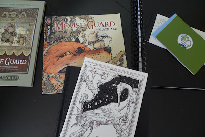 | | The tiny haul. |
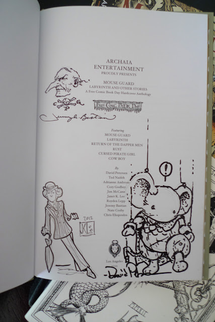 | | A few other Archaia FCBD book contributors were there! |

By: Corey Godbey,
on 6/18/2012
Blog: light night rains
( Login to Add to MyJacketFlap)
JacketFlap tags:
Add a tag
Din's Fire from The Legend of Zelda: Ocarina of Time is the coolest thing.
And to think of fire, something that's terrifying, wild, and out of control but in this context it's set into a gem and turned into a protective element, a force for good, is a powerful thought to me.
A quick piece I did for a friend. More or less another entry in my 'bit and run' series. At least in style, working method, and tone.

By: Corey Godbey,
on 6/15/2012
Blog: light night rains
( Login to Add to MyJacketFlap)
JacketFlap tags:
Add a tag
Here's a look at the steps of completing this illustration. To see the thumbnails and original idea, visit the previous post.
 | | The figure silhouettes. |
 | | Detail. |
 | | Watercolored, knocked out and layered trees to play with. |
 | | Arranging the forest. |
 | | Most of the elements added. |
 1 Comments on Digital Forest pt. III [final], last added: 6/15/2012

By: Corey Godbey,
on 6/13/2012
Blog: light night rains
( Login to Add to MyJacketFlap)
JacketFlap tags:
Add a tag
The art request must have been written with me in mind: a forest, at night, roots, interconnected tree limbs, animals, stars, fireflies, and a small group of figures admiring it all.
I really enjoyed my time on this piece. For this second post we'll walk through the conceptual stage. I did a few variations of the art request. I'm a little envious of those people who do a zillion thumbnails to find their piece. It must be nice to think of a lot of different things. I tend to see it quickly and get the idea down or I just struggle with it for a while, nudging the elements around in my mind until I arrive. Usually though, I'll hear a request and immediately see it.
 | | The three options. |
 | | The refined thumbnail. B. |
I liked C. a lot because I would have gotten to do more trees but B. ended up being the best choice because I'd get to do larger, more involved figures (and trees) which is ultimately my favorite thing to do. I love organic shapes and human (or human-like) figures. So this was approved and I moved on to making all the elements. Working along the lines of the Zune commercial meant working (mostly) all digitally and I started to put together the pieces. Le Cadeau du Temps for Microsoft Zune.
Next time, Friday, we'll take a look at finishing the piece.

By: Corey Godbey,
on 6/11/2012
Blog: light night rains
( Login to Add to MyJacketFlap)
JacketFlap tags:
Add a tag
I don't often get to do editorial work or single, stand alone illustrations for magazines so when I do it feels like a treat. Here's a look at a one such recent piece.
The AD referenced my Microsoft commercial as a direction he wanted to go which I was thrilled to hear, I also don't get asked to work in that method too often either.
This week (M/W/F) I'll provide a look at the stages of it's creation.

By: Corey Godbey,
on 6/8/2012
Blog: light night rains
( Login to Add to MyJacketFlap)
JacketFlap tags:
Add a tag
Here is the collection of available original art from Menagerie!
Dimensions and prices are marked. The size stated does not take into account the mat. You can add two or three inches (in most cases) on each side to get the total size.
Shipping will be handled on an individual basis. (I would estimate insured, UPS shipping an additional $50 - $75. Of course I would get an exact quote before sending an invoice.)
* * *
To purchase or ask about a piece please email me by clicking here! Cory's personal email. Or use cory [at] corygodbey [dot com] One final note, payments will be accepted through a PayPal transfer. Enjoy!  | Gryphon I.
8" x 10"
$250 SOLD |
 | Gryphon II
8" x 10"
$250 |
 | Gryphon III
8" x 10"
$250 SOLD |
 | Il Canto di Braci
(The Song of Embers)
15" x 19.75"
$800 SOLD |
0 Comments on Originals now available! as of 1/1/1900

By: Corey Godbey,
on 6/6/2012
Blog: light night rains
( Login to Add to MyJacketFlap)
JacketFlap tags:
Add a tag
This Friday I'll be making available many of the originals from Menagerie (and some from The Hidden People) right here on the blog!

By: Corey Godbey,
on 6/1/2012
Blog: light night rains
( Login to Add to MyJacketFlap)
JacketFlap tags:
Add a tag
I'm terribly excited to show you the project I've been been working on for the past four months: my 2012 sketchbook, Menagerie.
_____________________________________________________________ $15, color printing, 44 pages, soft cover, perfect bound. 6" x 9" You can find it on my shop,
2 Comments on Menagerie! Now available!, last added: 6/1/2012

By: Corey Godbey,
on 5/30/2012
Blog: light night rains
( Login to Add to MyJacketFlap)
JacketFlap tags:
Add a tag
I've recovered from @SFantasticAL (mostly recovered).
Here are some of my acquisitions from the show. For the most part I bought books and small originals.
 | | Behold, the collection. |
_________________________________________________
 | | Omar Rayyan watercolor. |
_________________________________________________  | Scott Gustafson drawings!
We also got two books. |
_________________________________________________
 | | No kidding, this is the Source of Imagination. |
4 Comments on The Spoils of #SFAL, last added: 5/31/2012

By: Corey Godbey,
on 5/21/2012
Blog: light night rains
( Login to Add to MyJacketFlap)
JacketFlap tags:
Add a tag
Back home from @SFantasticAL, Spectrum Fantastic Art Live.
My expectation were absurdly high. And I'm in no way exaggerating to say they were blown away, destroyed, absolutely devastated the first evening. It was, hands down, the best.
I split a booth with Justin and we had the good fortune to spend some time with some of the most brilliant artists working today. It was humbling, inspiring, and exhilaratingly fun.
Unfortunately, we didn't take too many pictures. Here's a quick look at some of our time.
 | | Erin caught some Instagram action. |
 | I love doodling in books. For real.
Gives me something to do at the booth. |
 | | Tragically, the only shot of the booth we got. Wahhh... |
______________________________________________________
 | | Kansas City style. |
|
|
|
|


oh! I can't wait to see more from this project :) I am seeing "the hobbit" opening night this December and dressing up like an elf to boot!