What is JacketFlap

  • JacketFlap connects you to the work of more than 200,000 authors, illustrators, publishers and other creators of books for Children and Young Adults. The site is updated daily with information about every book, author, illustrator, and publisher in the children's / young adult book industry. Members include published authors and illustrators, librarians, agents, editors, publicists, booksellers, publishers and fans.
    Join now (it's free).

Sort Blog Posts

Sort Posts by:

  • in
    from   

Suggest a Blog

Enter a Blog's Feed URL below and click Submit:

Most Commented Posts

In the past 7 days

Recent Comments

Recently Viewed

JacketFlap Sponsors

Spread the word about books.
Put this Widget on your blog!
  • Powered by JacketFlap.com

Are you a book Publisher?
Learn about Widgets now!

Advertise on JacketFlap

MyJacketFlap Blogs

  • Login or Register for free to create your own customized page of blog posts from your favorite blogs. You can also add blogs by clicking the "Add to MyJacketFlap" links next to the blog name in each post.

Blog Posts by Tag

In the past 7 days

Blog Posts by Date

Click days in this calendar to see posts by day or month
new posts in all blogs
Viewing: Blog Posts Tagged with: demographics, Most Recent at Top [Help]
Results 1 - 10 of 10
1. Eventbrite Survey: conventions have achieved gender parity but some still feel unwelcome

EventBrite, the ticketing agency, caused a lot of talk last year when they released the results of the first survey of convention attendees with breakdowns on gender, spending and more.

They’ve done another survey this year, and the results are even more detailed. Rob Salkowitz has done a round-up over at ICv2 but the Beat has also been given an exclusive preview of some of the data on safety at the con.

The survey was done to provide greater insight into the multi-billion dollar fandom events and convention business, and surveyed 2165 total respondents over two weeks in May. Respondents were drawn from Eventbrite users, with a few from external respondents via social media. 94% of respondents attended a fan event or convention in the past 12 months, While the poll did not cover sexual orientation, race or ethnicity, it delved into gender, and the news is that as far as men and women go it’s now even steven. Also, there is far more gender diversity among purchasers of indie/alt.comix than among regular comics. And that attendees of Tabletop/role-playing games felt less safe than any other kind of event — perhaps because fans of these are actually USED to acting out? Just a guess there.


SO MUCH TO CHEW ON. For breakdowns read on:


Fandom Overall Has Achieved Gender Parity

eventbrite1.png

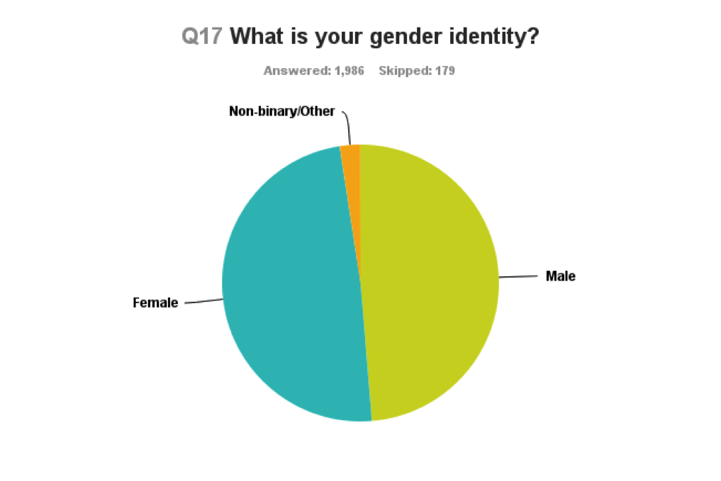
• Last year, in a survey using the same methodology and roughly the same sample size, the overall gender breakdown across all fandoms was 46% female, 54% male, but was 50/50 under age 30. (the survey did not provide a non-binary/other option in 2014)
• This year, gender identity breakdown across all responses was 48.9% female, 48.7% male, , 2.4% non-binary/other
• Fandom as a whole is trending female, with women very slightly outnumbering men in our overall sample.
• Under age 40, it’s 50.8% female/46.1% male/3.1% non-binary/other
• There are hardly any significant attitude or behavior differences expressed between male and female fans across most topics polled.


…but gender gaps remain across specific fan interest areas.

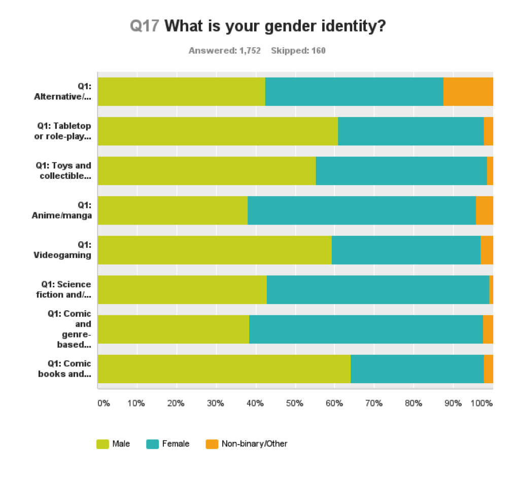
• Despite the overall trend toward women across all fan interest areas polled, no individual fandom is close to 50/50
• Tabletop and role-playing gaming and comic book fandom are where the boys are, clocking in at over 62% male.
• Female fans flock to anime/manga, science fiction and genre/comics-based media.
• Fans identifying as “non-binary/other” are most likely to be found in Alt/small press and anime/manga fandom.

Cosplayers are Intense Fans, Spenders, Frequent Con Attendees


eventbrite2.png

• 499 respondents, or around 23% of our sample, identified themselves as serious cosplayers and/or people who attend shows just to engage in cosplay
• The highest percentage – 29.4% – identified themselves as primarily manga/anime fans. 21% are fans of comic and genre-based media, and 17.7% science fiction and fantasy fans.
• More than 85% of cosplayers are under 40, with nearly 60% between the ages of 23-39.
• Cosplayers are predominantly female (62.5%), with 32% male and 5% non-binary/other
• Only 30% of cosplayers report spending less than $100 at shows. Most (42.7%) spend between $101-250, consistent with the spending patterns of non cosplayers.
• Cosplayers go to more cons than practically any other group. 64% of serious cosplayers attend 3 or more fan events per year. More than 27% attend 5 or more fan events per year.


Cons Generally Make Fans Feel Safe and Welcome
• When asked “In general, do you feel the fan events you attend do enough to make all attendees feel safe and welcome,” 7.2% of respondents (143 total)  said no. 92.8% said yes.
• Anime/manga and toy/collectible fans seem to feel their events do best, with fewer than 5% feeling unsafe.
• By far the worst fandom for safety is Tabletop/role-playing games, with around 17% of fans in that category answering “no.”
• Videogaming fans (mostly male fandom) response is at about 10%; comic and genre-based media (the most female fandom) is around the same.
• There were few statistical differences between how men, women and non-binary/other genders answered this question.


• Among those who feel unsafe and unwelcome:
o 53.5% are female, 45.1% are male, 1.4% are non-binary/other
o 20% are serious cosplayers. 44% do not cosplay at all.
o 40% have been going to cons for more than 10 years
o 35% spend $250 or more
o 85% go in groups of two or more, including family


1 Comments on Eventbrite Survey: conventions have achieved gender parity but some still feel unwelcome, last added: 6/30/2015
Display Comments Add a Comment
2. 30 Days of Teen Programming: How do you Know What's Needed?

teens in front of a graffitti muralThe first item in YALSA's Teen Programming Guidelines states, "Create programming that reflects the needs and identities of all teens in the community." And the overview of this guideline goes on to say:

In order to ensure that library programming meets the needs of all members of the community and does not duplicate services provided elsewhere, library staff should have a thorough understanding of the communities they serve. Library staff must continually analyze their communities so that they have current knowledge about who the teens in their community are. They must also develop relationships with community organizations already working with youth. Library staff play a crucial role in connecting teens to the community agencies and individuals that can best meet their needs.

The part of the overview that I think sometimes is difficult for library staff working with teens is the "continually analyze their communities so that they have current knowledge...." It's easy to get in a rut and not really notice how a community is changing and/or how needs and interests of teens change. For example, I live in a city that is going through a housing (and business) boom. Neighborhoods are changing in large and small ways. In some areas of the city where families never lived before families are moving in. In other areas of the city where teens were not a large population the age group in the area is growing, and in other areas it's declining. As the ways neighborhoods are changing is fluid, census data can't really help with continuous assessment as the data is older than you need it to be.

That means that the only way to continually check-on on teen populations and needs and interests is to connect deeply and continuously with the community. For example, At least three or four times a year (put it on your calendar) go out into the community and ask other agencies what they are seeing in terms of teen demographics and needs. Focus not just on schools, which is sometimes the easiest community partner to work with, but check-out Boys and Girls Clubs, youth employment programs, YMCA/YWCA's, parks and recreation departments, out-of-school time providers, and so on. In your community try talking to at least two new agencies that work with teens at least every quarter.

Make sure that you don't go in and say, "Here's what the library has and does for teens." Instead go in and ask questions about what the agency staff notice that teens need and what's missing in what teens have access to. Make sure to ask what the demographics are of the teen population that the agency works with. Don't assume that the demographic you see the most is what the rest of the community is seeing and working with. If you notice that there's a difference that's something for you to pay attention to and consider in terms of the best way to serve different teen populations.

I know that time can be an issue when working on a plan like this. It takes time to schedule a visit, prepare for the visit, have the visit, analyze the results of the visit, and then keep in touch with the community agencies that you talk with. However, if you do take the time to go out and hear what others have to say about teens in the community, you'll be able to develop programs that meet the needs of actual teens in your area. As a colleague of mine says, "I learned not to program from the gut." If you work with the community to continuously analyze your teen population you won't program from the gut you'll program for an actual need.

Add a Comment
3. Is your commute normal?

Ever wonder how Americans are getting to work? In this short video, Andrew Beveridge, Co-Founder and CEO of census data mapping program Social Explorer, discusses the demographics of American commuting patterns for workers ages sixteen and above.

Using census survey data from the past five years, Social Explorer allows you to explore different categories of American demographics through time. Here, Beveridge walks viewers through the functionality of the “Transportation” category, revealing the hard truth of Americans’ car dependency, as well as the true scope of the bike-to-work trend gaining speed across college towns and urban areas. Want to see how your travel time stacks up to the rest of the population’s workers? Use the “Travel Time to Work” category to explore other American commuting trends, or explore the various additional categories and surveys Social Explorer has to offer.

Whether it is the speed, assumed efficiency and control, or the status-marker of the automobile that makes it so ubiquitous, the numbers don’t lie – for most Americans, “going green” may be only secondary to “catching green” (lights, that is).

Featured image credit: Charles O’Rear, 1941-, Photographer (NARA record: 3403717) (U.S. National Archives and Records Administration). Public domain via Wikimedia Commons

The post Is your commute normal? appeared first on OUPblog.

0 Comments on Is your commute normal? as of 12/3/2014 6:59:00 AM
Add a Comment
4. Watch Comics by the Numbers with Brett Schenker and The Beat

This year at Baltimore Brett Schenker and I presented a panel called Comics by the Numbers Panel. Schenker is a political analyst and the author of perhaps the most cited post ever on The Beat, the much loved not at all controversial post Market Research Says 46.67% of Comic Fans are Female. The pane; was taped and you can watch (or probably better, listen) above. Depsite it being the first panel on Saturday there was a healthy audience of about 30-40 people, and the questions were really smart and engaged, which is the best you can ask on a panel.

Because you can’t see our slides, we’ve embedded them below.

This is an incredibly important topic for comics and all of pop culture, and I’m gald t be able to make this information available to all. For those who might want to confer further with Brett, his website is here, and he’s @graphicpolicy on Twitter.

1 Comments on Watch Comics by the Numbers with Brett Schenker and The Beat, last added: 9/13/2014
Display Comments Add a Comment
5. Number crunching shows female con attendees growing at rate of 62% at NYCC


Using numbers from this (itself very interesting) ReedPOP media kit, Janelle Asselin ran numbers on New York Comic-Con demographics, with an eye to growth by gender. The result:

Men
2010: 65% of 96,000 total = 62,400 men
2013: 59% of 133,000 total = 78,470 men

16,070 more men in 3 years
26% growth rate

Women
2010: 35% of 96,000 total = 33,600 women
2013: 41% of 133,000 total = 54,530 women

20,930 more women in 3 years
62% growth rate


Note the 40/60 f/m ratio falls within the “Golden mean” that we seem to be seeing everywhere. As I’ve opined before, this quick shift in gender balance is part of why we’re having so much turmoil as new roles are assigned and explored. But it’s all good in the end.

4 Comments on Number crunching shows female con attendees growing at rate of 62% at NYCC, last added: 7/10/2014
Display Comments Add a Comment
6. Can the shape of someone’s face tell you how healthy they are?

By Anthony J Lee


You can tell a lot about someone from their face, from simple demographic information such as sex and ethnicity, to the emotions they’re feeling based on facial expressions. But what about their health? Can the shape of someone’s face tell you how likely this person is to catch the common cold?

Studies have found that some facial attributes are associated with having good health. For instance, individuals with physically attractive faces report better health, are perceived as more healthy by others, and score better on objective health measures. Similarly, facial sexual dimorphism (i.e., the masculinity of male faces and the femininity of female faces) also appears to be associated with better health outcomes.

This ability to judge someone’s health based on facial features may be particularly important when choosing a sexual or romantic partner. This is because this will be someone with whom who you spend a lot of time in close proximity with, conditions in which pathogens or diseases are easily transferable from one person to another; also, any resulting offspring may inherit susceptibility to pathogens from their parents. As a result, humans have evolved to prefer facial cues of good health when choosing a sexual or romantic partner. This preference for facial attractiveness or sexual dimorphism may be stronger in those who are more sensitive to pathogen or disease threats.

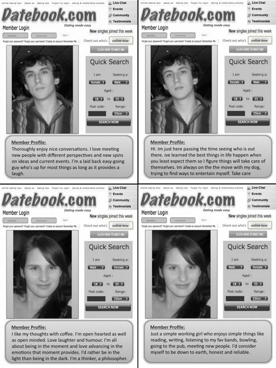
To test this, in a recent study we asked a large sample of participants to rate the appeal of ostensible online dating profiles. Each profile contained a facial photograph and a personal description, which were embedded in a dating profile template – some examples are shown below. Photographs were chosen to represent a wide range of facial attractiveness, and these were manipulated with special software to be more or less masculine/feminine. Personal descriptions were chosen to represent a wide range of perceived intelligence. Participants also filled in a questionnaire that measured their pathogen disgust – an individual’s level of aversion to exposure to pathogen contagions that could threaten their health.

Examples of dating profiles with male (top) and female (bottom) profile pictures, as well as masculinised and intelligent (left) and feminised and less intelligent (right) pictures and personal description. Note varying degrees of facial attractiveness and intelligence were used.

Findings supported our predictions. For both men and women, individuals higher in pathogen disgust reported greater attraction to facially attractive profiles compared to those with lower pathogen disgust. Similarly, individuals with higher pathogen disgust also showed a greater preference for profiles higher in facial sexual dimorphism. The same effect was not found for the perceived intelligence of the profiles. In fact, interestingly, the more participants preferred facially attractive and sexually dimorphic profiles, the less they preferred intelligent profiles.

While human attraction is a complicated process influenced by a large number of factors, this research suggests that an individual’s perceived health is an important factor when assessing a potential partner’s attractiveness. We found that individuals who are sensitive to pathogens place greater importance on traits associated with good health – in this case, facial attractiveness and facial sexual dimorphism – and we were able to show that these effects occur in circumstances relevant to contemporary settings (i.e., internet dating). It appears that evolved mechanisms shift around what we want in a partner in ways we’re not even aware of, and we’re only just beginning to reveal these fascinating processes.

Anthony J Lee is a graduate student at The University of Queensland, School of Psychology in Australia. His research interests include the role of sexual selection and mate preferences on human evolution; in particular, how contextual factors (such as pathogen prevalence and resource scarcity) influences human mate preferences, as well as preference for genetic quality in a mating partner. He is the author of the paper ‘Human facial attributes, but not perceived intelligence, are used as cues of health and resource provision potential’ in the Behavioral Ecology journal, which is available to read for free for a limited time.

Bringing together significant work on all aspects of the subject, Behavioral Ecology is broad-based and covers both empirical and theoretical approaches. Studies on the whole range of behaving organisms, including plants, invertebrates, vertebrates, and humans, are included. Behavioral Ecology is the official journal of the International Society for Behavioral Ecology.

Subscribe to the OUPblog via email or RSS.
Subscribe to only environmental and life sciences articles on the OUPblog via email or RSS.
Subscribe to only health and medicine articles on the OUPblog via email or RSS.

Image credit: Datebook profiles image used with permission of A. J. Lee. First published in Behavioral Ecology journal.

The post Can the shape of someone’s face tell you how healthy they are? appeared first on OUPblog.

0 Comments on Can the shape of someone’s face tell you how healthy they are? as of 12/24/2012 4:55:00 AM
Add a Comment
7. Turning Data into Dates

By Sydney Beveridge


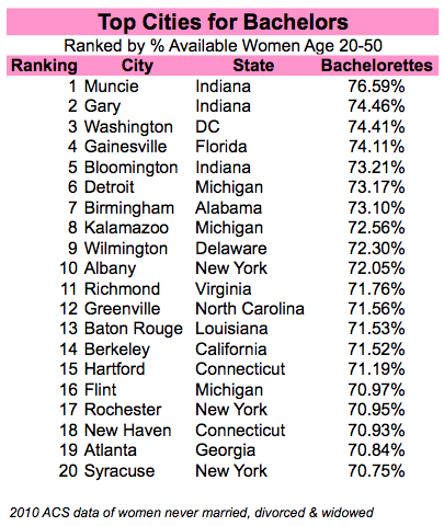
Cupid scours a trove of demographic data to guide his arrows. This Valentine’s Day, let Social Explorer help you map your way to love.

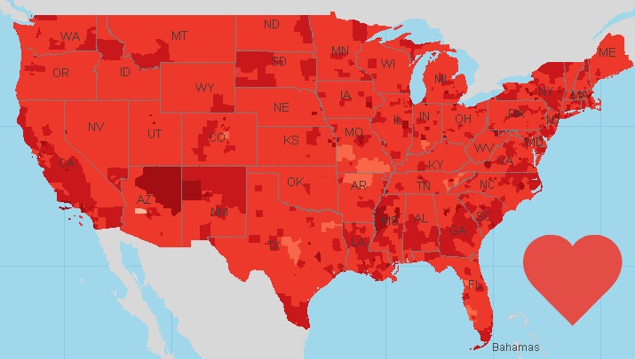
Look up information on the 59.7 million available men and 67.4 million available women across the nation (available meaning unmarried, divorced, separated or widowed). These bachelors and bachelorettes can be sorted by age group, geography and more as you develop your demographic dating plan.

Map of 2010 American Community Survey Never Married Population

For instance, Donald Demographics wants to know where the single ladies are. Using the data sorted by city, he can identify where lots of available women dwell. Since he has a thing for women with accents, he can refer to the “Sex By Place Of Birth By Year Of Entry For The Foreign-Born Population” table to help find an international lady.

Debbie Data is looking for a smart, financially stable man. She can use Social Explorer’s “Median Earnings By Sex By Educational Attainment (In 2010 Inflation Adjusted Dollars) (For Population Age 25+)” table to see which neighborhoods she should hang out in to find more of such guys.

She can even target neighborhoods where more people have health insurance — a really hot trait — by using the “Health Insurance Coverage Status By Sex By Age” table.

She also has a thing for arty types, and can keep an eye out for areas with more men in that occupation by consulting the “Sex by Industry” table. More into an outdoorsy crowd? Try areas with larger numbers of men or women in farming, fishing and forestry.

Check out Social Explorer’s maps and reports for more information on dating possibilities in your neighborhood and beyond. It’s the perfect opportunity to try out our custom colors in pink, red and more.

Happy Valentine’s Day from Social Explorer!

Sydney Beveridge is the Media and Content Editor for Social Explorer, where she works on the blog, curriculum materials, how-to-videos, social media outreach, presentations and strategic planning. She is a graduate of Swarthmore College and the Columbia University Graduate School of Journalism.

Add a Comment
8. If the World Were a Village

Smith, David J. 2011. If the World Were a Village. Ill. by Shalagh Armstrong. Tonawanda, NY: Kids Can Press.

First published in 2002, If the World Were a Village, received a much-needed update this year.  The colorfully-painted, folk-art illustrations haven't changed, but the statistics have been updated.  As with the original book, the numbers are fascinating to contemplate, and offer Western children a look at the world from a much larger vantage point than the one with which they are familiar.

The premise of the book is simple.  Proportionately reduce the world's population to 100 people and examine the demographics. Here are just a few of the many facts in If the World Were a Village:

How many people in the village of 100 have electricity?

76 have electricity
24 do not

Of the 100 people in the global village

61 are from Asia
14 are from Africa
11 are from Europe
8 are from South America, Central America (including Mexico), and the Caribbean
5 are from Canada and the United States
1 is from Oceania

How much money do people in the global village have?

If all the money in the village were divided equally, each person would have about $10,300 US dollars per year. But in the global village, money isn't divided equally.

The richest 10 people have nearly 85 percent of the world's wealth. Each has more than $87 500 a year.

The poorest 10 people have less than $2 a day.

Language, age, religion, food, environment, school, money, energy and health are also featured, along with extensive source notes.


I'm so glad that it's been updated. In today's world, politics, society, environment and economics are all global issues.  This is a must read.

A teacher's guide is available from Kids Can Press.

Today's Nonfiction Monday is at Apples with Many Seeds.  Be sure to stop by.
9. Learning The Way Around

One of the things that keep a person engaged is finding new locales to explore.

A person doesn’t have to take a plane, train, bus, or even a car. All that’s required is physical mobility. Some use feet, others use personal wheels. Sometimes when the weather is bad, a leisurely finger walk through the yellow pages can give a person an entirely new look at their hometown.

When Sister Jo and I go into a new town where we’re going to spend a few days, I look at the yellow pages as soon as I can. From those pale tissue leaves I discover the range of amenities available to locals and visitors alike. The demographics of the community are contained with that phone book section.

If you don’t believe me, go to the restaurant section of the pages. See what’s available for your dining pleasure. How many Mexican restaurants are there? Chinese, Thai, or Japanese? What about Mid-Eastern fare? Any Russian, French, or American Steak Houses? These numbers often reflect the population of an area.

What about churches? What denominations are there and how many of each can one choose from?

Is there a dealership where you can take your car if something goes wrong or you need an oil change? What if you need a new tire? Can you find a reputable local tire dealer that won’t cost you the contents of your bank account?

Sheer volume of entries in the yellow pages, their sizes, and the boldness of print tell the explorer much about where they are and what they can expect while in the area. This kind of information is overlooked many times in favor of asking available locals specific need-to-know questions. That’s fine, too, but laborious in nature. The phone book holding the yellow pages also gives you a map of the town so that you can find your way around without having to use the trial and error method.

Much entertainment can be reaped by locals from tourists asking those “Can you tell me…?” questions. Ask any farmer outside any small town how much fun it is to give directions to newbies.

Of course, if you ask the right questions and pay attention in the right locales, you can find your way around easily. Oklahoma is one of those places. The state’s smaller road system is set up on a one-mile grid and named accordingly. That holds true everywhere with one exception. Those areas in former logging areas along the eastern edge of the state and where rivers and lakes don’t allow for straight roads.

Local signage also clues the traveler as to the demographics of an area. There are clues everywhere. It’s up to the visitor to look for the gems.

Here’s an example from yesterday. We took in a local fresh-air farmer’s market in Templeton, CA. There was almost a carnival air to the occasion. Kids ran and played while parents selected the best of the locally grown produce.

We saw artichokes twice the size of softballs. I’ve never seen anything like them. Beside them were egg-sized purple artichokes. I’d never seen their like before either. Vine-ripened tomatoes that filled the hand snugged up against green onions that could feed three. It was marvelous.

The local historical society building was open for visiting where we found fodder for many future investigations. Watching the shoppers told another story. Old or young, they enjoyed the sunshine and produce presentations. Conversation was lively and relaxed

3 Comments on Learning The Way Around, last added: 4/11/2011
Display Comments Add a Comment
10. Librarian Demographics

If you offer me a choice between going to a conference program and observing the work of a committee or board…I’ll pick the committee  and board stuff almost every time. You’ll find debate, controversy, and loads of interesting discussions.

Yesterday, I observed the ALA Executive Board. They had a pretty interesting agenda, including a report on librarian demographics. It was fascinating stuff and merits discussion amongst a wider audience.

The demographers have not compiled their findings into a final report, and it will probably be a while before we see their interpretations. I’ll walk you through the slides, but keep in mind…while the numbers aren’t completely raw, you might consider them still medium-rare. As such I defer to the ALA Office for Research & Statistics when it comes to explaining all the charts and graphs. And keep in mind these caveats: this data represents particular snapshots and projections. It can be difficult to predict trends.

Slide 3: Credentialed Librarians by Age, 2005

These numbers are from census data, meaning this represents librarians throughout the US. There is an obvious bubble in the Baby Boomer age group, but interestingly, the numbers are concentrated in the first half of the Baby Boom. One of the demographers mentioned that the number of MLS degrees issued peaked in the 1970s. As the Boomers aged, they continued to join our profession, so the number of librarians in this age group continued to grow across the next thirty years. Note these numbers are for  2005, so projecting forward, 40% of librarians are age 54-63.

Slide 4: GM Auto Workers by Age and Sex, 2006

This is here as a comparison to other professions and industries. The same Baby Boom bubble is apparent, but you’ll also notice the steep decline around age 45. Seniority rules mean that workers under 45 are most likely to be laid off, so they’re simply not present in the GM workforce.

Slide 5: Credentialed Librarians by Gender and Age, 1980 & 1990

These are snapshots of the profession in 1980 and 1990. In 1980, the Boomer bubble occurs around age 30, and overall the profession appears fairly young. In 1990, the Boomer bubble has moved to age 40 and grown a bit in the meantime.

Slide 6: Credentialed Librarians by Gender and Age, 2000 & 2005

By 2000, the Boomer bubble has reached 50, and in 2005, it’s at 55. Since 1980, the profession has aged significantly.

Slide 8: Credentialed Librarians by Gender and Age, 1995

Same stuff we just saw, this is here to make the next couple of slides possible. Can you spot the Boomer bubble?

Slide 9: Credentialed Librarians Growth 1995-2005

Alrighty. The light blue represents the 1995 numbers aged forward 10 years.  The purple shows  people who have entered the profession since 1995. Remember, this represents a sample, so it doesn’t mean that there were no 39 year old males or 54 year old females who became librarians from 1995-2005, it just means there weren’t any in this sample. If you look past the choppiness, you can still get a general idea of what is going on…librarians enter the profession at many different ages.

Slide 10: 1995 Credentialed Librarians Aged to 2005

Once again, same data from slide 8 aged to 2005, but this time (represented in light green) we’re looking at individuals who have left the profession (through retirement, death, career change, etc). The demographers mentioned that men tend to enter the profession earlier, and they follow more traditional (i.e. earlier) retirement patterns than women.

Intermission. Switch gears, we’re blazing ahead to the future.

Slide 11: Number of Credentialed Librarians by Age 1980-2006

Once again, we’re looking at snapshots of the profession at particular moments in time. This chart shows quite clearly that young librarians were prevalent in 1980, and we can watch the Boomer bubble (and the profession overall) age as we progress to 2005.

Slide 13: Projected 2015 Data

There’s the 2005 data from the last slide, alongside three different versions of what 2015 might look like. The first is based on the changes that occurred from 1980 to 1990, the second on 1990-2000, and the third on 1995-2005. While the projections are generally similar, note the differences in the 65-70 and 70+ categories. (There’s a funny dip in the 50-54s for the set on the right. Yup, it’s weird, and nope, the demographers aren’t really sure what’s going on.)

Slide 14: Percent of Credentialed Librarians Age 60+

The left half of the graph represents actual numbers, the right half are all 2015 projections, based on different rates as in slide 13. From what the demographers said, I got the impression that the 1995-2005 scenario is mostly likely. You can see that from 1980-2000, the number of librarians aged 60+ was fairly constant at 10%. In 2005, it jumps to a little over 15%, but in 2015, we’re looking at 27-30% at age 60+.

Slide 15: Estimated and Projected Credentialed Librarian Retirements by Decade

This chart illustrates the impending wave of librarian retirements that we’ve been hearing about for a while. We’re already four years into the 2005-2015 projections. Of course, in recent years we’ve witnessed that Boomers are delaying retirement.

Slide 17: Projected Retirements of 2009 Domestic Working ALA Members

This slide represents just ALA members.

Slide 18: Anticipated Member Retirements 2009–2020

More ALA member-only data. The graph on the left is actual 2009 numbers, while the middle and right graphs are projections. Like slide 10, the projections show 2009 members aged forward to 2015 and 2020, with light green representing anticipated retirements (or people leaving the profession for other reasons). Notice the growth in the 70+ category.

Slide 19: Credentialed Librarians: Hours Worked by Age and Gender

I think we’re back to census data, but don’t quote me on that. This slide shows a general trend towards part-time work as librarians age. (Again, this is a sample, not everybody, so there’s potential for a certain choppiness. Yes, there are  probably 70+ year old males somewhere who worked 33 hours a week, it just happens that there weren’t any in this sample.)

Slide 20: Census Credentialed Librarian vs. ALA Membership Age Distributions

This might be one of the most interesting charts, but also the hardest to interpret. Here we compare total librarians compared to ALA members. My notes say that this is data for 2005. I think the member data used is from 2009, adjusted backwards for 2005. Note these are percentages; I’d like to see the actual numbers. At first glance, it looks like younger librarians are more likely to be ALA members. Of course, students enrolled in library degree programs aren’t credentialed, and therefore not included in the census numbers  (those are the blue bars). I’d like to see library school students included in this data somehow. The difference between ALA members and total librarians might also be affected by the definition of credentialed librarian. It looks like the turnaround point for ALA membership is age 40, but when asked about this, the demographers mentioned that ALA’s drop in market share with regards to membership begins around age 30. (I’d really like to see more data there.)

Alright, that’s a lot to digest. Interesting to consider it alongside discussions about how to make ALA more responsive to younger members. What do you think?

bookmark bookmark bookmark bookmark bookmark bookmark bookmark bookmark bookmark bookmark

Add a Comment