new posts in all blogs
Viewing: Blog Posts Tagged with: web site, Most Recent at Top [Help]
Results 1 - 15 of 15
How to use this Page
You are viewing the most recent posts tagged with the words: web site in the JacketFlap blog reader. What is a tag? Think of a tag as a keyword or category label. Tags can both help you find posts on JacketFlap.com as well as provide an easy way for you to "remember" and classify posts for later recall. Try adding a tag yourself by clicking "Add a tag" below a post's header. Scroll down through the list of Recent Posts in the left column and click on a post title that sounds interesting. You can view all posts from a specific blog by clicking the Blog name in the right column, or you can click a 'More Posts from this Blog' link in any individual post.

By: ALSC Children and Technology committee,
on 10/10/2015
Blog:
ALSC Blog
(
Login to Add to MyJacketFlap)
JacketFlap tags:
autumn,
fall,
Technology,
nature,
science,
websites,
Programming Ideas,
Web site,
families,
Digital World,
programming,
apps,
Children & Technology,
Blogger Children and Technology Committee,
Children and Technology committee,
Add a tag
Autumn has arrived here in Northeastern Ohio, bringing with it crisp weather, all things pumpkin, and beautiful fall foliage. The trees are only starting to reveal their brilliant hues of orange, yellow, gold and red here, but soon I’ll awaken to a glowing landscape that seemingly exploded overnight. As this season traditionally brings many requests for fall themed library materials, as well as special fall programming, I was inspired to think of ways that technology may add further enjoyment and educational opportunities to this time.
The best way to experience the beauty of fall is to strap on your hiking shoes and venture to the nearest wooded park (or your backyard!). Bringing along your smartphone or tablet, loaded with fall foliage apps, can enhance your exploration of autumn’s beauty. Children of a variety of ages will enjoy learning more about our natural environment with these apps and websites highlighted below, although most young users not yet in elementary school may need some parent or caregiver help.
- Yankee Leaf Peepr– This free app by Yankee Publishing Inc., available for Apple and Android devices, provides you with a very handy color-coded map that indicates where the leaves are changing anywhere in the United States. Users contribute to the map by posting photos and ratings of the foliage, making this app not only useful, but

Image from https://play.google.com/store/apps/details?id=com.ypi.leafpeepr&hl=en.
interactive. The current foliage color is determined by averaging user ratings in a geographic area.
- Chimani apps- These apps, offered as free downloads on all major mobile platforms, are a really fun way to explore various National Parks. They help you with planning your trip, letting you know when Ranger-led trips occur, and more. These apps work with or without WiFi or a data signal, which is especially helpful when you are out on the trail.
- LeafSnap– Once you’ve found some beautiful leaves, you may be left wondering what kind of tree they’re a part of. Make this a great learning opportunity with LeafSnap! Developed by researchers at Columbia University, the University of Maryland, and the Smithsonian Institute, LeafSnap helps users identify trees by allowing users to take a picture of a leaf from the tree and then providing them with the species. The app is free for iPhone and iPad, and also has a website displaying tree species. The only negative is that this is only usable for species found in the Northeastern United States and Canada.
- U.S. Forest Service website and Yonder app– The U.S. Forest Service has partnered with Yonder, a free app, to help nature lovers share their adventures. The website also provides a map of fall color based on eyewitness accounts and allows users to choose their state or local forest to see specific fall foliage information. You can find weekly color updates in your state using this tool!
- Foliage Network – The fall foliage prediction map on this website helps users visual the changing leaves around the United States and plan when to see the most beautiful colors in your neighborhood.
You can pair these fun apps and websites with traditional activities for a great autumn library program. How about leaf rubbing (which was recently discussed here on the blog), sharing a classic fall read-aloud such as Ehlert’s “Red Leaf, Yellow Leaf” and then using LeafSnap to identify the tree outside the storytime window? There are many possibilities to incorporate technology and nature into library programs and family time. What are some of your favorite hi- or low-tech autumn extension activities? ___________________________________________________________
Nicole Lee Martin is a Children’s Librarian at the Rocky River Public Library in Rocky River, OH and is writing this post for the Children and Technology Committee. You can reach her at [email protected].
The post Exploring Autumn with Apps and Websites appeared first on ALSC Blog.

Traffic
आज गूगल सर्च के दौरान जब गूगल का साईन देखा तो समझ नही आया कि ये क्या है … उसमे ट्रैफिक लाईट बनी हुई थी और ट्रैफिक भी था. पर भला हो नेट का बहुत जल्दी पता चल गया कि आज ट्रैफिक लाईट का 100वा जन्मदिन है …

सडक के ट्रैफिक के साथ साथ सोशल साईटस पर हमारा भी ट्रैफिक बनाए रखिए … शुभकामनाएं !!! Best wishes !!!
The post Traffic appeared first on Monica Gupta.
Since it’s Valentine’s Day, it’s a great day to show some love to my favorite blogs. Early in my career, blogs became my go-to resource for program planning and I follow quite a few in an RSS feed I can barely keep up with. (Am I the only one who still uses an RSS feed? I hear they are not widely used anymore, but I still find it quite useful!)
These are blogs, all authored by children’s/teen librarians, that I use time and again when planning programs, whether technology-based or otherwise. I hope you’ll find them useful in your own program planning!
Robot Test Kitchen—I don’t think this newish blog has been mentioned here before and I am super duper excited to tell you about it. Run by four librarians in Illinois (hi Heather, Jacquie, Michelle, and Sharon!), it covers all things tech as they relate to children’s and teen services in public and school libraries. They do product reviews (littleBits, Cubelets, LEGO WeDo, Sphero, Bee-Bots—they’ve all been covered), share program plans, and have a series called Ten Dollar Tuesdays, which features inexpensive programs that cost—you guessed it—under $10. My favorite feature is their True Confessions posts, in which they lay bare their doubts, fears, and frustrations. If you’ve ever experienced imposter syndrome or felt like you failed at a program (and haven’t we all?), these posts are so reassuring!
Library Makers is run by librarians at the Madison (WI) Public Library and features “non-traditional” programs they do for all ages. There’s WonderWorks, a series of STEM classes for preschoolers; Supper Club, an evening app-based storytime; Toddler Art Class; Craft Lab for teens; and even NeedleWorks, a sewing class for teens and adults. They provide everything you need to know to replicate the programs at your library, including materials lists and “hindsight tips.”
Jbrary—If you haven’t taken a look at all the fabulous resources offered by Jbrary, you must do so immediately! Dana and Lindsey, the two librarians who run Jbrary, write about a wide range of library programs and services, including storytimes, tween book clubs, reading lists, booktalking, and many other varied topics. And what’s really amazing is the wealth of additional resources they produce. Looking for new songs and rhymes to use in storytime? Look no further! Check out their YouTube station (which has over ONE MILLION views) or their Pinterest boards (which have almost 4,000 pins).
Thrive Thursday—Ok, so this isn’t a blog so much as a monthly round-up of blog posts about programming for school-age kids. But if you’re looking for program ideas for the elementary school set, you’ll definitely want to check this out! All their round-ups can be found on this Pinterest board.
Hopefully some of these are new-to-you resources that you’ll find invaluable. I also want to give a shout out to a few other favorites: Little eLit (new media in libraries), Mel’s Desk (baby storytimes) and Storytime Underground (all things storytime). If they’re unfamiliar to you, I encourage you to check them out as well!
Liz Fraser is Coordinator of Children’s Services at the Belmont (MA) Public Library and serves on the ALSC Children and Technology Committee. She writes about library programs for kids at Getting Giggles and can be found on Twitter as @lizfraserlib.
The post Blogs to Love appeared first on ALSC Blog.

Today's visit...The Drawn Blog
It's your daily source of inspiration for illustration, animation, cartooning, and comic art!
You know when you put something off so long that the problem solves itself? And by that I mean, melds with another problem so you just have one big problem? I meant to do a little post about my newly revamped website, and also to post on this poor, dusty blog more than once every six weeks.
In any case, I made a new front page image, based on that earlier painting and folding in illustration with design:
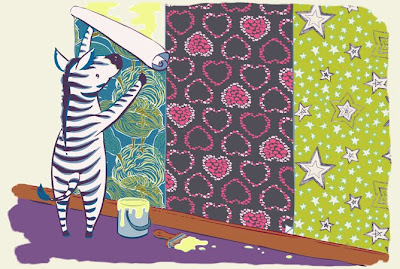
I'm super happy with how he came out, and have been circling the piece since, trying to figure out how to build off of it.
Okay, first problem/thing I procrastinated about solved! The other thing I wanted to talk about went live yesterday.
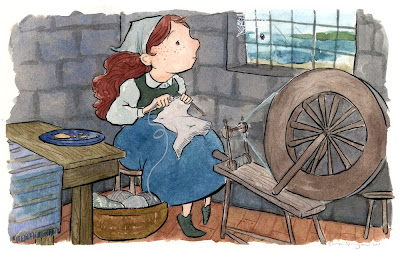
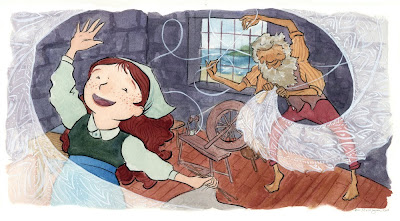
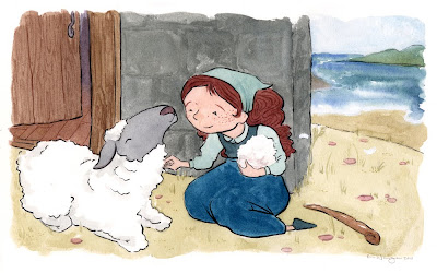
I have a new story in Twist Collective!
I've taken to describing this assignment as Illustrator Bait. It's a three-part narrative with a lonely peasant girl and magic and hand lettering and knitting. Take a look, but kindly click on the above link to see the pieces in context and read Daryl Brower's lovely story:
What was especially nice about this job was how smoothly I worked, compared to the last story I did for Twist Collective. Straight out of school, I was so nervous about messing up the paintings that I worked them half to death. I also managed to schedule a three-day interview the week before they were due, so I was both panicked and exhausted. On the (very) plus side, my fee for that job and the money I made selling the paintings paid for first, last, and deposit on the apartment I'm still living in today.
Alright, posting completed! In a fit of productive procrastination, I also reinvigorated my Etsy shop (yes, again), so the paintings are for sale there, among posters, notebooks, and cards. As usual, tell your rich friends.
Until next time (October?)!
I subscribe to the hard copy magazine Writer's Digest. I highly recommend it regardless of your genre, style, or target market. Their website sends me too many emails for my purposes, but the magazine itself is terrific.
One of my favorite features is their yearly "101 Best Websites for Writers."
I don't want to steal their thunder NOR get myself in trouble for quoting too much of the article or
Claim your button! We’ve recently add our own buttons (or widgets) to our blog that give you the opporunity to help support ALSC. What are we talking about? These little things:
 and
and 
Like our buttons? You’re welcome to help yourself. Put them on your blog and help us reach out to all of the people out there who are interested in possibly becoming an ALSC member.
Have a blog but don’t know how to install your button? Check out the ALSC Wiki for a handy-dandy guide to installing ALSC buttons. Happy blogging!
By the way, thanks go out to ALSC Blogger Lisa Taylor for suggesting this idea!
Christian Children's Book Review is having a terrific give-away! Hurry over to their site and get your name in the hat.
As a new year begins, it is a good time to consider ways to partner with other organizations in your community. ALSC is involved in many projects and partnerships. For descriptions of some of the latest activities, visit the ALSC Web Site –>Initiatives –> Partnerships.
Hey guys!
Come see my new website! Just launched today - took longer than I thought!
Thanks to hubby for spending so much time finishing it for me!!!!! (Love you babe!)
S.R.Johannes
Let me know what you think.
BAM! Body and Mind (http://www.bam.gov) is maintained by the U.S. Department of Health and Human Services’ Centers for Disease Control and Prevention. This site helps to answer kids’ questions about health issues as well as recommend ways to make their bodies and minds healthier, stronger and safer.
This is one of many sites recommended in the Biology section of the ALSC Great Web Sites for Kids (http://www.ala.org/greatsites).

By:
David Billings,
on 4/3/2009
Blog:
Sparky Firepants Art Blog
(
Login to Add to MyJacketFlap)
JacketFlap tags:
freelance,
client,
sparkyfirepants,
visual designer,
Client Profile,
design,
tips,
life,
illustration,
work,
lessons,
business,
philosophy,
project,
web site,
Add a tag
Dear Freelancing Artist,
Did you know there are hidden rewards in a freelance art career? Rewards that take you farther than the ability to buy tonight’s keg, that is. If you’re new to freelancing as an artist, you need to hear this. I wish they taught this stuff in art schools. It’s about sustaining your career in the long term. It’s about building something more than a permanent “side” business. It’s about truly going out on your own and feeling awesome about it. Read on!
The Perspective
As a freelancer, I do my share of one-off projects. There’s that package design illustration for a kid’s snack container. There were the custom avatars, a few icons, a web site header. They’re nice, these one-offs. I enjoy them (because why else would I fire up my computer every day), but the projects I do my best work on are the ones that require lots of chatting, e-mails, and idea-tossing. Those are the ones that blossom into an ongoing, mutually beneficial relationship.
Womb to Bloom is one of those relationships. 
The Womb to Bloom web site is an online community and resource for new moms and moms-to-be, “Maternity and Beyond.” Awesome concept, amazing potential for growth.
The Client
The Womb to Bloom founders (Greg and Heather Zellers) and I reached each other through a gig-type site about some animation work they needed done. It’s no secret that I love to talk with people about their projects. First, it’s just fun (I geek out on web and TV development). Second, it helps me frame my portion of their project with a reference that controls the budget. It’s also easier to offer new ideas without going off on crazy tangents.
So when they called, we talked a lot about what the animation could be. It also happened that they needed some simple illustrations and icons that would tie everything together. This is where I started drooling on my phone because I loved the site concept, they had a great logo already, and the web development was already flowing.
The Concepts
The initial concept was to have a central “mom” character to base everything on. Once we nailed down that character design, the icons and other illustrations would flow. I was already loving this project because it made sense before I even got out my pencils. It was also very easy for me to create a project plan that worked with their budget.
Although we had some great early chats about concepts, I have to admit that the initial brainstorm sketches I created were a little… off. The style of my first sketch was just somewhere between Family Guy and Rugrats. But this is the part that makes my job awesome, because we were able to use those sketches as a jumping-off point and keep the conversation going.
So we chatted in greater detail about Greg and Heather’s ideas. What they wanted was an attractive, hip, and fairly trendy woman who could transition easily from pre-pregnancy to new mom. The next sketches were right on target and ready for vector illustration and color. Below is a final concept image:

Incidentally, I created all the final art for this project in Adobe Illustrator CS3. In the very near future I’ll be providing step-by-step instruction on how to create this kind of work, so graphic designers, web designers, and traditional artists can reap the benefits of my experience. Yay!
A few things made it easier to create the final art for this project. They already had a logo, so I had specific colors to choose from. Greg and Heather really knew what they wanted to see. They couldn’t always sketch out an example or articulate a style, but once I gave them a sketch to go on we had a basis for conversation. They knew their demographic, which translated very well to visual goals.
The Work
I know, I know. You want to see sketches. I hear ya. Here’s a great, simple example of how an illustration concept developed. One of the sections on the web site is for contributors. We started out with the idea of a smart-looking woman (new character) in a cafe with a laptop. I sketched it out and hit the mark, woo-hoo! However, we did decide to go with the main character after all, and you can peek at the results:

As an even better demonstration of how a project can progress and a great relationship can generate even more fun ideas, take a look at what we finally used for that section of the site. I think it worked out nicely.
Another favorite illustration of mine from the project is the community section. The whole idea was to get moms together from all over the country and have them chat online, as if they were in someone’s living room. Pretty cool, right? I knew I had to thinkify something unique and fun, but also instantly communicate that idea. My first sketch:
 The question became, how do I divide this cozy little scene into sections that show that cozy closeness and distance at the same time? It turned out not to be so difficult with a little sleep and some coffee. After seeing the final art, they added a new wrinkle; let’s see an image of the U.S. behind them to really hit home the idea. Not one to shy away from a challenge, I came up with a funtastic solution. You can see the progression. I still like both. Good thing I didn’t have to decide.
 State of the Iconomy
The web site also needed some icons. About a hundred of them, in fact. I loved that I was able to work on this part of the project because I could take everything we had developed in the illustrations and use it to create the icon concepts. It worked out beautifully because we already had a flow going and could reference previous conversations. It turned out to be a lot of work, but also a ton of fun. You can see the icons all over the site, but here’s a sample page of a few I really like:
 Wrap it Up
This is the best part. We haven’t wrapped it up. The working together part, that is. After getting to know the Zellers through working with them, we’ve shared information, links, and even referred business to each other. It’s the ideal b2b relationship, where we mutually benefit beyond the exchange of service and money.
The truth is, I did find this client through a bid-type freelance gig site. I don’t love these sites because typically you’re bidding on projects in a vacuum. My whole method of working revolves around many conversations and lots of information exchange, which the bid sites make very difficult.
The thing that I took away from this is that bid sites can yield some good projects, but you have to be prepared to build a relationship beyond the one-off. If I see a project posted and I don’t feel that’s possible, then I move on. It’s just not my cup of chai.
If you’re new to freelancing, I can’t stress enough that long term relationship-centered business is one of the major keys to your success. You can work on a hundred one-off projects through a crowdsourcing site and make a little cash. That’s great. You can throw your artwork up on a stock site and make a few dollars for every download. Awesome.
Those activities will not sustain you for very long because you only come away with cash. I say “Big deal, Dude.” Anyone can make some quick cash these days. Create a free blog and stick a PayPal Donate button on it.
Remember that rewards thing, kids. If you want to keep the art thing going and get Mom and Dad off your back, listen to your Uncle Sparky.
By:
David Billings,
on 3/8/2009
Blog:
Sparky Firepants Art Blog
(
Login to Add to MyJacketFlap)
JacketFlap tags:
Software,
computer,
how-to,
web design,
web site,
geek,
adobe,
Product Review,
sparkyfirepants,
Training/Tutorials,
actions,
drag and drop,
freeway 5 pro,
javascript,
Softpress,
visual designer,
web-building,
Add a tag
Let me start by explaining how big of a geek I am.
I was one of the first of my friends to jump on that internet thing (will certainly fail), rely on e-mail as main source of communication (never last), and build myself a little thing called a web page (won’t be around for long). I’m what you call an “early adopter.” In twenty years I’ll be like Todd Rundgren or David Byrne, exploiting new technologies before my fans know they’re available.
Oh, and I’ll have fans.
I digress.
I learned HTML and a tiny bit of Java early on because I’m an impatient guy. I want a web page up NOW, not next Tuesday. So I searched Yahoo (pre-Google days) and taught myself how to code. It was fun, because I’m a geek and I do other insane things like make films one frame at a time. I even laughed at WYSIWIG editors because they were “the easy way out.”
Then I grew up.
Nowadays I love tech like Wordpress, Freshbooks, and AWeber. I’ve learned that “automated” and “template” are not curse words. I’ve now embraced the world of WYSIWIG (What You See Is What You Get, for the uninitiated). There was a tipping point when I decided that enough was enough, I wanted to spend more time being visually creative with my site and less time learning how to code things correctly. About the same time, my mother saw a copy of Freeway at the Apple store (I know, I know, my mother… shut up). She was itching to buy me something so I let her. I already had Dreamweaver with the Adobe Creative Suite, but I hadn’t even cracked it open. So I gave Freeway a whirl and created a new version of my web site.
Like any new app, I was at first befuddled by the menus, toolbars, key commands, windows, etc. Once I got into it and started seeing results, I was blown away. I’ve upgraded twice since then and I’m still loving it. However, I decided to combine my thoughts on Freeway itself and my review of Softpress’s latest version, Freeway 5 Pro (I’m using v 5.3.1 for this review).
Crack it Open
Installing Freeway on the Mac is pretty simple, as I would expect. By the way, I’m impressed by nice graphics on a software install because it usually means they don’t believe in afterthoughts on a product release. It reeks of careful planning and strategic branding, which I appreciate as a visually-oriented person. There’s also a very nicely formatted PDF help guide and I recommend doing the tutorials. I did it backwards (skipping them) but I probably would have learned more quickly that way.
Build Something
It’s pretty easy to get started building a site, even if you’ve never done it before. You can select templates for different themed sites if you prefer. I can see how it makes it easier to start, but the templates don’t appeal to me personally. If I wanted to get my 10-year old daughter building her web site, I would probably guide her towards a template. Savvy site builders will probably enjoy tinkering with a blank page to start.
I am the Master
If you’re familiar with master pages in PowerPoint or Keynote, then you already understand Freeway’s master page feature. The best use of Freeway is by choosing the CSS layout and using master pages. For example, I have a client who uses Freeway. I create his graphics (headers, icons, and such) and set up his pages for him based on a master. Then I just shoot him the necessary folders and Freeway source file so he can add his text, photos, or tweak things at will. If he gets stuck, I can guide him as long as he hasn’t messed with the master page.
Previewing and Uploading
Freeway has a nice preview feature. You can either preview your pages directly in the Freeway window (see also Improvements), or you can choose a browser and see it “live.” You can also upload the necessary files directly from within Freeway using the built-in FTP feature. Personally, I publish the site and upload my files using an FTP app, but I usually have other things I need to mess with on my site (client proofs, downloads, Wordpress stuff). I figure as long as I’ve got the hood open, I may as well clean the spark plugs.
Drag n Drop and Site Tweaks
Here we go. This is the number one, top-of-the-charts-with-a-bullet reason I love Freeway. Like I said, I’ve become more of a visual designer in recent years. One thing I like to do is create my site layouts in Adobe Illustrator. I can try things out visually and then figure out how to engineer them later.
When I found out that I could take the header I created in Illustrator and just drag the file right into Freeway, I was blown away. Seriously, astounded. This means that later, when my ever-changing creative mind goes wacky and I want to put a robot image in there instead of a pixie, all I have to do is tweak my Illustrator file and it automatically updates in Freeway. Then I just republish my site and it’s done.
As an artist with a gallery, I often go back in and update images on my site. This tool is just awesome for me.
I was also able to drag both the Quicktime movie of my demo reel and some Flash movies onto my animation page. A few control and quality settings and Bob’s yer uncle.
As an example of how quickly I can change something on my site, I recently decided to add a members club. In about four hours, I created a plan, set up the new pages, found some Actions (more on this later), inserted images, and had everything uploaded to my site.
In my world, I need to act quickly on these kinds of ideas and get back to illustrating and animating stuff. If I had to hand-code these updates, I would never do it. However, I should mention that because I have some hand-coding skills, I can look at the source file and at least understand where a trouble spot might be.
Meta and SEO
The buzz these days is SEO. It used to be that you would throw some keywords, a description, and a summary using META tags and you’d call it done. That’s still something you want to do and Freeway gives you an easy way to do it. However, that’s not the end. For a site to be truly searchable, you have to get key words and phrases integrated as part of your content.
As a visual designer, this is my main frustration. Without standards between browsers, my HTML text is going to look different on a Windows machine using IE than it will on a Mac using Safari, or an Ubuntu machine using Firefox. Using graphical text (users can’t select it in their browser), you have a lot more control over how your text will look across platforms. The rub is that search engines won’t find you with all graphical text, and HTML text is a crap shoot, unless you have several different machines to test on. There’s a section in the Freeway User Guide that states it succinctly: “…that’s the way life is with web design.”
Freeway gives you great options for choosing graphical or HTML text. I try to strike a balance between the two. One thing Freeway lets you do is go back and switch between graphical and HTML text in a block without changing any code. I can choose which text I think is important for search engines to pick up and which text I just want to control more closely.
Forms and Scripts
The time finally came when my site grew beyond the static brochure-type and I needed to make it more interactive (hence my new membership thingy).
The forms and actions included in Freeway 5 Pro are pretty handy. For example, I placed a Google map directly on my page with just a few settings to show where in the world Sparky HQ is. I figured it out in about five minutes after scrolling through the Actions panel for cool things I might want.
I also created PayPal Add to Cart buttons for the image licenses I sell on the site. Once I got the code from PayPal it was fairly easy to create the buttons. No graphic design necessary.
There’s a site called Actions Forge that’s specifically for creating and distributing Freeway Action scripts. At the time of this writing, there are 126 actions available, from rollover functions to password protection.
There are also options to insert markup language in your page. If you find a bit of code somewhere that you want to use, there are options for placing it (see also Tech Support). If you have no idea what I mean by markup language, then you probably won’t even use that feature. However, as your skills grow, you’ll discover it and love it.
Improvements
I’m sure that Softpress has an improved feature list on their web site and marketing materials. However, I specifically avoided looking for it because I thought it would be more fun to showcase the improvements that I noticed in my own work. Wasn’t that nice?
iPhone Support: The iPhone and Blackberry aren’t going anywhere. Handheld devices are just going to get better. Freeway has a new iPhone panel that helps you optimize your site for the mobile web.
Shape Menu: It’s small details like this that make my visual designer eyes perk up. My site has lots of rounded-corner boxes. When I want to make a shape in Freeway, I want it to be easy to manipulate. The updated shape menu makes this easier.
View Menu: I got used to the old way of previewing my pages in Freeway 4, but I wasn’t thrilled with it. Now the preview menu is right up top and easy to click. I preview my pages often, so this is a nice change for me. I can also access my master pages and link maps in the same bar, as if I were in a browser. For my efficiency, this small change is huge. Besides, it looks nicer.
Google Actions Suite: I mentioned Actions before, but this is new. I use Google Analytics and this integration is just awesome.
Blogger and MobileMe capability: I don’t use either of these services anymore, but I noticed they are available. Gives me hope for WordPress.
Stability: I used to get at least one crash per session in Freeway 4, but I put Freeway 5 through it’s paces and it seemed to hold up.
User Guide: This just gets better with every version, as it should. If you’re new to creating web pages, the User Guide even has a section called, “The World Wide Web and Freeway.”
Tech Support
The Softpress web site has pretty good support options. The usual Knowledge Base, Manuals, contact stuff… simple. If I had to research something, it’s all there. The real test of support for me is the people.
If you recall my new member area project, I had chosen a password protect URL action from Actions Forge. It was easy enough to install and set up and when I tested it on my local machine, it looked like I was in business. However, when I uploaded the new pages to my domain server, I got… bupkis. Zero functionality. Oxford, we have a problem.
After doing some research and attempting to alter the code (geek), I decided to put in a support case. Joe from Softpress Support contacted me the next day and gave me some suggestions. Later I heard from Keith in Support who gave me more suggestions. He also gave me an option of sending him the Freeway file itself so they could take a look at it, which I did. As of this writing, they haven’t found the issue yet. Of course I need my issue resolved, but during the process it’s all about the people and their communication; Softpress Support does an excellent job.
Since I’ve seen the Action working on other web sites, I’m certain it’s an issue with my server or something I’m doing (or not doing) on my end. In the meantime, I found a similar javascript that I was able to implement quickly. I had members signing up and the password they were getting was useless, so I had to take care of those people before playing with the Freeway Action.
Did I mention I’m a geek?
Freeway is simply an excellent web-building tool. At different times I’ve thought about trying out Dreamweaver just to see how the other half lives, but then I move onto other projects that are more important. The thing is, Freeway lets me do everything I need to for my web site. As I’ve grown the site I’ve found new features that I hadn’t touched before. I tend to use things as I need them rather than explore every feature just because it’s there. So I’m confident that I know where to look for an action or feature when I want to do something totally new.
I’ll be using Freeway to maintain my site and build others, as well as recommend it to my clients for the foreseeable future.
Below are some screen caps from my recent site update:

I created the button illustrations in Adobe Illustrator and later just dragged the files into Freeway.

Freeway 5 Pro's updated shape menu rocks. Also note the t-shirt button illustration.

The updated navigation menu is much more efficient.
Greetings!
As another school year begins have you been searching for titles that excite kids about libraries? Check out the titles on Kids! @ your library Tool Kit: http://www.ala.org/ala/alsc/projectspartners/bks_kids_libs.doc
Here is a baker’s dozen, picture books to read aloud to kids both in and out of your library! These familiar friends and surprising newcomers are guaranteed to delight boys and girls in grades K – 8. Picture books can be used to help younger kids feel comfortable with library routines and terminology when they visit. Nonfiction titles can be used with all to deepen knowledge and appreciation of libraries. A chapter read aloud from a fiction book during a visit is a sure-fire winner for older boys and girls.
Download free logos and line art to customize your own bookmarks: http://www.ala.org/ala/alsc/projectspartners/kidslogoandart.cfm
You might even want to include a quotable quote from Julie Andrews, Lilian Jackson Braun, Maurice Sendak or others: http://www.ala.org/ala/alsc/projectspartners/kidsquotes.cfm
Enjoy exploring the other fun ideas and activities for connecting kids and libraries at the Kids @ your library Tool Kit: http://www.ala.org/ala/alsc/projectspartners/kidstoolkit.cfm
Happy Exploring!
Bethany Lafferty, ALSC Public Awareness Committee member
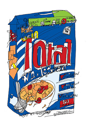
Blind Contour- Total Cereal
I' ve been health and nutrition consious all my life. My day is "totally" about starting with a good breakfast - and my favorite cereal. I top it off with fresh blueberries (great antidioxants) and flaxseed (lignin) and cold skim milk. This combination is a must for me and a great way to start the day!


.jpeg?picon=2058)


Lately I've been thinking about subscribing to Writer's Digest. Maybe your post is a sign I should go ahead and do it :) <br /><br />I follow Rachelle's blog and also Hope Clark's blog and get lots of helpful tips from both. I've fallen behind with Hope's FundsforWriters newsletters, but I need to get back to perusing them. I used to find some neat opportunities there, too
Jean,<br /><br />Thanks for the website suggestions and the strong recommendation for the magazine subscription. Much appreciated.<br /><br />Linda A.
Thanks, ladies, for dropping in.<br /><br />I know what you mean, Cheryl. Sometimes I do so much "keeping up" I don't have time to WRITE!<br /><br />Blessings,<br />Jean