JacketFlap connects you to the work of more than 200,000 authors, illustrators, publishers and other creators of books for Children and Young Adults. The site is updated daily with information about every book, author, illustrator, and publisher in the children's / young adult book industry. Members include published authors and illustrators, librarians, agents, editors, publicists, booksellers, publishers and fans. Join now (it's free).
Login or Register for free to create your own customized page of blog posts from your favorite blogs. You can also add blogs by clicking the "Add to MyJacketFlap" links next to the blog name in each post.
Blog Posts by Tag
In the past 7 days
Blog Posts by Date
Click days in this calendar to see posts by day or month
Viewing: Blog Posts Tagged with: Todd Klein, Most Recent at Top [Help]
Results 1 - 9 of 9
How to use this Page
You are viewing the most recent posts tagged with the words: Todd Klein in the JacketFlap blog reader. What is a tag? Think of a tag as a keyword or category label. Tags can both help you find posts on JacketFlap.com as well as provide an easy way for you to "remember" and classify posts for later recall. Try adding a tag yourself by clicking "Add a tag" below a post's header. Scroll down through the list of Recent Posts in the left column and click on a post title that sounds interesting. You can view all posts from a specific blog by clicking the Blog name in the right column, or you can click a 'More Posts from this Blog' link in any individual post.
Just before Christmas, I ran a picture tweeted by DC Comics of the 1945 DC Christmas party, with many figures from comics history—from artist Joe Kubert to publisher Harry Donenfeld —in the room. The photo conveyed a palpable sense of the past brought to life, the clinking of glasses, the laughter of women, the camaraderie of the still young industry. And now Letterer/historian Todd Klein has identified as many of the people in the photo as possible.
2 Comments on Comics Detective: Todd Klein has nearly solved that big DC Comics Christmas party photo from 1945, last added: 1/20/2016
Thanks, Heidi! I should note that I was corrected by Jacque Nodell, Carrie Nodell died in 2004. I misunderstood her earlier, the identifications were by her father, not Carrie.
family survival kit said, on 1/20/2016 1:02:00 AM
If something goes awry during the trip for anyone, it’s
much easier to ask for help from somebody who was courteous enough to introduce
themselves.
Todd Klein is the dean of comics lettering in the US, with more awards than he can carry, and a portfolio of logos and classic lettering that would be hard to touch. And he’s put it all together for a seven part series on the history of comics lettering:
This is an amazingly concise and fact filled journey through the most overlooked aspect of comics creation. That contains not only examples of lettering through history but a ton of photos of the letterers themselves, few of whom I’d ever seen before. I’d love to read this in a little chapbook but I guess copyrights would prevent that. For instance, the above lettering from an early Wonder Woman looks like mechanical lettering but it’s actually from the dreaded Leroy lettering guide, which produced a more mechanical looking font.
In the final chapter, Klein looks at the actual rise of Digital lettering:
The 1990s were definitely a era of turmoil for letterers in comics. Once digital lettering became possible, it was just a matter of time before comics publishers adopted it. An all-digital workflow offered many advantages for them, saving time, expense and materials. It also offered flexibility for reprints in other languages they hadn’t had before. Artists and especially inkers generally hated it, as it meant they had more to draw or ink on the page, once the lettering wasn’t there. It also hurt sales of comics art to fans. Without the lettering, comics art is just pictures, the story is missing. Letterers (and colorists) faced the hardest challenges though, needing to buy expensive computers and software and learn new working methods if they wanted to stay in the market. Letterers also had to create their own fonts, a difficult task, or use commercial comic book fonts, thereby making the work they did less likely to stand out from the crowd. Many feared the changes, and much anger and hatred were directed at the pioneers in digital lettering. Alan Moore once said, “You can always recognize a pioneer — he’s the one lying face down in the dirt, pointing the way with arrows in his back,” It was true for comics lettering, and there are still hard feelings from the 90s, when some letterers unwilling to go digital, or behind the curve, were pushed out of the business. Others came around later and reluctantly, often at a cost to their ability to find work.
Despite this, we now seem to have a fairly wide field of lettering options, from hand designed fonts to the occasional mad(wo)man who still does it by hand. If you’ve ever wondered about comics lettering, get a hot drink, sit down and red this whole series.
PS: Klein reprints this chart made by Comicraft back in the day he made detailing the old way vs the new way. UPDATE: This is actually Todd’s work sorry for the misidentification!
3 Comments on Must read: Todd Klein’s history of lettering, last added: 11/24/2014
Thanks for the links, Heidi, but that workflow chart is not from Comicraft, I made it myself for the article.
Torsten Adair said, on 11/21/2014 7:50:00 AM
My preference is lettering on the board, especially if it’s crazy display lettering, like the Ambush Bug parody of the Comics Buyer’s Guide, or a splash page.
Then it’s pasted lettering, which is rarely archival, and subject to adhesive failure.
What I really love is a black overlay on top of a color background, or full color separations.
Is Leroy lettering despised? If so, why was it so widespread, especially at EC Comics?
Is anyone using movable type in comics, artistically? Either printing on a flatbed press, or via cutting-and-pasting?
And Comic Sans… there’s a bigger picture to that, which I hope to write up next week…
Derrick A. Richardson said, on 11/24/2014 12:03:00 PM
Great stuff. Amazing research Todd, kudos to you. Thanks for the post Heidi.
As noted in my Baltimore Comic-Con report for Publishers Weekly, one of the programming highlights was a two hour “The LAst Fables Panel” which united Bill Willingham, Mark BUckingham, Steve Leialoha, Todd Klein, Andrew Pepoy, Barry Kitson and special guests for a last look at the beloved comic. Klein, the logo letterer, has a fine report on the panel, which included special guests like Paul Levitz and Bob Wayne. There are also photos, such as Pepoy and Willingham above.
1 Comments on Nice read: Todd Klein on The Last Fables Panel, last added: 9/12/2014
Publishers seem increasingly willing to roll the dice on anthology formats recently. Maybe it’s the success of things like Dark Horse Presents, and the model they’ve followed of introducing new works and then successfully spinning them off into new story titles like BLACK BEETLE. There’s an inherently approachable aspect to anthologies—new readers can pick them up and take a tour of many ideas and art styles without feeling out of the loop, and creators themselves aren’t subjected to the high-wire act of telling fresh tales while balancing the necessities of continuity. It’s also a chance to bring on new talent and give readers a chance to play a role in selecting what appeals to them. Vertigo, however, has a long history of valuing the anthology format to engage with new readers, from its FIRST CUT to FIRST OFFENSES, which readers still pick up when trying to get a handle on what the line has to offer in terms of genre and content.
TIME WARP, a revival of a late 1970’s anthology format, presents nine stories by a variety of well known and new creators following a loose theme that may not be as loose as it appears at first glance. The key word “time” stands out as a recurring (literally) factor in these stories. On the whole, because the anthology contains so many varied story-telling techniques and art styles, its appealing and gives the reader a sense of time and money well spent based on its “something for everyone” approach. As a one-shot, it also reads like a graphic novel in disparate parts that comments on the potential of science fiction in the comics medium with capacity to challenge our concepts of humanity, technology, and their often troubled relationship.
[Caution: Mild spoilers on content, but no plot-twist revelations ahead]
“R.I.P” , written by Damon Lindelof, with evocative art by Jeff Lemireand fluid colors by Jose Villarubia, is a strong start to the collection. What could be more basic, pulpy, and attractive than a time-travel tale with dinosaurs and multiple attempts to escape death? The story’s variations on a theme, however, get complex quickly, with satisfying results. All the kinds of questions about the implications of time travel that kids grew up with watching Star Trek: The Next Generation take a bite out of the story and lead the reader in logical loops. Lemire’s energetic, chaos-controlling line-work, combined with Travis Lanham’s quirky lettering, suggest an undercurrent of the haphazard about all human endeavors. The message seems to be, despite all our planning, when we deal with factors essentially bigger than us, we might get by, but only by the skin of our teeth. The suspension of belief necessary for the story isn’t overbearing since it points out all the problems and difficulties of handling big themes in its plot structure.
“It’s Full of Demons” is a particularly challenging story, one might almost call a mystery despite its early introduction of a possibly alien time traveller in turn of the century Austria. After reading the complete story, you might have a Memento-like experience of reconstructing the details of the story backward along the lines provided by a full revelation of their significance. This is engaging for the reader. Tom King’s writing is clever in providing just enough detail to make this backward reading possible while not revealing too much about why the increasing madness of a little girl growing up after her brother’s death might be important to readers. The themes of the story are, in fact, heavier the more you examine them, commenting on how fear and the “demonizing” of figures and groups may be an even greater threat than the shocking intrusion of the vastly unknown into daily life. Tom Fowler’s artwork suggests history well without rendering it ponderous, and in particular conveys emotional states in its main character with great empathy.
Gail Simone writes “I Have What You Need”, with upbeat and somewhat eerie art by Gael Bertrand, and vibrant colors by Jordie Bellaire. Simone isn’t afraid to get complicated, either, about the implications of time travel, even within one’s own mind, and delves pretty deeply into human nature by exploring the idea that a drug could enable you to revisit the best ten minutes of your life. Her kindly shopkeeper holds this god-like key to a “product” that everyone wants, and also provides commentary on what humans deserve, and what they get out of life. Twist endings are a common feature of many of the stories in TIME WARP, and though the stories might have been intriguing without them, it’s a pattern that gives the reader a sense of the value of each particular story as a unit of entertainment and harks back to the genre features of early pulp sci-fi.
“The Grudge” is an intelligent and very human tale of rivalry between two scientists, the kind of rivalry we’ve seen in techno pop culture between Steve Jobs and Bill Gates. Written by Simon Spurrier, with art and color by Michael Dowling, its compressed storytelling gives you a sense of having read a whole comic or perhaps a graphic novel, again presenting an entirely different, detailed world within the anthology. It spans the life of these scientists, their tragedies, and the tension between public demand for spectacle in scientific discoveries and the real needs of scientific advancement to look toward greater future building. Dowling’s near photo-realistic art style easily conveys the sense that this could be our twenty-first century future, still governed by the baser, and higher impulses of the human beings involved in advancement. But the story infuses even tragedy with humor, and most importantly, believing in the reality of the characters helps convey the messages of the narrative.
One of the most surprising additions to TIME WARP is a Dead Boy Detectives story. Originally created by Neil Gaiman as a spin-off from SANDMAN, the Dead Boy Detectives seem to veer pretty far from science fiction in their investigation of the occult. However, Gaiman was never one to draw a firm line between the occult and the scientific, and neither has pulp tradition, a borderland other comics in TIME WARP also explore. This episode, “Run Ragged”, written by Toby Litt, with layouts by Mark Buckingham, finishing work by Victor Santos, and letters by the great Todd Klein, reads like a sudden glimpse of a return to a favorite world, and indeed it’s described as a lead-up to a continuing storyline in THE WITCHING HOUR ANTHOLOGY. The artwork, and also the colors by Lee Loughridge are accomplished and appealing, particularly successful at conveying motion and action while creating a sense of the haunted atmosphere of the material.
“She’s Not There” may remind readers of the more psychological aspects of good science fiction, with more than a dash of the noir emphasis on intense relationships. The premise, that a company in the future can charge vast amounts of money to resurrect ghosts as “information” gleaned from loved ones, hits one of the many common themes in TIME WARP, the general neediness of human beings and the lengths they’ll go to in order to seek comfort from their pasts. Another “mystery” aspect of the story, written by Peter Milligan, with art and colors by M.K. Perker, is the reason for the resurrected wife Angel’s death, and the lingering problems that might have comprised her relationship with her husband in the first place. The story poses a unique question, “Can you own a ghost?”. In a technological world where everything’s a commodity, it seems like a singularly dark possibility. The artwork suggests a blend of the familiar and the unknown in equal proportions, keeping readers guessing, just like the plot.
The unusually titled story “00:00:03” places human beings under another kind of microscope under the pressure of extreme situations. During vast interstellar wars, we follow the decisions of Helene as she attempts to perform her military duties under the influence of a unique “molasses” protocol that extends perception of time. Written by Ray Fawkes and drawn by Andy MacDonald, this is the kind of story that sci-fi readers will be particularly attracted to. It offers sweeping conflicts on a large stage, space battles, and remarkably deep characterization of a central figure in action. The age old question posed by sci-fi, “Are we still human inside our technology?”, is both addressed and answered in a poignant way.
If you’re all about the art of sci-fi comics, then you’ll have quite a few surprises to look forward to in TIME WARP, but it’s likely that Matt Kindt’s “Warning: Danger” will be top of the list. With Kindt’s sketchy outlines, and splashy use of watercolor tones, the story breaks from many of the common assumptions of what traditional sci-fi art should look like. How do you convey the crisp lines of spectacular technology in such an idiosyncratic style? Kindt’s answer is to render technology, and its premises in the story, organic, and therefore a little more alarming. By breaking with what readers may recognize, Kindt presents an unrecognizable, and very compelling vision of the future. His diagrams of the armor and accoutrements of two civilization-representing soldiers locked in single combat schematize the ingenuity and determination of one-upmanship in technological advancement. There’s a downbeat sense of recurring time that’s featured in a number of TIME WARP stories, providing the opportunity for humans to relive their obsessions and failures, or get it right when given another chance.
The final piece in TIME WARP gathers together the thematic threads of recurring time, human decision-making, and the bizarre responsibilities that power over technology entails. When technology becomes somewhat monstrous, who’s really in control? Is the humanity inside the machine enough to guide progress away from disaster? “The Principle” is written with a key focus on two main characters by Dan Abnett, and presented rather beautifully with colors and art by I.N.J. Culbard. The trope of presenting a guy new to his job as an identifying character for the readers is here completely necessary to add tension to the gradual revelation of plot. The attempt to prevent an assassination of the “principle” figure through staging the same moment in time over and over again gives characters repeated chances to get things right, and also humorously comments on some historical mysteries as time-travel screw ups. Culbard’s inks, particularly, have a certain noir sensibility, too, though infused with a sci-fi eye toward motion, and seem appropriate when grounding the future in the past. Abnett doesn’t hold off on the sci-fi theme of responsibility, either, and closes the collection with a final message about the tendencies of humanity to abuse power in banal ways, and the responsibilities, often dire, we face in trying to keep that kind of potential chaos under control.
In fact, looking back through TIME WARP, the overarching implication of these stories seems to be Time=Responsibility. The further we push technological advancement, and the more we tinker with our humanity, the more work we generate for ourselves monitoring our trajectory. But with concepts and artwork like the kind contained in TIME WARP, the spectacle of those sci-fi heights never ceases to be attractive, even when it’s pointing out the potential pitfalls that almost certainly lie ahead. TIME WARP contains a miscellany of energetic science fiction, and its hard not to find the sheer breadth of material and the talent behind it a selling point. Nine worlds, and compact story-telling that often spans lifetimes in one volume? It’s both entertaining and consistently thought-provoking, marking a worthy return of the TIME WARP title.
Title: TIME WARP #1/Publisher: Vertigo, DC Comics/Creative Teams:
“R.I.P”: Damon Lindelof, writer, Jeff Lemire, artist/“It’s Full of Demons”: Tom King, writer, Tom Fowler, artist/“I Have What You Need”: Gail Simone, writer, Gael Bertrand, artist/“The Grudge”: Simon Spurrier, writer, Michael Dowling, artists/“Dead Boy Detectives”: Toby Litt, writer, Mark Buckingham, layouts, Victor Santos, finishing/“She’s Not There”: Peter Milligan, writer, M.K. Perker, artist/“00:00:03”: Ray Fawkes, writer, Andy MacDonald, artist/“Warning: Danger”: Matt Kindt, story and art/“The Principle”: Dan Abnett, writer, I.N.J. Culbard, colors and art
Hannah Means-Shannon writes and blogs about comics for TRIP CITY and Sequart.org and is currently working on books about Neil Gaiman and Alan Moore for Sequart. She is @hannahmenzies on Twitter and hannahmenziesblog on WordPress.
4 Comments on REVIEW: TIME WARP #1, Putting the Vertigo in Sci-Fi, last added: 4/18/2013
It’s awesome. As a no continuity needed expo of scifi talent there’s no reason not to get it.
Around the Tubes | Graphic Policy said, on 3/29/2013 6:01:00 AM
[...] The Beat – Time Warp #1 [...]
MEGA-INTERVIEW with Matt Kindt: ‘find the territ said, on 4/17/2013 9:08:00 AM
[...] I recently reviewed TIME WARP from Vertigo and you had a short story in it. The theme in that seemed to be that people need violence, or need [...]
Good morning. I cannot stay long as deadlines are happening.
Cat Mihos, in association with the CBLDF, has made the most beautiful print of Jim Lee's glorious pencil-art to accompany my poem "100 Words". It'll be limited to 750 numbered prints, and is lettered by Todd Klein. (Click on it in order to actually see it at readable size.) She decided that the first 24 hours it was on sale at her neverwear.net site, it would be $35, going up to $45 the following day. I linked to it on Twitter and... crashed the site. (Or possibly, crashed the shopping cart. I'm not sure. Different reports from people who couldn't get in.)
So Cat is extending the sale (at http://www.neverwear.net/store/) until the end of Monday, when she gets home from her trip out here, to apologise to people who had problems, and to allow people to get to it. You can read all about it (and see lots of Cat's candid snaps, including one of me in a 20 foot long Tom Baker style Doctor Who scarf I was sent by a reader who knits and likes Doctor Who and thought I needed one) over at http://kittysneverwear.blogspot.com
And on the subject of photos, KImberly Butler is out at the house right now to shoot photos of me, with her daughter Caitlin as a camera assistant. She is a remarkable photographer (http://www.kimberlybutler.com is her website). She's here because I am the Honorary Chair of National Library Week next year (details at this ALA website).
She's taking pictures of me to find one that could be used as a poster for National Library Week, and for press releases. Here are a few of the photos from yesterday, raw from her camera. I put up a selection at http://twitpic.com/photos/neilhimself. Here are four of my favourites. One of them is not of me.
(Strangest twitter comment this morning was from the person who told me off for surgically trimming my dog's ears. Someone who, I assume, has never encountered a German Shepherd or has any idea what their ears do. His ears are fine -- he just sticks them up when he's interested or listening. )
During the shoot Lorraine brought me tea. I got happy. Kimberly kept shooting.
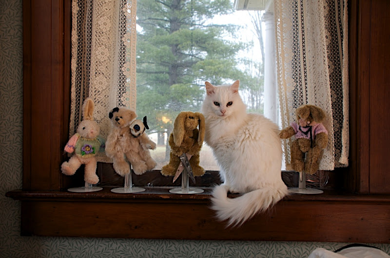
Princess the cat and deformed bunnies (and a two-headed teddy). Probably will not be a National Library Week poster. (Click to see it full-size.)
I went to Los Angeles, had a sort of a working holiday, came home, and am writing. Working out a lot with the trainer, got a new trampoline. The cherry tree is covered in cherries, and the wild raspberries (red and black) are out in the woods, and I find them when I walk the dog.
Nights here are filled with fireflies. Steve Brust came over for dinner tonight and brought his puppy, and we talked about stories and writing until late. It's a good world.
That's about it for excitement at this end. Lots of people have written in asking stuff about me and Amanda, and I don't really know how to answer them. Either they're really nice and pleased for us and encouraging and don't need answering, or they're the kind of things that leave me deeply puzzled, and to which the only responses are "Isn't that a bit personal?" or "Probably none of your business I'm afraid," or even "Why would you write things like that?"
Hello Neil,
Why don't you blog more often?
Just a death wish I guess. Your blog is a wonderful thing to read.
I have a rare case of skin cancer and your blog cheer me up!
Mostly because I have less to say right now, I think. Or at least, I hate repeating myself. The blog's eight years old, and over one million three hundred thousand words long. That's a lot of things. People write me lots of questions still, but so often they're questions that have already been answered on the blog, usually at some length -- the kind of things that make me think that I should spend time I could spend writing again (say) how you get an agent in, instead, organising things and getting a really useful FAQ up and running, or just a way of finding things, particularly advice on writing.
Todd Klein, letterer extraordinaire has the fourth in his series of prints out. The art is by J. H. Williams III, and you can see it here.
Back in November I was interviewed by Chip Kidd at the 92nd St Y. (I talked about it on the blog at the time.) The whole talk, with Karen Berger's introduction and all, is up now on YouTube, and is embedded here for your pleasure. It's an hour and a half.
And finally, there are now more than 666,666 people following me on Twitter. So we had a party. It's still ongoing, the party, over at http://bit/ly/666party and to join in all you have to do is upload a photgraph of you and a Balloon. And once 600 people showed up at the party, the webgoblin made this: a mosaic.
"The Witch's Headstone", Chapter Four of The Graveyard Book, is nominated for a Locus Award. http://www.locusmag.com/2008/LocusAwardsFinalists.html for the full list -- It would be an excellent reading list, incidentally: I don't think there's a book or story on the list that isn't readable, cool, or doesn't deserve to win its category.
They'll be awarded next month, on Saturday, June 21, 2008 in Seattle WA, during the Science Fiction Hall of Fame Awards Weekend. I was toastmaster for this a few years ago, and it's a wonderful event. https://secure.locusmag.com/About/2008LocusAwardsAd.html (Note that The SF Hall of Fame ceremony, inducting William Gibson, Ian & Betty Ballantine, Rod Serling, and Richard Powers at the SF Museum Saturday evening, will be ticketed separately. Also that some members of the Hall of Fame are no longer with us.)
Right. Back to signing Todd Klein's prints (in a purple ink called "Tanzanite") -- you can see what they look like, and learn about Todd's process -- at http://kleinletters.com/Blog/?p=1184.
Back to signing. I'll try and make the next blog post more exciting. Sorry.
0 Comments on Without fireworks as of 5/22/2008 1:23:00 PM
Back from the ABC studios where I was interviewed for Triple J -- it'll be up as a podcast for those of you who were either asleep or not in Australia (which is most of you): http://www.abc.net.au/triplej/ is their website, and I'll put up a link when they send it to me.
Congratulations to everyone else who won -- the complete list of winners and nominees is here (and I'm thrilled that Guillermo got the script Nebula for Pan's Labyrinth, just as I'm sorry that Stephen Moffat didn't get it for Blink, and that Gene Wolfe didn't get it for Memorare -- which you can read at http://www.sfsite.com/fsf/fiction/gw01.htm, and which I really, really hope gets the Hugo) (Gene Wolfe has never won a Hugo award. I'm just saying.)
I'm slowly catching up with things I've promised people, one thing at a time. Todd Klein asked if I would do the signed Todd-lettered print after the Alan Moore one, and there was no way I could say no. Then I kept him waiting on tenterhooks until I had an idea, and then I made him tenterhook longer while I worked on it, but eventually I finished something called Before You Read This, which begins
Before you read this familiarise yourself with the text. Note the position of the escape hatches, the candles that will light in the event of a forced landing to show you the way out. The author will make an announcement.
and goes on from there. I'm looking forward to seeing whether it works when read aloud. Todd's got the work-in-progress version of the print up at
Which I mention here as the first printing of the Alan Moore print sold out in three days. (You can get a second printing at http://kleinletters.com/BuyStuffTop.html).
Since you're travelling I'm willing to bet this message will get lost in the shuffle, but here goes.
So I'm reading the excellent "Lonely Werewolf Girl" which I'm loving, more than "Good Fairies of New York" I think, but I have a bone to pick. Once I started keeping track, I've counted six typos in the first 233 pages. Maybe this seems like a small number of typos but I find it five typos too many! Don't people get paid specifically to ensure that doesn't happen?! It's driving me bonkers...
Anyway, not meant to be any slight against this wonderful, whimsical, punk rock, wolfy book, but seriously; what's up with that?
-J.
Speaking as someone currently proofreading The Graveyard Book, who is only certain of one thing: that typos will lurk and creep and scuttle on the edges of the text and, despite my best efforts, jump out and wave furiously at everyone as soon as I'm done, all I can do is sympathise. But you know, the magic of the internet is that Martin Millar, author of both the above books, has his own blog. It's at http://martin-millar.blogspot.com/ and he has his own website at http://www.martinmillar.com/, where not only can you ask him what's up with the typos, but if you give him a list of them, he can pass them on to his publishers and then they won't be typos in the next edition. Such is the magic of the internet. (Also, you can buy signed books directly from the author at http://www.lonelywerewolfgirl.co.uk/. Which is very nice of him.)
...
Dear Mr. Gaiman,
These are some very simple questions: Do you ever listen to music when you work on something or does it distract you? Have you ever been influenced by a song or peice of music to write a scene?
And last but not least: What are you listening to these days?
Thank you much,
John
Yes, I often write with music on. It doesn't distract me. Anything that makes me more comfortable and keeps me writing is good. And occasionally I'll reread something I've written and know what I was listening to when I wrote it. (I think it's a good bet that Iggy Pop's song Passenger was on repeat a lot when I wrote Sandman 5, for example.) As for what I'm listening to these days, It's mostly up at http://www.last.fm/user/neilhimself/. Here are a couple of Last.fm widgets that might or might not work -- one of songs that seem to have been played more than other songs in the last month, and the other the Last.Fm "My Radio Station", of songs it knows I enjoy...
Just when I think I've got this whole publishing thing down, another little kink gets thrown in my pipe. What was it yesterday? Copyright infringement. And whose copyright were we going to possible infringe? Oh, yes. Disney. That gentle giant just known for their leniency when defending their copyright. (I am positively dripping sarcasm right now. It's oozing out of my pores and is starting to coat my computer keys.)
Fortunately the infringement in question is one paragraph in a 250 page book where the character compares, by name, other characters to a certain set of 7 dwarves. You know, Angry, Wretchy, Bumbly, Stuttery, Wrinkly, Bitterly, and Joe. I ran the paragraph in question past Lawyer, and he said that it could be construed as infringement. So to be safe it needed to be changed. And for the ARC it has been although we may try to get permission to use the original paragraph in the final book.
When I told my author that we needed to change, he understandably was upset and proceeded to regale me with countless pop-culture references some of which appeared to infringe on someone's copyright much more than his but didn't have permission notices. And I agree with him that there's some line out there that makes it okay to use pop-culture references that infringe. I just don't know where that line is.
So, I shall ask all of you: when do you think a reference crosses the line? I don't mean give me a legal opinion. This is just an open dialog.
And finally, how do I feel about pop-culture reference? Normally I try to have my authors avoid them. I feel they date a work, and I generally only accept very common, older references. Hence characters can drink Coke or refer to Snow White's dwarves because they are such an intrinsic part of our culture that everyone knows who they are. More obscure things like band names or movie names I tend to leave out. I don't want kids to have to read an annotated version in 20 years in order to understand all the wit in the story.
2 Comments on Just when I think I've got it down, last added: 3/17/2007
Using pop culture references would require me to stay up to date with pop culture. Not gonna happen. I do think Anna Nicole Smith could be name dropped in a novel for at least a good 6 years. :) Seriously, though, some celebrities do seem to have longevity. Madonna is a good example.
The Buried Editor said, on 3/17/2007 8:49:00 AM
That's why I don't mind the ones that have been around for a while. And lots of kids know of Madonna thanks to her literary efforts.


Thanks, Heidi! I should note that I was corrected by Jacque Nodell, Carrie Nodell died in 2004. I misunderstood her earlier, the identifications were by her father, not Carrie.
If something goes awry during the trip for anyone, it’s
much easier to ask for help from somebody who was courteous enough to introduce
themselves.