What is JacketFlap

  • JacketFlap connects you to the work of more than 200,000 authors, illustrators, publishers and other creators of books for Children and Young Adults. The site is updated daily with information about every book, author, illustrator, and publisher in the children's / young adult book industry. Members include published authors and illustrators, librarians, agents, editors, publicists, booksellers, publishers and fans.
    Join now (it's free).

Sort Blog Posts

Sort Posts by:

  • in
    from   

Suggest a Blog

Enter a Blog's Feed URL below and click Submit:

Most Commented Posts

In the past 7 days

Recent Posts

(tagged with 'Backgrounds')

Recent Comments

Recently Viewed

JacketFlap Sponsors

Spread the word about books.
Put this Widget on your blog!
  • Powered by JacketFlap.com

Are you a book Publisher?
Learn about Widgets now!

Advertise on JacketFlap

MyJacketFlap Blogs

  • Login or Register for free to create your own customized page of blog posts from your favorite blogs. You can also add blogs by clicking the "Add to MyJacketFlap" links next to the blog name in each post.

Blog Posts by Tag

In the past 7 days

Blog Posts by Date

Click days in this calendar to see posts by day or month
new posts in all blogs
Viewing: Blog Posts Tagged with: Backgrounds, Most Recent at Top [Help]
Results 1 - 8 of 8
1. Tutorial - Background Color Around A Subject

Laying in a background color around a subject can be tricky, and it can be very frustrating, especially after taking the careful time to draw out all of your details. It can be approached loosely, or with a tight hand. I will demonstrate both.

Keep in mind, these are my methods, and by no means the ONLY way to go about it. Watercolor painting is a very personal in application. Trial and error are the best ways to learn the medium. The worst thing you can do for your painting is get furious and give up. Give yourself grace and have patience.

Okay, here we go.

Set Up


Place your water, paper towel, and paints on the side you write with, keeping your painting in the middle. Grouping your supplies will help you grab what you need more efficiently.


Choose your brushes. I usually have three different sizes on hand. They are #2, #5, and a #12 (or around that). These are not my BEST kept brushes, and are typically used for events such as this.


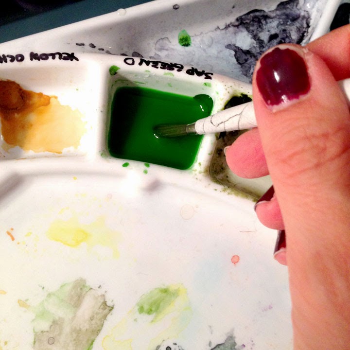
Prepare enough paint to fill the space you're going to cover. Choose a transparent color, like my Sap Green here. It will allow light go travel through down to the white of the paper and back. Trust me. I have also chosen a color that will work well with the other colors I'm going to lay down, such as blues, yellows, and reds.

• • • • • • • • • • • • • • • • • • • • • • • • • • • • • • • • • • • • • • • • • • • • • • • • • • • • • • • • • • • • • • • • • • •

Painting Around the Subject
The Tight Hand Approach


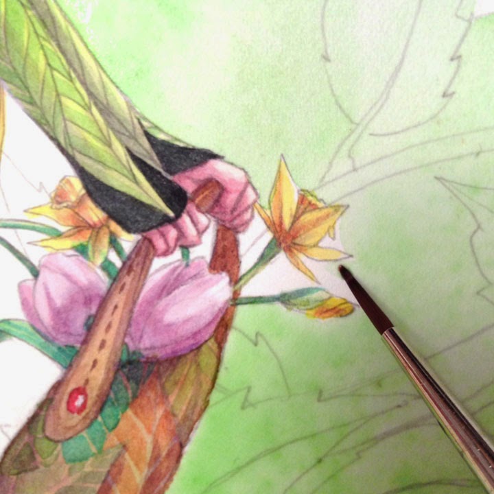
Choose the smallest of your brushes to start, but keep that medium size close by. You want it to be small enough to get into the tight spots, but large enough to hold a decent amount of paint/water mix. You can see I have placed it close to the face (most important to me) to ensure I'll be able to get in around the nose and lips with the point of the brush. 


Scary part, start laying in the color. Charge (meaning fill the brush) with your color making sure it's full. Lay down next to the subject, but NOT along your line. Give yourself wiggle room. Make a little 'puddle' of paint, but don't over extend it. The idea is to keep plenty of wet paint sitting there, hence the 'puddle'.


Now pull from the puddle to your line with the color. Slow down here...it should all be wet enough to give you at least a moment to do this. It will take practice to find your sweet speed spot. Remember, give yourself grace. 


To prevent unwanted lines, RIGHT after you do some of the face move to the other side of your puddle with a rinsed brush. Fade it out, this way, if it dries, you'll be able to paint and fade over it giving the illusion that you painted it all at once. ;) NOTICE I didn't do the entire face all the way down. 


Work in little puddles/spots and work your way down and around, using the same method over and over again.


Again, fading out with a rinsed brush and clean water, getting rid of any unwanted crisp edges.


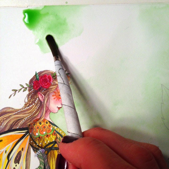
With this method I can confidently move away from my subject and begin to venture out. You may need to switch to your medium sized brush to have enough paint and water.


I will begin to add droplets of clean water in to help give my background texture, depth, and this will give the eye something to look at other than what I may have missed. Naturally, in my opinion, this is the most beautiful characteristic of watercolor, they're called blooms.

You can continue the entire painting with this approach. 

• • • • • • • • • • • • • • • • • • • • • • • • • • • • • • • • • • • • • • • • • • • • • • • • • • • • • • • • • • • • • • • • • • • 

Painting Around the Subject
The Loose Approach


Grab your big brush and charge it up. Lay down a good size puddle, but small enough that you still have a puddle (remember, don't over extend your paint). Also, don't go to your lines, you need the space between.


Rinse out your brush and return to the edge of your puddle, pulling the paint towards and OVER your line art. You are fading out the color on top of your subject. 


Like with the tight approach, take your rinsed brush and fade out the back end of the puddle. Repeat.


• • • • • • • • • • • • • • • • • • • • • • • • • • • • • • • • • • • • • • • • • • • • • • • • • • • • • • • • • • • • • • • • • • • 

Touching Up


In the tiniest of spots, take your smallest brush and pull the wet paint in. If it's dry charge your brush, but first dab it on your paper towel so that it won't over flow or bubble in the tight space you're painting. Try to match the intensity of the color.


If there are crisp edges you don't want...


...go back in with a rinsed brush and clean water, gently scrub and fade them out.


There are tiny little white spots left around the forehead and nose...see them?


Very lightly, and very gently, with your small brush, pull the paint left in the crisp edge onto the white. Go in, lightly do this, and get out. Too much scrubbing too aggressively will leave inconsistent marks you don't want.

• • • • • • • • • • • • • • • • • • • • • • • • • • • • • • • • • • • • • • • • • • • • • • • • • • • • • • • • • • • • • • • • • • • 

Fading Color on top of Faded Color


Just to show I know what I'm talking about, once your first faded section is dry, go in to a new section and start again with a puddle.


Keep making puddles and scooting/painting them over the dry faded area. Once you've overlapped start to fade out your puddle with a rinsed brush. Again, might take some practice, so use light water droplets if you need to. ;)

• • • • • • • • • • • • • • • • • • • • • • • • • • • • • • • • • • • • • • • • • • • • • • • • • • • • • • • • • • • • • • • • • • • 

Finishing It Up


Good Luck!
And feel free to ask me any questions or if there is something you need a tutorial in I'd be happy to help out if I can. 

0 Comments on Tutorial - Background Color Around A Subject as of 11/1/2014 12:11:00 AM
Add a Comment
2. Splash Ink Watercolors


I can't believe how long it's been since my last blog post: over a month. Guess I've been busy! Most of August found me editing my new novel, The Abyssal Plain, and practicing the techniques I learned in a recent 2-day art class, Splash Ink Watercolor.

I was attracted to this class for two reasons: first, the word "ink" made me think of fountain and gel pens, freewriting, and calligraphy. And I just love ink! Second was the course description that mentioned using our imaginations to paint--always a good sign of something interesting up ahead.

In a nutshell, Splash Ink is based on Chinese art and theory. One of the things that surprised me the most was that the word "splash" actually means "pour" in Chinese, so the class wasn't quite as messy as I thought it would be. (I wore my absolute worst clothes and shoes on both days, terrified that we would be throwing paint all over the room and each other. Thankfully, this never happened and was straight out of my over-active "imagination." Splash Ink can be safely attempted in any work space or studio with a plastic tablecloth and paper towels.)

To start off the first day of class, our wonderful instructor, Ming Franz, gave us each 12 sheets of good quality rice paper measuring roughly about 14" x 14" that we divided into sets of 4. The sets of 4 were kept together and taped to plastic boards. After taping, we then sprayed water onto the top sheet until all 4 sheets were saturated. We then poured ink and liquid watercolor and/or acrylic paints onto the top paper in the following order: sumi ink first, then blue, red, yellow, and white paint. Using the white paint was the most surprising to me as I've always heard, "Don't use white in a watercolor!! Ever!" But for this method it was essential. Somehow the white paint seemed to soften, blur, and highlight the other colors all at the same time, a very nice effect.

After pouring the color and letting it seep down into all 4 sheets, the next optional step was to sprinkle salt onto the first sheet. We could also drip diluted dish washing liquid into the damp color for added depth and texture. Another option was to place pieces of scrunched-up plastic wrap in selected spots. Last of all we then carried our boards outside into the New Mexico sun to let the papers dry--which in our super-dry climate took about 30 minutes.

Once everything was dry we were able to separate the pages, and wow: 3 sets of 4 abstract backgrounds in varying degrees of dark to light depending on the order of the papers . Here is one of my lighter pieces that was #3 in a set of 4:


This next much darker sheet was the first of a set of 4. I also used some of the crunched-up plastic wrap to fill out the design:


Day 2 was where the magic really began--we got to paint over the backgrounds with either acrylic or gouache (opaque watercolor) paints. Our homework assignment between classes was to study and meditate on our pieces so that we could "find the picture" inside each one, kind of like looking at clouds or cracks in the ceiling. There's an elephant! No, it's a giraffe! Ming also suggested we look through books and magazines for reference photos we could bring to class and that could help turn our background pieces into finished paintings.

For me, a magazine picture of falling autumn leaves over rushing water seemed to fit the red paint splashes I already had on this particular piece:


I was sorry the class was for only two days, because I certainly had a lot more backgrounds to fill. I ended up with even more when I took 4 of my least favorite sheets and cut them down into quarters, giving me a stack of little "mini-sheets" to practice on. Here's the result of my first small attempt at home; I called it "On the Way to Taos" as that's exactly what it reminded me of:


Now that the class is over, I hope to continue using Splash Ink and adapting it to my own style and choice of mediums. I think it would be an incredible way to illustrate a book, especially one for children, or perhaps a dark and mysterious Gothic novel for grown-ups. Maybe I'll have to do this one day for a new edition of Overtaken!

Tip of the Day: To learn more about Ming Franz and Splash Ink, take a look at Ming's book, Splash Ink With Watercolor (Looking East, Painting West). Not only will her beautiful artwork inspire you to try some painting of your own, but you might want to experiment with using Ming's paintings as writing prompts--a great idea for yourself or your writer's group. Happy creating!


0 Comments on Splash Ink Watercolors as of 1/1/1900
Add a Comment
3. Get to Know Your Character(s): Let's Pretend

When I was little, I could play "let's pretend" all day. I mean, like, all day. I could start the morning as a secret agent, switch to being a marine biologist by lunchtime, live on the 1840's American prairie by dinner, and go to bed as a Moomintroll. You could say I lived to play.

As an adult, I'm pretty much into being my own character of me: writer, artist, friend, not to mention Head of the Laundry Department, Chief of Grocery Shopping, and Executive House Cleaner. But recently during a trip to Trader Joe's and wondering why I always buy the same old things, it occurred to me how much fun it would be to play at being someone else for the day--somebody who bought champagne and Gorgonzola instead of milk and vegetarian chili. And the best person I could think of being was my latest character in my new screenplay, especially as she is NOTHING like me.

For starters, she's 18, LOL, and she's a former child prodigy (I may have been imaginative, but I was a long way from being top of the class). As I stood there in the store, I began to wonder what she would buy, and that's when it struck me: pretending to be your character, at least for a little while, would be a great way to know that character on a level way beyond filling out the usual character bio. Talk about research! For instance, you could:
  • Shop for your character in a grocery store--even Trader Joe's! Buy items he or she would choose (or at least make a list of those items if you find them inedible or too expensive).
  • Using these or other ingredients you have at home, prepare your character's favorite meal. Then eat it and describe your feelings after dining.
  • Go to the kind of department or clothing store your character frequents. Pick out several new outfits, complete with accessories. Take notes (because you may not really want to buy a new tiara or desert kaftan) and use as the basis of your character's fictional wardrobe.
  • Buy your character a present. What is it? Can you use it in the plot somewhere? (Note: if the item is beyond a reasonable budget or something you can't actually use yourself, you can always resort to "let's pretend." Just go to the shop where the item would be sold, and imagine you are buying it, similar to the way you "bought" their new clothes. A fun and inexpensive extra would be to purchase a card, wrapping paper, and ribbons to place in your WIP binder or journal as a visual reminder.)
  • Re-create your character's last vacation. Again, if you can't really travel to the destination, at least get some travel brochures, maps, and pack a real or imaginary suitcase. A day spent pretending you are in Paris or Toledo could have a charm all its own, too! The imagination is a powerful tool.
  • Dream for your character--it's not as difficult as it might sound. Before you go to sleep, think of your character's main story goal or problem. Ask your subconscious to solve it. The answer could surprise you.
  • Go to your character's least favorite or most feared place. Absorb the reasons why he or she dislikes it so much.
  • Next time you find yourself waiting in a long line, become your character. Why is he or she so anxious for the line to move? Where does she have to be before it's too late?
  • Visit a nursery or garden center. Pick out 5-10 plants your character loves or hates. What has generated these strong feelings? If possible, purchase and plant the flowers or bushes in your own garden. Use the plants' characteristics and growth cycles as metaphors.
  • Go to the library. Choose your character's 12 favorite books. Now choose one they have never read. Read it through new eyes.
  • Watch your character's favorite movie. Write about a scene that has the most emotional impact for your character, and why.
  • Using magazine cut-outs or other print material, assemble an album of "family photos" for your character. How does your character feel about each of these people--and why? Be sure to include some bad'uns! 
Tip of the Day: The next time you take an Artist's Date, try taking one for your character. Where would he or she want to go? Why? When you arrive at the chosen place, experience as much as you can through your character's viewpoint. Write up your findings either on site or as soon as you return home.


0 Comments on Get to Know Your Character(s): Let's Pretend as of 4/3/2013 1:57:00 PM
Add a Comment
4. The Importance of Background


When I first started taking art classes and learning how to draw and paint, I made a mistake common to most new artists: I painted everything in the middle of my paper and without any kind of background. Everything I drew just kind of hung in mid-air without a context to keep it anchored within the (nonexistent) setting. Over and over I'd have to go back into my pictures and add my backgrounds, if I could be bothered to do so at all, and that wasn't always an easy thing to do.

It was the same with my writing: I'd freewrite an exciting conflict scene out of the blue, add some troubled characters, and then have to figure out where they all came from. I'd have to travel back in fictional time and ask my characters questions straight out of a Henry James or Edith Wharton novel: "You want to marry whom? Where's he from? What's his background? Not one of those dreadful Van der Leeden Hoopsie-Kopecky boys is he??"

A quick and easy fix to both these problems has been to tackle my backgrounds first. The benefits of this have been practically endless, not the least being "No More Blank Paper Staring Me in the Face," and "No More Wondering What to Write or Paint."

This is especially helpful when I find myself with a limited amount of time to work on a project, for instance a spare half hour or two when I know I could do something creative, but I'm not sure where to start. Working on the background for a future painting or story is the perfect solution. For some well-spent art time, I try:
  • Gessoing art journal pages or full-size paper or canvases. (Admittedly not the most exciting item on my list, but getting it done ahead of time is a huge step forward.)
  • Adding some color to the gesso--or simply using color on its own, perhaps mixed with a clear acrylic medium for texture and durability--is a great way to step up the excitement factor.
  • As is experimenting with brushstrokes: swirls, linear patterned grids, stippled dots.
  • Or doodling into wet gesso with a stick or the end of a paintbrush. A dry sponge or any other kind of imprint-making object is effective too.
  • Abstract collage: old newspapers, junk mail, decorative art papers--tear them up, paste them down, paint over with either a thin coat of gesso or a clear acrylic medium.
  • Sprinkle sand or seeds, confetti or even dirt into the damp medium for a super textural effect.
  • If you want to go beyond an abstract design, try drawing or painting a background of a more structured surface such as stone, brick, or wood. Or practice painting or drawing drapery of different kinds of fabric: seersucker, silk, cotton, terry cloth.
While I'm working on these visual backgrounds, I find it's helpful to not think about what I might place in the foreground. My job at this stage is to build up a good collection of styles, colors, and textures that I can easily turn to when I've got the time and inspiration for a longer painting session.

The same is true for writing. Having a collection of pre-written back stories on hand guarantees that I'll always have something and someone to write about in the future. You can do this too:
  • Without referring to any physical references such as a photograph or actual person, start by choosing a name at random, any name: Bunny McPherson; Lucky Holmes; Wendell Marlow. This is your new character. Now write about his or her early life: where have they come from?
  • The ancestors--who are they? What's their story?
  • Write about your character's childhood through the POV of a best friend--or a worst enemy.
  • Write about the various settings in which you could place this person: e.g., home, work, vacation/travel spot.
  • Write about a severe emotional trauma this person experienced as a child.
  • What's this person's biggest secret?
  • Place this character in a setting: restaurant, bus, city sidewalk, farmyard. Now envision the other people in the background: what are they doing? Who are they? How does your character interact with this background? Could any of them become secondary characters in a longer work?
I promise if you do this often enough and on a regular basis, a short story or novel will emerge without you even trying. Goal, conflict, and motivation--the big three essentials to plot and page-turning--are all in that background somewhere, just waiting to be uncovered.

The best part of having all my backgrounds--written and visual--in place before I start any new work is that often the finished background will determine what my next piece will be. Two weekends ago I took out a large piece of paper I had pre-painted in various shades of yellow and green. It turned into a scene I titled "Sunday Lunch." The green leafiness of the background brushstrokes lent itself to framing a shady outdoor terrace set for a lunch party. And because I always think art and writing are but two sides of the one story-telling coin, I was next inspired to write about the people who were going to eat their lunch there--more background grist for the writing wheel!

Tip of the Day: Shake it up: writers, try some painting! Artists--get our your pens and journals! Everybody: practice some backgrounds--ideally it would be fun to put both disciplines together into one lovely piece. How about writing a story or poem onto a painted background?


0 Comments on The Importance of Background as of 3/27/2013 1:15:00 PM
Add a Comment
5. Ponyo BG studies II


A couple more studies of background art from Ponyo. I'm finding that gouache and coloured pencil is a really great combination. As far as I can tell this is what was used in the actual backgrounds for the film, along with pastels. Apart from being nice and opaque when you want, gouache appears to be quite suitable for watercolour like effects. However getting the right mixture is something that will take just as much practice and experience to do well. As for the coloured pencils, good quality ones proved essential for vibrant marks. Scribling away with dirty hands I really did feel like a child again.

0 Comments on Ponyo BG studies II as of 1/1/1900
Add a Comment
6. Ponyo background study


It was time to learn gouache I thought... So here's a study of a background from the beautiful studio Ghibli film 'Ponyo'. After struggling with watercolour the past 12 months or so, it's so nice to use a medium which is pretty forgiving.

0 Comments on Ponyo background study as of 1/1/1900
Add a Comment
7. The Modifyers I had never seen this before, but wow, what a...


The Modifyers

I had never seen this before, but wow, what a great looking animated short. Super Punch offers up a look at the beauuutiful background paintings for this 2007 Nickelodeon short. The backgrounds are the work of Justin Thompson and Seonna Hong.

Super Punch’s post also includes YouTube video of the full short.


0 Comments on The Modifyers I had never seen this before, but wow, what a... as of 1/1/1900
Add a Comment
8. Backgrounds


A few years ago you couldn't find a single background in my illustrations. I only drew characters on white paper or inside some kind of frame. When I decided that I wanted to work with children's books one of the first challenges for me was to start drawing backgrounds. Now that's just as natural for me as drawing the characters. Here you can see an example of one of my older drawings and one of my new drawings. Even though my new drawing is very simple with just one character it was natural to give it a background.

0 Comments on Backgrounds as of 11/3/2008 4:49:00 AM
Add a Comment