and i can't tell you how HAPPY i am to FINALLY be able to pick up the paintbrush again after a week of editing html and cropping and watermarking photos and staring at the 17" screen on my mac. SO ready to paint!!! :)
i am loving the new colors i have chosen for the site as well as the home page painting entitled, sakura dreamers, which i specifically designed with the new home page in mind. i LOVE sakura blossoms and elephants and dream in strawberry moons and cotton candy clouds (wait, don't we all? ;) )
*PRINTS COMING SOON!
Colors are all around us. They inspire us, they sooth us, they motivate us, they can even anger us. They can even be healing. Colors can be viewed as non-verbal communication.
According to Psychology.About.com , colors are “a powerful communication tool and can be used to signal action, influence mood, and cause physiological reactions.”
So, it’s easy to see that colors are a critical
What is an effective color combo for a website?Marketers agree that black (very dark) text on a white (very light) background is the way to go. This has been the proven tested strategy for quite a while now, but I still see websites that have very dark backgrounds with light text.
Another ineffective color combination, according to MarketingExperiments.com, is a grey background with dark grey or black text. And, red is a negative color.
Your author website should be easy to read and easy on the eyes. Simple always works best.
~~~~~
RECOMMENDED TOOL -
WordPress Subscribers PluginSince we're talking about websites, if you have a WordPress site, this plugin is a must. It offers lots and lots of features, including a ‘lightbox’ opt-in form; footer and header bar opt-in forms, commenting opt-in form; and exit popups. Find out what this
marketing tool has to offer.
~~~~~
To keep up with writing and marketing information, along with Free webinars, join us in The Writing World (top right top sidebar).Karen Cioffi
Karen Cioffi Professional Writing Services
http://karencioffifreelancewriter.com/karen-cioffi-writing-services/Author Online Presence and Book Marketing Ecourse:
http://karencioffifreelancewriter.com/book-marketing-ecourses/
Today I have a guest article from the
Book Marketing Expert Newsletter that gives 10 excellent steps you need to take to be sure your site is doing what it's intended to do: be effective in funneling in visitors, keep the average surfer there long enough to see what you're offering, and supporting conversion. And now, off we go:
Your 10 Point Website Check Up by Penny SansevieriSo you have a website, congratulations! Now let's make sure it's doing what it is supposed to be doing for you. Read: selling your book or product. While websites will differ in color, layout, and target audience, there are a few things that need to remain consistent. Let's take a look at them.
1. Editing: Your website needs to be edited. There is no discussion on this topic at all. And don't self-edit. Hire someone to go through your site page by page and make sure you don't have any typos. Finding mistakes on your site is like finding typos on a resume. Doesn't bode too well, does it?
2. Website Statistics: do you know your site stats? Did you even know you can get them? Site statistics are part of every website design. If you don't have access to them make sure you get this. A good site stat service is Google Analytics, pretty comprehensive actually and easy to integrate into your site. You should know your traffic patterns and learn to read these reports (it's a lot easier than it sounds). This way you'll know what your site is doing and what it isn't.
3. Media Room: even if you have never had any TV or radio appearances, you should have a media room. The media room is a great place to list all of your accomplishments as it relates to the book. Also, a good place to put your bio, picture (both of you and the book cover), as well as media Q&A, and a host of other items (I'll cover the art and science of a good media room in an upcoming piece).
4. Website Copy: Your website isn't a magazine, people don't read, they scan. Make sure your site isn't so crammed with text that it's not scannable. Ideally your home page should have no more than 200 to 250 words. Also, make sure you have a clear call to action. You want your visitors to do something on your site, yes? Make sure they know what that is, clearly and precisely.
5. Store: Yes, you should have a place for people to buy on your site, even if it means sending them off to Amazon.com or somewhere else to make their purchase. One key factor though: don't make them hunt for it. Shorten the staircase. In other words, make it easy to find your stuff and then give them the quickest route to get there.
6. Design: I have two major rules in life: you should never cut your own hair or design your own website. Period. End of story. Why? Because much like editing our own books, we're just too darned close to our message to be able to do it justice. Also, most of us are writers, not designers. Hire someone, invest the money, you'll be glad you did. When you're designing, also remember that your homepage should only do one thing. Your website can sell a lot of things, including any consulting or speaking services you offer, but your home page should be focused in on one major item. Surfers spend an average of 1/50th of a second on a website, if they have to stop and try and figure out what your site is about they will leave. I call it surf shock or analysis paralysis. Don't make them guess what your site is about, or you will lose them.
7. Social content: make sure that you have some


You're an author. You need a website. You know you do. Your publisher expects you to have one. They're not helping though. What are your options? Hire a web developer? Yes, you could. I don't begrudge anyone his due, especially if he has an education and experience in a field and knows programming languages. Add visual design to the mix, and that person is worth his weight in gold. The web is a complex field and it's hard to figure out sometimes.
But, if you are in my shoes, where books are probably an avocation, which you continue to work at to turn them into a vocation, and you make only a buck or two per copy, you can easily outspend income.
I'm offering design for a basic web site. I've made my living for 20 years in one form of design or graphic arts or another. I've had experience designing for the web, but do not have all the development (coding/programming) skills. So, I do the visual set up, focussing on who you are, how you want to represent yourself on the web—kind of like a book cover for YOU! Then, I work with a developer who is prepared to do the basic coding for a basic site, to get it up and live.

I met Joyce at a Highlights Founders' Workshop in March of this year. As soon as I returned, I read her book Blue and thoroughly enjoyed it (see post). Be sure to read it's Sequel Comfort. I plan too :-)
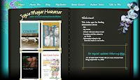
Through online conversations, I knew she was thinking about updating her website and offered to help. I don't code (develop), but I can offer design. We wanted to make it seem like
her—choosing symbolic imagery from her work, capitalizing on things in her life that are important, and giving her readers a rich, visual impression. (
Visit Joyce's Website)
Also, she's giving away
free books, so you better log in!
 Curious City just finished up a website for author Amy MacDonald. Having just released, Too Much Flapdoodle that includes the same line up of eccentric characters as her chapter books, No More Nice and No More Nasty, we decided to create a greater "series presence" for her books.
As the third book did not follow the naming mechanism of "No More..." we created a themed website based on the character's names and quirks.
As the books deal with the formerly straight-laced boys, Simon and Parker spending time with their wacky luddite Maine relatives, we decided that the site would be built by and authored by Simon and Parker. The boys launched "Mattie and Philbert's World" to pass on the Un-Lessons handed down to them by their great aunt and uncle.
The site intentionally includes lots of PDF Downloads to provide materials for classroom, homeschool, and young reader use. They include everything from multiplication tricks to how to play songs with your armpits.
Also in support of Too Much Flapdoodle, we helped Amy create a character blog for Parker to pass on the luddite oddities of his summer with Aunt Mattie and Uncle Philbert --like how to build a turtle trap.


 Curious City just finished up a website for author Amy MacDonald. Having just released, Too Much Flapdoodle that includes the same line up of eccentric characters as her chapter books, No More Nice and No More Nasty, we decided to create a greater "series presence" for her books.
Thanks for this great post, Karen. Will be bookmarking it.
Hi, Rachna, Glad you found it useful!
Covered most of that, except I did design my own website(s.) If I'd waited for my husband's help (he's a computer graphics designer, illustrator, and business designer) they'd still be sitting there with nothing.
Diane,
LOL I hear you! I created four or five websites using Wordpress themes, so not sure if that counts as designing. :) But, I did all the rest.
Thanks for stopping by!