new posts in all blogs
Viewing: Blog Posts Tagged with: Abstract, Most Recent at Top [Help]
Results 1 - 25 of 49
How to use this Page
You are viewing the most recent posts tagged with the words: Abstract in the JacketFlap blog reader. What is a tag? Think of a tag as a keyword or category label. Tags can both help you find posts on JacketFlap.com as well as provide an easy way for you to "remember" and classify posts for later recall. Try adding a tag yourself by clicking "Add a tag" below a post's header. Scroll down through the list of Recent Posts in the left column and click on a post title that sounds interesting. You can view all posts from a specific blog by clicking the Blog name in the right column, or you can click a 'More Posts from this Blog' link in any individual post.

By: Linda Kay,
on 7/15/2015
Blog:
Watercolor Wednesdays
(
Login to Add to MyJacketFlap)
JacketFlap tags:
watercolor painting,
plants,
abstract,
watercolorist,
small format art,
Linda Snider Ward,
Louisiana artist,
Linda Kay Thomas,
watercolor daily,
Add a tag
This little piece was actually created in the hospital while I was recovering from back surgery. It helped to have my watercolor paints and paper with me for my two week stay. More of my artwork can be seen on my
website and my
Etsy shop
If you're a watercolorist and would like to join this site, send me a link to your blog or website in a comment, and I'll add you to the site.

Submitted by Chloé Bulpin for the Illustration Friday topic GARDEN.

By: Jerry Beck,
on 4/13/2015
Blog:
Cartoon Brew
(
Login to Add to MyJacketFlap)
JacketFlap tags:
Festivals,
Abstract,
Robert Seidel,
Bret Battey,
Józef Robakowski,
Paul O'Donoghue,
Punto y Raya Academy,
Punto y Raya Festival,
Sabrina Schmid,
Steven Woloshen,
Music,
Add a tag
For those who like their animation in its purest form: a feast of form, color, motion and sound in Spain.

Laura Slater is a pattern and textile designer based in West Yorkshire, where she runs her own studio. Her work is largely inspired by Danish design and is a superb combination of shape and texture which unite to create intriguing abstract interpretations of nature. Laura hand prints each piece in her collection onto lampshades, pillow covers, dish towels, aprons and paper products. Laura’s work is a true testament to the idea that simple shapes, textures and a limited color palette can make some truly impactful imagery.
You can check out Laura’s work on her website, or follow along with her process and inspiration on twitter. She recently posted this video about her process; it’s a really interesting peek into her world and inspiration!


Written by Bryna Shields.

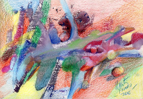
By: Rachel Frankel,
on 12/11/2014
Blog:
Illustration Friday Blog
(
Login to Add to MyJacketFlap)
JacketFlap tags:
illustration,
mixed media,
artists,
conceptual,
fine art,
oakland,
abstract,
asian american artist,
betti ono,
geometrics,
linework,
lostboy,
Add a tag

Sometimes I feel like the wrong people are being boosted up and supported by their community. That may be a loaded thing to say–I simply mean that some of the art scene here in the Bay has become a bit homogenous and male-dominated. It’s no secret that the fine art world can often feel a closed door to many emerging artists as they continue to boost those who are already successful and well-known.

But obviously, there is room for everyone. My momentary pessimism was quelled when I stumbled across photos of LOSTBOY’s first solo show hosted at Betti Ono Gallery here in Oakland. To see an illustrator my age succeed in this way is incredibly motivating and empowering. Also, it doesn’t hurt that their work is wonderful to behold.


LOSTBOY is a first-generation Korean artist, illustrator, maker and a self-described “proud Aquarius.” They focus on visceral imagery and use the integrity of linework to draw attention to themes of identity, affirmation, consciousness and self-discovery. They are a graduate of the Portland Northwest College of Art’s Illustration program, and currently reside in Los Angeles, CA (yay hometown!).
After graduating from PNCA, LOSTBOY spent about 4 years in Oakland and recently moved back to their hometown to concentrate on preparing work for the aforementioned show, Core. LOSTBOY cites varied influences such as Yayoi Kusama, Yoko Ono, Ruth Asawa, and Antony and the Johnsons, in addition to fractals, oceanic imagery, and their own Asian-American heritage. In many ways, LOSTBOY’s work is about finding oneself and embracing one’s community, but it’s also about noticing and welcoming the unseen.


LOSTBOY’s solo show “Core” will be up at Betti Ono Gallery in Oakland until February 15, 2015. I can’t wait to see it myself and highly suggest you all check it out as well.
Follow along with LOSTBOY’s adventures:
Website
Instagram
Etsy
By: Heather Ryerson,
on 12/5/2014
Blog:
Illustration Friday Blog
(
Login to Add to MyJacketFlap)
JacketFlap tags:
day job studio,
grace helmer,
uk,
animation,
london,
Blogroll,
conceptual,
brighton,
freelance,
oil paint,
abstract,
painterly,
Add a tag
post by Heather Ryerson


Grace Helmer uses strong brush strokes to create her rich, ethereal oil illustrations. The expressive color progressions in her paintings give the work a delicate, transient presence; the viewer can’t help but be caught up in the joy and beauty of Helmer’s brief captured moments. Her style is used to especially great effect in her animated pieces. Constantly changing textures and shapes create a depth and dynamism that one might feel could easily be drunk from the canvas. Helmer graduated from the Camberwell College of Art in 2012 and is part of the illustration studio collective Day Job.
See portfolio | Watch an animaton
By: Rachel Frankel,
on 9/27/2014
Blog:
Illustration Friday Blog
(
Login to Add to MyJacketFlap)
JacketFlap tags:
freelance,
children's illustrators,
abstract,
hand lettering,
freelance illustrator,
abstract painting,
lisa congdon,
pen/brush and ink,
master of the month,
apparel / products,
art inc.,
design,
creativity,
mentor,
typography,
children's art,
digital,
artists,
editorial illustration,
Lettering,
pattern,
san francisco,
surface design,
Add a tag

This Art Crush entry has truly been a long time coming. I first came across Lisa Congdon by way of Meighan O’Toole’s former art blog and podcast, My Love For You (which is post-worthy in its own right–it was an enormous source of inspiration for me during my college years). While I definitely gravitated to Lisa’s work on a visual level, it was her personal story that drew me in. Freelance illustration had been her second career. She didn’t start painting or making art until she was 31, and here she was, participating in museum-level shows, working with clients like Chronicle Books, and just being a genuine, successful badass. Lisa is not only someone I look up to artistically–she’s also a prime example of a human being.
Lisa’s art career was secondary, after she accumulated over a decade of experience in the education and nonprofit industries. By pure chance, she stumbled into a painting class and began making art of all kinds from that day forward–fueled by pure joy instead of the desire to succeed quickly. Having always been an avid collector, her random ephemera would find their way into countless collages as well as a series of photos, drawings and paintings that would eventually make up her A Collection A Day project. As she continued to develop her craft and share it with the ever-expanding Internet, people began to catch on. Today, she is an accomplished and prolific working artist, blogger, illustrator, public speaker and writer. Some of her most notable clients to date include The Land of Nod, The Museum of Modern Art, Harper Collins, 826 Valencia and Martha Stewart Living Magazine.


Lisa unabashedly tackles the subjects she is most passionate about, and that fearlessness is expressed effortlessly in the execution of her work. She describes herself as a “visual junkie,” and is deeply inspired by patterns, travel, architecture and vintage packaging, just to name a few. A faithful blogger, Lisa writes about her own process in addition to other artists whom she admires, as well as her life “outside the studio,” which includes swimming, biking, sewing, and traveling. In other words, she’s just making all of us look bad! (I only kid.)


One of the reasons I relate to Lisa’s work is due to the versatility and ever-evolving nature of her aesthetic. Certain characteristics like neon hues and her penchant for all things Scandinavian are mainstays, but she continues to branch out and explore all kinds of mediums (block printing and calligraphy, to name a few). These explorations fuel her work and expand her direction, which is most recently geared towards abstract painting. She’s a wonderful example of why you don’t need to narrow yourself down to one specific style (something I often grapple with).


Lisa is quite a unique artist in that she is not only a creator, but a mentor as well. Breaking into freelance illustration can be a challenging and solitary undertaking, and she continues to give her generous time to those who wish to pursue and learn more about the field through classes, speaking engagements and conferences around the country. I first met Lisa at her first Freelance Illustration class at Makeshift Society back in December 2012, and it was one of my most pivotal learning experiences to date.

Lisa recently released her new book, “Art, Inc.: The Essential Guide for Building Your Career as an Artist,” which is a revolutionary and timely answer to the starving artist stereotype. It covers all areas of the freelance artist’s domain, such as photographing fine art, finding printing services, copyright, and diversifying income. It sits on the shelf above my working desk (I like to call it my “VIP” shelf) as I reference it constantly.
On that same note, I’m very excited to be taking Lisa’s “Become A Working Artist” class through CreativeLive next week! You can follow along with the class virtually by RSVPing here.

To listen to Meighan’s podcast with Lisa, click here. I also highly recommend her feature in The Great Discontent.
Follow along with Lisa below:
Website
Twitter
Blog
Instagram
Purchase Lisa’s books below:
Art, Inc.
Whatever You Are, Be A Good One
A Collection A Day
graphite bar and pencil on paper
© William Cho
I visited the studio of an abstract painter once. There was a group of us. All the others were painters; I was the only writer. We started flicking through a portfolio of abstract paintings, and I have to say that they all looked much the same to me: like wallpaper samples. But every now and again when the next painting was revealed, these other painters would collectively say: “Ah! Now that’s interesting!” Their reactions were spontaneous and genuine – and I realized then that they were seeing something that I was missing.I’m certainly no expert, but I’ve come to understand that appreciating abstract art is about how a painting makes you feel. It’s not about what you think it is. But this is a difficult mindset to get into. Like a lot of people, I like to understand something. I like to know what it’s about. I need to be able to articulate what it is telling me. I’m not used to asking myself how a painting makes me feel.
I visited another abstract painter’s studio yesterday. She had a canvas leaning up against the wall that looked unfinished to me. There was an outline of what could have been the figure of a woman in the middle, and a pool of yellow in one corner and some bright splashes in the other. I wanted to know what it was about: was the woman falling? Was this the sky and this the ground? Which way up was it supposed to be? I wanted to be about something – I wanted to understand the message. “It’s not about anything,” said the artist. “It’s what it is, that’s all.”
A Young Lady's Adventure by Paul Klee
This painter works by feeling. She doesn’t know what she’s going to paint before she starts a canvas, she only knows the colours she wants to use, and which brushes. Then she’ll ‘play around’ until some combination of colours appears that she can ‘have a conversation with’. Then she follows the conversation to see where it leads – which might be nowhere. Or it might become something bigger than she herself was capable of, if she’d tried to impose a plan on it beforehand.
Painting and writing are both creative activities, and I recognized parallels in how she described her process. I know that my trouble with writing is that I need to know where it’s heading, I need to know what the message is, well before it appears. I know that this inhibits my creativity, and presents me from feeling the ‘conversation’ that the book might want to have with me.
I asked her how she managed it. “The first thing you have to do,” she said, “is stop. Then, you have to feel with your heart where you need to go next. You need to be playful, you need to be brave, and you need to take risks. And you mustn’t be afraid to make mistakes.”I know she’s right. The best stuff is always the stuff that we never intended to write about. The best things can’t be articulated, and the most wonderful thing about writing fiction is when a story surprises you, and turns out – to your delight – better than you feel you could have made it. The same process would seem to apply both to painting and to writing – and also, in fact, to life.www.heatherdyer.co.uk
Within 15 seconds of hitting the play button on Kou Kou by Takashi Ohashi, I did something I rarely do when watching films on my laptop: I turned off the lights at my workspace to create a dark theater environment. Good abstract animation, like a good song, demands the audience’s full attention, and I sensed this was going to be something special.
Takashi Ohashi, who has been featured on our Animated Fragments feature, has created a masterful piece of abstract animation with Kou Kou. Ohashi does something rare for abstract filmmakers, which is to organize his visual ideas with the clarity, pacing and dynamism of a more traditionally narrative storyteller. The second ‘movement’ that begins around the 4-minute mark packs a real punch. The competing red and blue offsets create tension and instability in the imagery, which serves to heighten the visual excitement.
To a non-Japanese speaker, the film is a beautiful visual experience, but the Japanese speaker will enjoy an additional layer of depth. Ohashi sent Cartoon Brew the following explanation of the film:
Kou Kou is a visual work based on an abstract animation synchronized with a song comprising the unique syllabic sounds of the Japanese language, without actually using any full words.
It is in the elements of sounds from which words are made that we find syllabic sounds. In the case of the Japanese language, the linguistic roots, or ‘Yamato Kotoba,’ each individual sound possesses a unique meaning. For example, words containing ‘su’ exhibit a frictional characteristic and hence are used to represent a linear or direct movement. In modern-day Japanese, ‘sasu’ or ‘susumu’ represent a concrete, tangible action.
Furthermore, words with fewer syllables are used to express simple onomatopeia-like words, whereas the more syllables a word contains, the more concrete it becomes.
However, although a given syllabic combination may not be understood despite its constituent syllables possessing their own meanings, there are particular instances where we are able to discover meaning from a meaningless word.
This is what I feel is most interesting about the Japanese language and why I’ve thought to express myself by combining just how good the combination of vowels and consonants unique to Japanese resonates with music synched to abstract animation.
This musical composition was made by recording 6 natural voice vocal tracks from singer Luschka and selecting lyrics with Japanese syllabic combinations which afforded expression. The track comprises words which themselves are meaningless, but carefully combining syllables and their respective unique resonances ensured highly musical peaks and troughs.
CREDITS
Director: Takashi Ohashi
Composer: Yuri Habuka
Mixing: Masumi Takino
Vocal: Luschka
Drums: Kyojun Tanaka (from DCPRG)

By:
Ellis Nadler,
on 2/16/2013
Blog:
Ellis Nadler's Sketchbook
(
Login to Add to MyJacketFlap)
JacketFlap tags:
children,
man,
drawing,
people,
cartoon,
memory,
words,
death,
Nadler,
transport,
nude,
chair,
plant,
abstract,
unconscious,
iPad,
Add a tag
Two more pages from my ongoing
Autobiography.
Paper53 on iPad. Click to enlarge.

Paris-based Oerd van Cuijlenborg made this music video for Miho Hazama’s debut album Journey to Journey. The synesthetic visuals, which exploit the tension between flatness and three-dimensional space, provide an elegant accompaniment to the music.
I had a go at painting my favourite Ben Nicholson picture entirely from memory for the Masterpieces From Memory Group.Gouache 20cm x 28cm. Click to enlarge.
I can't think straight right now.Coloured pencil 19.5cm x 26cm. Click to enlarge.
I imagine they sell postcards like this on Io.
Silkscreen monoprint. 10cm x 15cm. Click to enlarge.


Alberto Seveso’s high-speed photographs of ink mixing with water are beautiful and have inspired several other variations. Visit his site for more.
 Share/Bookmark
By: Jerry Beck,
on 4/23/2012
Blog:
Cartoon Brew
(
Login to Add to MyJacketFlap)
JacketFlap tags:
Music Videos,
Austria,
Abstract,
Stop Motion,
ISO,
Jack Featherstone,
Jamie Caliri,
LWZ,
Markus Wagner,
Martin Lorenz,
Maxwell Sorensen,
Stefan Salcher,
Will Samuel,
Add a tag
Simian Mobile Disco by Cerulean
Jack Featherstone and Will Samuel designed, directed and animated this abstract video at London’s ISO studio. (Thanks to Felipe Robles for the link.)
Cpt. Metal by Die Arzte
Vienna, Austria collective LWZ, comprised of Martin Lorenz, Stefan Salcher and Markus Wagner, created Cpt. Metal for German punk band Die Arzte.
Te Koop / A Vendre by Pree
Maxwell Sorensen animated this piece over the last two months, during evenings and on weekends. Created entirely in Photoshop and After Effects after scanning “a big pile of real paper textures to keep it more organic”. Sorensen spends his days interning on stop-motion projects at Hornet Inc.
The Rifle’s Spiral by The Shins
That’s Jamie Caliri’s new video for Portland-based indie rock band, The Shins. Caliri, best known for his Lemony Snicket end titles, created this surreal stop-motion animation inspired by Edward Gorey illustrations and Martin Scorsese’s Hugo. Go here to watch the making of video.
Cartoon Brew |
Permalink |
No comment |
Post tags: Abstract, Austria, ISO, Jack Featherstone, Jamie Caliri, LWZ, Markus Wagner, Martin Lorenz, Maxwell Sorensen, Stefan Salcher, Will Samuel
All Luciano Foglia wanted to do was create an animation app exploring the “visual geometry containing the non-explicit description of sexual organs or activity.” Apple rejected it from their App Store on these grounds:
Apps that present excessively objectionable or crude content will be rejected. We found that many audiences would find your app concept objectionable, which is not in compliance with the App Store Review Guidelines.
Foglia’s piece suggests the power of abstraction in art. When placed in a certain sequence, even the simplest marriage of form and color can be considered “objectionable” and “crude.” Mason Gentry on Vimeo suggested a way for Foglia to extend his experiment:
“I think you should make it slightly more abstract, then resubmit the app. And if it gets rejected again, make it even more abstract. Continue the process until we have a definitive example of what Apple thinks is and isn’t porn.”
Cartoon Brew |
Permalink |
9 comments |
Post tags: Abstract, Apple, Luciano Foglia, UK


Melanie Mikecz abstracts are just lovely. Check out her site for more of her colorful work, and her etsy page here.
Share/Bookmark
By:
Ellis Nadler,
on 3/3/2012
Blog:
Ellis Nadler's Sketchbook
(
Login to Add to MyJacketFlap)
JacketFlap tags:
man,
religion,
animals,
space,
ink,
Nadler,
sculpture,
panels,
moon,
conceptual,
abstract,
dog,
cartoon,
words,
pen,
architecture,
Add a tag
Some thoughts put down on paper today:
- The identical twins, one was beautiful, the other considered ugly
- An incredibly sophisticated object
- Cut a painting in half to double its value
- Nonsense objects for wealthy idiots
- A dog specially trained to sniff out art
- Shit....a new asset class
- The perfectionist crosses himself out
- The Earth destroyed by a planet sized Ferrero-Rocher
- The Church of Coltrane
- A tax inspector set to the plough
- Why should the moon care about howling dogs?
Pen and wash with digital colour. A4 size. Click to enlarge
From today's discussion with
Terry Ryan.
I showed this monoprint to a friend who exclaimed "I see souls on their journeyat 6.20 am!"Monoprint 26cm x 21cm. Click to enlarge.
By:
Ellis Nadler,
on 9/6/2011
Blog:
Ellis Nadler's Sketchbook
(
Login to Add to MyJacketFlap)
JacketFlap tags:
dog,
war,
red,
cartoon,
London,
watercolour,
ink,
pen,
Nadler,
city,
cat,
panels,
England,
castle,
transport,
chimney,
abstract,
Add a tag
I went down Walworth Road tonight.
Watercolour and ink 18cm x 12.5cm. Click to enlarge.
By:
Ellis Nadler,
on 8/30/2011
Blog:
Ellis Nadler's Sketchbook
(
Login to Add to MyJacketFlap)
JacketFlap tags:
computer,
self-portrait,
Nadler,
sculpture,
moon,
hole,
pipe,
abstract,
planet,
Add a tag
I went to the
Pistoletto show at the Serpentine Gallery but found it rather disappointing and banal. In an attempt to take something positive from the show, I took a photo on my iPhone of my head reflected in one of the mirrors and processed it heavily to make this picture.
Apps used: PS Express, PhotoForge, Photostudio and DXP. Click to enlarge.
View Next 23 Posts


.jpg?picon=1806)
.jpg)


Beautiful, I love the “BE YOU” illustrations.