new posts in all blogs
Viewing: Blog Posts Tagged with: Books that Inspire, Most Recent at Top [Help]
Results 1 - 13 of 13
How to use this Page
You are viewing the most recent posts tagged with the words: Books that Inspire in the JacketFlap blog reader. What is a tag? Think of a tag as a keyword or category label. Tags can both help you find posts on JacketFlap.com as well as provide an easy way for you to "remember" and classify posts for later recall. Try adding a tag yourself by clicking "Add a tag" below a post's header. Scroll down through the list of Recent Posts in the left column and click on a post title that sounds interesting. You can view all posts from a specific blog by clicking the Blog name in the right column, or you can click a 'More Posts from this Blog' link in any individual post.
Last November the non-profit organization, Reading is Fundamental (RIF), asked if I would donate an original piece of artwork to be auctioned off at their spring “Cat in The Hat” gala held in Washington DC.
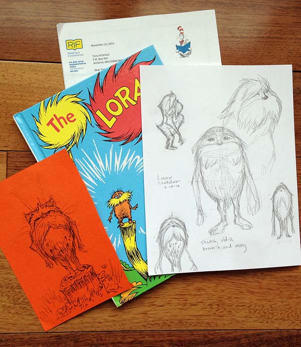
Since RIF’s mission is to provide books for impoverished children, their annual galas are themed around legendary icons of children’s literacy. You may recall my piece for last year’s “Where the Wild Things Are” gala celebrating the work of Maurice Sendak. The theme for this year was another hero of mine, Dr. Seuss.
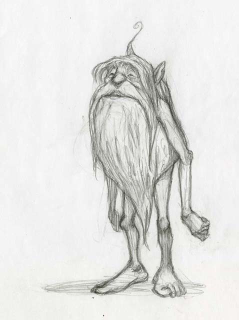
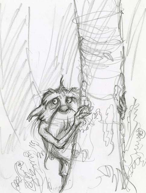
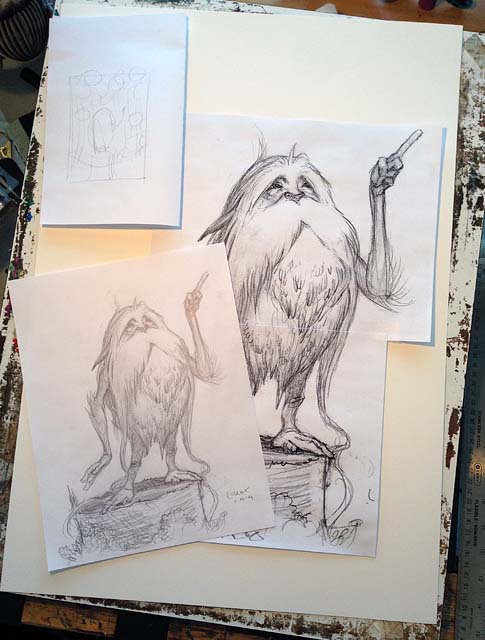
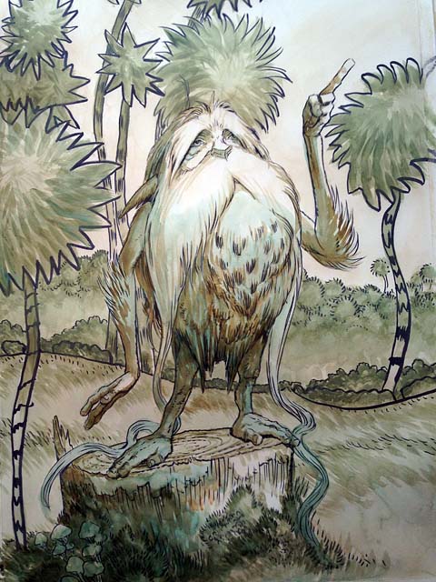
For these auction requests, I could simply rummage through my flat files and send over a sketch or study. Instead, I’ve used it as an opportunity to create one-of-a-kind pieces that I would not normally take the time to do. Though this year’s theme was The Cat in the Hat, I had a favorite Dr. Seuss character that I have loved since grade school. To this day, I continue to cherish – and have been longing to paint – the Lorax. In fact, I’ve been sketching the feisty spirit who “speaks for the trees” for some time. Here’s a sketch from 1999:
…and another, 10 years later, from 2009.
…with my daughter’s copy of the book, I revisited the Lorax in February and tried to put my spin on him while retaining the squat seed-sprout shape of Seuss’ original. I wanted to capture the creature’s ancient wizened face with a hint of sadness in his eyes.
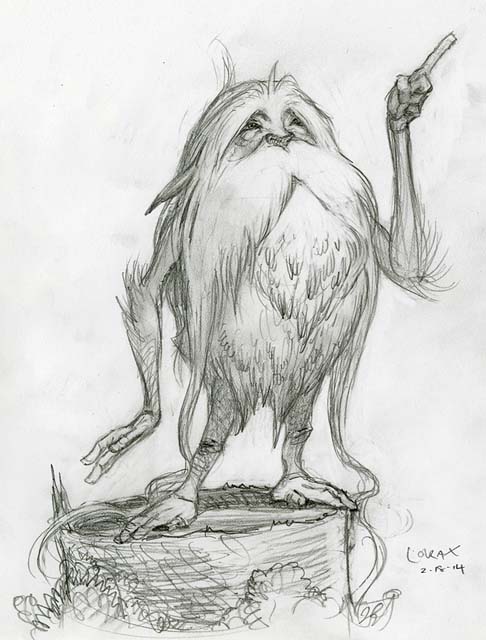
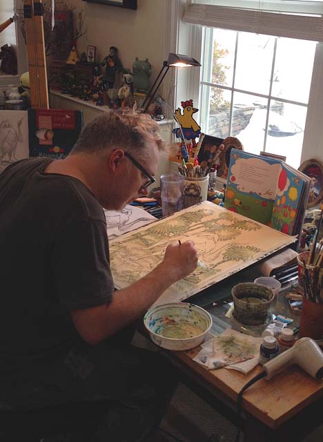
Once I had the sketch down, I enlarged it (using Photoshop) and prepared it for tracing onto a 16×24″ sheet of Strathmore plate Bristol board.
…that’s when I noticed I had a li’l assistant in the studio watching every step that I did.
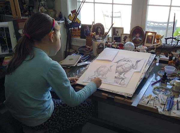
This was was a welcome relief as my daughter is still a bit young for the WondLa books (that I’ve been working on for the past 5 years). I was thrilled to see her genuinely interested in this project so I asked her to help me complete the finished painting. First, I taught her how to draw Truffula trees. We practiced on loose sheets of paper.
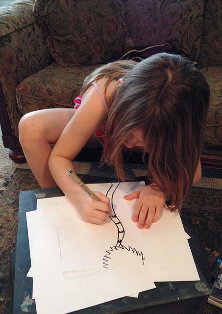
Then I handed her my Pigma brush pen and had her draw and ink the trees.
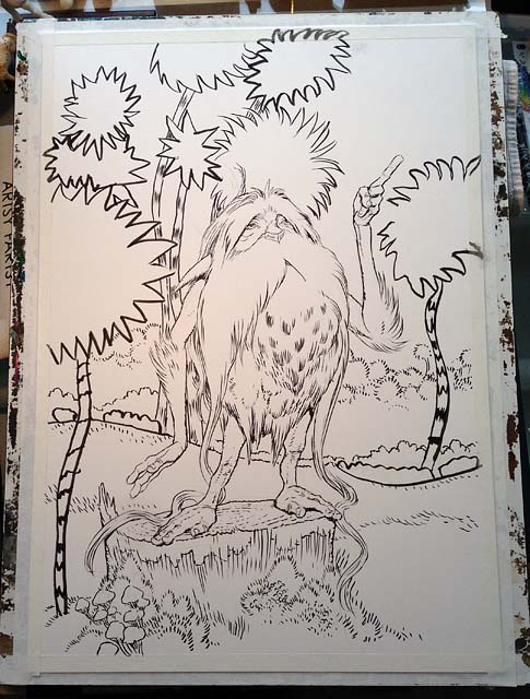
I gave her a break and finished inking the Lorax and his stump. I was thrilled at my daughter’s childlike execution of the trees. It was a chaotic, energetic line that reminded me of why I love Seuss’ art. As I pondered how to paint the image, I thought back on the process I used for the large cut-out animals I created for our local gift shop’s holiday window a couple of years back. I dug out my acrylic paints and got to work.
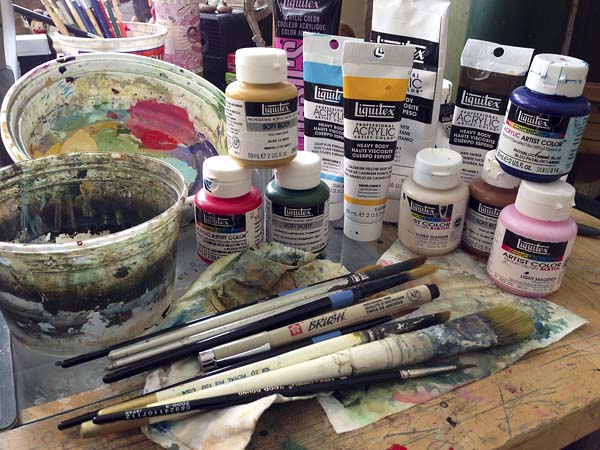
First I antiqued the entire image in “Unbleached Titanium”. This provided a nice base coat and it white-washed the pen line so it wasn’t as strong a contrast.

Afterwards, I continued under-painting using diluted acrylic paints. I kept the tones cool so that the warm golds and oranges would become richer when added on top.
Once I got that where I wanted, I was ready to add the local color. Once again, my assistant came to my aid. I had her paint the distinct bright base colors of the Truffula trees.
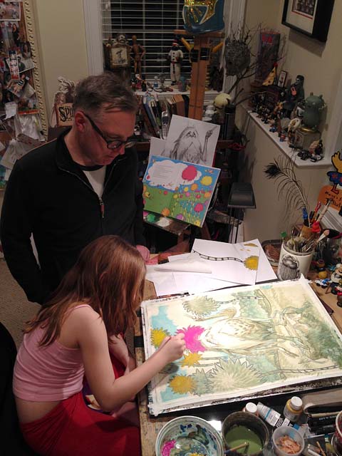
Once her colors were down, I began to build upon them and integrate her strokes into mine for the final painting.

Truth be told, there were moments where I was nervous as to what my 6 year-old might do to this piece during the stages that she helped on, but I realized I’ve totally botched up my own paintings before. Just as I’ve done in the past, I would either fix it or start over. Fortunately, I did not have to do either. She did a fantastic job.

In the end, this collaboration couldn’t have turned out better. Not only did we create this image together, I was able to show my daughter that something she and I love doing – painting pictures – can be turned into something else. In this case, the sale of our painting will provide books to those who don’t have any. I wanted her to know that having a special skill set doesn’t have to be about serving yourself only, it can be about helping others as well.
Providing books to expand young minds is important to the next generation. Books cause us to question, find answers, be entertained and even inspire–just as I was inspired by the good doctor’s words long ago.

“Unless someone like you cares a whole awful lot, nothing is going to get better. It’s not.”
Disney & Lucasfilm have released some exciting news that I have been dying to share…
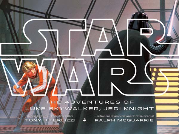
“Disney Publishing Worldwide announced today the upcoming global release of four new books based on the original Star Wars film trilogy. The classic Saga will come to life like never before through adaptations by bestselling children’s authors Tom Angleberger, Tony DiTerlizzi, Adam Gidwitz, and R.J. Palacio. Each of these celebrated authors will bring their contemporary, unique voice to the galaxy far, far away, bridging the multi-arc storyline in anticipation of the release of Star Wars Episode VII in December 2015.
The Star Wars Saga program will hit stores beginning in October of 2014, with THE ADVENTURES OF LUKE SKYWALKER, JEDI KNIGHT a picture book written by New York Times bestselling author Tony DiTerlizzi (The Spiderwick Chronicles), illustrated with concept art created by Ralph McQuarrie, for the original Star Wars films. This winning collaboration, combining the entire storyline of the original trilogy, is bound to delight dedicated Star Wars fans and enthrall readers new to the series.
Additional titles to follow include new retellings of STAR WARS: A NEW HOPE by R.J. Palacio (Wonder), STAR WARS: THE EMPIRE STRIKES BACK by Adam Gidwitz (A Tale Dark and Grimm) and STAR WARS: RETURN OF THE JEDI by Tom Angleberger (Origami Yoda series), which will be illustrated by award-winning Star Wars concept artist Iain McCaig.”
Knowing full well what a geek I am, the folks at Lucasfilm contacted me last fall to see if I would be interested in taking the late Ralph McQuarrie’s concept art to create a picture book retelling the original STAR WARS trilogy. Without hesitation, I agreed.

How I pored over my Art of Star Wars when I was a young padawan artist. Within those pages my imagination exploded like a Death Star as I studied the blueprints of movie magic. And, of course, most of the drawings and paintings in the Art of Star Wars were by Ralph. I was familiar with many of his iconic images, but not prepared for the 200+ jpegs that soon arrived in my dropbox.
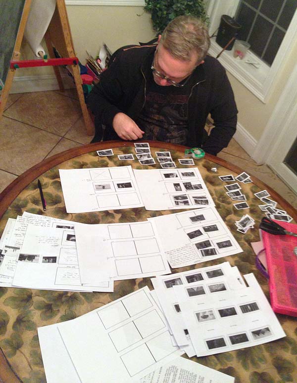
I printed out small thumbnail-sized images and began sorting them in order of each film and scene. I laid the book out as if I were not only the author, but the artist as well. As I designed the flow of the book, I could see where the text would have to work harder to tell the story and where the art would do the job – just like the division of labor in a true picture book.
As a fan, I also tried to incorporate images that I had not seen in previously published books. I’m hoping the parents reading The Adventures of Luke Skywalker, Jedi Knight will enjoy a nice blend of Ralph’s iconic imagery mixed with some fresh new art (I even figured out how to include his cover painting to Splinter of the Mind’s Eye)
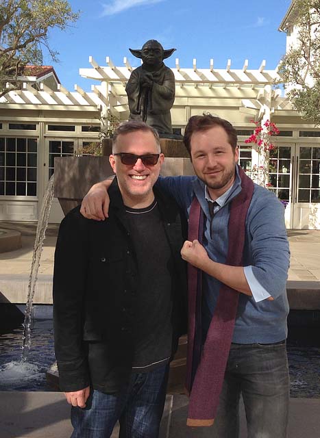
I am also incredibly excited for the other participating authors involved with the chapter book adaptations of the original films (like Adam Gidwitz here, hanging out with me and Yoda). Earlier this year, we met at Skywalker Ranch to discuss our projects and immerse ourselves in a galaxy far, far away. Ten year-old Tony had died and gone to heaven.

(Left to right: Ten year-old T, Tom Angleberger, Luke Skywalker in disguise, R.J. Palacio and Adam Gidwitz)
There’s no question that the STAR WARS myth has impacted me as a storyteller. I am humbled and honored to be the author asked to retell George Lucas’ classic space-age story of good triumphing evil for the next generation.
May the force be with you.
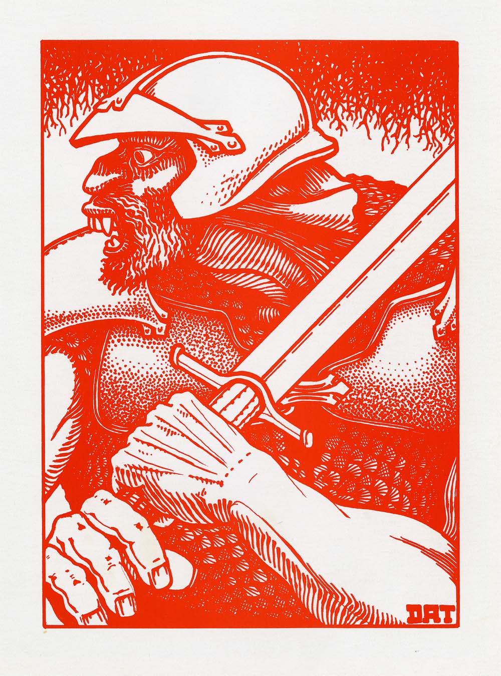
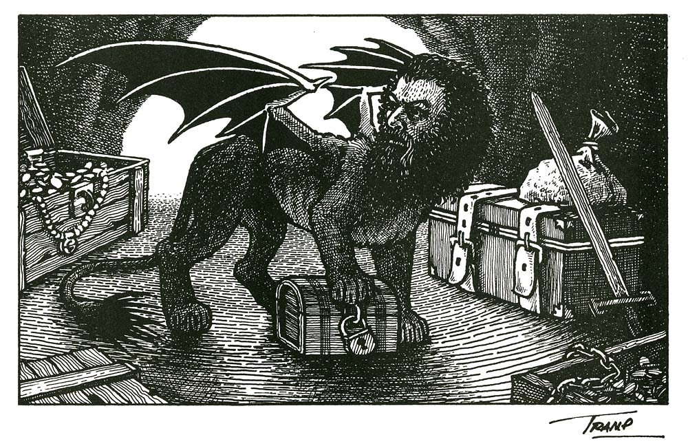
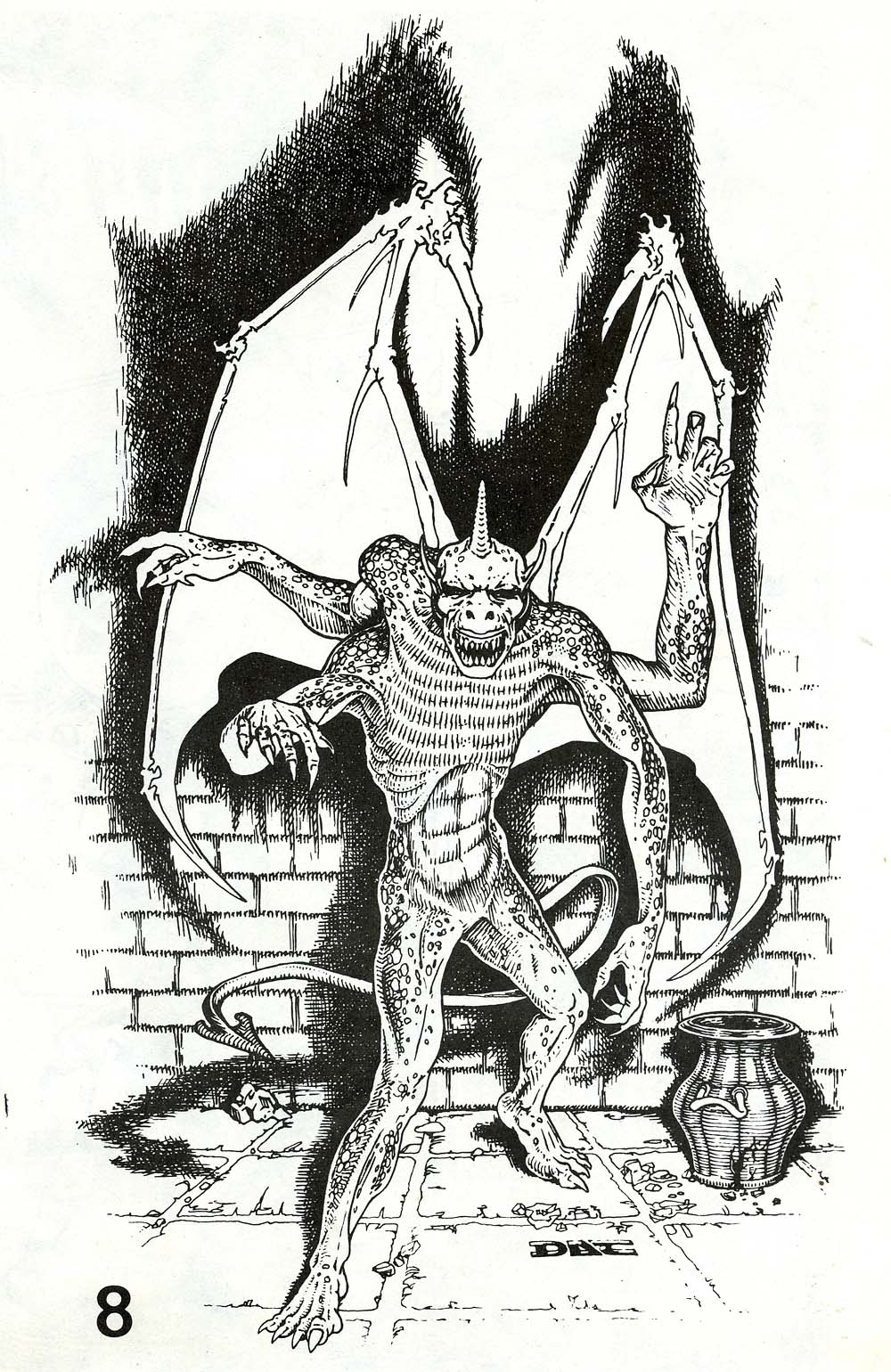
I am saddened to learn the news of the passing of 1st edition Dungeons & Dragons artist, David A. Trampier–or DAT as he was known to us old-school gamers.
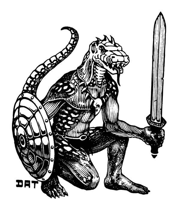
Though I never met him, I’ve posted several times about the impact Trampier’s art had on my burgeoning artistic abilities way back in middle school. And I cherish my artifacts of his inspiration to this day.
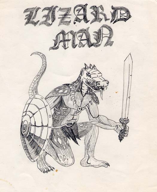
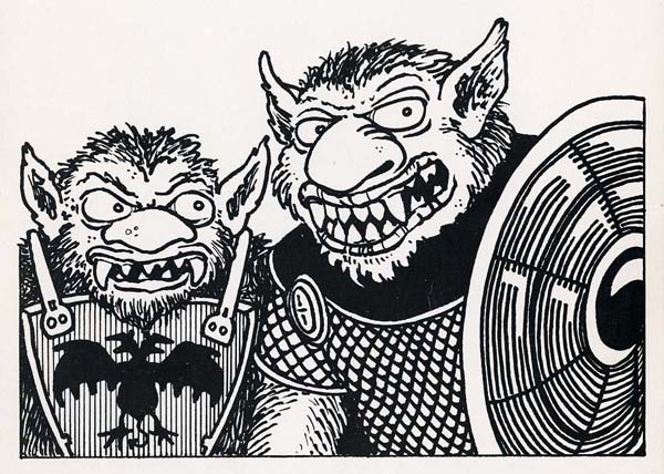
Many know his graphic inkwork from the AD&D Monster Manual (1977) and the AD&D Dungeon Masters Guide (1979). His cover to the AD&D Player’s Handbook (1978) has become an icon from this era of role-playing. A quick image search of Trampier’s name will show you many fine examples of his work from these popular tomes. Being a collector of all things from childhood, I also happen to own many of the early “pastel” adventure modules from the 1970′s, which also featured his woodcut-inspired illustration. Below are some of my favorite pieces that aren’t seen as often (click to enlarge):
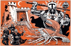
 Fire Giant from 1978′s Dungeon Module G3 “Hall of the Fire Giant King”
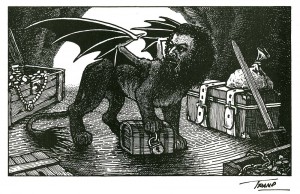 A manticore in his lair for 1977′s “Monster & Treasure Assortment”
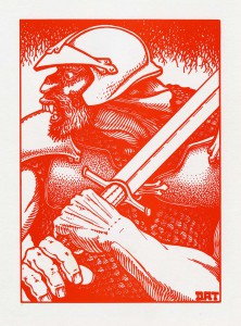
 Tramp’s cover to Dungeon Module T1 “The Village of Hommlet”, 1979
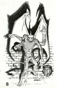 Gargoyle from the AD&D classic, “Tomb of Horrors”. 1978
Thank you for your continued inspiration, Tramp. May your art continue to influence many imaginations for generations to come.
Early in my career in children’s publishing, I filled in the gaps between my picture book projects by illustrating jacket art for paperback books. Most were reissues of older titles like the Bernie MaGruder series and the Magic Shop books. Though I channeled classic illustrators (like Norman Rockwell and J.C. Leyendecker) I was also inspired by another great illustrator, Joanne Scribner.
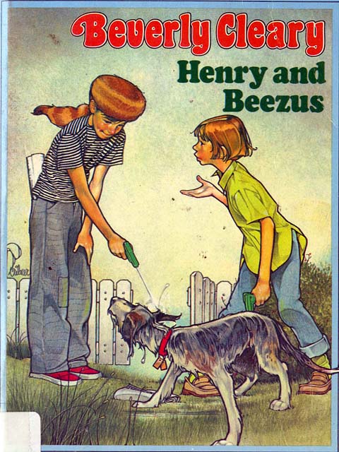
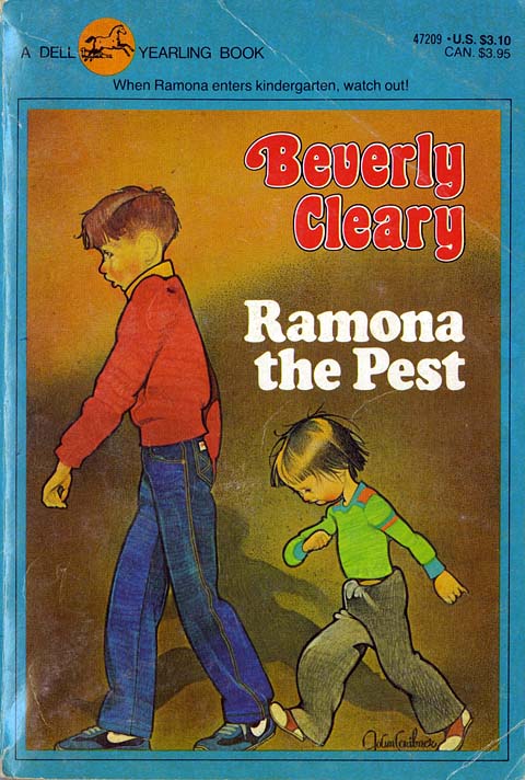
Around that time, I remember visiting a used bookshop in upstate New York with artist-pal, Scott Fischer. I was telling Scott of my ongoing jacket art assignments as we browsed through the old paperbacks. From a dusty, overloaded shelf, Scott pulled out a classic from Beverly Cleary – Ramona Quimby, Age 8.
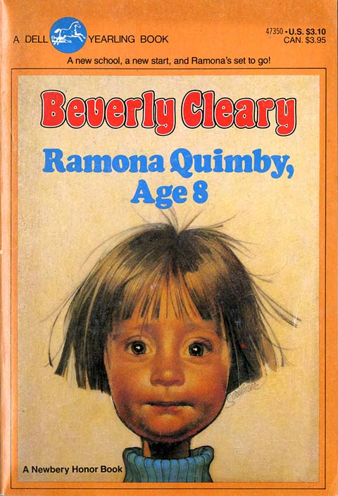
We both recognized this iconic cover from our elementary school days. As illustrators we could see the technical mastery in the simple composition. As the title suggests, you are meeting the precocious and endearing Ramona. But the exaggeration of her features (like the flyaway hair and that skinny neck) add a levity to the detailed realistic rendering.
From that day on, I began scooping up books with Scribner’s unmistakable imagery whenever I chanced upon them.
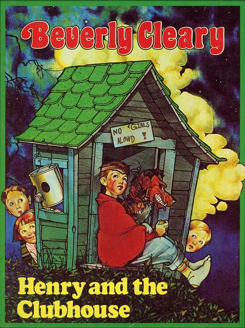
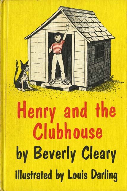
As any librarian from the baby-boomer generation will tell you, Scribner was not the first to render covers for Cleary’s classics. The Henry Huggins books, Ramona books, and even Mouse & The Motorcycle were illustrated by the late Louis Darling.
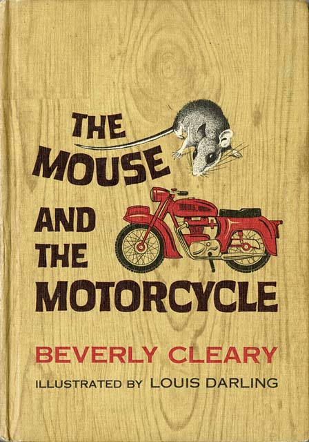
As much as I LOVE the original jacket to Mouse & The Motorcycle, it is not the version I grew up with. This is:
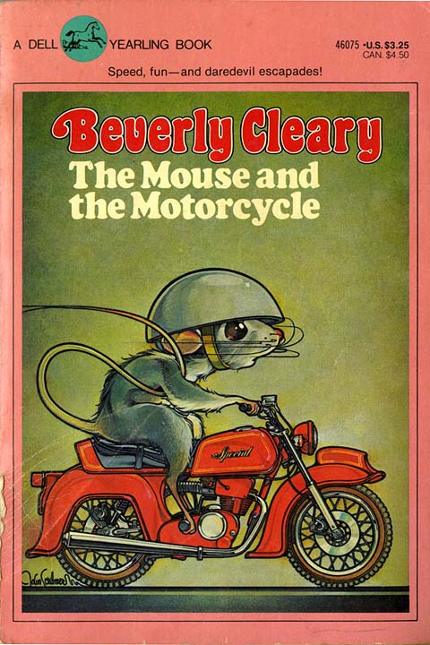
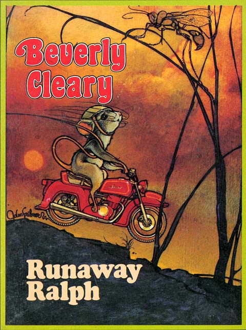
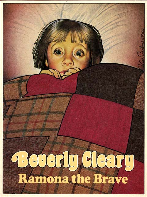
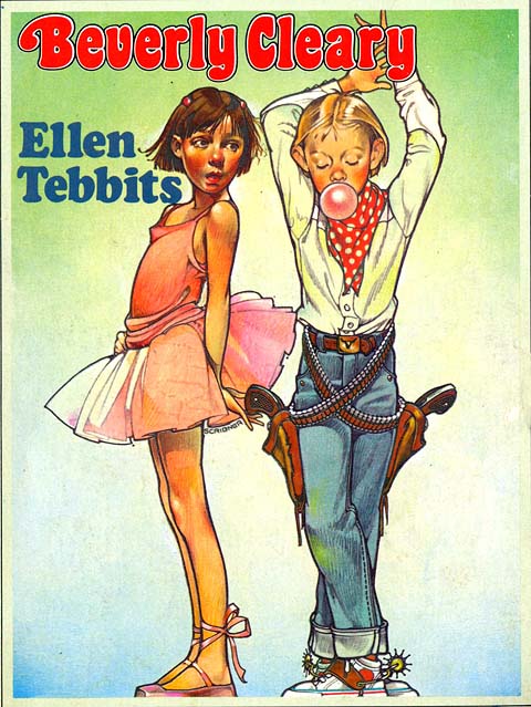
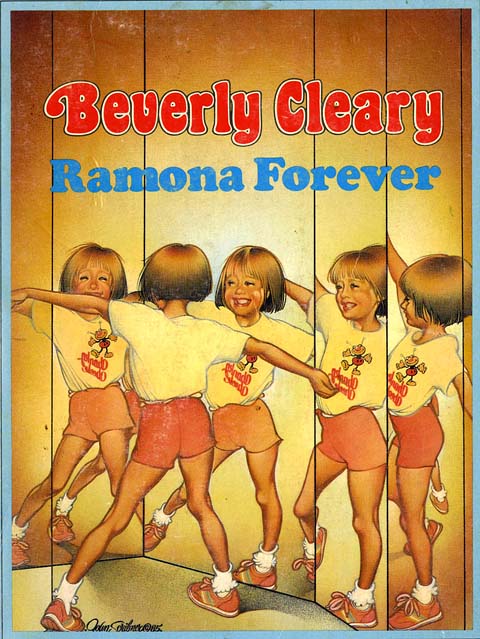
It appears that Scribner was tasked with re-imaging these beloved titles for Dell’s imprint, Yearling Books for Young Readers, in the late 1970′s. This is an illustrator’s dream, to be sure, but to maintain a high-level of artistic quality that spans over many titles with many characters is quite a feat. Joanne’s talent prevailed and an entire generation was introduced to Cleary’s classic texts.
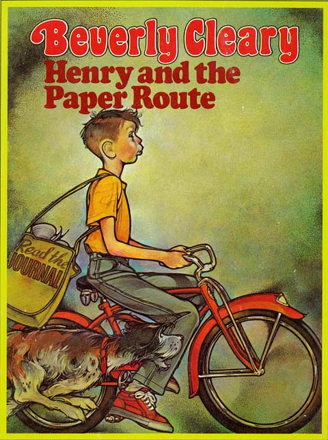
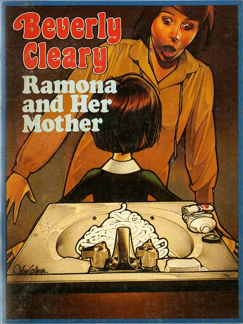
I’ve trimmed off some of the jacket design only so you can focus on her illustration more. I adore how every title is set in the Cooper font. I can’t think of any other typeface which perfectly reveals the time in which these books were designed.
In looking at her images now, I can see the influence of Rockwell (especially in the staging and acting of the models), but there is also an Art Nouveau quality to the line that is quite distinct. The colored pencil hatching brings to mind the work of Brian Selznick, who is also a fan. When I sent Brian these scans from my book collection, he responded with images from another favorite illustrator from that time – Richard Amsel.
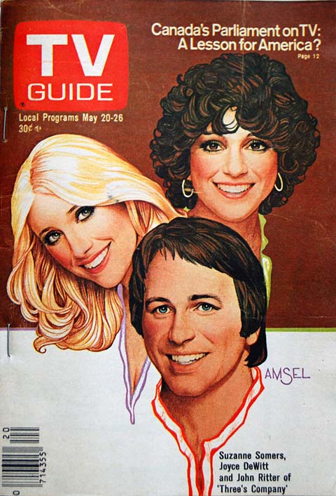
Amsel’s ubiquitous art permeated album covers, magazine covers and movie posters in the 1970′s and early 80′s. He was master of his craft, able to render a perfect likeness while maintaining his distinct pencil-sketch style. I have no idea whether or not Amsel’s work influenced Scribner’s or if that style was just part of the artistic zeitgeist back then. Regardless, Scribner did for kid’s book covers what Amsel did for movie posters and magazines.
I couldn’t find an official site or page for Joanne Scribner anywhere (if anyone knows of one, please post it in the comments). I did come across an article from the Spokane Daily Chronicle in 1979 reporting her leave of New York and return to Washington, where she’d begun teaching illustration at a local community college. In the article she is quoted, “It is my job to make people want to buy that book. The cover is what grabs people when they walk into the book store.”
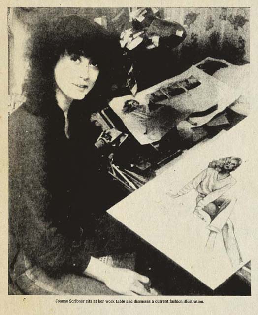
Thirty-plus years later that philosophy still applies. And, as far as I am concerned, Joanne Scribner’s work still does just that.
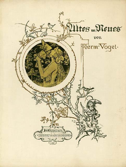
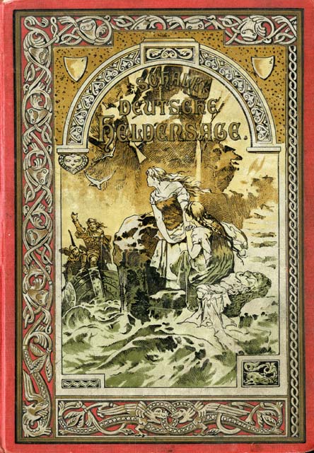
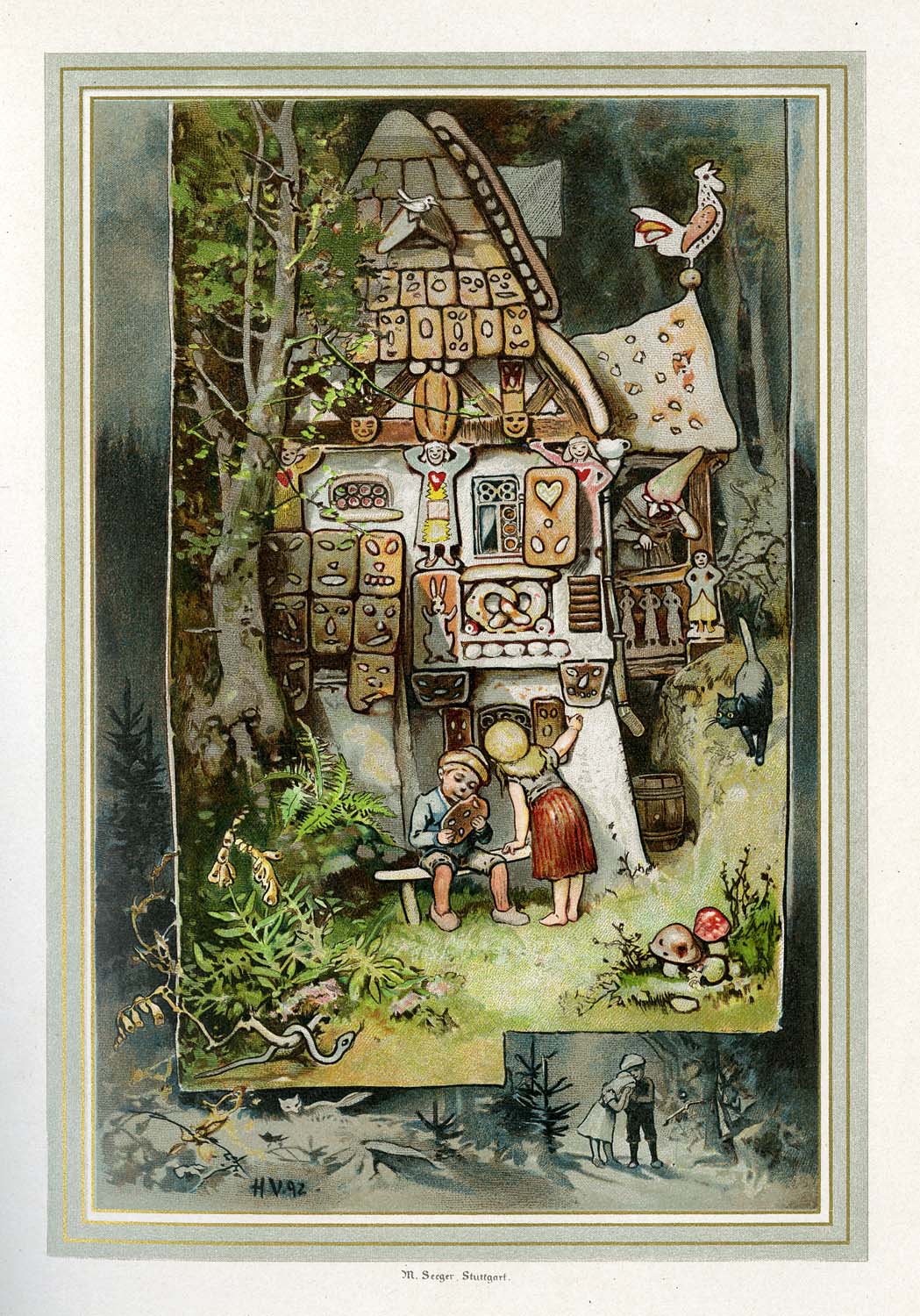
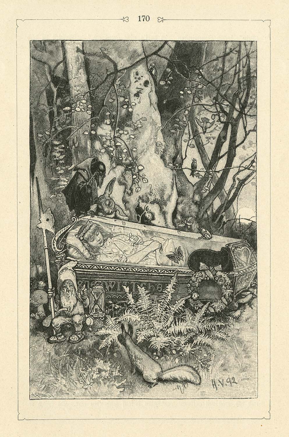
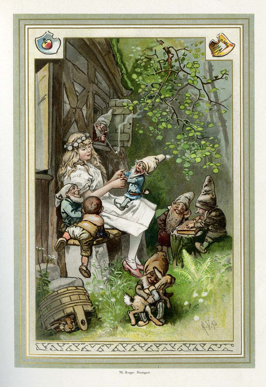
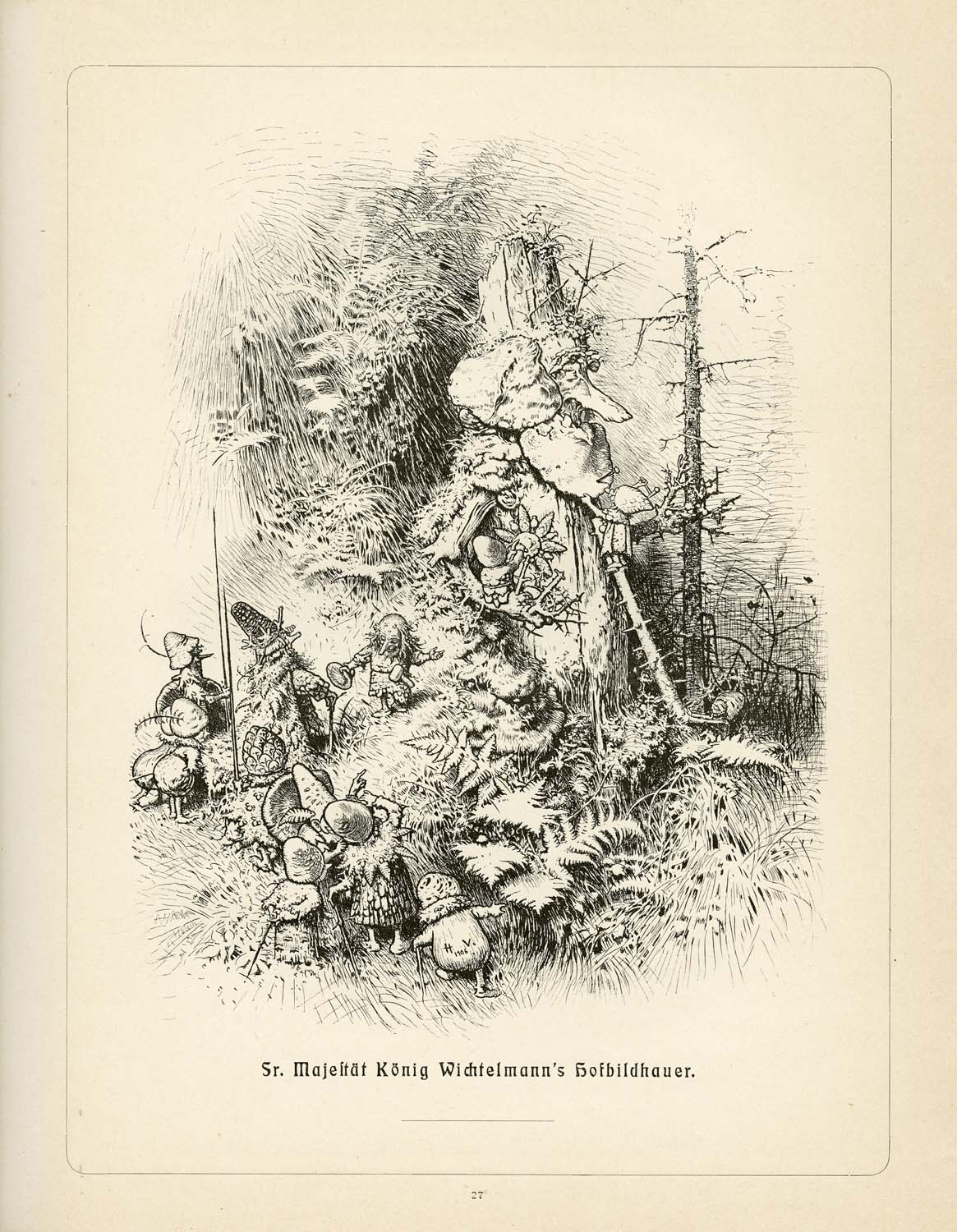
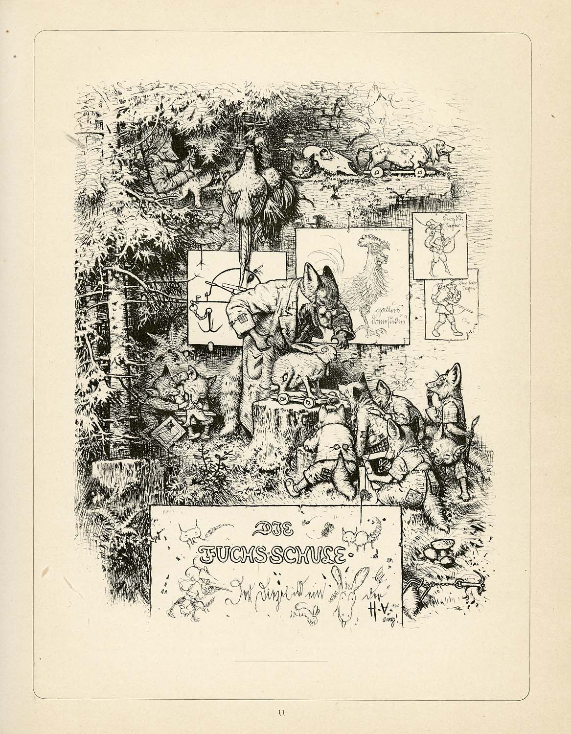
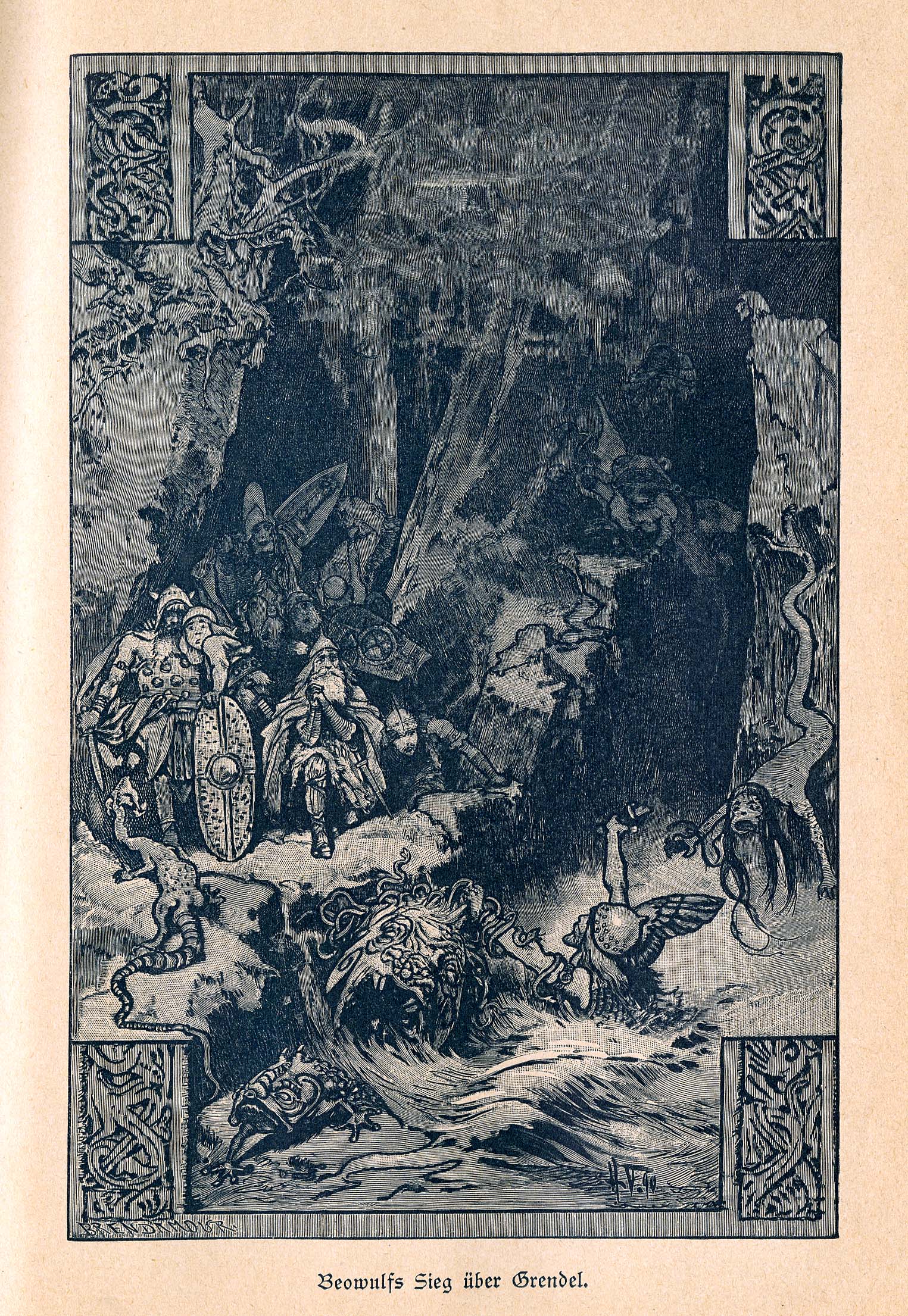
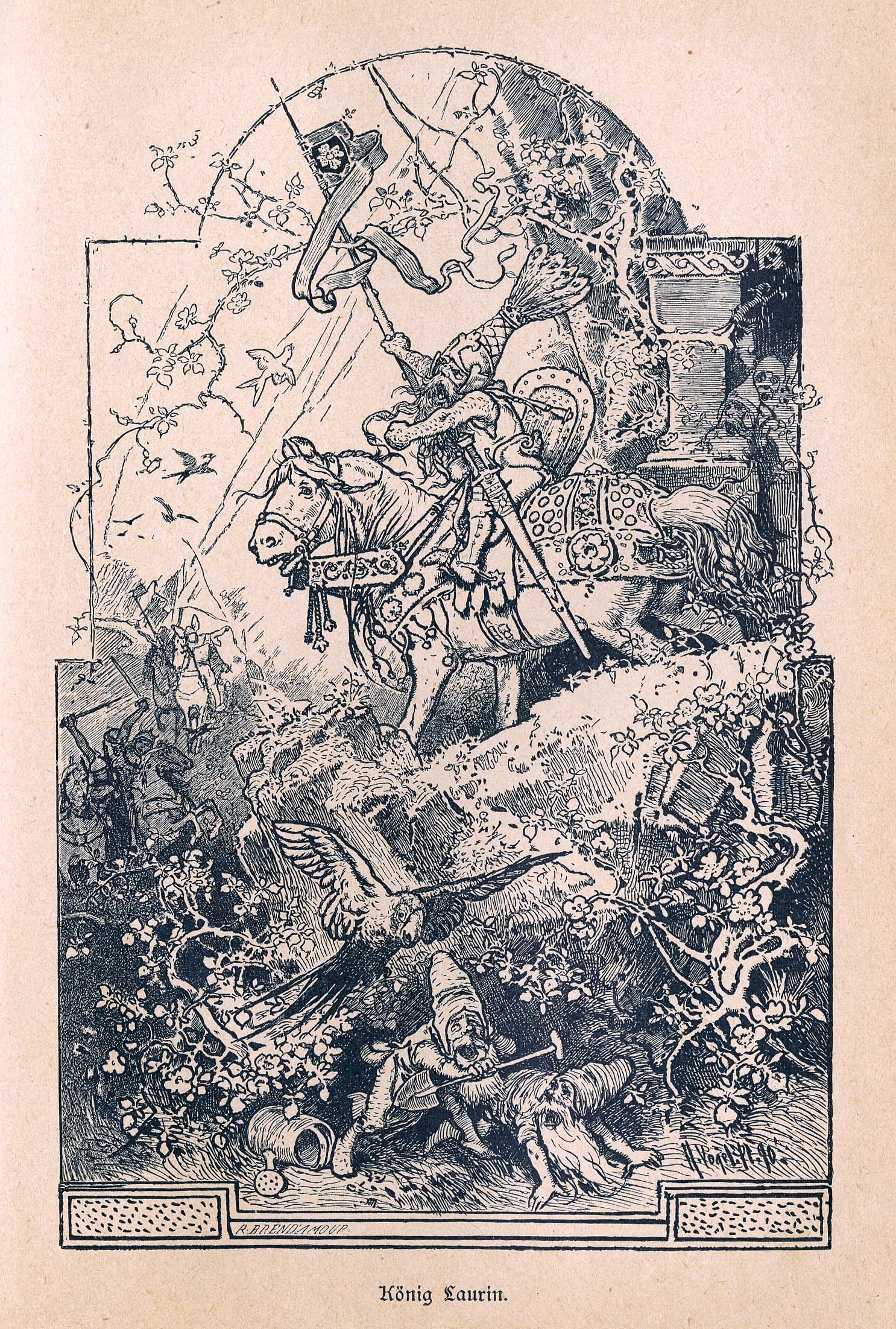
I haven’t rattled on about other artists whose books I love for some time now (Like H.J. Ford or A.B. Frost). While I’ve been at my desk for the past four months writing the first draft of WondLa III, I’ve still craved artistic inspiration. During this time, I started each day with snapshots of some of my treasured books in my collection that I shared on Facebook, Twitter and Instagram. One that received many a response was by German illustrator, Hermann Vogel.
Unlike previous posts (where I am quite educated on the artist and can show how their work directly influenced me), Vogel is simply one of those that is so grand, so in tune with the art I make, that I mostly just want to share a bunch of hi-res scans with you. Though, I must confess that part of this reasoning is because I honestly don’t know a whole lot about him.
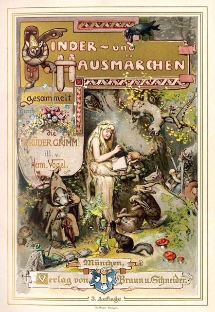
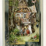
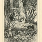
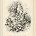
What I can tell you is that I was at San Diego Comic Con a few years back walking the floor with my wife, Angela. Out of the throngs of costumed fans, Charles Vess appears, seizes me by the sleeve, and escorts me over to a used bookseller’s booth. He points to a 1894 German edition of the Grimm Brothers’ Kinder und Hausmärchen (Children’s & Household Tales) and tells me, “This book is expensive ($100+), but you won’t regret purchasing it.”
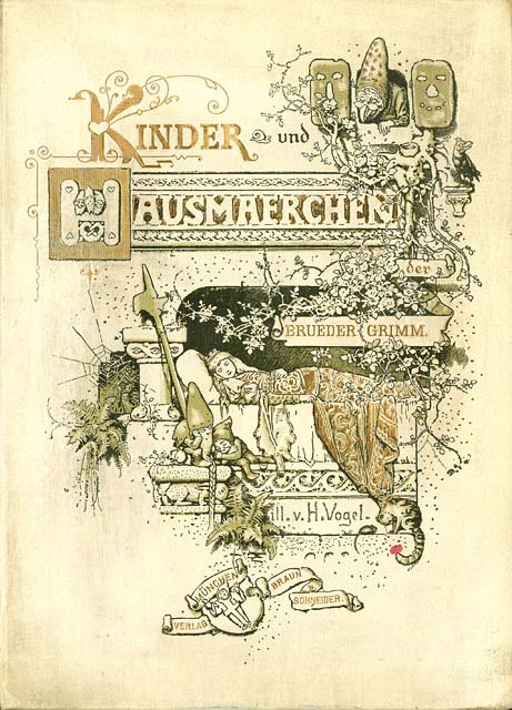
I picked the book up and leafed through the pages. In one chapter’s worth of illustrations, I closed the book and opened my wallet. Charles was right. (click on each thumbnail to have your mind blown)
Since then, I have managed to find a few more copies of Vogel’s magnificent work. He released four albums of collected art around the turn-of-the-century. The cover alone is a triumph of design.
While I’ve been hunting for his books, more artists have mentioned their mutual love of Vogel’s work. Michael Hague, Barbara McClintock and Brian & Wendy Froud are all fans. For me, its the disciplined draftsmanship that is matched only by his epic imagination.
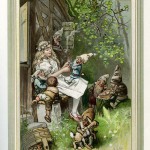
Here’s some scans from Heldensage Deutsche (German Heroic Sagas) and include illustrations from Beowulf and the Nibelung.
I wish I could tell you that Dover books offered affordable reprints for you to snag and add to your collection. However, as of this writing, none exist. In the meantime, I will scan and post more images here from time to time. If you own/find any of his books let me know, I’d love to share what everybody has and build a wishlist.
Next month, Reading is Fundamental (RIF) will be celebrating Maurice Sendak’s controversial classic, Where the Wild Things Are.
I was asked to donate a Wild Things homage to be auctioned off with all proceeds benefiting RIF, an organization I am proud to be affiliated with. In fact, some years ago I contributed a short recollection of my mom reading young Tony House at Pooh Corner for RIF’s anniversary book, The Art of Reading.
Maurice’s legacy in words and pictures has inspired me since I first lay eyes on In the Night Kitchen and Higglety Pigglety Pop! 1980′s The Art of Maurice Sendak had a tremendous influence on my journey to become a children’s book creator. In fact, I quoted from it last year when I spoke at the SCBWI’s annual conference. Like many, I was saddened to hear of his passing last year. I honored Maurice by reading Wild Things before beginning my first event in Los Angeles for the Hero for WondLa tour.
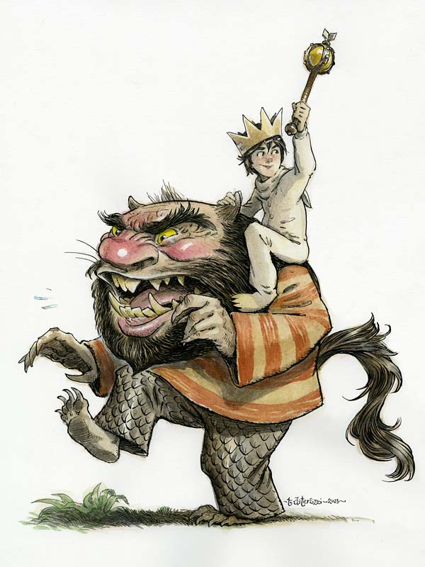
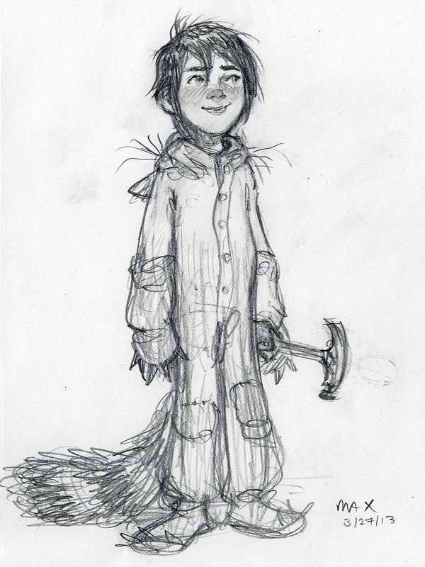
Needless to say, I was nervous and excited to “cover” Maurice’s most beloved characters. I’d seen some lovely tributes before and knew I had my work cut out for me. I came across a little drawing of Max, likely done back in 1999 or so.
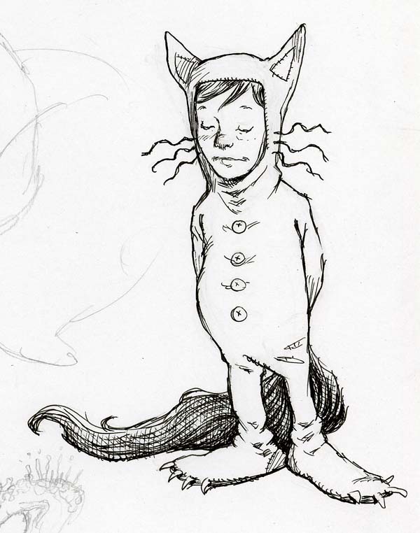
…and since Max is who I associate with most, I started with him for my new rendition.
I returned to my dog-eared (signed!) copy of the book looking for inspiration. I really liked the wild rumpus scene where Max is riding the minotaur as king; however, I worried that my version would look really minotaur-y (yes, its a word). So, I swapped out the minotaur for the bearded Wild Thing (with the striped shirt) as he seemed the most iconic of all the monsters.

In drawing the Wild Thing, I realized what an influence their design must have had on Jim Henson when he was creating his more monsterly Muppets – especially Sweetums. (In addition, I once read that Maurice’s Outside Over There was the inspiration for Labyrinth.)
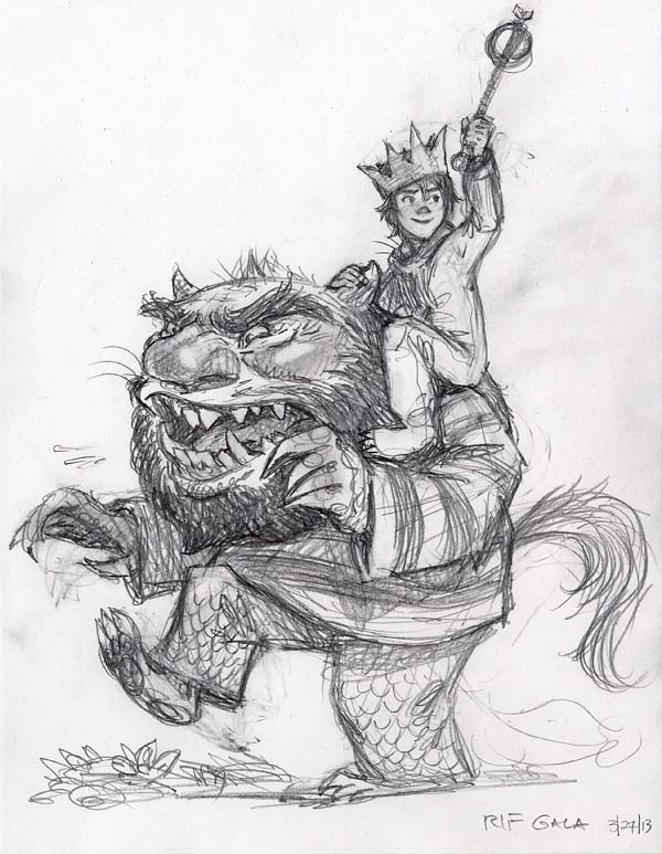
As I refined my sketch, I remembered an interview where Maurice said that the Wild Things were inspired by his aunts and uncles. With that in mind, I put a little of Maurice in the monster. (Or did I just show a little of the monster that was in Maurice?)
I’d like to think Maurice would have liked this. I sure hope you enjoy the final result. I’ll post news on the auction once it goes live.
In between book tours and summer barbeques, I’ve managed to squeeze in a couple of new pen & ink images of two beloved characters from La Belle et la Bête (better known as Beauty & the Beast) for an upcoming exhibit in Paris, France.

The Daniel Maghen gallery specializes in graphic novel artists from abroad. The talent represented in the gallery’s collection is mind blowing, so I was thrilled when I was asked to contribute an image for their upcoming “Book Show” exhibit in which a gaggle of artists render an image from a favorite book.

Seeing that the exhibition was in France, my mind drifted off to my favorite French fairy tales, especially the work of Charles Perrault. I’ve been enamored by the original Beauty & the Beast story since I first read it, so I used the exhibition as an excuse to create my own interpretation of the main characters, Belle and Beast.

Though the original artwork will not be for sale (Ang wants to hang them in our personal collection), I may yet create prints of them down the road…hmmmm.
")
")
Anne McCaffrey passed away yesterday in her home in Ireland at the age of 85. Though Anne authored numerous books, many know her as the grand storyteller of the beloved Dragonrider of Pern series, originally crafted as novellas when they were released in the late 1960′s.
I had the opportunity of re-imagining and re-illustrating the first Pern book, Dragonflight, in 2002. And, though it met with mixed reviews with Anne’s diehard fans (including her editor at Delrey Books), I was honored to be a part of the Pern legacy. I still have my dog-eared paperback, with Michael Whelan’s classic 80′s cover, from my middle school days.

I never met Anne, and honestly I don’t know if she saw my interpretation of her world. Regardless, her words did inspire me greatly and I believe they will continue to do so for many generations of readers who dare to imagine.

Here’s a desktop image I’ve made for my fellow Pern fans. Simply click the image for a hi-res file.
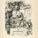
Dragons, trolls, nixies, mermaids, giants and fairies. I could be talking about Spiderwick, Brian Froud & Alan Lee’s Faeries, or perhaps this is (yet another) post on old D&D. But, in fact, I am referring to the collection of twelve colored fairy books collected and translated over 100 years ago by Scottish novelist, Andrew Lang, and illustrated by English inkmaster, Henry Justice Ford.

This collection of fairy tales from around the world was a favorite in the DiTerlizzi household when I was a kid. We could pick any color book we wanted (there was The Red Fairy Book, The Green Fairy Book, The Lilac Fairy Book…you get the idea) and my mom would read stories from them to us at bedtime. In later years, I would attempt to copy Ford’s intricate linework and design. His sense of composition and iconic illustration style certainly had an impact on me, especially on the Spiderwick chapter book illustrations.

Never heard of H.J. Ford? Most probably have not. Its odd how his legacy is eclipsed by contemporaries of his time such as Arthur Rackham or Ernest Shepard – both of whom I am sure were looking at his work. However, in Ford’s art you can see the influence of the Pre-Raphealites more so than say, Rackham’s, and I like that. Its as if he were the illustrator equivalent to John Everett Millais or Edward Burne-Jones. His black & white imagery is of danger and drama, mixed with beauty and youth, against that lush English landscape.

There is no question that Ford’s art inspired illustrators working today. Michael Hague cites him as an influence and has collected first editions of all the colored fairy books (so jealous). I would even venture a bet that up-and-comer, Jeremy Bastian, has Ford’s blood pumping through ink-filled veins of awesomeness, especially in his comic, Cursed Pirate Girl.

(In case you missed it, here’s a quick link to Part 1)
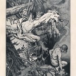
Back in August of 2003, as I began work for the fourth Spiderwick book, I started thinking about re-illustrating a classic text after the Spiderwick series was complete. I spoke with my editor at the time, Kevin, and he thought it a good idea – especially given how well my rendition of The Spider & The Fly was received.

We discussed lesser-known classics that might be enjoyed by readers of today and arrived at Edgar Rice Burroughs’ A Princess of Mars. Like his other classic, Tarzan of the Apes, Burroughs’ sci-fi adventure was action packed with lots of fighting, rescuing and all around swashbuckling. I loved it when I first read it in middle school and I still love it today.

Aside from the coveted Frank Frazetta Doubleday editions, which came out in the 1970′s, no one had really tackled publishing a re-illustrated edition since Frank Schoonover painted the illustrations for the 1917 first edition. Excited, I began to re-read A Princess of Mars with sketchbook at my side.

I soon theorized that to bring in a new audience of young readers I would shift my focus less on the human characters – like the hero, John Carter, or the martian princess, Dejah Thoris – and spend time on the unique alien life forms. More specifically the unusual four-armed Tharks, the tribal aliens that John battles throughout most of the story. It was in their design that I focused most of my creativity.

As I worked through variations of the other martian creatures, I thought of my story about the wandering alien, and returned to him during the Princess of Mars sketch session. I infused some of my Thark design into my character and felt like I had made some serious headway on his look, which began to inform his personality.

In the end, Spiderwick‘s success and hectic schedule did not allow me the time to illustrate A Princess of Mars. I did continue with my “new take on a classic” idea and it e
As you may have read recently, I’ve uploaded all sorts of activity and coloring pages throughout the site and on my facebook page. This had me thinking about coloring books and the artwork created for these treasured tomes.
Its a certain style of illustration, that which entices little ones to color while allowing freedom to be creative while doing so. As the father of a four-year old, I’ve been reminded how relaxing coloring can be. Perhaps its because you can shut off my mind and fill in-between the lines of a completed image while basking in the scent of waxy crayons or inky felt-tipped markers.
I remember I colored A LOT when I was young. My mom actually made a deal with us DiTerlizzi kids that, “if you complete a coloring book, I’ll buy you a new one.” That was a pretty awesome deal and I took great pride in my colorized masterpieces. I’m excited to share with you a few of my favorites, thanks to a recent discovery exhumed from the strata of my parent’s old storage unit.

Like many grade-school boys, dinosaurs were alive and well in my bedroom. From the Aurora Prehistoric Scenes models on my book shelf to posters of Charles Knight’s lush paintings taped to my wall, you stepped back into the Mesozoic when you stepped through my door. Lying on the shag carpet, among the Hot Wheels cars and Marx dinosaur playset, you would have found the above gem published in 1975 by Whitman. The scenes inside were begging for you enter them with a box full of Crayola ammunition.

…hmmm, I’m not sure why Gorgosaurus is labeled as a horned dinosaur here…but then again, scientists didn’t know as much back in the 70′s as they know today.
Some years later my parents bought me this one beautifully drawn book by Anthony Rao and published by Dover.

I loved the art in here so much I didn’t dare mar it with my sub-par coloring ability. It remains pristine to this day (spare for the colored pteranodon, a personal fav). Here’s a page for you to enjoy Anthony’s line-work (click the image for a larger file):

As I said, my Hot Wheels collection was right in this prehistoric mix, and the official coloring book (also published by Whitman in 1978) allowed you dream about owning a tiny garage full of the Hot Wheels classics like “Poison Pinto”, “Spoiler Sport” and &ld

For those following this blog, you’ll remember my endless waxing about the many incarnations of Tolkien’s masterpiece, The Hobbit, a couple of months back. Subsequently, I was asked to write up a proper essay for the LA Times about the Maurice Sendak illustrated edition of The Hobbit that never came to be. Read on and see what I discovered…
Every once and awhile I stop blathering about my work and bow down to the many book titles that had a tremendous impact on my developing imagination and ability as a Kid Artist with Big Dreams.

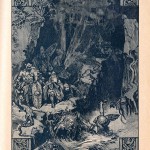
Like most of the literate world, I adored J.R.R. Tolkien’s first foray into Middle-Earth when I read The Hobbit back in middle school. To me, it was an epic tale that I devoured like a hungry troll in between my games of Dungeons & Dragons and Adventure on my Atari 2600. My reality of a pimply lollipop-headed geek disappeared each time I slipped on the ring, opened my dog-eared tome, and plunged into the wilderwood of hobbits, elves, dwarves and dragons.

What I didn’t grasp then, is that the copy I read contained drawings by that Gandalf of great storytelling himself. I adored Tolkien’s decorative, almost Kay Nielsen-esque, images of Hobbiton, the Trolls and the mighty Smaug.

Tolkien’s images were further brought to life in the 1977 made-for-TV animated film adaptation done by none other than the holiday-celebrated-stop-motion messiahs, Arthur Rankin and Jules Bass.

The Rankin & Bass rendition of The Hobbit not only galvanized my neverending storybook love of all of Middle Earth, it took it to new heights with its Arthur Rackhamy watercolor backgrounds, somewhat-grotesque character designs and sinister songs.

Here’s a couple of scans from the book adaptation of the film. (Click for a larger view)

Yes, to some this version may not hold up, but I feel that this adaptation of the story lured in a new generation of young hobbits ready for more adventures. And the nostalgia for the Rankin & Bass film absolutely affected my drawing style as can be seen by this 1997 cover to Dragon


.jpg?picon=847)


Fantastic. I love how you both contributed to this project. I think the good Dr. would totally approve.
A fantastic blend of styles.
Inspiring as well as I am about to attempt my first acrylic painting for my soon to be born niece. I have been a digital painter for some time, but am really excited to try this. I have no idea what to expect but it should be fun.
Always enjoy your work and I love seeing the progress shots.