


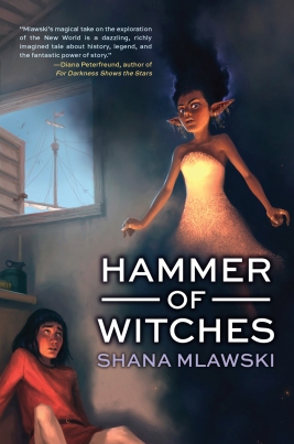
We’re so excited about the upcoming release of our new YA historical fantasy Hammer of Witches! In this post, Tu Books Editorial Director Stacy Whitman discusses how she and the designer came up with the final cover:
Historical fantasy can be tough to market. You have to show that, despite being steeped in research and history, this is an exciting, awesome book. It should look different from all the contemporary books out there, but not old-fashioned. Because of the fantasy element, a photographic cover just couldn’t do this book justice, but for YA, illustration can be tough because you don’t want the illustration to make the book look like it’s for a younger audience. We needed an illustrator whose art had a more mature look, whose sensibility tended more toward something you’d see in the adult market than the middle grade market—and we found that illustrator in Andrew Mar.Because the cover is illustrated, there’s a lot more leeway in terms of what we can pick to show. So we get to see an important moment in the story: a character moment where the main character, Baltasar, meets one of his primary companions throughout the book, Jinni (who is a half-genie). We know there’s magic happening–she’s floating, after all!–and we get to see how the author envisioned these characters rather than having to find a model whose looks fit the character or a stock photo that’s not quite right. We can also see that this is a historical setting from the view out the window, the characters’ clothing, and the items on the table. We even get some nice detailing in Jinni’s dress, and I love the expression on her face compared to Baltasar’s!How did we choose this particular scene? The illustrator and designer both read the book, and we all actually came separately to the conclusion that this key scene had a lot of potential for illustration. Check out a few of the early sketches to peek in on the illustration process. First we had to choose what position the characters would be in, and then we had to figure out where the type could go in juxtaposition with the scene. How would the reader’s eye travel across the artwork and type together? Would this invite them in to the book to read to figure out what will happen?
The modern look of the typography ties it all together–this is a book for today, looking at this controversial time period through a different lens than the old stories. We looked at several font choices—as you can see from the thumbnail sketches, that font is not the one we ended up with on the final cover. Then the designer, Isaac Stewart, had to place the typography in a way that stood out without overwhelming the great artwork.The end result: a cover that says “READ ME!” to anyone who sees this book.


- “An engaging, magical adventure set against the historical backdrop of Columbus’ westward voyage.” —Kirkus Reviews
- “Mlawski’s magical take on the exploration of the New World is a dazzling, richly imagined tale about history, legend, and the fantastic power of story.” —Diana Peterfreund, author of For Darkness Shows the Stars
- “Hammer of Witches is a historical revelation—an eye-opening magical carpet ride that takes the reader over the ocean and through the woods to an ancient time, full of beauty and grace, and the ever-present conflict between man’s spirituality and his natural brutality.” —Guadalupe Garcia McCall, Pura Belpre Award winner, Morris Award nominee and author of Summer of the Mariposas
- “A truly enjoyable energetic tale and an altogether original take on one of the most important events in human history—the first voyage of Columbus.” —Joseph Bruchac, author of Wolf Mark
Look for Hammer of Witches in April 2013! In the meantime, take a look at the cover design of our other upcoming YA title Awakening in Cover Design 101: The cover of Awakening.
Filed under: Art, Publishing 101, Tu Books Tagged: cover design, diversity, Hammer of Witches, illustration, Science Fiction/Fantasy, Spring 2013, Teens/YA, Tu Books


_72.jpg)
[...] shared on Facebook, but I’d like to round them all up here. First let’s start with a cover reveal and some insight into the design and illustration process for Hammer of Witches! And I linked this later in the last post, but just in case you missed it, here’s also the [...]
I’m sold!