Signage, the bane of every retail store’s existence. It often seems like customers don’t read signs at all. A good sign can increase business and make your store easier to navigate. A bad one can just be a big waste of money. So here’s some tips for getting you sign noticed. This applies both to longer informational signs and simple section labels.
MAKE IT BIG!
If you can’t read at least part of it from 6 feet anyway, it’s too small. As people get closer, they can pick up more detail. So make the grabbing headline big and then as you offer more info, it can be in progressively smaller type as they get closer to read it all.
I suggest making the smallest type 14 point.
For large section labels, apply the 6 foot rule. For things that really only need to be read while you’re actually standing there (price labels) they can be closer to 14 point.
Don’t forget to include the ANGLE the sign is read at in the distance calculation. Signs above people’s heads or below their knees need to be bigger than ones at eye level to compensate for being read at an angle.
And this is a nonbrainer, but I don’t think I’ve ever seen a bookstore do this: MAKE THE SIGNS IN THE LARGE PRINT SECTION BIGGER. I’d suggest doing the same in the books on tape section too, as often they’re the same customer.
Keep it simple, stupid.
Oh, the lure of exotic typefaces… just say no to crazy scripts. Most “handwriting” scripts are difficult to read quickly. As someone walks past the sign, you only have a split second to catch their eye. If that second is wasted on them trying to recognize the basic letters in the typeface, they won’t actually read the sign. Keep it clean and easily recognizable.
Just say no to reversed text
White lettering on colored background looks cool, but its murder on the eyes. It’s fine for a headline, but don’t write any of the details in this color scheme.
Use a limited color palette
Often the best sign is a crisp black and white because it’s uncluttered. In a retail store, there’s a lot going on. The starkness of a black and white sign draws the eye. If you decide to go with color, pick ONE. Text should be black on a light colored or pastel background. If you simply must have a more colorful background to match the décor or to contrast with a large stack of black and white items, use color complements. Use a darker one for the text. Cool colors work better for text in most cases. This will make the color ‘pop’.
Complementary colors are the ones that appear across from each other on a color wheel. I’ll just list them here for ease of use. (I’ve put the cool color first)
Green & Red
Blue & Orange (gold)
Purple & Yellow
You can do more complicated splits, but there’s a reason these three appear so often, they work!
Make space for space!
A clear, concise sign is more effective than a cluttered one. Make sure there’s space so people can break the text and pictures up into easily digestible chunks. They’ll retain more info that way. If it’s one big mass of text (or too many pictures) they won’t be able to parse it as they walk past.
They aren’t looking at it straight on.
People are rarely facing a sign dead on. They’re often walking past or approaching it at an angle. Make sure the sign is recognizable (and legible) when viewed at an angle. Stick it above your head, near your waist, and to left and right of you so you can see what it looks like from various angles.
Proofread! Proofread! Proofread!
After you have designed your sign, take a break. Ideally, leave it be for at least a day. THEN proofread. All the errors will jump out you. If you do it too soon after writing it, you will see what you think you wrote, rather than what you actually wrote. (a classic example of good signs gone bad: http://www.fugly.com/pictures/16785/kids_with_gas_eat_free.html Remember, if its REALLY bad, it may take the internet by storm!)
Show it to at least two other people. They’ll pick up some more mistakes and point out spots where things are unclear. You may know what you meant, but that’s doesn’t mean you wrote it as clearly as you could!
Special note: If you are in a multiethnic area, grab someone from each of the main ethnic groups to proofread. Its embarrassing to find out what looked like a great sign uses a slang term that is either offensive, confusing, or just plain really funny to your customers. If you’re living somewhere other than your birth country make sure to double check your spelling matches the local spelling! British and American English have lots of spelling differences that can trip you up.
Make a mockup
If you are having fancy signs made that will be near permanent fixtures (such as section labels), have a friend or employee walk around the store with a mockup and hold it in various places so you can see how it will look. You may discover its not big enough, a bad color scheme, looks strange under your lights, the finish is too reflective and its unreadable, its too cluttered, etc. Nothing beats actually seeing the sign in action.
Put the sign in the right place
This should be a no brainer, but how many times have you come in and seen the “big sale!” signs clustered over the checkout? If people are standing in checkout, telling them about the great sale on something in back of the store is not going to work! Sale signs should be where people can act on it. This means either at the entrance or somewhere people can be drawn towards the sale section.
Signs at checkout should either relate to something the customer can get right now (impulse buys), can do at checkout (sign up for our e-mail list), or relates to an event in the future that they might wish to come back for (come see author X next week!).
Don’t lay it flat
Flat is great for eye level or things that are hanging and have writing on both sides. However, if at all possible, signs above most people’s heads should be tilted slightly down so they will appear at a 90 degree angle to someone’s plane of vision when they look up. Signs below the waist should be similarly tilted up slightly. Use a yard stick or long rod on your shoulder to gauge angle. Tilt it so it follows your line of vision to the sign. (if you’re exceptionally short or tall, have an average height friend do it instead)
For signs that are only meant to be seen close up, like price labels, adjust them to be visible that way. They may be invisible from farther away. Don’t worry about this. For ones that are meant to be seen from several points farther away, you’ll want them at shallower angle so they can still be read from very far away. Try several different angles before you secure the sign.
You may even want to have two sets of signs! One large sign that can be seen from across the length of the store, plus a smaller one tilted so that people standing within 3 feet of the display can easily read it.
Put it next to your face… or put a face on it
Most people prefer to look at other people’s faces over anything else. Our brains are exceptionally good at recognizing faces and we naturally turn to look at them. Even things that only vaguely parse as faces will get our attention. It’s why the Virgin Mary turns up on trees, toasts, and rust stains so often. It’s hardwired into the brain.
If you REALLY want people to see the sign, stick it next to the cashier’s head. Or get the cashier to wear it. Don’t block the view of the cashiers face, or have cashiers head in front. You want it where it’s in the sweet spot around the face so its in line of sight, but not distracting.
If it’s a sign that will be nowhere near stationary people, you can cheat and put a face on the sign. It doesn’t even have to be a particularly accurate face. WalMart, love ‘em or hate ‘em, has perfected the “look at the face” trick with use of the smiley face to draw attention to signs. A symbol that didn’t read as a face wouldn’t draw nearly as much attention.
You can try a variation on “look at the face” for large signs by sticking it next to, or in the arms of, a stuffed animal. Animal faces work almost as well as abstracted human faces. Or, if you’re really going for attention, stick a mirror there. The only thing better than someone else’s face is the customer’s own face!
No matter what you do, you’ll still have some customers that don’t read the signs, but now you have a fighting chance!
This post was written by Nora O’Neill of
Rainy Day Paperback Exchange
Bethel, CT
gently used books for kids and adults
http://www.rainydaypaperback.com
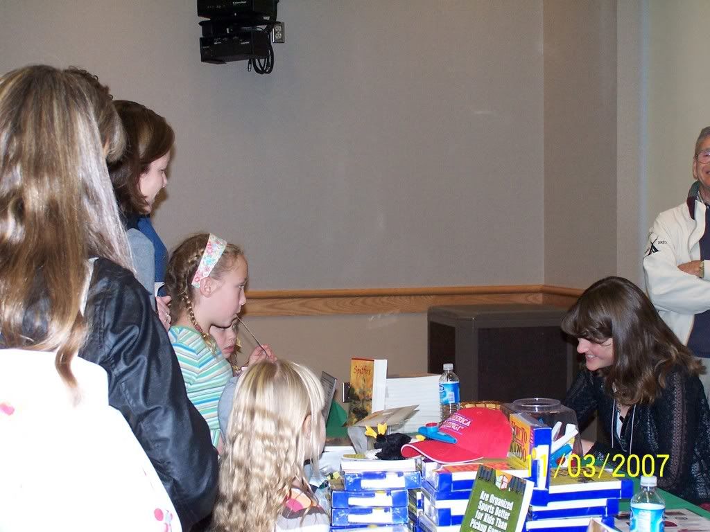
 By: Kate Messner,
on 11/4/2007
By: Kate Messner,
on 11/4/2007
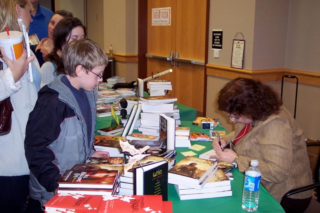
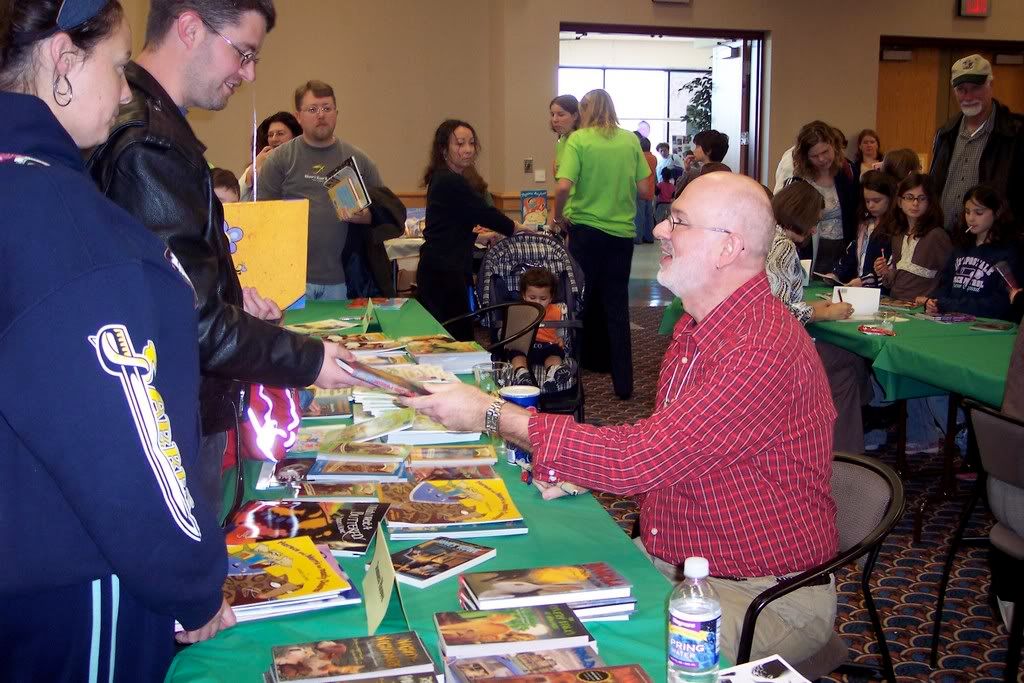
This is what it looked like when they opened the doors at 10:00...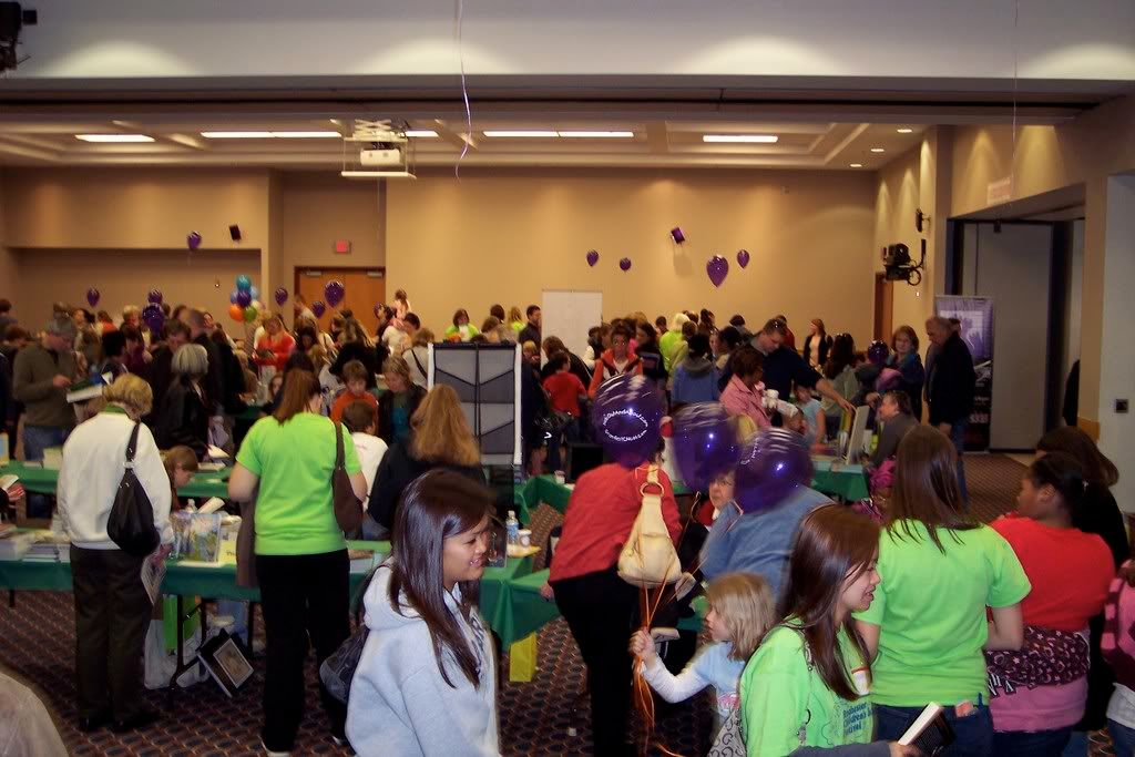
...and what it looked like all day long, while several thousand people poured into the festival on the campus of Monroe Community College.
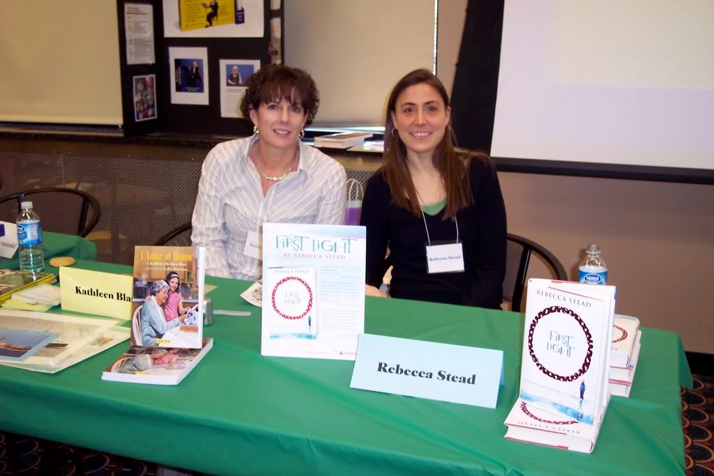
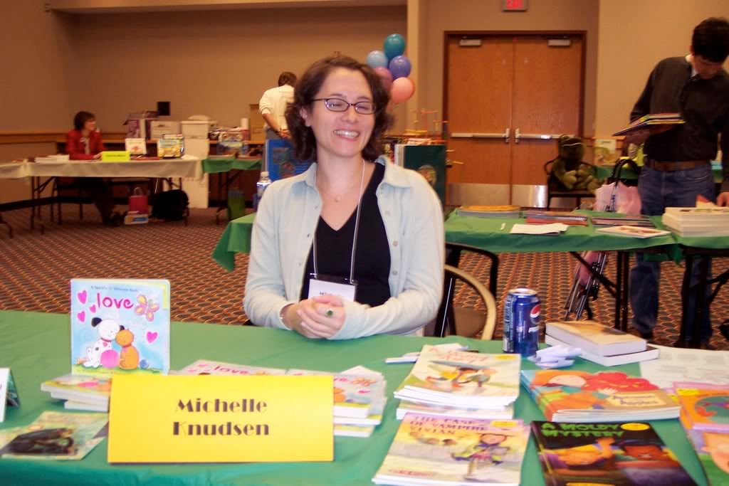
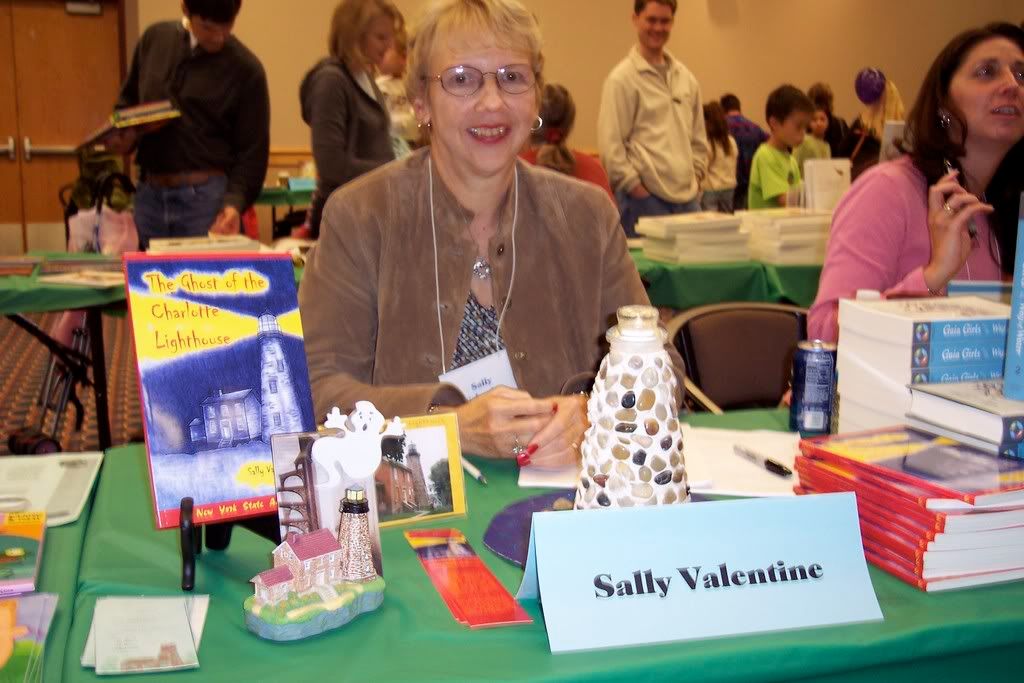
I am in AWE of the volunteers from the Rochester Area Children's Writers & Illustrators who put this festival together. I've never seen so many kids, clutching so many shiny, new, autographed books, looking so excited. Saturday's festival was a high-energy, joyful celebration of reading, and I was thrilled to be a part of it. I sold out the bookstore's 50 copies of SPITFIRE and was especially happy to hear that some of those copies are on their way to classrooms & libraries. I met lots of great readers, too!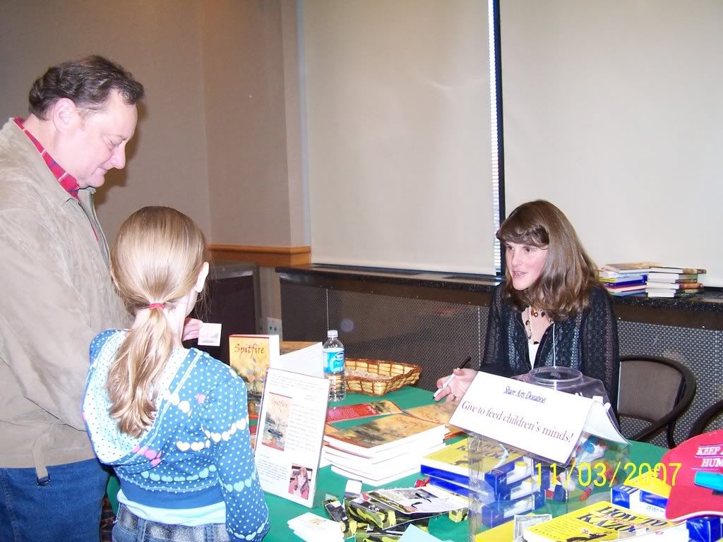
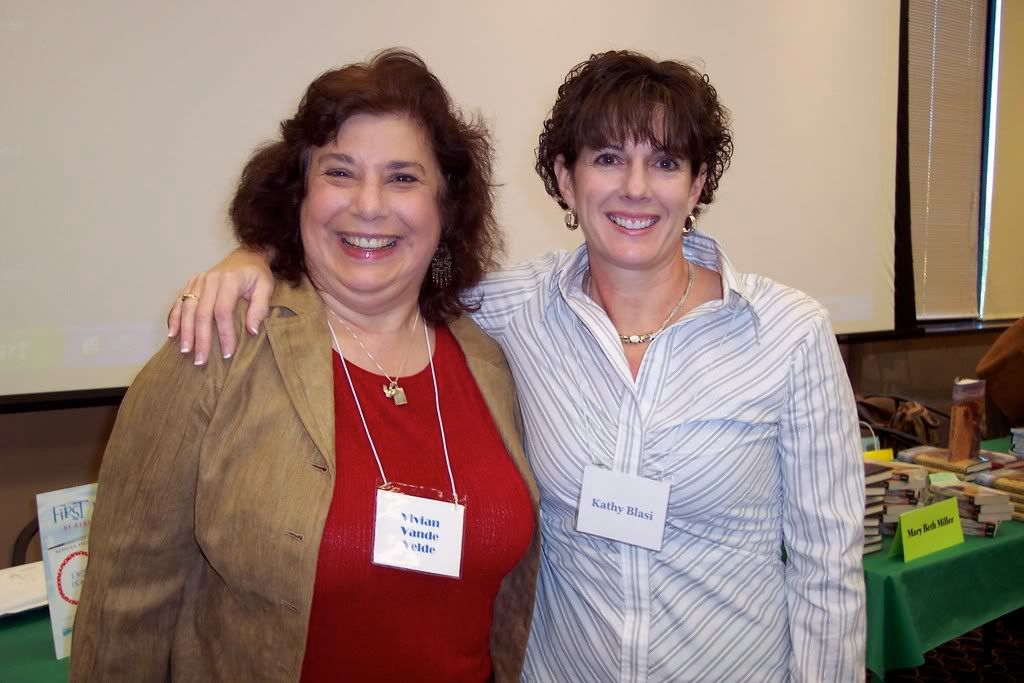
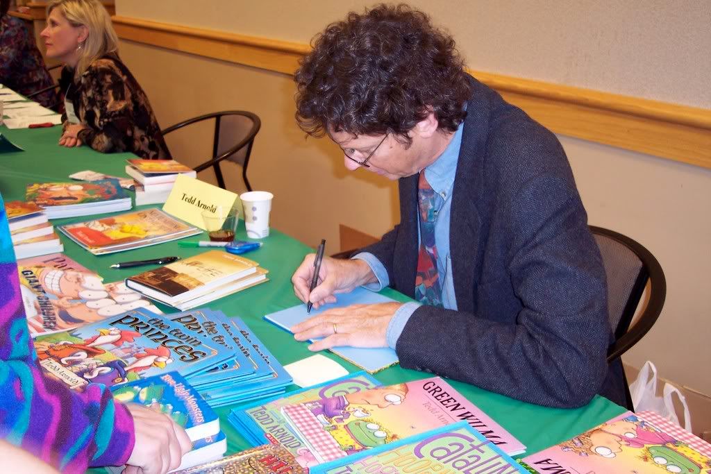
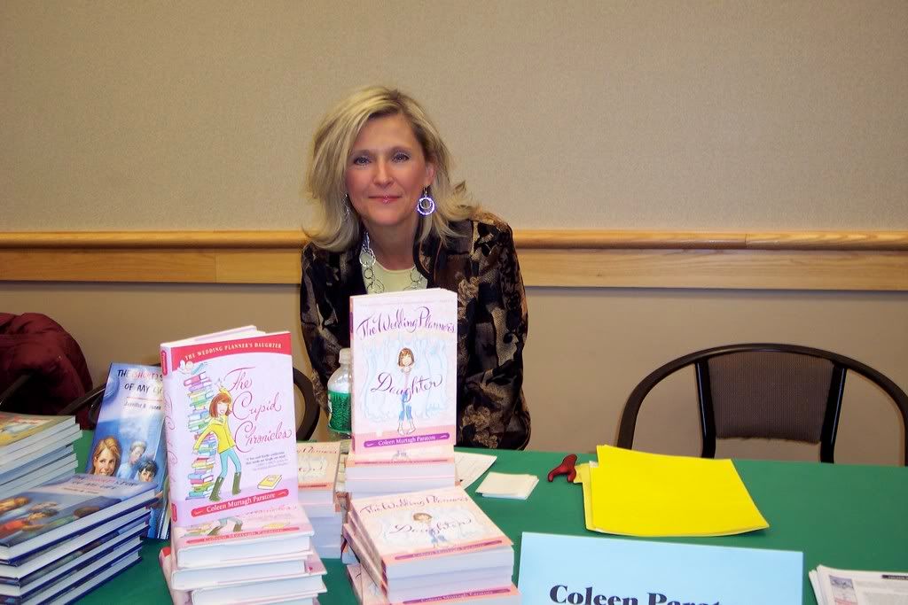
My family and I came home with a huge pile of books signed by some of our favorite authors as well.