


.png.jpg?picon=3640)
Today I embarked on combining techniques, process, and drawing developed throughout last year. I started a personal piece, but now it's time to apply it to the real world, a custom request. I did my research and concept sketch, now ready to paint.
I had to start with my color palette. As much as I love color, my head spins very fast and gets dizzy when trying to figure out the best combination of colors. I know what WORKS, but until I see it visually, I'm a jumble of thoughts.
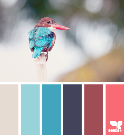
This is where Design Seeds color palettes come into play. They're amazing! At first I didn't really care for them because most show subtle or value changes. This time I went to pinterest and found many palettes with variety. I'm stoked!
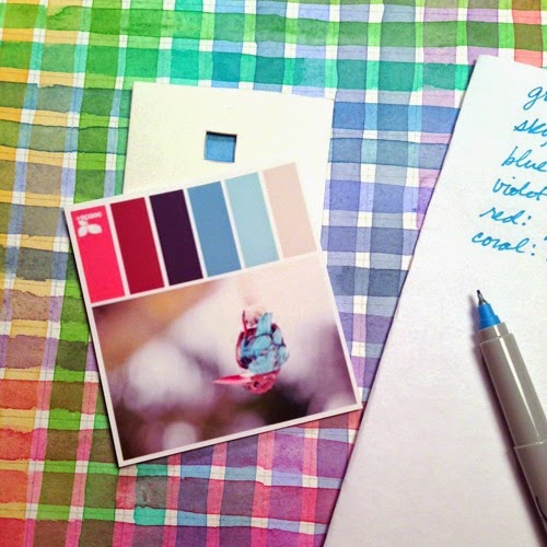
Once I print out the palette I go to my home made glazing color chart and view finder. I search for the colors within the palette and jot down the colors I need to re-create it. This takes a lot of the guess work out so I save time in the long run.
• • • • • • • • • • • • • • • • • • • • • • • • • • • • • • • • • • • • • • • • • • • • • • • • • • • • • • • • • • • • • • • • • • • • • • • • • • • • • • • • • • • • • • • • • • • • • • • • • • • • • • • • • • •
There are two charts I'd like to point out. One is a mixed color chart. Here each square has been individually mixed and applied. Very grueling, especially if you have 20 colors in a palette like I do! I started this one years ago when I first stumbled upon this method by Suzie Short. I never finished it. :( Unfortunately my palette has changed so I can't use most of it.
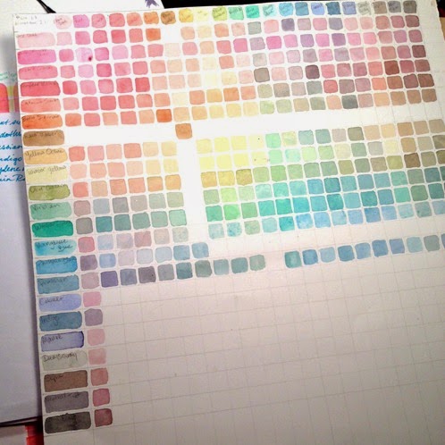
The second one is a glazed color chart. Here you paint one set of color strips vertically, let them dry, and paint a second one horizontally, "glazing" one color on top of the other. I prefer this method and I grabbed it from this video by Kelly Eddington. Although it's for laying color on top of one another, not mixing, I can work from there and mix on my palette. I usually test the color out on a scrap piece of paper and alter it just a tad if I need to. Very rarely.

The other brand new approach to painting is the skin. I did a very traditional technique, wet onto wet. It's usually quite difficult since I paint so small, but thought I'd give it a go instead of my usual wet onto dry. To my surprise, it worked very well, and gives me a great base to start with. Yay! I used my usual gold, rose, and phthalo blue too. :)

• • • • • • • • • • • • • • • • • • • • • • • • • • • • • • • • • • • • • • • • • • • • • • • • • • • • • • • • • • • • • • • • • • • • • • • • • • • • • • • • • • • • • • • • • • • • • • • • • • • • • • • • • • •
The Daily Sketch

I have discovered I'm not too chic about keeping up with a daily commitment. It's the effort that counts right? Numbering the Daily Sketches has already been off several times, so instead, I'm simplifying it more and NOT numbering them. They are dated, and that's enough for me. Just assume they'll be in each post. ;)
0 Comments on Color Me Crazy as of 1/23/2015 3:17:00 AM
Add a Comment


Wow, I love the glow around the fairy lady! She reminds me of a dear friend faraway. It's beautiful :-)
Beautiful!! It's gorgeous ^_^
*hugs* and happy weekend!!
Jordan @ Rainbow Veins
Beautiful! I love it!
Rachel @ Maybe Matilda
Lovely, just like all of your paintings. :) I love the flowers reaching up to the sky in the background...
Hugs,
Taylor Lynn <3
I love 'shrooms'!! :)
This painting is just beautiful - I love the background, you just take it all in, and the faery is awesome.
hugs
xxalisonxx