Its been a while since I've done any real painting with watercolors. I've been busy being a colored pencil artist for a while now, with some detours into digital, but have been wanting to go back to watercolors, so here I am.
This piece is my Christmas card, a little behind schedule, but on its way now. I'm working on illustration board (Strathmore 500 series) which is my all time favorite surface to work on. I get cranky with watercolor paper because I can't stand when it warps when wet (even if its stretched and taped down), and illustration board doesn't do that. The only drawback is that you can't transfer art onto it with a light box (its too thick to be 'see-through'), so its back to old-school transferring methods - tracing the drawing down over a graphite transfer sheet.
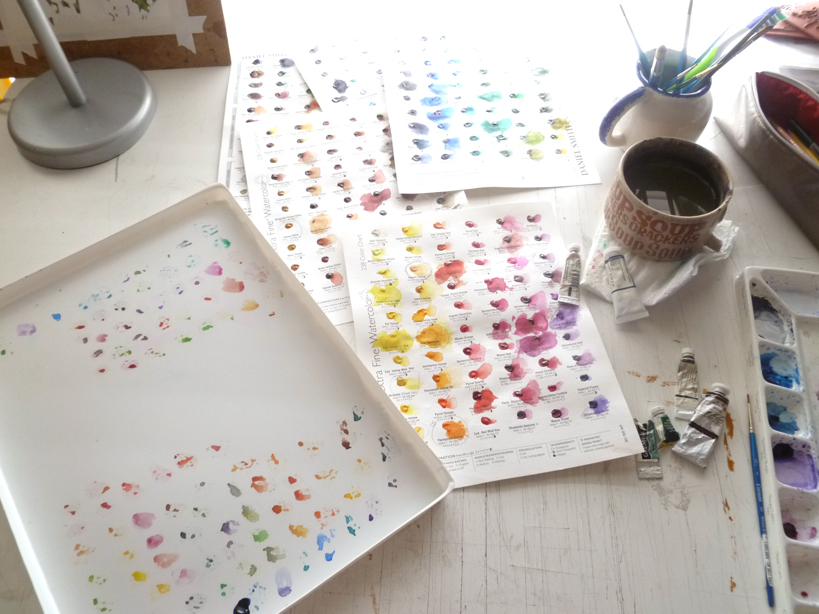
Here is my glamorous set-up. That's a fancy ceramic yogurt cup for the paint water, held steady by a roll of packing tape. Hey, it works. My drawing table is at a slant, so I have to keep stuff from rolling down. The parallel ruler on the bottom keeps most things from rolling off altogether.
I use a combination of Winsor Newton, Holbein, Daniel Smith, and Turner watercolors. I'm not really a purist - whichever brand has the color I need is what I use. I tend to stay away from the really grainy ones if I can help it, unless I'm doing something with special effects. I like a more even kind of pigment. Sometimes I use gouache (opaque watercolor) too if I need to. Here I've squeezed out some Winsor Newton Hooker's Green, Permanent Sap Green, and Green Gold. So far all I've use on this piece is the Permanent Sap, in various strengths.
And here we have some Christmas tree needles. There will be a lot more of them by the time I'm finished. A LOT.
We're due for an apocalyptic storm tomorrow and the next day. 60-70 mph wind gusts, and 3-4" of rain. This, after years of drought. I think last December it rained one day for about 10 minutes, and the rest of the time we had sun sun sun. The year before, too. Now, we're getting the opposite, and its too much! They're warning the power will go out, trees will fall over and all sorts of awful things will happen, so I thought I'd better blog something in case I'm offline for a while. Let's hope its not as bad as they say!
It's a large investment.
I just spent $80 on 9 tubes of watercolor paint. Nine. Seems like a small number for that price, but I believe it's worth the investment.
I have been using student grade Winsor & Newton watercolors for years, and have a few professional/artist grade tubes. The idea of spending $10 on one 5ml tube of paint just didn't compute. Until I got the
Daniel Smith Try It Dot pages. These are
AWESOME!Over 200 colors, all there to try out and use. The real deal in trial size. Genius. It is because of these sheets did I finally come to realize, as a professional, how much I needed professional grade watercolors.
They're smooth like silk, mix without a hitch, and the colors are so gorgeous! I then decided to purchase. But the price tag was still making my stomach turn. So expensive!
This led me to an entire week of studying and figuring out which colors to purchase. The DS dot sheets were key to this. They're the only professional grade paints I have right now. To help I found a great website that makes watercolor paints into science called
HandPrint.
I don't understand much in science, but he had a large section on palette color choices. All of the research was done for me, and they listed which colors were the best to have in every palette....colors that make all of the "convenience" colors (sap green, turquoise, violets, etc.).
 That's what I needed, the foundation colors.
 From there I could at least start, then purchase as needed the extra colors.
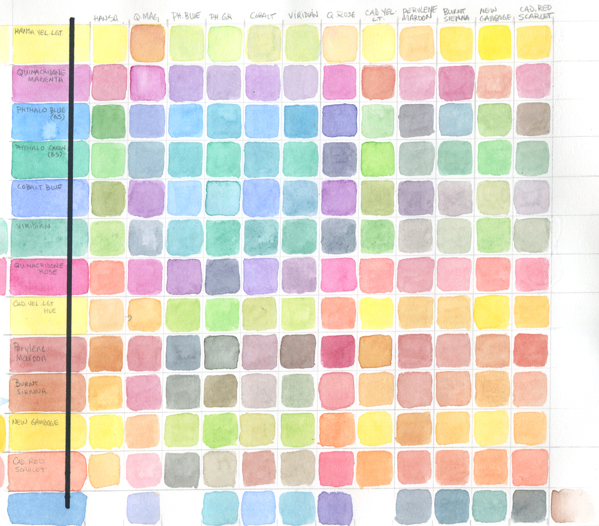
I also came upon an exercise to help decide which colors to have in your palette. A color chart. As one of my students yesterday best said "A multiplication chart but with color." Exactly!
Here's the blog link:
Ask Susie -
http://ask-susie.blogspot.com/2009/01/make-your-own-color-chart-for.htmlTho the woman who suggested the chart used only 7 colors, I ended up having 13. I wanted to see and be exactly sure what I was going to spend my money on.
This was grueling but totally surprising and fun seeing what two colors made what. I was pretty amazed at the little knowledge I had about color mixing.
Here are the colors I ended up purchasing:Phthalo Blue GS - DS
Phthalo Green BS - WN
Cobalt Blue - WN
Quinacridone Rose - DS
Perylene Maroon - DS
Burnt Sienna - WN
Cadmium Scarlet - WN
Yellow Ochre - WN
Benzimida Yellow (Winsor Yellow) - WN
* DS = Daniel Smith; WN = Winsor & Newton
A peek into her progress thus far.
Totally lovin' the Daniel Smith sample sheet. She is pretty much
painted with colors from the sheet. I already know my favorite
Daniel Smith colors. AND I purchased the 238 color sheet.
MUAHahahahaha!
OOooo iridescent watercolors. Click the image to
see the sparkle! Curious to know how it will scan.
Remember, it's still BOGO over at my Etsy shop!!! I goes till the end of January! Hurry!


.png.jpg?picon=3640)


I just upgraded my watercolors to Artist Grade, so I can completely relate!!
Thank you so much for this information. I'm just now trying out watercolor. It use to frighten me but I'm now really enjoying it's possibilities. This is so helpful.
Awesome to hear about the upgrade Amanda!
Kim, I'm so happy to hear that this helped. Those two pages are FILLED to the brim with information. I find I'm more excited about watercolor the more I learn. :) Heh, and I was terrified and totally rebel against watercolors until I began to truly play with them on my own. Careful, they can become an obsession. ;)
Oh, congrats Sara!! I think you are really going to love painting with professional grade. They are just so much richer and lay on the paper so nice. Can't wait to see what you'll paint with them!!
oh congrats! I can't wait to see what you will create with them! I love that colour chart, I never thought of doing that, now I have something new and fun to try out! anything to get to use and understand paints more:)thanks!
Great info,thanks:)