JacketFlap connects you to the work of more than 200,000 authors, illustrators, publishers and other creators of books for Children and Young Adults. The site is updated daily with information about every book, author, illustrator, and publisher in the children's / young adult book industry. Members include published authors and illustrators, librarians, agents, editors, publicists, booksellers, publishers and fans. Join now (it's free).
Login or Register for free to create your own customized page of blog posts from your favorite blogs. You can also add blogs by clicking the "Add to MyJacketFlap" links next to the blog name in each post.
Blog Posts by Tag
In the past 7 days
Blog Posts by Date
Click days in this calendar to see posts by day or month
Viewing: Blog Posts Tagged with: Swiss, Most Recent at Top [Help]
Results 1 - 19 of 19
How to use this Page
You are viewing the most recent posts tagged with the words: Swiss in the JacketFlap blog reader. What is a tag? Think of a tag as a keyword or category label. Tags can both help you find posts on JacketFlap.com as well as provide an easy way for you to "remember" and classify posts for later recall. Try adding a tag yourself by clicking "Add a tag" below a post's header. Scroll down through the list of Recent Posts in the left column and click on a post title that sounds interesting. You can view all posts from a specific blog by clicking the Blog name in the right column, or you can click a 'More Posts from this Blog' link in any individual post.
A time-traveler, visiting from 1970s Britain, would be surprised by pretty much everything on the modern high street. While prestige brands such as Rolls Royce and Berry Bros. & Rudd have formed part of a much older landscape, the discriminating buyer of the Wilson and Heath eras would be astounded by the topsy-like growth of the modern luxury market. No longer the preserve of a privileged elite, myriad luxury brands now reach out to everyone. Specialist glossy magazines abound, for every interest, from hi-tech snowboards to waterproof smartphones — and the iPhone, in its regular updates, feeds a mass market appetite for the desirable luxury good. Apple has also spent years developing a related personal accessory — the iWatch — but for one group of discerning luxury buyers, this has proved to be a potentially disturbing phenomenon.
The market for luxury (or “high-end”) watches, in a world that naturally goes by a French title — haute horlogerie — has never been stronger. That market’s history has unfolded remarkably differently for participants in different countries. For the most tech-savvy punters — with funds enough for an iPhone — the rhetorical question posed of a fine Patek Philippe watch might be “why would I want such a single-function device?” Yet modern high-end brands can sell their entire output, and are coveted by collectors who own many valuable watches, yet perhaps leave them unworn, locked away safely, housed in boxes with motorized compartments that will keep the rotors of the automatic models turning and the lubrication properly distributed. The cult of the prestige watch has never been stronger, and one of its English bibles is QP, a magazine added by The Telegraph to its stable of luxury publications in 2013. And if there are bibles, so there is a temple, in that the Saatchi Gallery plays host each year to SalonQP, the showcase for haute horlogerie.
The phenomenon of the modern watch collector reflects the triumphant survival, rebirth, and stunning success of the Swiss watchmaking industry in particular, and is often credited to the intervention of one man — Nicolas Hayek — who rescued many heavily over-indebted brands from oblivion in the 1980s, and thereby saved a group of Swiss bankers’ bacon. The emergence of the popular Swatch at the popular end of the market underpinned the capacity of the high-end to recover its equilibrium and to forge forwards.
No such luck for the British market of the same period. Our time-traveler would recall the 1970s witnessing the last gasp of a small British watchmaking industry, born just twenty-five years earlier, in the wake of the Second World War. Preparation in the 1930s had seen firms such as S. Smith & Sons of Cricklewood forge alliances with Jaeger and LeCoultre, and these were vital at the outbreak of war, in securing deliveries from Switzerland of tools, complete watches, and a huge range of parts, including millions of tiny synthetic jewels, needed in every fine instrument across the cockpit of the Spitfire and Hurricane.
As such supplies continued throughout the war, generally through diplomatic smuggling, the realization crystallized that Britain required a larger capacity in light and fine engineering, leading to ambitious plans for the development of a post-war watch manufacturing capacity. With the backing of Stafford Cripps and Hugh Dalton, Attlee’s post-war Labour administration did indeed back the creation of a new industry, centred around Smiths, with factories in development areas of Wales and Scotland, offering much needed employment and generating vital foreign exchange.
But technology, as well as political backdrops and personalities, moved on. The demand for guided missile technology waxed as the need for mechanical fuzes for weapons waned. The watchmakers recalled Cripps committing to their support in the Commons, and believed a covenant had been established between government and the horological industry, in which tariffs and quantitative restrictions on foreign imports would remain in place and at effective levels, ad infinitum. They were wrong.
The affirmation of free-trade doctrine under the Conservative government of the 1950s saw the dismantling of the protectionism that had characterized the post-war Labour government. A long and painful demise of the newborn British watchmaking industry resulted. When Heath replaced Wilson, Smiths was already winding down its watch businesses, returning briefly to the historic practice of importing Swiss mechanisms, and simply adding its name to the dial.
Spitfire by johntrathome. CC BY-NC-SA 2.0 via Flickr.
Remarkably, however, a dream of establishing high-end watchmaking in the UK was nevertheless kept alive, not by industry, and not supported by government subsidy, tariffs, and restrictions. The principal guardian of the flame was the determined and eccentric genius George Daniels (1926–2011), now considered one of the finest watchmakers ever. His methods involved a significant element of handcraft and he made nearly every part of his limited series of watches, which have risen colossally in value since his death. His successor and acolyte, Roger Smith, has in turn found huge support from a continuing market that demands the finest and most exclusive hand-crafted products. Another arrival in this rarefied atmosphere, Frodshams — a distinguished British clockmaking name of old — expect to produce watches in the coming years that will out-Daniels Daniels.
Thus the determined British private sector appears to have forged a new and successful small corner of a wider market, and the memory of the UK’s brief-dalliance with a state-supported and subsidized watch industry will gradually fade away in the slipstream. Corporate survival requires anticipation, commitment, investment, risk-taking, and many other qualities. Smiths risked and lost much in its involvement in watches (despite success in other industries), and the temptation is to imagine the Swiss watch industry revival merely preserved the natural order. In truth, the degree of sponsorship and backing for that industry in the last sixty years has been colossal.
If the British government’s support for an upstart post-war infant industry failed in short order, owing to overwhelming foreign competition, it will be interesting to see if the Swiss state and its horological industry, after the scare of the 1980s, have this time looked far enough forward, to support any repositioning necessary. Can the luxury ‘single-function device’ continue to thrive? We live in interesting times.
Headline image credit: 1970 by Noodlefish. CC BY-NC 2.0 via flickr.
Josef Müller-Brockmann’s graphics left a lasting mark on Swiss visual communication from the 1950s onward. His posters demonstrate how a sober, formally reduced language works best for conveying a universal, timeless message. Poster campaigns for longtime clients such as the Tonhalle concert hall in Zürich or the Automobile Club of Switzerland follow strict functional criteria–and yet exhibit a variety of design solutions and exciting, dynamic compositions.
This book presents selected posters by Müller-Brockmann and places them in the context of their own time while also examining the validity of his solutions from today’s point of view.
Marcus Kraft is an award-winning multidiscplinary studio located in Zurich, Switzerland. Their diverse portfolio ranges from editorial pieces that are bold and confrontational to posters that are more subtle and nuanced in their approach.
Andreas Hidber is an accomplished designer out of Basel, Switzerland. Although his specialty is editorial design, Hidber also dabbles in branding and corporate identity.
The first piece that caught my eye was a newspaper designed for the JFK Festival for Youth Culture where he rotated every single element 45°.
In another piece, Hidber collaborates to provide a chronicle of the most recent design undertakings coming out of the Harvard Graduate School of Design.
If you missed The Visual Language of Herbert Matterat your local theater you can now pick up a copy of the film at iTunes or Amazon. The 78-minute documentary directed by Reto Caduff traces Herbert’s life and work and includes interviews with design luminaries such as Steven Heller, Jessica Helfand, Robert Frank and Massimo Vignelli.
From the website:
With the help of historical footage, vintage photographs, never-before-seen film excerpts (some shot by Matter himself) and a broad overwiew of his extensive body of work, the feature length documentary helps in bringing the picture of an almost forgotten creative genius back into focus.
Interwoven with interviews from a who’s who list of legendary artists, designer and photographers, the film sheds light on a remarkable career and its impact on the evolving language of design during the short 20th century both in the USA and Europe.
For the first time in an encompassing and comprehensive way, the film touches on the innovative expressions of his free experimental work, his fashion and advertising photography and his portraiture. His amazing talent of combining bold combinations of words, images and space is shown in his iconic Swiss travel posters, pavilion designs for the New York World’s Fair 1939, photographs for Condé Nast publications; corporate image programs for Knoll furniture, the New Haven Railroad, exhibition- and numerous catalog designs for the Museum of Modern Art and the Guggenheim Museum; covers for the legendary Arts & Architecture magazine and his lesser known work in film, the prime example being a film on the works of Alexander Calder.
Zurich, Switzerland based Philipp Dornbierer, a.k.a. Yehteh, is a digital illustrator and designer. Philipp has a great way of basing his work around rather doomy symbolism, such as swords and hooded executioners, but juxtaposes them with bright colors, pleasing patterns, and some friendlier icons to create joyfully accessible imagery. Some of my favorites include his collaborations with stateside’s Andy J. Miller. With a client list including Carhartt, IBM, and 55DSL, I think we can expect to see a lot more great things from this guy in the near future.
Patrick Eberhard has amassed an amazing collection of Swissair-related material. His website, Sr692 which is named after the flight number from Zürich to Lisbon, is filled with vintage posters, flyers, logos, stamps, route maps, tickets and books, as well as a detailed history of the airline. This is an absolute goldmine for those interested in Swiss design.
A hat tip to Shelby at Wanken for discovering this amazing resource.
Recommended Reading: Airworld: Design And Architecture For Air Travel - Published by Vitra
This book focuses on the corporate design of airlines, uniform fashion, the graphics of air travel posters and the significant role that aviation played as an inspiration for architecture, design and art up to the present day.
Really looking forward to the release of The Visual Language of Herbert Matter. It’s due to hit theaters this summer. The film was a finalist in the SXSW title design competition and the poster (designed by Cristiana Couceiro) just won a Merit Award at the 3 x 3 Professional Illustration Show.
From the website:
With the help of historical footage, vintage photographs, never-before-seen film excerpts (some shot by Matter himself) and a broad overwiew of his extensive body of work, the feature length documentary helps in bringing the picture of an almost forgotten creative genius back into focus.
Interwoven with interviews from a who’s who list of legendary artists, designer and photographers, the film sheds light on a remarkable career and its impact on the evolving language of design during the short 20th century both in the USA and Europe.
For the first time in an encompassing and comprehensive way, the film touches on the innovative expressions of his free experimental work, his fashion and advertising photography and his portraiture. His amazing talent of combining bold combinations of words, images and space is shown in his iconic Swiss travel posters, pavilion designs for the New York World’s Fair 1939, photographs for Condé Nast publications; corporate image programs for Knoll furniture, the New Haven Railroad, exhibition- and numerous catalog designs for the Museum of Modern Art and the Guggenheim Museum; covers for the legendary Arts & Architecture magazine and his lesser known work in film, the prime example being a film on the works of Alexander Calder.
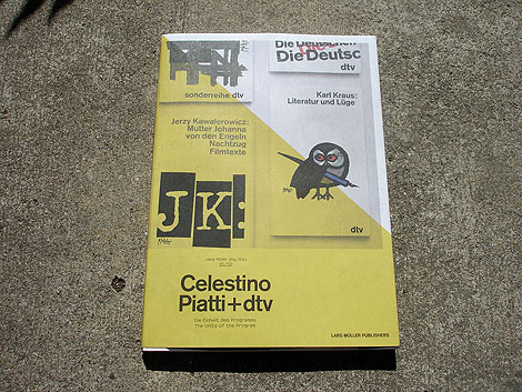
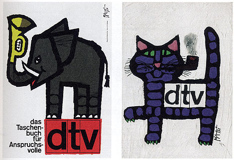
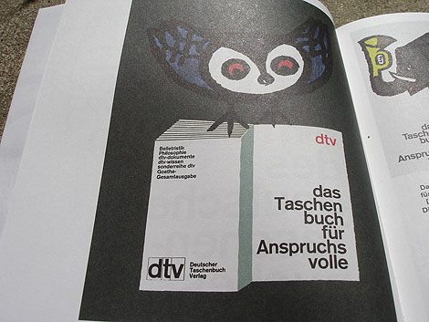
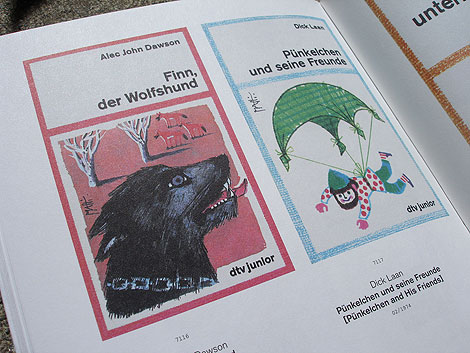
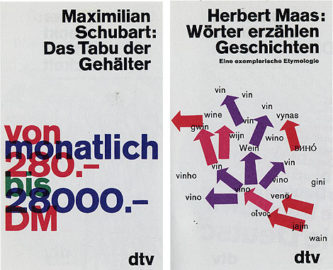
Celestino Piatti + dtv: The Unity of the program - Edited by Jens Muller
Two weeks ago we featured the Philips-Twen book from Lars Muller’s new A5 series. Celestino Piatti + dtv is the third title to be released in the series and my favorite of the bunch.
Celestino Piatti was born in the little Swiss village of Dietlikon on January 5,1922. Early on his parents recognized his talent and secured him training at the Kunstgewerbeschule (School of Applied Arts) in Zurich and later a graphic design internship with fellow Swiss designer Fritz Buhler. After four years with Buhler he left to start his own studio and eventually landed the job of a lifetime. In 1961 Deutscher Taschenbuch Verlag (dtv) hired Piatti to design their bookjackets. A comission that lasted up to his death in 2007. For over thirty years, he endowed the books published by dtv with a singular and unique look. He became the most productive book designer of all times, producing covers for over 6300 books that sold in a total print run of over 200 million copies.
Typografische Monatsblätter is a Swiss magazine that focuses on typography and photography. Over the years the magazine has played host to an all star cast of contributors including: Herbert Matter, Emil Ruder, Max Caflisch, Wolfgang Weingart, Jan Tschichold, Adrian Frutiger, Jost Hochuli, Walter Cyliax, Helmut Schmidt, Atelier Eidenbenz, Hans Rudolf Lutz and many others. Flickr user Berlintypes has assembled an amazing collection of these magazines from the 1950s -1990s. Enjoy them all here.
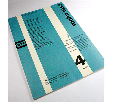
Typografische Monatsblätter-Schweizer Graphische Mitteilungen-Revue suisse de l’Imprimerie
Nr. 4, 1952, 71. Jahrgang
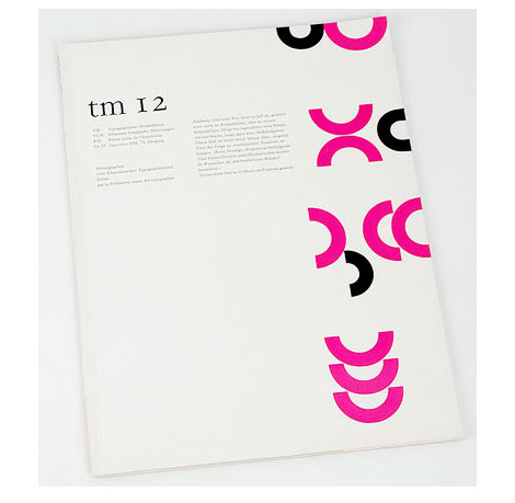
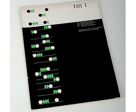
TM Nr. 1, 1957, 76. Cover design by Albert Gomm, Basel
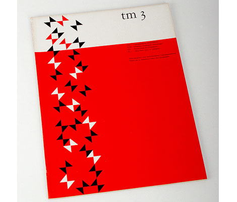
TM Nr. 3, 1957, 76. Jahrgang Cover design by Albert Gomm, Basel
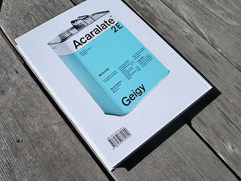
Corporate Diversity- Swiss Graphic Design and Advertising by Geigy 1940-1970. Published by Lars Muller +Museum fur Gestaltung Zurich - Back cover image of Acaralate canister designed by Markus Low in 1967
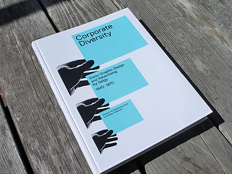
The fine folks at Lars Muller have just published an excellent book titled Corporate Diversity: Swiss Graphic Design and Advertising by Geigy. I know alot of designers (myself included) that are extremely excited over the release of this book. It chronicles the work of the design studio J.R Geigy AG which was a launching pad for one of the great periods of Swiss graphic design, in the 1950s and 1960s. It’s amazing to see the quantity and quality of the designers associated with Geigy. Under the leadership of Max Schmid for many years, the studio employed Roland Aeschlimann, Karl Gerstner, Jörg Hamburger, Steff Geissbuhler, Andreas His, Toshihiro Katayama, and Nelly Rudin, among others. Freelance designers such as Michael Engelmann, Gottfried Honegger, Armin Hofmann, Herbert Leupin, Warja Lavater, Numa Rick, and Niklaus Stoecklin were also used. In the 1960s, the Basel office, most especially George Giusti and Fred Troller, was involved in developing the studios of the subsidiaries in the United States and the United Kingdom, placing more emphasis on advertising. This is the first comprehensive presentation of Geigy design, an important Swiss contribution to the international history of design.
For those of you that have been wanting a copy of Publicity and Graphic Design in the Chemical Industry by Hans Neuburg, this book features some of the same content and is going to be easier to find. If you have money to buy one design book this spring, this is the one. You can purchase a copy on Amazon, unfortunately it is only available from sellers based in the UK and Germany. It should be available in U.S. soon. We will alert you on grain edit when US based dealers have copies in stock.
———————
Details:
19.8 x 26.4 cm, 208 pages, 385 illustrations, hardcover
Edited by the Museum für Gestaltung Zürich, Andres Janser, Barbara Junod
Book Designed by Norm and set in their typeface Replica
———————
Corporate Diversity: Swiss Graphic Design and Advertising by Geigy 1940-1970
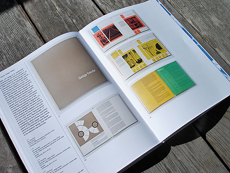
Geigy Heute (Geigy Today) designed by Karl Gerstner 1958, letterpress 25.4 x 22.9 cm
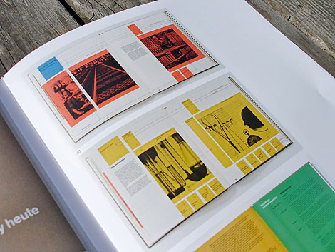
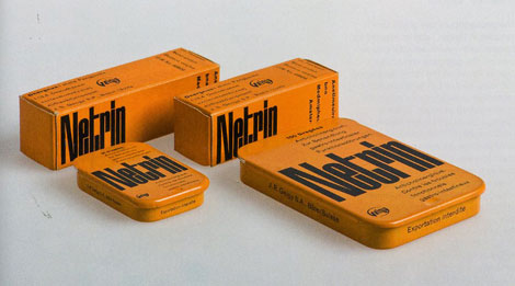
Packaging for Netrin designed by Armin Hofmann in 1953
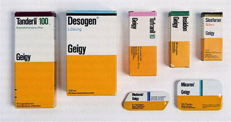
Retail Packaging for Geigy pharmaceuticals 1961-1962 - Design by Max Schmid
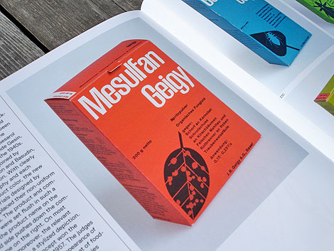
Mesulfan Geigy insecticide/ herbicide packaging for Swiss market designed by Andreas His 1956, Offset printing 12.6 x 8.6 x 4.9 cm
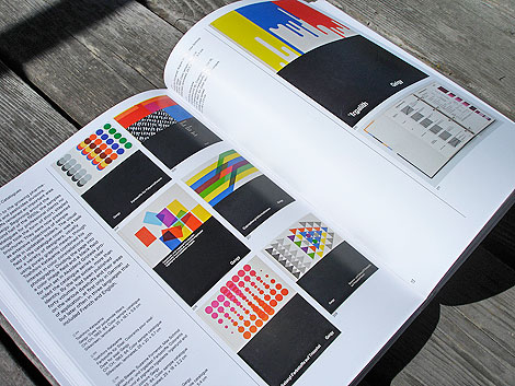
Color sample catalogues designed by Toshihiro Katayama 1963-1964 set in Akzidez Grotesk, 25×18.1×5.6cmSilkscreen
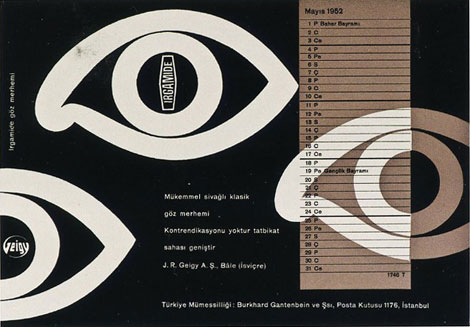
Irgamide Blotter designed by Armin Hofmann in 1952 Letterpress 14.1 x 20.3 cm
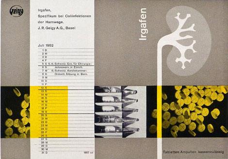
Iragafen Blotter designed by Nelly Rudin in 1952 : Letterpress 14.1 x 20.2 cm
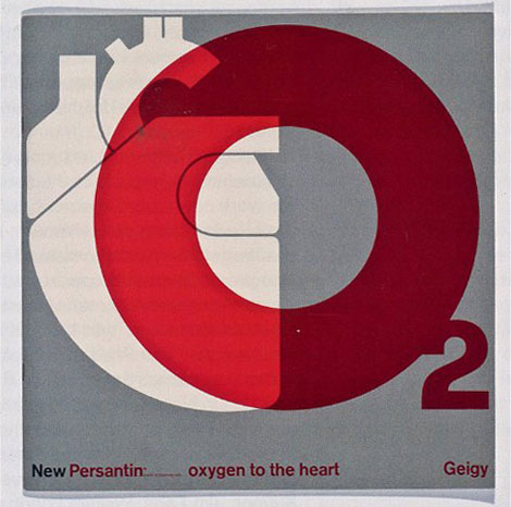
New Persantin brochure designed by Fred Troller, offset printing
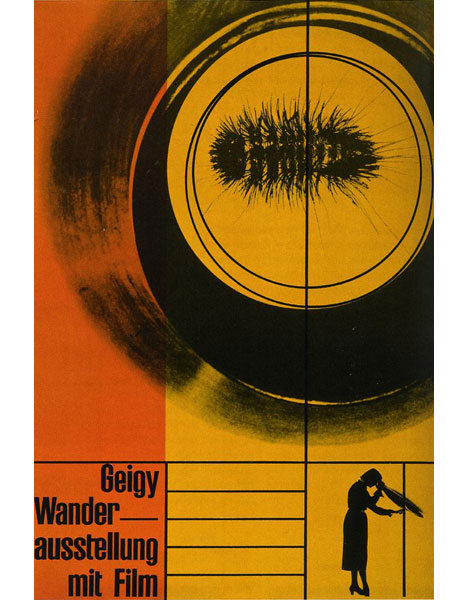
Geigy Traveling Exhibtion with Film poster designed by Karl Gerstner in 1953, offset printing 100×70cm
Grand Prize goes to Tim Kim - 1st pick of the 4 prize options goes to Vertigo Andy - 2nd pick of prizes goes to Jory Dayne- 3rd pick of prizes goes to Tim Kim - 4th prize goes to Celiajoy our winner from twitter - We will contact all of you directly.
Zurich Excursions 1963-Printed by Orell Fussli in Switzerland
The Swiss do it again! Top notch layout by Franz Fassler. Fassler also designed the cover of anwendungstechnik moderner anstrichstoffe seen in our post on modern Swiss book design. This booklet contains information on escorted and non escorted tours around Zurich.
The city appears to be under attack from a giant sweat stain approaching from the north.
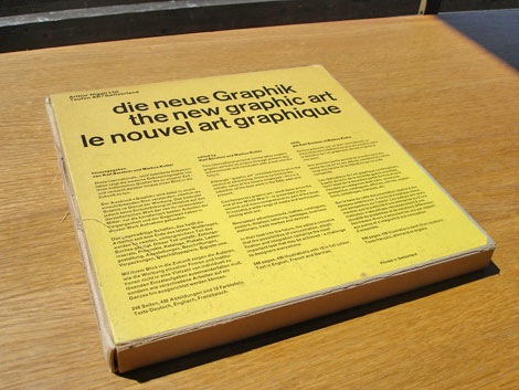
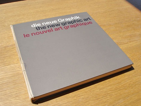
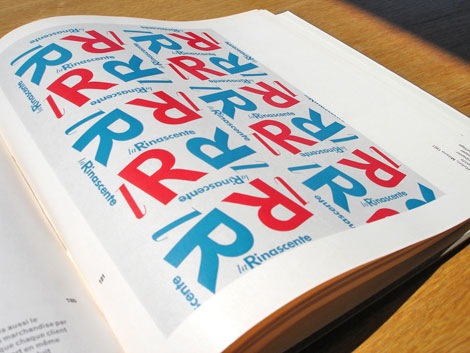
Karl Gerstner and Markus Kutter - the new graphic art - c1959 published by Arthur Niggli Ltd.
Classic book that surveys modern graphic design from its origins up till the late 1950s. Filled with advertisements, posters, packages, lettering, logos and displays. Lots of Swiss design to drool over. I just wish there were more color images.
I love the clean type and the 3 column grid on the cover. The modern day remake of the cover would be exactly the same except someone would replace the header “die neue graphik” with “this is a design book”. Ha
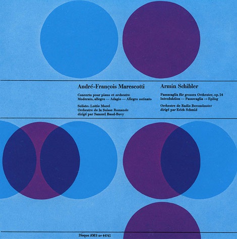
Andre-Francois Marescotti / Armin Schibler album cover - Designed by Joseph Muller Brockmann
I’m off to a late start today, I was up late last night making a few changes to the far right column. In addition, I’ve added a page dedicated to our Modern Sticker + Stamp club and Paul Rand group. Give it spin!
I hope everyone had a great weekend. Has anyone been to the Birth of Cool : California at Midcentury exhibition yet? I’m dying to go but, I haven’t had a chance yet. I’d love to hear your thoughts on the exhibit.
Up above. Beautiful example of Swiss graphic design via Alki1.
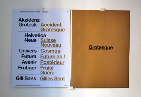
peter & wendy just released this classy piece of posterage entitled “Grotesque”. It’s a double-sided 170 gr/m² Offset paper poster printed in black and PMS 871U. Get your hands on it while you can. It’s a limited edition run of 100.
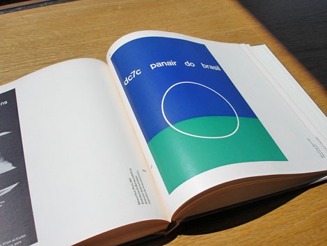
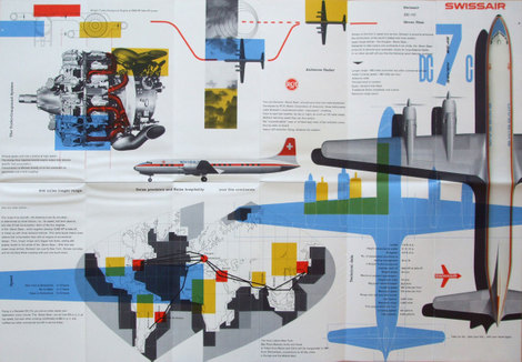
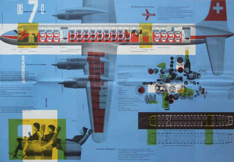
Swiss Air pamphlet - designer: Kurt wirth and Paul Beer c1950s
SwissAir has a rich history with some of Switzerland’s finest designers. Over the last 60 years the Airline has worked with Karl Gerstner, Kurt Wirth, Donald Brun, Fritz Buhler and Siegfried Odermatt just to name a few. The pamphlet above is one of many brilliant pieces to result from this relationship.
It appears to be some sort of promotional piece for the Douglas DC 7 which was produced in 1956. I love how Kurt Wirth laid out the information.
You can see the rest of the pamphlet at Ace Jet 170. Many thanks to Richard for posting this gem.
Book Divas, an online community/ book club for young adult and college readers, is having an author visit with Jenny Downham on October 2nd to promote her novel Before I Die.
There is no easy way to face death and their are no easy answers for how to prepare. Yet, Drs. Joanne Lynn and Joan Harrold, in their book Handbook for Mortals: Guidance for People Facing Serious Illnessprovide equal measures of practical information and gentle insight. Their book prepares readers for the decisions they will need to face, where to look for help, how to ease pain and other symptoms, what to expect with specific diseases, and how the health-care system operates. It also provides advice on how to come to terms with dying. In the passage below the authors reflect on a common mistake, forcing your loved ones to eat. Be sure to check back later today for another excerpt. (more…)