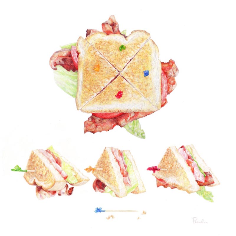
"BLT"
15" x 15"
Prismacolor colored pencils on Stonehenge paper
BLT stands for Bacon, Lettuce and Tomato. I honestly don't know if that's just an American, or English-speaking thing, or if it translates to other languages or cultures. Here, you just go into a restaurant and order a "BLT" and you might be asked what kind of bread you want it on, and maybe "toasted?", but otherwise they know what you're ordering.
Some places have fancied-up versions with avocado, which to me makes it something else altogether. A proper BLT should be on white toast, with mayo.
I had fun putting together the reference for this! I fried up some bacon, sliced some nice 'off the vine' tomatoes, rinsed some leaves of head lettuce, toasted up some plain white bread, and cracked open a jar of Best Foods mayonnaise. (It HAS to be Best Foods. )
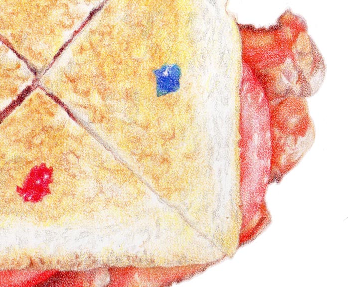
The other fun thing was shopping for the frilly toothpicks. I am now the proud owner of a box of 1,000 of them, since that's the only way they come, apparently. So I am well stocked for a lifetime of BLT making!
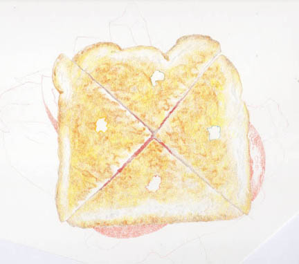
This was the first work-in-progress scan I did. The toast was the most challenging part of the drawing. Lots of nooks and crannies.
And then the next, with the toast done, the toothpicks in, and the bacon and tomatoes partway there.
And then I didn't do any more work in progress shots. I wanted to just get it done, so I glued myself to the chair and didn't feel like getting up to scan.
I purposely did this drawing a little looser in style than my previous 'architectural food' pieces. It still has a formal layout, with the top, and section views. But I combined the "side" and "section" views by doing the individual quarters this way, and also let the sandwich itself be a little sloppy - the way they are in real life.
And then I thought it would be fun to show one of them eaten, with just the toothpick left.
Are you craving one now? :~)
Finished!
This has to be one of the most decadent things I've ever eaten (or drawn).
I used mostly Prismacolors, then a little Polychromo Caput Mortuum Violet (my favorite color!), and a Coloursoft Brown Earth. Its about 8" x 8" on 10" square-ish paper.
Not much else to say. I'll clean up the background and do prints.
Now its back to kitty drawings . . .
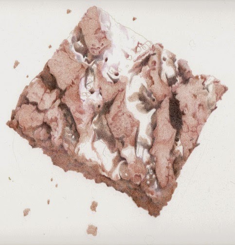
Last week I had to get my car worked on (new brakes!), so I put together a little tin of treats to give the guys (I know, I'm so nice). My motivation wasn't all selfless though. I kept back one of these luscious brownies for myself, to draw.
This isn't any ordinary brownie. Its a super decadent salted caramel brownie. (I overheard one of the car shop guys say he could feel his arteries clogging after he ate one.) They're big, and luscious, and heavy. And irresistible to someone who likes to draw food!
This is how I start. Actually, this is several 'steps' into the process. I just didn't feel like getting up to scan it, but decided I'd better before I got much farther into it. I start by mapping out the nooks and crannies, then start filling in the shadows first, then the more chocolatey parts. I'm simultaneously working out the color (hue), as well as the values (light and dark). One pass of color might focus more on the value, and the next layer might just fill in some flat color.
The parts that are still white are where the caramel is. Its a completely different color, so I'm getting as much of the chocolate established as I can first, then I'll do the caramel.
I can't wait to eat this thing. The smell is driving me crazy! (in a good way)
It has quite a ways to go, but I'll get there.
Oh, its about 8" x 8", so far all Prismacolors, on Fabriano Artistico paper.
Maraschino Cherries
8" x 10" (20.32 x 25.4 cm)
Every brand of pencils under the sun, on Stonehenge paper
I felt like making a new drawing, and looked in the cupboard for a subject. At first I thought I would do anchovies, but for some reason they grossed me out. Then I saw this little jar of maraschino cherries hiding in there which I'd forgotten about, and was so happy.
I always start with a line drawing, then start laying in some shadows or values just to get it going. I've darkened this up quite a bit so it would show up for you here. In real life it was a lot lighter.
This is a very RED drawing. Red is for me the hardest color to do with colored pencils. I really picked my way through this in the first several layers - kind of a 'Sunday painter approach', dawdling along, enjoying the subtle building up of color and value.
By the time I finish I will have used Coloursofts, Prismacolor, Luminance, Pablos and Polychromos.
At this point (above) I've used: Polychromo Burnt Carmine, Coloursoft Rose, Red, Deep Red, Scarlet, and Polychromo Green Gold. All really really light tentative layers.
I'm going back and forth between deepening the color, and re-establishing the forms in the jar.
At one point I got out my Prismacolors, against my better judgement. They've been breaking so much that I put them away and vowed to never use them again, no matter what. But they have the best reds. The best. So I pulled a Permanent Red, and started doing a layer. Then it came time to sharpen, and it broke, instantly. Grrrrrr. Try it again. Broke again. Pulled a whole NEW pencil out of a spare box, more breaking. Break, break, break, break break. I had to finish the one layer though, since I'd started, so I muddled through, but I was not a happy camper.
So now, by about this point, I've used all of the above, plus: Polychromo Purple, Fuschia, Middle Purple, Violet and Pablo Light Purple and Purplish Red. I know, hard to believe.
Then some Polychromo Geranium Lake and Pablo Reddish Orange. I think its here that I let it go for the night, and sat down to watch Downton Abbey.
The next day I was fully out of 'Sunday painter' mode, and very much in a "let's get this DONE" mode, so finally got serious about committing to putting down some real values. That required a bit of burnishing, which I always try to avoid until its the only thing left to get the piece where it needs to go. I skipped a few steps here in the scanning, because I just wanted to tuck in and get it done.
These couple of scans show the addition of: Luminance Permanent Red, Carmine Aubergine, Alizarin Crimson, Scarlet, Pablo Ruby Red, Luminance Green Ochre, Polychromo Olive Green and Green Oxide, Zinc Yellow, and maybe a couple more that I forgot to write down.
I just kept tweaking with a little of this and that until I was happy with it.
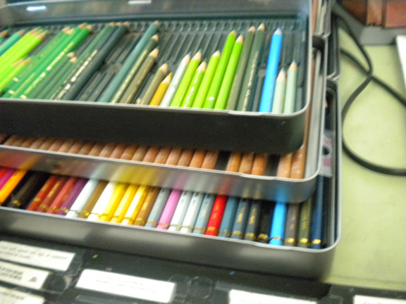
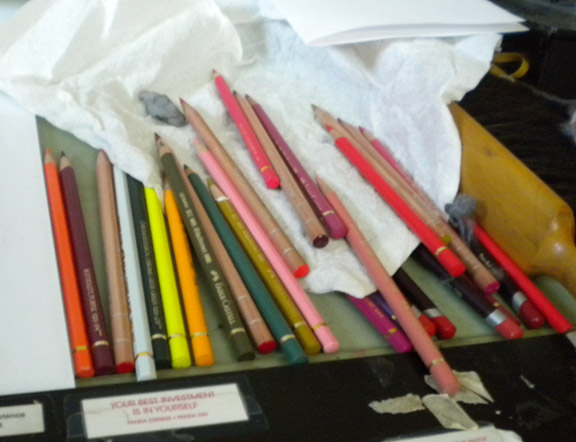
I thought you might like to see how un-glamorous my work set up is. I know there are people who have pristine, organized, "let's take a photo for the magazine" kinds of work spaces. How nice for them. Not me.
I stack all my tins of pencils that I'm using up on top of each other, like this, on my slanted drawing table. In the above pic you can see two tins of Polychromos, on top of Luminance, on top of Pablos.
I've separated them out a bit here below so you can see them better. I just pull up a tray when I need to search for a color in a tin below. The Polychromos are all organized neatly by color. The others are not.
And here's a shot of how the 'used' pencils look off to the right side of the board. Not neat. Not organized. They often fall off onto the floor (but I have carpet, so they don't get broken). I honestly don't know how you neat people keep everything all perfect. I admire it, but it doesn't work for me. Of course I'll clean them all up and put them back in their tins now, and the board will get cleared off for the next piece. And it will start all over again.
I'll put prints in the shop at some point. I'm searching for a new paper to do prints on in addition to the semi-gloss I've been using. I would like to offer an option for a more matte paper for some of my pieces. There are just way too many papers to choose from! I want to keep the cost down, so my prints will not be expensive. I do have some fancy paper that turned out to be too thick to feed through my Epson - boo. So I'll keep looking.
The sun is out here, its like Spring. Crazy. Nice, but crazy. People are mowing lawns and watering, washing their cars, wearing t-shirts. Gotta love California.
This website, fronted by renowned British author Anne Fine, provides the most gorgeous range of bookmarks for children to keep their place in their bedtime story, as well as an extensive range of bookplates. They are all designed by well-known book illustrators and it’s just as well you can print then out individually as it would be impossible to have to make a single choice from among them!
 One bookplate that immediately appealed to us, though, if I have to state a preference, is Mairi Hedderwick’s as we love her Katie Morag books. Katie is a feisty wee heroine, and enough of a tomboy to appeal to boys too. The illustrations bring the fictional Scottish island of Struay to life and the stories themselves make you laugh aloud, whether it’s Grannie Island using Grannie Mainland’s best shampoo to wash her prize sheep in Katie Morag and the Two Grandmothers; or the Big Boy Cousins being terrified by the ghosts of Castle McColl in The Second Katie Morag Storybook. Struay is based on the real-life Hebridean Isle of Coll: these lovely stories conjure up the very special way of life there, both through the narrative and the illustration, and are richly rewarding when read aloud.


There's a printmaker in Colorado who works in similar fashion,layering her inks and building up to the final.
http://brushandbaren.blogspot.com/
I break pencils, too. I've always sharpened with a knife as those little twisty sharpeners make it worse.
Paula, you're step-by-step posts always fascinate me. It is such a help to see how other artists work, no matter what the medium. As usual, I love the drawing. P.S. I'm not a neat worker either.
I love, love seeing the step-by-steps. And I always love seeing how others organize their pencils and workspace. Since I've always used just Prismas, I keep them in jars on my desk, but I just bought a little set of Coloursofts to try. I'm dying to "sample" some new treats. But I'm a little worried that I'm not organized enough to keep multiple brands going...we'll see!
I had been using Canon Matte Photo paper for prints, but it's a very bright white, and it's not as heavy as I'd like. Then I got a new wide format printer for Christmas which led me to a new paper that I really like: Epson Premium Presentation Paper, Matte. (The box is kind of a teal color.) It's a bit heavier (44 lb.) but sails thru my printer just fine, and it's a nice clean white. It comes letter size, 11 x 17, and 13 x 19. And my local Fry's Electronics carries all sizes!
Marschino Cherries makes my mouth water--loved seeing the step-by-step.
Paper I use for small inexpensive prints and note-cards is Staples matte Photo Supreme, which is double sided, and 61 lbs. About $15for a 50 sheet pack.
Your drawing table looks well organized to me-I made a shelf from a 12" board to place at the far edge of my drawing table, with wedge-shaped wood pieces under each end to bring it to level, then bought three plastic turntables which sit on it,each turntable holds about 5 inserts from "tran" pencil cases (Blick)Each insert folds onto itself with velcro,all pencils vertical,I keep Polychromos,A.Durer,and Prismas separately on each turntable which keeps all colors at my fingertips, yet out of the way.then, like you, I keep a tin on the table for pencils I'm using at the time. If I need to take my pencils for a demo,or class,I just open each triangle and stack them flat in my bag and go. The shelf lets me have more open work space on my drawing table because the slant top leaves the space underneath open. Sorry to make this so long, but wanted to share. :-)
your work is beautiful and i really enjoy seeing your artistic process!
This is amazing! I really love the vibrant colours you've achieved, and your lovely soft texture. (also, anchovies would gross me out too, and that smell!).
So glad I found your blog!