

A humorous collection of sketches around the theme of physical discomfort, with people who find themselves in painful, awkward or plain absurd situations.
The post ‘Bodily Dysfunctions’ by Aisha Madu appeared first on Cartoon Brew.
Add a Comment
 By: Jerry Beck,
on 8/6/2016
By: Jerry Beck,
on 8/6/2016
A humorous collection of sketches around the theme of physical discomfort, with people who find themselves in painful, awkward or plain absurd situations.
The post ‘Bodily Dysfunctions’ by Aisha Madu appeared first on Cartoon Brew.
Add a Comment By: Kathleen Sargeant,
on 3/2/2016
By: Kathleen Sargeant,
on 3/2/2016
Why would agricultural producers engage in practices such as conservation, animal welfare, waste management, or organic farming? The literature hints that economic, social, and personal motivations are drivers of adoption. Sustainable practices are welcomed by farmers if there is a potential increase in profitability through more efficient processes, or as a source of differentiation (i.e. labelling). From a social perspective, sustainability has become a license to operate in food supply chains, where long-term viability depends on the fit between firm and society values.
The post Understanding producers’ motives for adopting sustainable practices appeared first on OUPblog.
By: Alice,
on 2/22/2016
In early November 2015, the Belgian and Dutch press announced that a small land swap was in the making between Belgium and the Netherlands. Agreement has been reached at the local level that Belgium would cede a small peninsula in the river Maas [Meuse] of about 14 hectares – the size of 28 soccer fields – to the Netherlands. In return, Belgium would get a smaller piece of Dutch territory where it had already built a water lock.
The post Demarcating sovereignty: a history of Dutch-Belgian land swaps appeared first on OUPblog.
By: Jerry Beck,
on 2/1/2016
In this fairy tale about relativity, a cuckoo clock narrates a day where bread was sliced one second thick, lovers fell in sync and time rarely flowed at an even rate.
The post ‘Between Times’ by Ru Kuwahata and Max Porter appeared first on Cartoon Brew.
Add a Comment
By: Jerry Beck,
on 1/20/2016
Discover the art of Paul Driessen, Cartoon Brew's Artist of the Day!
The post Artist of the Day: Paul Driessen appeared first on Cartoon Brew.
Add a Comment
By: Clare Hanson,
on 1/14/2016
In the 1990s Australia began reforming its employment assistance system. Referred to as welfare-to-work, at the close of last century Australia had a publically owned, publically delivered system. By 2003, that system had been fully privatised and all jobseekers received their assistance via a private agency, working under government contract. To this day, Australia is the only country with a fully privatise quasi-market in employment services.
The post Getting (Active) Welfare to Work in Australia and around the World appeared first on OUPblog.
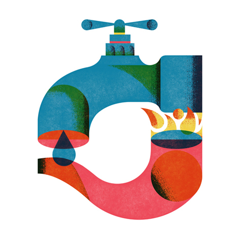
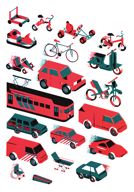
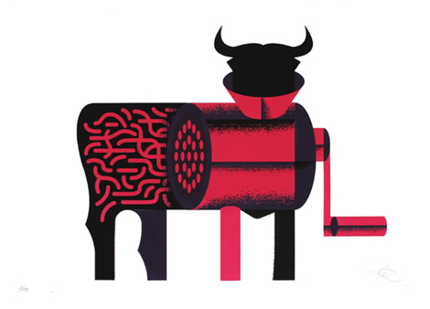
I’m really enjoying Aron Vellekoop Leon’s work. His portfolio is filled with projects that showcase his uncanny ability to distill complex concepts into clear and visually compelling stories. A native of Fuerteventura, Spain, he now calls Amsterdam his home.

——————–
Also worth viewing:
Francesco Muzzi
Ty Wilkins Interview
EIGA Design
Follow us on RSS, Instagram, Pinterest, Wanelo,
——————–
Thanks to this week's Sponsor // Font Fabric: 93 Fonts for $29
George & Harrison is a multidisciplinary design studio based in the Netherlands. Founded by Martijn Maas (George) and Maarten Stal (Harrison), the duo pair smart strategy with thoughtful execution to create work that stands at the vanguard of contemporary design.
——————–
Also worth viewing:
Francesco Muzzi
Ty Wilkins Interview
EIGA Design
Follow us on RSS, Instagram, Pinterest, Wanelo,
——————–
Thanks to this week's Sponsor // Font Fabric: 93 Fonts for $29
By: PennyF,
on 7/12/2014
As we gear up for the third place finalist match of the 2014 FIFA World Cup today — the Netherlands face the host country Brazil — we’re highlighting some interesting facts about one of the competing nations with information pulled right from the pages of the latest edition of Oxford’s Atlas of the World. Germany (tomorrow’s country highlight) and Argentina go head-to-head on Sunday, 13 July to determine the champion.
The Netherlands, located in the western end of Northern Europe is widely known for its rich Dutch culture. The population is 83% Dutch, with a smaller percentage made up of Indonesian, Turkish, and Moroccan ethnicities. The nation has two official languages: Frisian, spoken mainly by inhabitants of the northern province of Friesland, and Dutch.
The country has a vast history, dating back earlier than the 16th century when it saw a multitude of foreign rulers including the Romans, the Germanic Franks, the French, and the Spanish. After building up a great overseas empire, the Dutch lost control of the seas to England in the 18th century, and were under French control until 1815. After remaining neutral through World War I, and being occupied by Germany in World War II, they went on after the wars to become active in West European affairs.
In 1957, the Netherlands became a founding member of the European Economic Community, now known as the European Union, and continues to be a leader in industry and commerce. Exports currently account for over 50% of the country’s GDP and include natural gas, machinery and electronic equipment, and chemicals. A highly industrialized country, it is also a major trading nation as it imports many of the materials their industries require.
With a constitutional monarchy, the Netherlands saw its Queen Beatrix abdicate the thrown in 2013 in favor of her son Prince Willem Alexander. She had served a 33-year reign.
Oxford’s Atlas of the World — the only world atlas updated annually, guaranteeing that users will find the most current geographic information — is the most authoritative resource on the market. The milestone Twentieth Edition is full of crisp, clear cartography of urban areas and virtually uninhabited landscapes around the globe, maps of cities and regions at carefully selected scales that give a striking view of the Earth’s surface, and the most up-to-date census information. The acclaimed resource is not only the best-selling volume of its size and price, but also the benchmark by which all other atlases are measured.
Subscribe to the OUPblog via email or RSS.
Subscribe to only geography articles on the OUPblog via email or RSS.
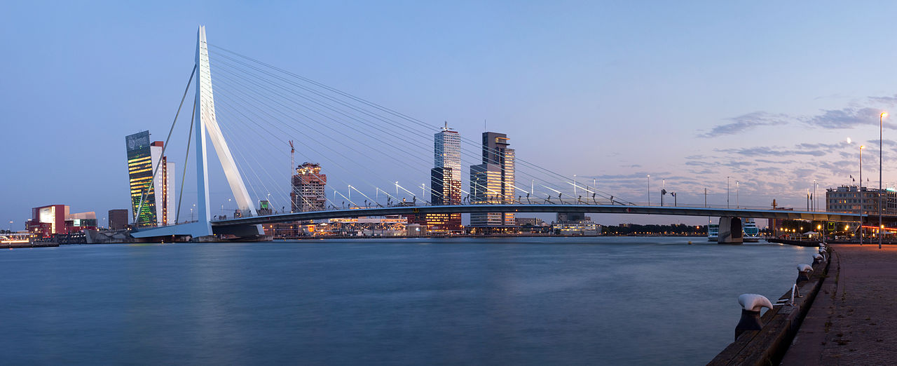
Image credit: A panorama of the Erasmus Bridge and the River Meuse in the Dutch city of Rotterdam. Photo by Massimo Catarinella. CC BY 3.0 via Wikimedia Commons.
The post Countries of the World Cup: Netherlands appeared first on OUPblog.
Maggie Steele, the storybook heroine who vaults over the moon, has been attracting thousands of visitors from around the world. So many visitors, in fact, that she’s using a time zone map to keep track of them all.* People are … Continue reading ![]()

Ricardo Leite is an accomplished graphic designer and art director out of Amsterdam. While juggling a passion for typography and illustration, Leite manages to maintain an extremely clean style without being overly stark.


Check out more work from Leite on Behance, and over at his sideproject, Bye Bye Home.
——————–
Also worth viewing:
Jan Feliks Kallwejt
Adrian Johnson Interview
Colorcubic
Not signed up for the Grain Edit RSS Feed yet? Give it a try. Its free and yummy.
Featured Book: Irving Harper: Works in Paper.

Ted Parker is an international man of mystery, whose work exhibits extreme joy in the most strange and comical of situations. This illustration, titled Jungle Coffee, was created to promote The Village Coffee and Music in Utrecht, Netherlands. Regardless of the subject matter, whether it be dogs smoking, lions dancing, or people and animals engaging in pure rowdiness together, one thing is for sure - Ted’s work is sure to put a big smile on your face.


Tim Lahan
Sac Magique
Brecht Vandenbroucke
Like what you see?
Sign up for the Grain Edit RSS Feed. Give it a try. Its free and yummy.

If you’re unable to visit the Wim Crouwel retrospective at London’s Design Museum, you can still pick up the exhibition catalog. Designed and published by Unit Editions the catalog contains Crouwel’s posters, documents, manuals - even his stamps and personal photographs - presented in the raw, bare-concrete setting of the Crouwel archive. Also included is an interview with Wim conducted by Tony Brook, the exhibition’s curator and the book’s co-editor.
Available now at Unit Editions.


Details
152 x 230mm
144 pages
Paperback (3 different covers)
ISBN 978-0-9562071-3-5
Editors: Tony Brook & Adrian Shaughnessy
(Via Aisle One)
——————–
Also worth viewing:
Total Design and its pioneering role in graphic design
Wim Crouwel Archive
6th Biennale of Graphic Design
Not signed up for the Grain Edit RSS Feed yet? Give it a try. Its free and yummy.
——————–
©2009 Grain Edit - catch us on Facebook and twitter
.jpg?picon=925) By: Sarah McIntyre,
on 3/8/2011
By: Sarah McIntyre,
on 3/8/2011
I had a great time pottering around Amsterdam for three days with my sister and Stuart. My sister and I did a lot of general goofing around and we did a lot of walking in the freezing cold. Here's a photo she took of me in a coffee shop. (No, not that kind of coffee shop.)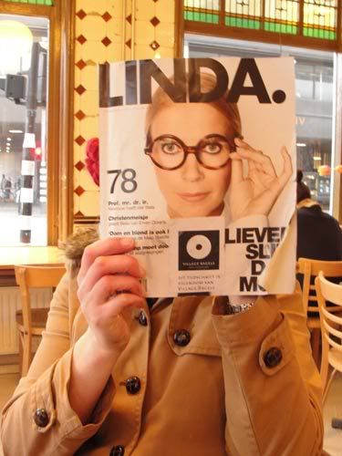
We stayed in a hotel that had once been a rather grand theatre, so we were expecting a great lobby, but even more pleased to find we had an amazing view from our top floor room. Here's a picture I drew, looking out through the window in the slanted ceiling.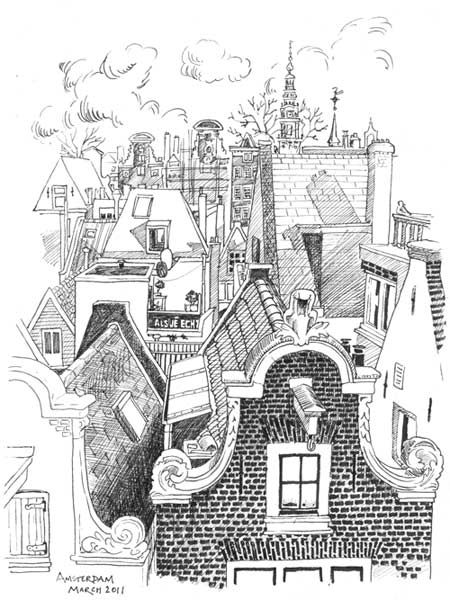
And a rough panorama photo collage of the view (which doesn't include the ringing church bells):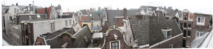
I made some pen sketches of a few of the paintings we saw in museums. Here's one from the Rijksmuseum. I rather like how it came out.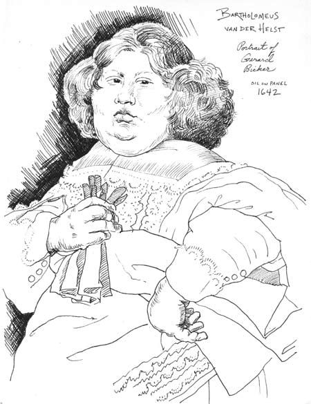
And a few from the Van Gogh Museum: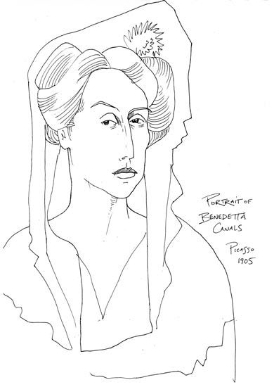

The guards at both museums were rather distractingly interested in what I was drawing. I think they were very bored. In the Van Gogh Museum, I thought one guard was telling me off for about two minutes and going to chuck me out, until I realised he was just being overly friendly. (...You are a weirdo, sir. Is this Dutch humour?.)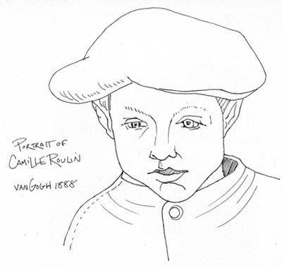
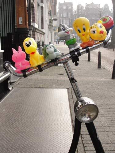
When we weren't almost getting run over by them, we love-love-loved all the bicycles everywhere. I bought one of the really big bells to put on my bike back in London.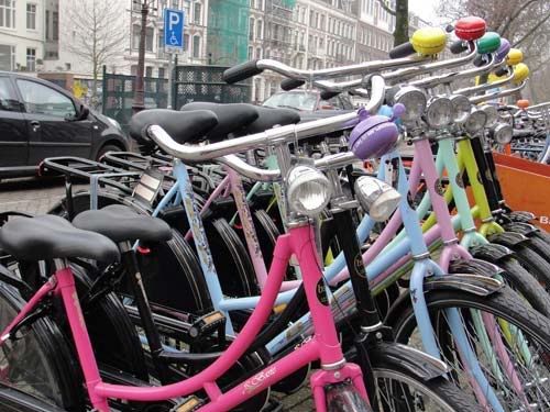
The Dutch know how to haul things around on their bikes, I don't know why Londoners don't have more of this sort of gear. I suppose the cycling's a bit gentler in Amsterdam.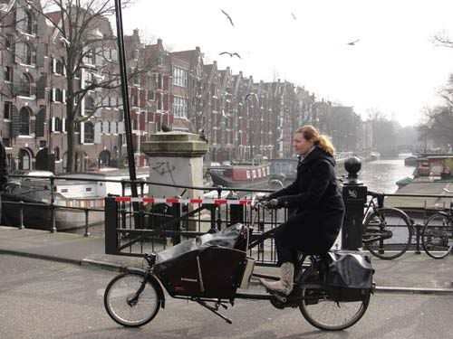

We took the train, a much more civilised way of travelling than airports with their endless security queues and having to get to the faraway airport super early. 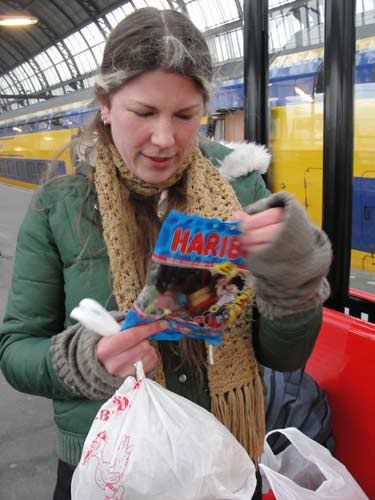
Here's a picture I drew on the train of my sister reading Vainglory by Geraldine McCaughrean.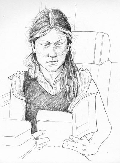
And a cool station clock: 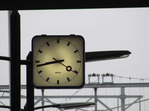
As always, it was fun spotting bits of English slightly out of context.
We headed over to the Rembrandt House Museum, but only Stuart ended up going in because my sister and I got completely distracted by a nearby flea market. I drew this when we met him in the reception area, clutching three vintage dresses and a coat in our arms.

I just downloaded the Gerd Arntz memory app and I’m giving it a test spin. The game contains 250 from the more than 4,000 pictograms Gerd Arntz drew between 1928 and 1965, and were scanned from the original prints in the Arntz archive of the Municipal Museum The Hague.

If you like Arntz’s pictogram work, I recommend picking up Dutch publisher 010’s recent release, Gerd Arntz Graphic Designer.
Here’s a brief introduction from the 010 website:
“As a politically engaged graphic artist and designer Gerd Arntz (1900-1988) portrayed the world in wood and linoleum cuts. During the 1920s, he conveyed his vision on social wrongs and the rise of Nazism in Germany in his prints. He did this in such a simple, direct style that anyone - regardless of their education and nationality - was able to understand his images.”
More on Gerd Arntz here.
——————–
Also worth viewing:
Handbook of Pictorial Symbols
Icographic Journal: Isotypes& Pictograms
Herbert Kapitzki
Not signed up for the Grain Edit RSS Feed yet? Give it a try. Its free and yummy.
——————–
©2009 Grain Edit - catch us on Facebook and twitter

Hailing from the Netherlands, illustrator Sue Doeksen creates wonderful worlds that are overpopulated with bright colors and friendly shapes, with mediums ranging from physical, digital, pencil-drawn, paper-cut, and animated. Judging from the massive amounts of blissfully exciting work on her blog, Sue is clearly one of those artists that doesn’t give up: most likely because she can’t stop creating.


——————–
Also worth viewing:
Hvass&Hannibal
Emily Forgot
Not signed up for the Grain Edit RSS Feed yet? Give it a try. Its free and yummy.
——————–
No Tags©2009 Grain Edit - catch us on Facebook and twitter <
Add a Comment

It’s here! The third edition of Karel Martens: Printed Matter is now available in the U.S.
Upon publication in 1996, printed matter was labeled an instant classic in the world of design publishing. This beautifully designed visual survey of the career of Dutch graphic designer Karel Martens is a tactile distillation of Martens’s unique and personal approach to design. Projects—ranging from postage stamps to books to signs on buildings—are arranged in layouts that fully explore the print process. The first edition of printed matter rapidly sold out along with a second edition published in 2001. This third and final edition includes a new interview with Martens and brings the survey of his work to 2010, marking fifty years of practice.


Copies are available at Amazon.
Details:
Karel Martens: Printed Matter/ Karel Martens with Jaap van Triest and Robin Kinross/ 208 pages/ Text in English/ More info is available at Hyphen Press.
The top three images are from Insect54’s amazing Flickr stream. *** Note these images are from the first edition of the book.
——————–
Also worth viewing:
Mimmo Castellano: Posters and Packaging
Born Modern: The Life and Design of Alvin Lustig
Giovanni Pintori Exhibition Catalog
Not signed up for the Grain Edit RSS Feed yet? Give it a try. Its free and yummy.
——————–
No Tags
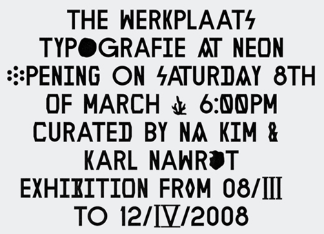
Voidwreck is the collaborative studio of Amsterdam residents Karl Nawrot & Walter Warton. Karl is a graduate of the Werkplaats Typografie, which is considered by some to be the holy grail of typography programs in the world.
As an experimental studio, Voidwreck constantly explore different mediums to develop shape and pattern. The same can be said of their typography, which I think embodies the word ‘modernism’—embracing the new while drawing on geometrical sans serifs as inspiration.
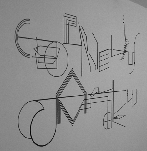
And for good measure, I’m pretty fascinated by the patterns that Karl & Walter create using stamps and die-cut cardboard. Take a couple of minutes to explore their site (hint: press refresh to see each of the 8 different websites).
——————–
Also worth viewing:
Herbert Kapitzki: Graphic Designer and Teacher
Typografische Monatsblätter
Vette Annonce type specimen sheet
Related Books:
In Alphabetical Order: We

Here’s another book to add to the holiday wish list. Lauwen Books recently released Wim Crouwel ‘in his own words’, a selection of lectures and articles delivered by Wim Crouwel between 1973 and 2006. Considering Wim’s long and established history with design, I’m sure it’s a fascinating read full of inspiring stories and valuable insights. The book is currently sold out at typotheque, but it appears copies are still available directly through the publisher as well as Nijhof & Lee.

——————–
Also worth viewing:
Wim Crouwel Archive
6th Biennale of Graphic Design Brno 1974
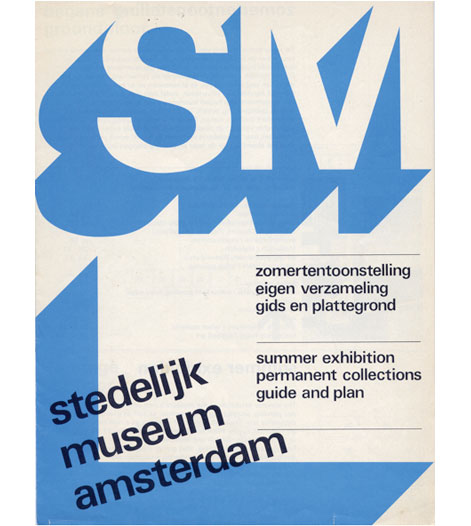
Stedelijk Museum Poster design - Wim Crouwel
Not signed up for the Grain Edit RSS Feed yet? Give it a try. Its free and yummy.
——————–
No Tags.jpeg?picon=3304) By: Leslie Ann Clark,
on 10/16/2010
By: Leslie Ann Clark,
on 10/16/2010
 In my quest for new ideas, I often begin at our local library. In fact, I am discovering all the libraries that are located between my house and my dad’s house which is about an hour away. Each library has different books! What fun it is browsing through pages and pages of BOOKS! Children’s books, garden books, books about weaving, decorating, farm animals, famous painters, travel books and more! Sometimes just having a stack of books near my chair inspires me! ha! I LOVE BOOKS!!!


Schriftenkatalog der n.v. Lettergieterij Amsterdam voorheen N. Tetterode
I rarely find cool type catalogs, but this one is a real goldmine. The catalog seen above was produced by the Amsterdam Foundry (formerly N. Tetterode) and appears to date back to the mid-1960s. It’s filled with beautiful specimens including Nobel, Mercator and Aigrette all lovingly laid out in a simple yet elegant manner. If this sparks your interest, I suggest taking a quick glance at the Vette Annonce type specimen sheet we posted back in 2008 as well.
Grotesk in different weights
Karten & Grotesk Breitt Fett
Aigrette
—–
Also worth checking: Simmelkiaer Grotesk Type Specimen
Enjoy this story? Sign up for our tasty free grain edit RSS feed.
—–
No Tags
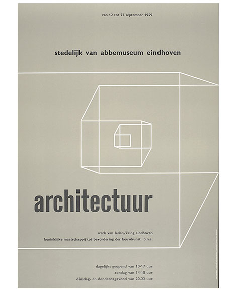
Architectuur werk van leden poster c1959
Wim Crouwel fans rejoice!
The Het Geheugen van Nederland (The Memory of the Netherlands) is a dutch website that contains an extensive collection of illustrations, photographs, texts, film and audio fragments, all of Dutch making. They have an impressive archive of work by Wim Crouwel. Over 500 original designs by Wim and his partners at Total Design lay in wait for your perusing pleasure. Enjoy!
Huge thanks to Antonio at Aisleone for sharing this gem.
* Note - If the link doesn’t work type “Wim Crouwel” into the search engine found on the site.
——
If you like this, check out: Wim Crouwel Interview 1, Wim Crouwel Interview 2
Not signed up for the Grain Edit RSS Feed yet? Give it a try. Its free and yummy.
——
No Tags
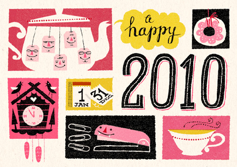
It’s out with the old, in with the new. Goodbye 2009, hello 2010!
Netherlands based illustrator, Esther Aarts, created this holiday greeting card for van Ditzhuijzen accountants. Its charm lies in its personified objects, such as the gleeful teabags and toothy stapler, set against coarsely textured backgrounds. I really like the color scheme with its varied pink hues in stark contrast to the grainy black, and the hand drawn type is also an added plus…making way for a fresh new year.
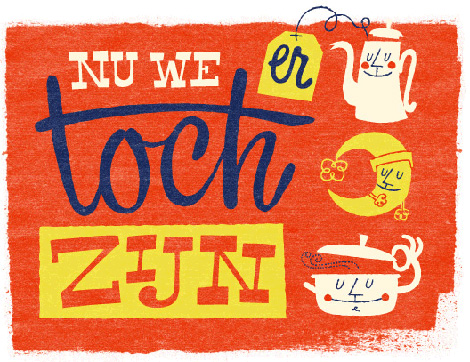

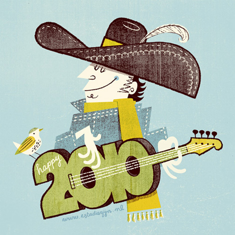
Esther has a nice collection of illustrations, many of which incorporate smiling people and objects, hand drawn lettering, and neat textures. To see more of her work, check out her website.
——————–
Also worth checking: Sol Linero illustration.
Not signed up for the Grain Edit RSS Feed yet? Give it a try. Its free and yummy.
——————–
No Tags©2009 Grain Edit - catch us on Facebook and
Add a Comment
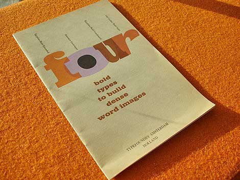
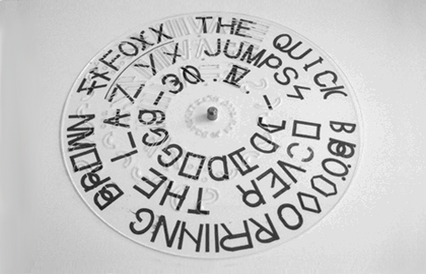
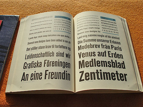
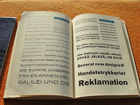
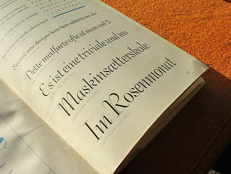
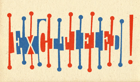
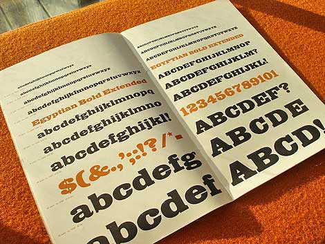
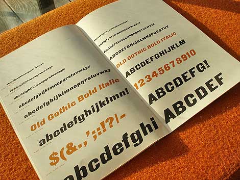
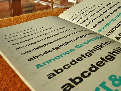
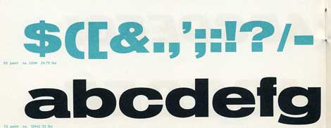
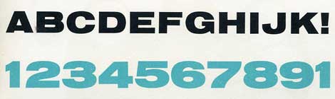
Four bold types to build dense word images c. early 60s?
Beautiful type specimen booklet produced by Typefoundry Amsterdam and imported by Amsterdam Continental. Includes samples of Egyptian Bold Extended, Annonce Grotesque, Egyptian Bold Condensed and Old Gothic Bold Italic.
From the intro of the Booklet:
In this specimen booklet, we have grouped four bold, decisive display type faces. Based on design modes which became classics of the midnineteenth century style, they have in common the power to create a dense , highly integrated word image, with the effect of a broad band or ribbon. A wide diversity is offered within this overall unity of effect: Egyptian and Gothic, roman and italic, condensed and extended. Where strong impact is required, these faces achieve dramatic solutions. They create an advanced, modern accent when maxium contrast with the even tone of text material is the designer’s aim.


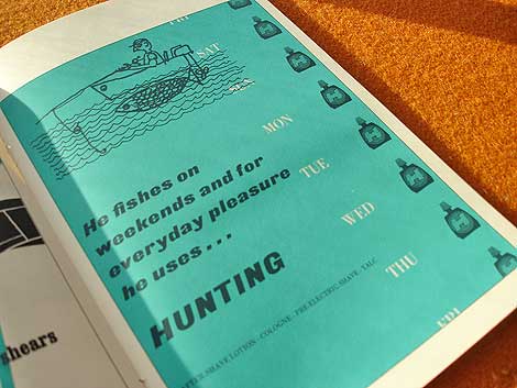
Who writes this stuff? This is great. He fishes on weekends and for everyday pleasure he uses hunting. Killing furry meat in the week and doodle socking on the weekend.. nice!
*Note-I googled fishing slang. I’m not actually this cool.
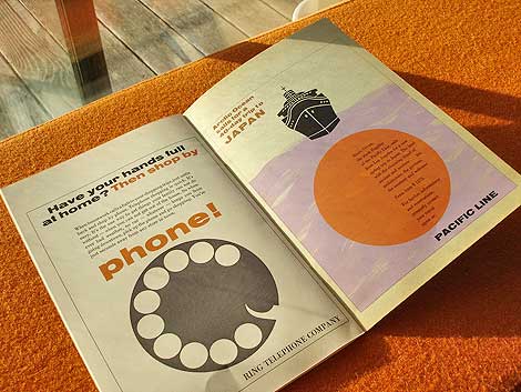
Ring telephone company..clever.

Also worth checking: Vette Annonce
Not signed up for the Grain Edit RSS yet? Give it a try. Its free and yummy.
No Tags
Grand Prize goes to Tim Kim - 1st pick of the 4 prize options goes to Vertigo Andy - 2nd pick of prizes goes to Jory Dayne- 3rd pick of prizes goes to Tim Kim - 4th prize goes to Celiajoy our winner from twitter - We will contact all of you directly.
©2009 Grain Edit
 By: John,
on 1/13/2009
By: John,
on 1/13/2009

Fun, bright illustration from the Netherlands’ Jelle Gijsberts. I’d gladly read an entire shelf of kids’ books filled with work like this.
Oh, a day at the library would be lovely! I’ll have to look for one in Golden!