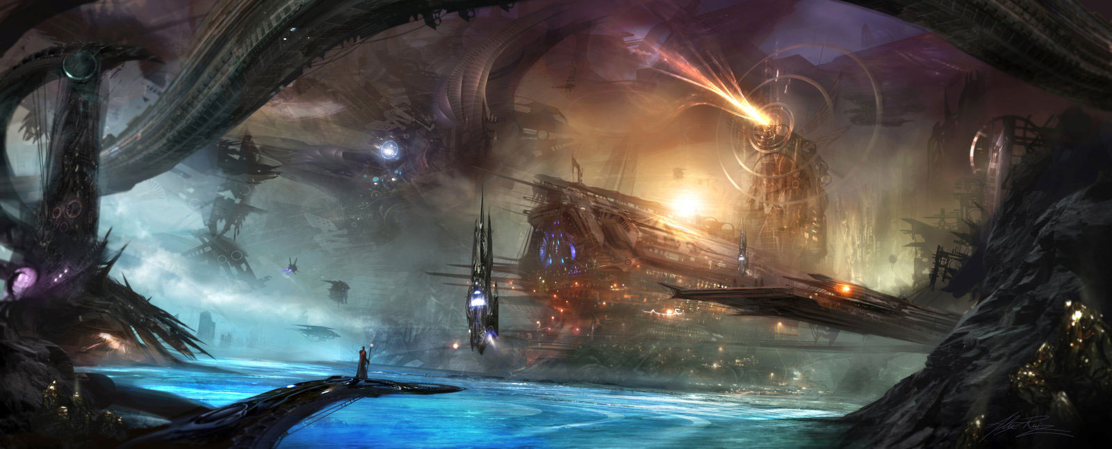
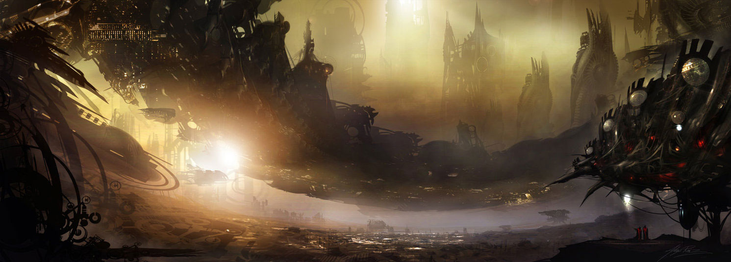
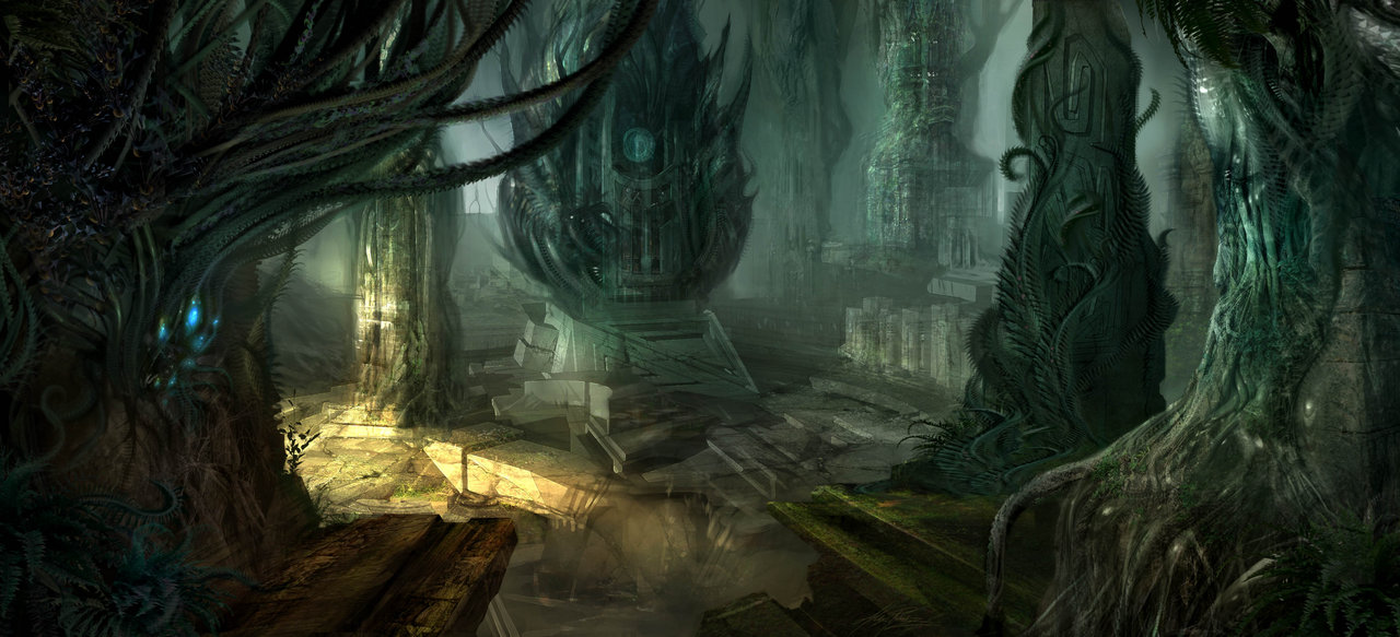
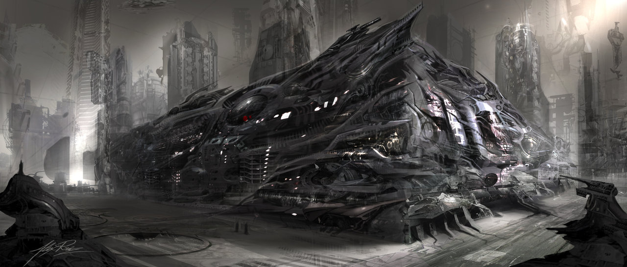
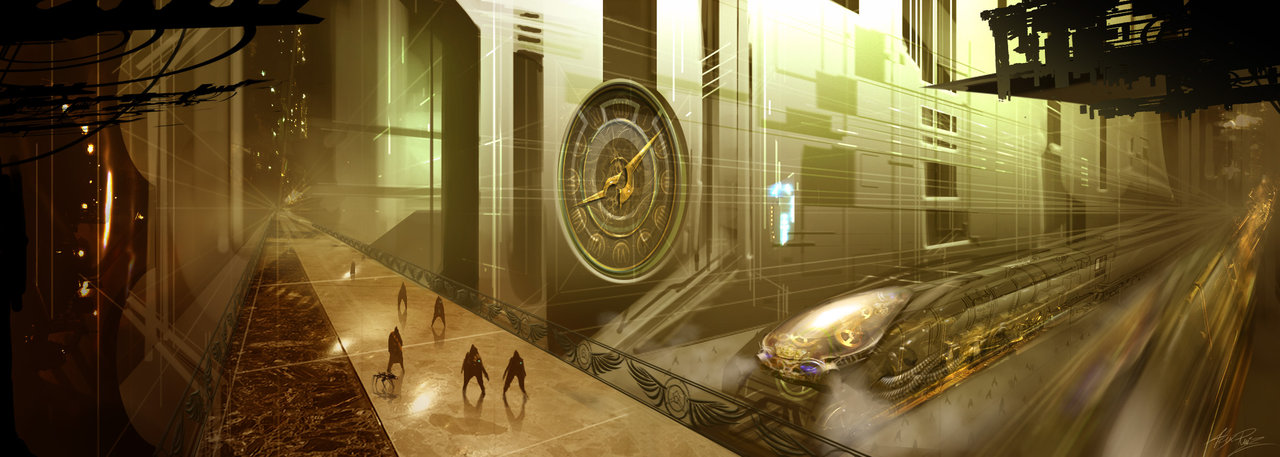
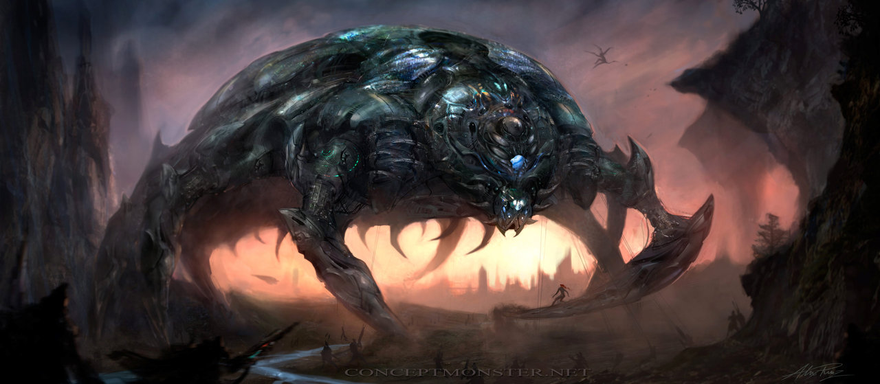
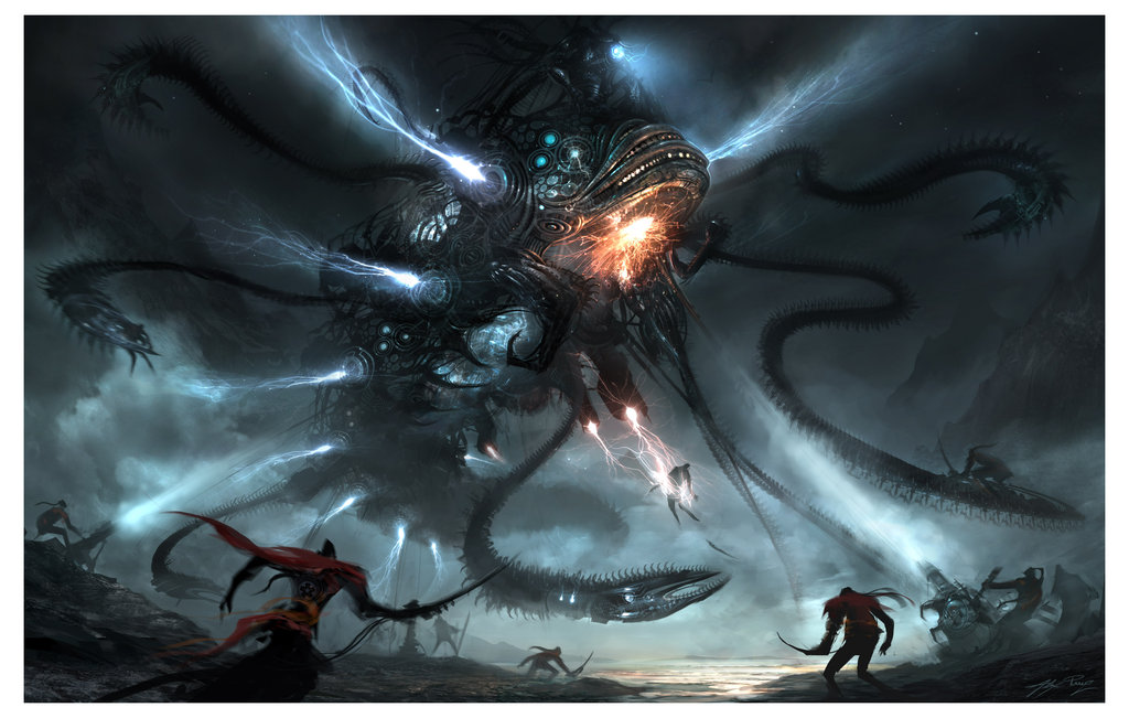
The visions of Alex Ruiz range from dark and disturbing, all the way to vomit inducing cuteness and hilarity. In his paintings, the creatures of his thoughts crawl off the page and transplant themselves into the unsuspecting brain, hopefully taking residence there as well.
Journal of a typical or maybe an atypical Logo Design ProjectThe
Cupcake Station retail store was started a couple of years ago in the upscale town of Birmingham, Michigan. It has been a great success and has expanded now to an Ann Arbor store and a Van-Store that goes to big events in our area and sells cupcakes on location. I did the main logo first, then the Van-Store logo a year later.
One of the cupcake guys is an architect that I had done another project for, Tom Holliman. His partner is Kerry Johnson a landscape architect. They are both creative types who wanted a fun but tastful approach to their identity. I am including a number of the choices I gave them. On jobs like this I really have fun and always overdo the choices.
They had a hard time picking only one. I incorporated my usual method of gathering all manner of pertinent visual material. I believe "the solution usually lies in the problem". This is not always true, but is always a good place to start. First I hand drew the elements I wanted to use, cupcakes, bakers and border devices. I knew I wanted to do some old-time ad type of borders and shapes. I spent a full week doing the ideas and comps. The guys love their stuff and get lots of compliments for their “look”. This job went very smoothly. Guess I don’t have to tell you that logos can be very painful at times.
....................................................................................................
And that was the final installment for the biography of Detroit great, Ron Rae. Once again I'd like to thank Ron for taking the time to put this together for us. It certainly was an honor to have him featured on
Illustration Pages. I really hope you enjoyed this special series on graphic designer and illustrator, Ron Rae. Don't forget to read our other
interviews too.
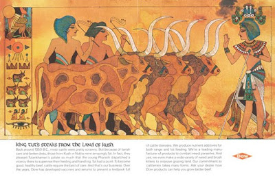
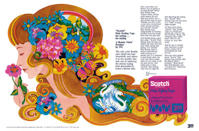
How the big Detroit Art Studios worked (and then they didn’t)
The big Detroit art studios (in 1968 there were eight or so of them) all had six or so full time reps who called on the big advertising agencies every day for work. A typical large studio (Skidmore-Sahratian) had a production department with a manager and, six or so "keyliners", the people who pasted up the boards with type and position photostats for art elements and photographs. This work was done under the direction of graphic designers. The "keylines" or "mechanicals" went first to the ad agency art directors for approval, then to the printing companies along with all the retouched photos and finished art work. The production department also included stat camera operators who could also shoot reference photos for the illustrators and a team of apprentices who ran back and forth to the ad agencies and learned a studio art skill when not busy with apprentice duties. Artists on the board would consist of several realistic figure illustrators, a couple of decorative illustrators, one or two lettering artists, several photo retouchers, a couple of penciling artists who did pencil drawing underlays of automobiles and all sorts of mechanical items on illustration board for the mechanical painters to do final art on. The "pencilers" also drew all the obvious distortions that one sees on 1950s and early 1960s auto art, the stretching and widening and lowering that made the cars look so big (and the figures look so small). Figure artists always put in backgrounds and people. Painting the figures in the cars had a name, "stuffing the cars". The big studios always had a design department. The graphic designers at any of the major studios were excellent at styling the concepts of art directors or designing a project from scratch with their own concepts. They did thumbnail sketches first to plan the project. These could be shown to the art director for approval before tight comps were done. Full sized tissues were then done by the designer as guides for the comps. By the middle 1960s the presentation comps for car catalogs and ads became very comprehensive indeed, with real type setting that had to be specked and sent out to the type house in the evening to be delivered first thing in the morning for assembly by keyliners. Major changes were a big problem. Sometimes patches could be done on the comps, but often the comps had to be totally redone. A whole class of artists came to be, who specialized in “zippy” photo indications for catalogs, ads and TV storyboards. The stylish comps done by these real pros resulted in the saying... "This comp makes promises that the finish can never keep!"


A New Lesson in Old Dogs and Pixel Tricks
When I was 55 years old, I had to learn the Mac computer and Adobe programs or fold up my tent. It was one of the hardest things ever for an old brain, but I stuck to it. Luckily I really wanted to be able to do all the cool things I was seeing in print. I had been doing elaborate collage, montage illustrations for years combining my art with photos and old prints, etcetera. I had even done transparent effects by overlapping Xerox images on tracing papers. I was really ready for Photoshop... and Illustrator was ready-made for my graphic icon styles. Being able to set my own type and do the comps without those awful type rubdowns was just too good to be true. One more really good thing about computer art... as a drawing board artist I had regularly had black india ink bottles land in my lap, but I have never spilled any pixels. Being able to make changes to things without redoing the whole hand rendered comp was a revolution in itself. If only we had unlimited “Command Zs” for everything in our lives.


A whole new area opened for me by 1994-1998. I joined the Detroit area’s best interior and environmental design group, Peterhans Rea Design as they merged with James P. Ryan Architects. The two groups had merged to add an interior and environmental design group to their capabilities. We did total projects... buildings, interiors, and major high-end shopping complexes, restaurants/bars, music venues and zoo projects. Some of the work was for projects in London, England, Brazil in South America and Sydney Australia as well as all over the United States. My part of this was an amazing number of logos (mostly illustrative), art murals and dimensional decorative graphics and signage. Environmental design has been described as "just like regular graphic design... only thicker!" This period allowed me to design with some of the most creative and skillful artists I had ever worked with, David Peterhans, Ron Rea (pronounced just like my name, talk about confusion), Greg Tysowski (architect), Eileen Devine and Jim Ryan founder of JPRA Architects. This was one of my favorite periods of my career.
50 Looong Years of Graphic Art and Design.
by Ron Rae
First Beginnings
I was born in 1937 in Saginaw, a town in Mid-Michigan famous as a lumbering center in the mid to late 19th century. A couple of sections of Saginaw have clusters of Victorian Era mansions built by the Lumber Barons. My first home was in one of these Victorian palaces, a mansion turned into an apartment house. My grandparents lived in another elaborately detailed Victorian home close by. I think growing up in this overtly decorative environment influenced my life-long interest in historical art movements and design styles. I started drawing as a youngster as most of us did and often illustrated my school projects to get better grades than the written content deserved. Many of my teachers fell for this ploy. I knew early on that I was destined (or doomed) to be some kind of an artist.
Hitched and Married at Twenty-One
When I married in 1958. My wife Kathy and I soon became avid antique collectors and she became, and still is, an antiques dealer. She handled a wide variety of antiques, but our own favorites were of the Arts and Crafts movement, Art Nouveau, Art Deco, and later on, Mid-Century Modernism as it is now called. We recently found some of my 1970s silk screen prints showing up in the Modernism antique shows. I’m now officially an "antique artist" - I guess.
Just a Smidgen of Education
I attended Wayne State University in Detroit for one year (1957). My formal art education also consisted of one year (1958) at The Art School of the Society of Arts and Crafts in Detroit. Today it's known as Center for Creative Studies. In the 1970s I taught graphic design there myself. Incidentally I have no degrees (except 98.6). My first job in 1959 was as an apprentice in a desirable commercial art studio in Detroit called Gilchrist-Osler Studios. My first boss was Jerry Campbell, Detroit’s premier lettering artist and designer. My early training was for a position called “Layout Man” the old designation for a graphic designer.

My first job “on the board” (that’s drawing board) was at a small but pretty hot art group called LeBeau Studios. At this studio I first met and worked with my friend of 48 years, Edward Fella, now a world famous designer/graphic artist, teacher and lecturer. Ed and I discovered and explored a lot of art influences both historical and contemporary while working together in the same room. It was with this group (1960-1962) that I was officially called a graphic designer, and it was here that I was caught up in what I call "The Great Graphic Art Explosion of the 1960s". My first admired New York contemporary group was the original Pushpin Studios... Milton Glaser, Seymour Chwast, Paul Davis and John Alcorn. Imagine how amazing it was, when a few years out of Saginaw I was actually (if only occasionally) competing with Pushpin Studios for specific projects. In their "Historical Eclecticism" approach the Pushpin guys were referencing the historical styles and eras of art that I was so interested in, Victorian woodcuts, The Arts and Crafts Movement, Art Nouveau, Art Deco and the great early
This week we’re changing things up a bit. We’re going to do something you don’t normally see here on Illustration Pages. I’m very excited to report that all this week we’ll be featuring the biography and art of one of the most prolific and accomplished illustrators and graphic designers, Ron Rae.
Ron was a major player during the height of the Detroit advertising scene in the1960s and 70s. And everyday this week we’ll be featuring a different segment of his biography written exclusively for
Illustration Pages by the artist himself.
Ron Rae’s career as an artist has spanned more than five decades – almost four of which were spent working at top Detroit agencies sid
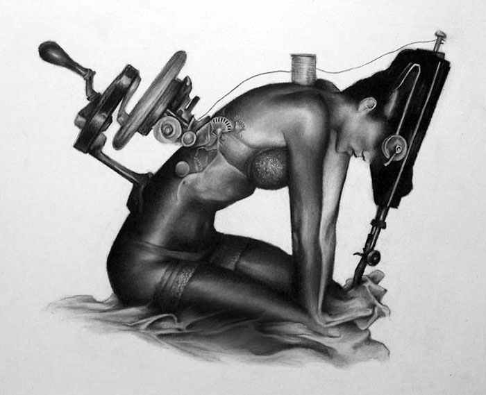
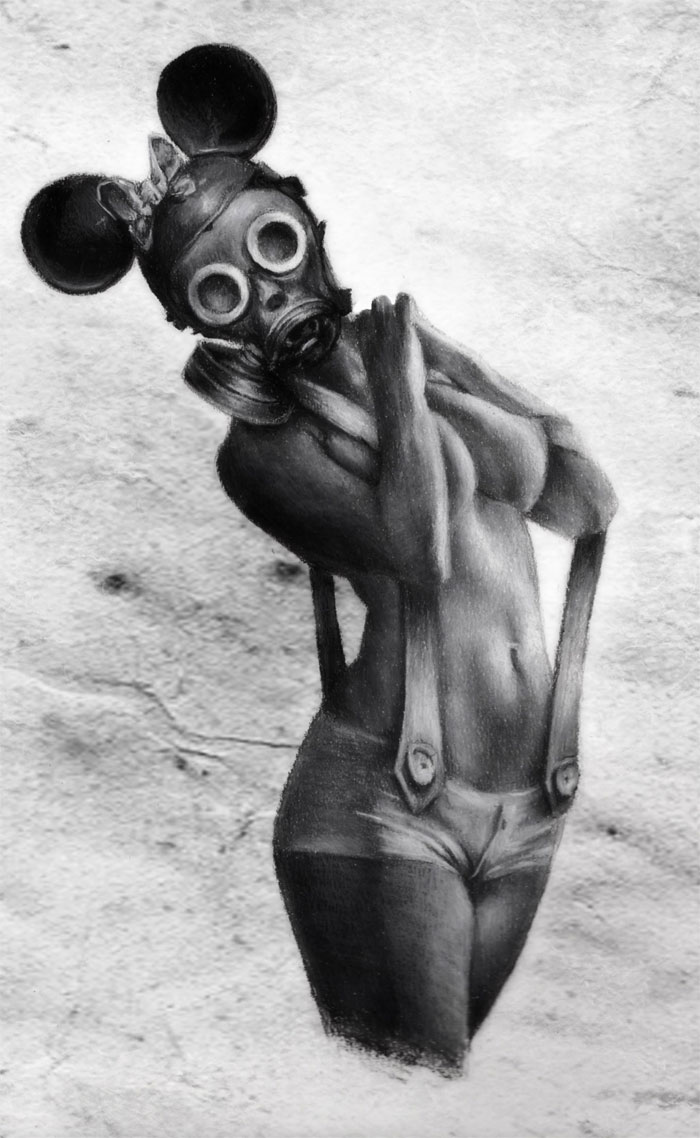
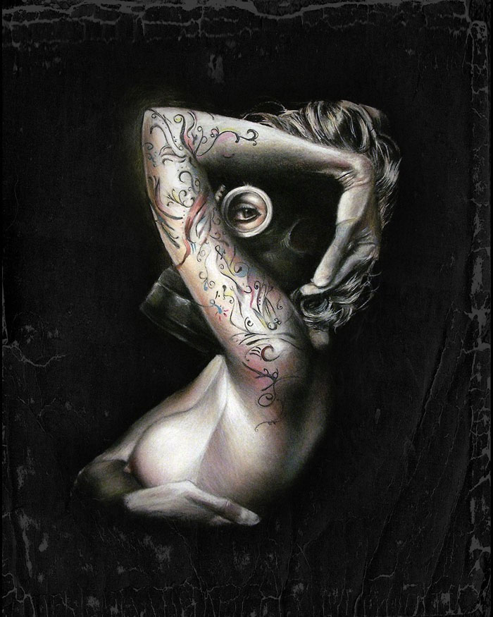
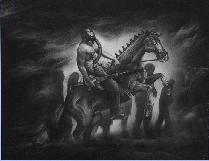
It's hard to believe what some artists can create using charcoal, ink and graphite. Jeffrey Richter is one such artist. His meticulously detailed images are seductive and haunting, thought provoking and full of depth. In black and white, grayness and shadow, machinery is melded into the human form and beauty morphs into nightmares. Each of his pieces tells a story, like the woman above who sews herself together to become complete.
Love and war, strength, life and death, conflict and the relationship between man and machine, this is the art of Jeffrey Richter communicated with passion and contemplation. Beyond his impressive skill as a draftsman, Jeffrey captivates his viewers with the stories he tells about each piece and the stories his viewers can’t help but imagine about them on their own.
When not designing apparel as a graphic artist, Jeffrey can be found in his studio in St. Clair, Missouri recording his dreams and thoughts on paper – creating his astonishing works of art.
It has been established that persons who have recently died have been returning to life and committing acts of murder. A widespread investigation of funeral homes, morgues, and hospitals has concluded that the unburied dead have been returning to life and seeking human victims. It's hard for us here to be reporting this to you, but it does seem to be a fact.
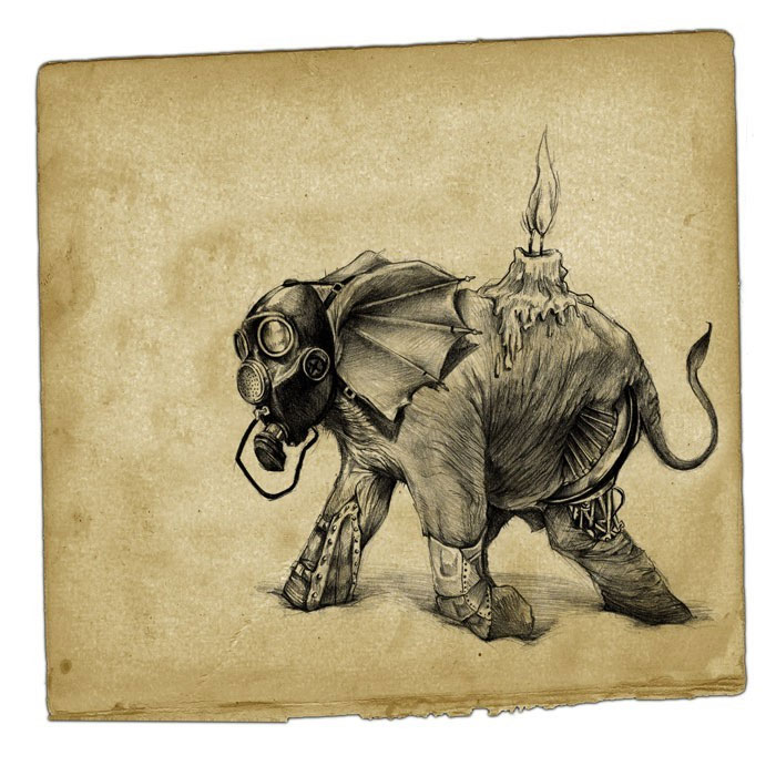
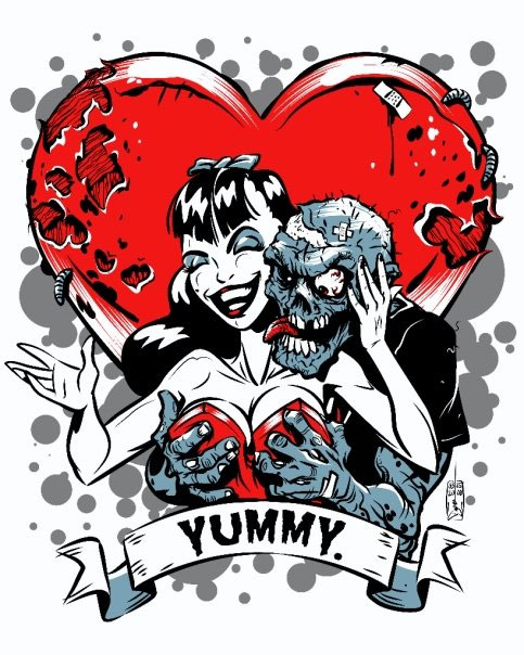
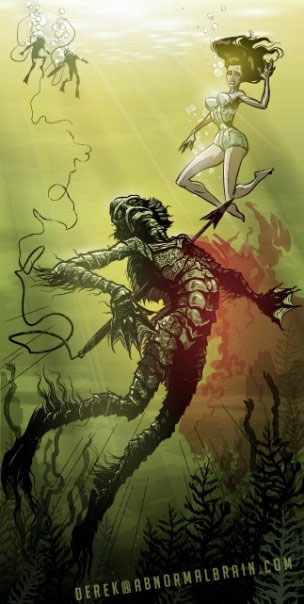
[1]Derek Ring is an illustrator with a passion for the undead, ghouls, zombies, mermaids, devils, frankensteins, draculas, robots, and sea monsters, girls in bikinis fighting sea monsters, comic books, ghost stories…you probably get the picture.
Whenever an artist has a passion for a specific type of subject matter it really shows. Derek’s passion is clearly displayed in his creepy but very cool illustrations of ghosts, mutants, miscreants and other creatures of the night.
It has been rumored that Derek Ring creates his illustrations using a mixture of embalming fluid, human bone marrow and goat’s blood in the dungeon of a dark castle high atop a hill somewhere in the New England region of the northeastern United States – exact location unknown.
0 Comments on The Abnormal Brain of Illustrator Derek Ring on Facebook as of 1/1/1900

By: Rebecca,
on 5/5/2010
Blog:
OUPblog
(
Login to Add to MyJacketFlap)
JacketFlap tags:
Oxford,
language,
Oxford Etymologist,
Lexicography,
Dictionaries,
word origins,
r,
etymology,
warsh,
resonants,
pottage,
Add a tag
The title is from The Posthumous Papers of the Pickwick Club (wash-up is the way one of the characters pronounces worship), but I owe the idea of this post to two questions. I decided not to wait for the next set of “gleanings,” because my summer schedule will prevent me from answering questions and responding to comments with the regularity one could wish for. Both questions concern Engl. r.
The first was about the status of r. Some people say that r is not a real consonant. Is it true? Yes, partly. In rate, late, mate, and Nate, the sounds r, l, m, and n, known in the phonetic nomenclature as resonants, are consonants like any other (compare Kate, pate, fate, date, etc.), but word finally they can form the crest of the syllable and thus display a feature characteristic of vowels. For example, each of the words—Peter, bottle, bottom, and button—pronounced as Pet’r, botl, botm, and butn, has two syllables, and the peak (crest) of the second syllable is r, l, m, and n. It follows that resonants sometimes behave as consonants and sometimes as vowels.
The second question requires a much more elaborate answer. Why do so many people pronounce wash as warsh? It will be easily seen that the title of today’s post was inspired by this question. In my recent discussion of wh-spelling, I referred to the weakening of Engl. h, s, f, and th, a process that has been going on for at least two millennia. Resonants are also prone to weakening. One can observe this change with a naked eye (with a naked ear?). British English is “r-less” (that is, r is not pronounced in far, for, fur, cart, horse, bird, and their likes), while in most varieties of American speech they are sounded. Obviously, the loss of r after vowels occurred in British English after the colonization of the New World by English-speakers, who preserved the traditional pronunciation of ar, or, ir, and so forth (colonial languages are always more conservative than the language of the metropolis). In similar fashion, l was lost in some positions, but that happened before the 17th century, so that here British and American English share a common cause: compare balk, talk, walk, chalk, balm, calm, alms, and salmon (in which mute l is still spelled) with bilk, whelk, and bulk (in which l is pronounced). The weakening was capricious: for instance, in Dutch a similar process took place, but the Dutch for holt “wood” (obsolete except as a last name) and salt is hout and zout: l is neither pronounced nor (providentially) spelled in them. In Scotland, golf used to rhyme with loaf (I don’t think anything has changed in the last fifty years).
After vowels, especially word finally, r disappeared not only in British English but also in some varieties of German. Occasionally other sounds, when weakened, find their last refuge in r. The name of the Greek letter that designated the sound of r is rho. Hence the term rhotacism “a change of any consonant to r.” Long ago, z was weakened to r. This is the most ancient case of Germanic rhotacism. The difference between was and were, rai
By: Rebecca,
on 7/20/2009
Blog:
OUPblog
(
Login to Add to MyJacketFlap)
JacketFlap tags:
Reading Room,
Bryant,
John R. MacArthur,
MacArthur,
Sawyer,
Harper\ s,
Literature,
Current Events,
Free,
A-Featured,
A-Editor's Picks,
Prose,
Leisure,
OWC,
Bryant Park,
Harper's Magazine,
Reading,
Magazine,
read,
John,
Tom Sawyer,
Mark Twain,
Oxford University Press,
R,
Park,
Tom,
Mark,
lunch,
Room,
Twain,
Add a tag
What are you doing during lunch tomorrow? If it involves sitting at your desk eating a sandwich consider joining us in Bryant Park. Oxford University Press has teamed up with the Bryant Park Reading Room to host a FREE discussion of The Adventures of Tom Sawyer led by John R. MacArthur, publisher of Harper’s Magazine and author, most recently, of You Can’t be President: The Outrageous Barriers to Democracy in America. In the blog post after the break MacArthur introduces us to the relationship between Harper’s and Mark Twain.
So be sure to come to the Bryant Park Reading Room (northern edge of the park), Tuesday, July 21st from 12:30 p.m. to 1:45 p.m. The rain venue (don’t worry we are doing our best no-rain dances) is The General Society of Mechanics and Tradesmen Building, 20 West 44th Street. Sign up in advance and receive a FREE copy of the Oxford World’s Classic, The Adventures of Tom Sawyer (offer is limited while supply lasts).
The histories of Mark Twain, William Dean Howells and Harper’s Magazine are so intimately linked, so important to the fabric of the magazine, that I talk about Twain and Howells around the office as if they were still alive. The other day I told a staff meeting that as long as I was running Harper’s, it would remain a literary magazine that also publishes journalism — not the other way around — because of Howells’s and Twain’s ever-present legacy.
Howells met Twain in 1869, three years after Twain had published his first long narrative in Harper’s, “43 Days in an Open Boat.” As the future literary editor of Harper’s recalled, “At the time of our first meeting…Clemens (as I must call him instead of Mark Twain, which seemed always somehow to mask him from my personal sense) was wearing a sealskin coat, with the fur out, in the satisfaction of a caprice, or the love of strong effect which he was apt to indulge through life.” It’s no coincidence that for our special 150th anniversary issue in 2000, we constructed a cover photo of Twain in his dandy suit facing Tom Wolfe in his dandy suit.
Clemens and Howells became good friends and in 1875 the genius from Hannibal asked Howells to read the manuscript of The Adventures of Tom Sawyer. “I am glad to remember that I thoroughly liked The Adventures of Tom Sawyer,” Howells wrote, “and said so with every possible amplification. Very likely, I also made my suggestions for its improvement; I could not have been a real critic without that; and I have no doubt they were gratefully accepted and, I hope, never acted upon.” Howells was underrating his influence on Twain, who penned over 80 pieces for Harper’s. As a critic and a fine novelist in his own right, Howells was correct — Tom Sawyer is a great American novel. Indeed, not everyone agrees that it’s any less of an achievement than the more widely acclaimed (at least in serious literary circles) Huckleberry Finn. I’m looking forward to talking about the book next week and finding out the answer to a number of questions: for example, precisely how old is Tom Sawyer? I assume the Twain scholars in the audience will enlighten me on this and other matters.


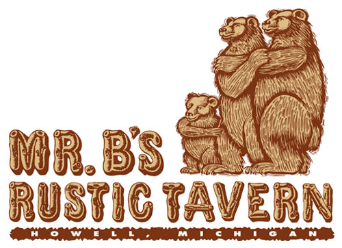
these guys are just trying to stay warm!
(teehee)


 0 Comments on Who I Am... And How I Got That Way - The Impressive Career of Graphic Designer and Illustrator Ron Rae - Part II as of 1/1/1900


This is awesome