JacketFlap connects you to the work of more than 200,000 authors, illustrators, publishers and other creators of books for Children and Young Adults. The site is updated daily with information about every book, author, illustrator, and publisher in the children's / young adult book industry. Members include published authors and illustrators, librarians, agents, editors, publicists, booksellers, publishers and fans. Join now (it's free).
Login or Register for free to create your own customized page of blog posts from your favorite blogs. You can also add blogs by clicking the "Add to MyJacketFlap" links next to the blog name in each post.
Viewing: Blog Posts from the Illustrator category, Most Recent at Top [Help]
Results 78,851 - 78,875 of 156,698
How to use this Page
You are viewing the most recent posts from blogs in the Illustrator category in the JacketFlap blog reader. These posts are sorted by date, with the most recent posts at the top of the page. There are hundreds of new posts here every day on a variety of topics related to children's publishing. Scroll down through the list of Recent Posts in the left column and click on a post title that sounds interesting. Click a tag in the right column to view posts about that topic. You can view all posts from a specific blog by clicking the Blog name in the right column, or you can click a 'More Posts from this Blog' link in any individual post.
Here are some previews from upcoming work I recently did for Highlights for Children and Highlights High Five. The first two are from High Five and should be available in the winter. The first preview is from a "That's Silly!" illustration and the second is part of a surprise that will be included inside the back cover. The rest are from back cover "What's Wrong?" illustrations for Highlights for Children.
Thanks for the peek! These all look great, Chuck! You've been very busy! Love your color palette, by the way. It looks traditional, but with a twist. Very nice!
Just a quick note to say that I'll be at the San Diego Comic-Con in support of my new book, FAT VAMPIRE.
On Sunday from 11-12:00 I'll be participating in a panel called Entertaining One's Inner Child in room 24ABC. Also participating will be Matt and Jennifer Holm (Babymouse), David Steinberg (Daniel Boom), Jimmy Gownley (Amelia Rules), Sina Grace (Among the Ghosts), and Greg Van Eekhout (Kid vs. Squid).
I'll also just be wandering around most of Saturday and Sunday, so if you see me please say hi. I'll be the guy who looks like me.
2 Comments on Okay, I'm Back, last added: 7/24/2010
I ran into Chupacabra at the pub the other night. He follows your blog, too. He was kind of staring moodily into his drink, muttering about the whole nossssferatu ordeal. "Again with the vampires. Always with the vampires. Now even fat vampires get more press than me. Cryptozoology is as sexy as the supernatural, any day! Night. Whatever. I'm sexy." And then, with much slavering and snorty gnawing, he ate his straw and mini umbrella.
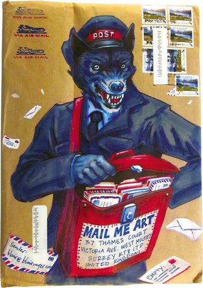
Mail Me Art: Medium Without a Message is the follow-up to the successful 2008 Mail Me Art: Going Postal. We are proud to announce we have over 700 new pieces of mail art. Medium Without a Message is an amazing collection of envelopes and boxes from around the world decorated by some of today’s most talented illustrators and artists. What makes the work special is that every single piece of art was sent through the postal system, exposed and on view as regular mail. At the end of this month all of the work will be on display at the London Mail Me Art exhibition.
How can you help support the project and become part of it? Well... The running costs for the project are currently at around £6000 ($9120). We’re hoping to recoup most of that by selling the new book and we’re also hoping to make the artists lots of money by selling their work at the exhibition. We’ve just finished the book and we got as many of the mail artists into the book as possible in some way or another. So please help us recoup some of the costs by making a pledge and supporting the project. In return for a pledge we're sending people copies of the new book. We've also got some really cool artwork up for grabs from the likes of Dan May & Jon Burgerman. Please check out the site for more details - mailmeart.com
0 Comments on Support the Mail Me Art Project and Make a Pledge as of 1/1/1900
Over the past couple of days I’ve posted Part 1, Part 2, and Part 3 of the opening keynote address from theICON6 Illustration Conference, called The Future of Publishing, which brought together Wyatt Mitchell (Creative Director, WIRED), Kelly Doe (Art Director, The New York Times), Jim Heimann (Executive Editor, Taschen America), Jeremy Clark (Senior Experience Design Manager, Adobe), and Roger Black (Principal, Roger Black Studios).
Today I’d like to conclude this particular series with Part 4 of the presentation, featuring Jim Heimann of Taschen America, who introduces the controversial question of whether or not Illustrators should animate their work to maintain their relevance in today’s market.
In addition, you can listen to an audio recording of the panel discussion and audience Q&A session where some Illustrators expressed concern about the comments made about putting their work into motion.
First, here’s the video:
And here’s the audio from the discussion that followed:
Hi Thomas,
Thanks for filming and posting these. Just a few points that came to mind:
1. The tone of the keynote did come across (maybe unintentionally) as “animate or die” or “there’s no place for your static illustrations in this brave new world” but there’s no denying that these new forms of delivery open up exciting opportunities for illustrators, whether you are a “motion” illustrator or one of those old fogeys that makes quaint old images that don’t move.
2. An illustrator working with an “enlightened” magazine like Wired is one thing but you can easily imagine many lesser magazines jumping on the bandwagon. “Yes we want it to move but don’t expect us to pay for that!”
3. If it’s overused and it will become more “visual noise” and the audience will just ignore it. It will end up era a fad and go the way of the animated gif banner. Remember all that awful Photoshop filter art in the 90′s.
4. Animating your illustrations is exciting but it has to fit the context. One powerful image is worth a 1000 frames of animation that out stays its welcome. With the risk of sounding very old fashioned personally i find find static images are full of movement and narrative. Just take a look at any painting by N C Wyeth.
5. As one person said on the imprint site we must not confuse motion with animation. Making your illustration move is different to breathing life into a character. Animation is a skill that requires understanding of timing, acting, rhythm and the principles of animation.
This discussion made me think of a quote from artist Jean Cocteau who upon experiencing wide screen films for the first time said slyly
“Remind me the next time I write a poem, I will use a larger sheet of paper!”
Cheers
Eddy
DELTA73 said, on 7/25/2010 1:40:00 PM
Thank you for your comments video. In Slovakia, such information is not very much
Carlos Castellanos said, on 7/25/2010 9:19:00 PM
I think the idea of “artists going out there and doing it themselves” or “illustrator as entrepreneur” is the key message in this video and audio.
It’s time we stopped looking at ourselves as merely hands for hire. And become creative artrepreneurs.
I've done a few things in the past, from theatrical set designer and muralist to Montessori teacher... but always in the background I pursued illustration. Not always as diligently I wanted to... but always trying to learn more and hone my skills. Now that I have the ability to work at my craft full time, I'm trying to step up the promotional send outs to one every other month. Hopefully the persistence and crossed fingers pays off in the end! So that's what I've devoted this year to.... holding up my hand, waving my flag, Ill even dance if need be..... OK I have two left feet so that won't work!
This is the next one in the lineup! Up, up and away!
2 Comments on Up, Up and Away, last added: 7/24/2010
Roberta, this is a wonderful piece. There is so much action, color and happiness in the work. I watched as it grew from sketch to finished painting, and the result is filled with joy.
What a strong piece! Wonderful expression and the characters are so sweet! Great work and you should not have to dance. Your work is amazing and persistence should capture the right persons eye! Love it! :D
After two days of painting, I've finished my newest portfolio piece. This was my first time incorporating texture/pattern overlays directly into my work. I'd like to explore that further, along with several other elements that make digital painting so advantageous to my process.
After two days of painting, I've finished my newest portfolio piece. This was my first time incorporating texture/pattern overlays directly into my work. I'd like to explore that further, along with several other elements that make digital painting so advantageous to my process.
While I definitely liked the V&A museum, what I REALLY liked was the Natural History Museum right next door. Call it the 8-year-old in me, but big skeletons of dead animals are just cool to look at.
0 Comments on Travel Sketch: London as of 1/1/1900
I created Carmen Carretta a few years ago for "Turtles On Parade", a fundraiser we had here in Stuart, Florida. She stands about 10' tall overall and is fabricated out of fiberglass, foam, epoxy, and acrylics. Great fun!
Oh, I forgot to mention…there’s another kind of caustic reflection that’s as near to you as your coffee mug: a nephroid caustic. That’s the name for the little shape that forms when sunlight slants into an empty cup or bowl.
These mathematical figures are called “nephroid curves” because they sometimes have a kidney-like shape, and they’re called “caustics” because they’re focused rays, so they could potentially burn something (but dang, the won’t keep my coffee hot).
Note that in the photo there’s also a caustic halo bouncing off the outside of the mug, too. Any time you’ve got glass or metal objects in direct sunlight, there will be lots of caustic effects all over the place.
The giveaway that it’s a caustic effect (as opposed to plain old reflected light or highlights) is that the light is focused into a definite shape with a bright line or edge around it.
So that's what those things are called. They look like those shapes made by magnifying glasses that will start a fire. I used to light my dad's cigarette butts on the driveway when I was nine. I would puff away like a little train. Where were my parents??? Thanks for the cool little science experiment.
Fascinating information; I had no idea of the proper scientific nomenclature of these phenomena. I also had little idea exactly how they worked, so this was quite enlightening.
So on a whim, I entered my screenplay on the beginning of archeology and tourism at Mesa Verde in the late 1800's into the Nicholl Fellowship Screenwriting Contest., considered one of the few competition for new writers that Hollywood takes slightly seriously. 5 Fellows are chosen from over 6,000 applicants, given $30,000 dollars and a year to write another script, which Hollywood insiders pay attention to, something a lot of writing contest can't claim. Well, I didn't win. But I'm actually kind of excited.... 6,300 scripts were submitted this year- each was read one time, if it received a favorable read- it went on to a second read. Mine, went on for a second read- so the playing field went from 6,300 to 2,900, which tells me.... I can actually write a script, not talking about a brilliant script, but I know the structure of screenplay writing, can create a story with a beginning, middle and end, have enough of a grasp of grammar that some underpaid reader in Hollywood didn't cringe and toss the script onto the reject pile like in 15 seconds! The scripts are read a second time, so the playing field went from 2,900 to 900- and guess what I got another favorable read! Which means my standing in 6,300 scripts was 15%- ( gosh, I feel like this would make a great word problem in Math class!) 15% tells me- hey- I can write a decent story- that is somewhat interesting and is exciting enough to hold a reader's attention that is basically locked in a very small room like the girl in Rumplestilkin, with a very large pile of scripts and she can't have lunch till she reads them all, I'll take that! Well, these 900 scripts were read again and this time instead of getting a pass or fail, they were scored, and well, no go, my script did not hit the 20% off the 900 scripts need to go to the next stage, which is the top 180 out of 6,300 scripts. The 180 scripts will be cut to 30 scripts and then to 5 Fellows. Sure, I had ideas of grandeur, that standing in the long line of "want to be" script writes, a slick back dark haired Hollywood type executive with a big bodyguard, all dressed in black of course with the dark sunglasses would mosey right towards me, unclip the velvet rope barricade, inform me I could go into the V.I.P. section of glory and well, go all around the monopoly board and collect my $30,000 dollars. But I kind of knew that wasn't going to happen. What I really hoped for, and think was confirmed- was that the two lowly readers that read my 120 pages of words and ideas pulled from somewhere in the back of my head, did not laugh themselves silly with my delusions of being a writer and head to their favorite coffee shop and continue to have a good laugh with all their other reader type friends over my expanse. It might be "Pollyanna-ish" - But I am happy I'm in the pack, not at the front of it, but at least I am in the pack.
0 Comments on A Pollyanna look at rejection... as of 1/1/1900
Just received my yardage of the Flying Birds fabric I ordered through Spoonflower. It is now available for sale in my shop. The scale is very large - each bird about 6" wide. I can't wait to find the perfect project for it.
6 Comments on Spoonflower Flying Birds Fabric, last added: 7/24/2010
As an art teacher and a comics fan, this is the Comic-Con panel that I am most excited to attend on Friday:
4:00-5:00 James Sturm and Scott McCloud, A Center for Cartoon Studies Conversation: Understanding, Making, and Teaching Comics— Join CCS co-founder James Sturm and Scott McCloud in a freewheeling discussion about transforming the unruly creative process into practical instruction. Plus catch a sneak peak of Cartoon College, the upcoming documentary about The Center for Cartoon Studies!
But, HEY COMIC-CLONE PARTICIPANTS, why attend a one hour conversation when you could take an actual comic booking workshop? I teach one at Art Center College of Design here in Los Angeles. Many art schools do! James Sturm’s self-same Center for Cartooning Studies even offers them
We still don’t know whether the new Looney Tunes Show for Cartoon Network will meet our lofty expectations, but I was invited to a screening this past week to preview the three new CGI Road Runner-Coyote shorts for theatrical release — and my verdict is in: They’re terrific!
Coyote Falls is the first one out (it’ll be attached to Cats and Dogs 2 opening next Friday, July 30th). These are three-minute, three-dimensional cartoons in widescreen (scope). It works perfectly for these characters – the feeling of space in the vast desert only adds to Coyote’s desperation. This time he has ordered an ACME bungee cord and has set up a birdseed trap under a highway bridge. It’s a “foolproof” plan that takes everything into consideration … except oncoming traffic.
The characterizations, posing, even the sound effects and music (by Chris Lennertz) are spot on. I especially liked the explosions, which in cg have a stronger impact and thus are funnier. The 3-D is even used to extend into the audience – something most modern filmmakers are loathe to exploit. At three minutes these films really are too short (I think some trailers are longer than that), but they show real potential. This is the first Looney Tunes short produced by Sam Register’s new Warner Bros. Animation division. (BTW, the film is simply a Warner Bros. Cartoon with no Looney Tunes or Merrie Melodies designation). Spike Brandt and Tony Cervone are supervising producers along with Allison Abbate (Fantastic Mr. Fox, Corpse Bride, Iron Giant), Matthew O’Callaghan (Curious George) directed in respectful homage to Chuck Jones. The film begins with a very cool 3D CG WB-rings logo designed by Peter Girardi. Below is a 25-second clip to give you a taste – followed by three exclusive images (click thumbnails to enlarge).
Phone Booth Gallery, created by Garry Booth has opened their official shop. If you’re in the Long Beach, California area visit Phone Booth Gallery at their new location on Broadway on Saturday, July 31, for a night of painting and fun. Participating artists include Matt Hendon, Alan Villanueva, Arlene Reyes, Kevin Bannister, Joel Juercher, Scott Flanders, David Owen, Nancy Chiu, Ryan Milner, and of course, Garry Booth.
Saturday, July 31 5pm - 10pm Phone Booth Gallery 2533 E. Broadway Long Beach, CA 90803
0 Comments on Illustration Pages News: Phone Booth Gallery Presents A Live Painting Event as of 1/1/1900
Really strong entry. Popped out of the group right away, as most of the other entries this week are yellowy. Very graphic. I love the cut-out quality of it.
Anonymous said, on 7/23/2010 4:05:00 PM
Hey Pips, again I find myself cheering for the monster! He's pretty ambiguous with the wings of a harmless butterfly but legs that can swipe and crush. Cool. Love to see more...Bertie H
Boy, confident use of magenta, and to great effect! This theme is very strong both graphically and in subject too. The 'Toodle' empire is developing in leaps and bounds... :)


.jpeg?picon=2593)


 1 Comments on Coming Soon, last added: 7/24/2010


.jpg?picon=2760)


.jpg?picon=573)


.jpg?picon=1083)


.jpg?picon=1009)


These are lovely. A wonderful graphic flatness to it, but with a bit of unexpected depth.
So pleasant!
These are very nice. I really like the simple style. There's a very nice layering of depth as well.
Really nice artworks!