new posts in all blogs
Viewing: Blog Posts Tagged with: retro, Most Recent at Top [Help]
Results 26 - 50 of 61
How to use this Page
You are viewing the most recent posts tagged with the words: retro in the JacketFlap blog reader. What is a tag? Think of a tag as a keyword or category label. Tags can both help you find posts on JacketFlap.com as well as provide an easy way for you to "remember" and classify posts for later recall. Try adding a tag yourself by clicking "Add a tag" below a post's header. Scroll down through the list of Recent Posts in the left column and click on a post title that sounds interesting. You can view all posts from a specific blog by clicking the Blog name in the right column, or you can click a 'More Posts from this Blog' link in any individual post.

Searching for some retro logo inspiration, I stumbled upon Depression Press’s Flickr stream, which has retro logos in spades along with other old printed goodies, including plenty of illustration:

Posted by John Martz on Drawn! The Illustration and Cartooning Blog |
Permalink |
No comments
Tags: Design, ephemera, logos, retro


By: Sevensheaven.nl,
on 10/23/2009
Blog:
Sugar Frosted Goodness
(
Login to Add to MyJacketFlap)
JacketFlap tags:
box,
game,
minimalism,
amiga,
1992,
commodore,
hoi,
classic,
graphic design,
retro,
cover,
vintage,
Add a tag

Alternative box cover design for the Hoi Amiga game from 1992, executed in a minimalistic 1960s style.
More at Sevensheaven.nl

By: David Elzey,
on 10/9/2009
Blog:
The Excelsior File
(
Login to Add to MyJacketFlap)
JacketFlap tags:
preschool,
09,
balzer+bray,
lincoln agnew,
katie van camp,
picture book,
retro,
bubbles,
david letterman,
harpercollins,
space,
Add a tag
by Katie Van Camppictures by Lincoln AgnewBalzer+Bray / HarperCollins 2009Here we have the promise of some truly bold retro graphics marred by a weak text with the faint whiff of celebrity, second-hand by-association celebrity at that.Late at night, while she should be sleeping, Harry sneaks out of bed and grabs his Bubble Blooper down, a 50s space gun that shoots large bloopy bubbles. The
I think I'm on a roll?
I FEEL like I'm on a roll.
I just recently discovered that CHICKEN DANCE made it into the Original Art Show at the Society of Illustrators in New York. Now, it's not the first time I've been in the show, but I have to be honest with you, I was truly bitter when I learned that THE GHOSTS OF LUCKLESS GULCH was excluded from last years show. With that said, if OH NO doesn't make it into next year's Original Art Show I will feel truly jaded.
In any case, I wanted to share the cover for OH NO with you all because it will be relevant to my next blog, which will come later on in the week(s)
A while back I blogged about this great book my parents got for me while they were in Thailand. It was a book about old movie posters. Stuff like this...

I just loved the rough painterly feel of old pulp retro posters. OH NO was one of those projects that I felt lended itself to that feel so I modeled it after an old 1960's Japanese Monster Movie Poster such as this...

and especially these...

See the influences? I hope it translates well into a children's book...
 (click on all images to see a larger version)
I'll walk you through a few details....
First of all, the jacket as a whole may look a little busy, but if you look at it as parts of a whole then it makes more sense.
Here's the cover...

I thought the single image of a girl standing in front of a city in carnage would stand out on a bookshelf. Then upon closer inspection you would notice that in her glasses you can see the reflection of a giant robot and a giant frog preparing to fight. The art director and I decided that the paper should be matte (or satin finish) and that the glasses would be spot glossed to give it that reflective feel.

The back of the book continues on with the whole retro feel. The robot is a dominant shape in the background which is predominantly red/orange. I also gave him a speech bubble where the book bar code would be placed as if the robot were talking and I included a 'Presented in Retrovision' and 'Color by Colorflux' ads which were later removed before printing. Also note the rough painted edge over the white border. The large signwritten in Japanese literally translates to "OH NO" in Japanese. For the longest time I was trying to convince the folks at Hyperion to include Japanese in the title and in the text. We ended up settling on a middle ground.
 The about the author/illustrator section is also part of the whole retro feel of the jacket. Here is an image of the author, Mac Barnett and I running away from the monster (in classic sci-fi poster form). I added an eye patch to myself as an homage to to some of the old mad scientist villains you would see in the Bond movies and so forth. It almost rings synonymous with the goatee in Star Trek that automatically signified Spock as being evil. It was as if to say a prerequisite to being evil in the 60's was that you had to have lost an eye. Oh those silly 60's...
But wait that's not all... Take off the jacket and turn it over. What's this? A door poster?!

The art director and editor were awesome enough to let me include a movie poster that kids can hang up on their wall. It comes complete with tag lines and movie credits which include the names of the art director and editor as well.
BUT WAIT DAN! HOLD ON! If my kid hangs this book poster on his door then he's gonna have a book with no jacket on it. What good is that?!
Ah, never fear. The hardcover is decorated, as well, as you can see here...

It's supposed to be the science notebook of the girl in the book. The coffee stains were supposed to be tinted to more of a chocolate milk sort of feel but I think it failed. There was originally more stuff on it to begin with but Mac and the editor felt it was best to simplify it and keep it minimal.
OK. I'll concede on that one...
By: Anita Mejía,
on 7/10/2009
Blog:
Sugar Frosted Goodness
(
Login to Add to MyJacketFlap)
JacketFlap tags:
retro,
vintage,
wallpaper,
wall,
Anita Mejia,
chocolatita,
vynil,
phonograph,
disc,
illustration,
boy,
dog,
Add a tag
A few years ago I was working as an animator for a commercial studio in Chicago. For many years I had animated rabbits and leprechauns for cereal commercials, and always wanted to do something just for the fun of it. So I did this spot "Funny Fizzles" as an homage to my favorite drink of all time, "Funny Faces".
Here's the fruity cast: Bonkers Blueberry, Looney Lime, Kooky Coconut, Batty Bannana, Mambo Mango, and Fruity Punch.

...which were inspired by some of my favorite original Funny Face gang: Goofy Grape, Lefty Lemon, Choo-Choo Cherry, Freckle Face Strawberry, Jolly Olly Orange, and Loud-Mouth Punch.

Hope you enjoy-
Darryl

We Ain't Afraid Of No Ghosts!
~ Timothy Lim
Ninjaink's Portfolio
 Here is an illustration I did a few years ago. It immediately came to mind when I read about the new SFG theme, Ad Boy. It's such a fun theme, I plan to do another very soon.
By: Sevensheaven.nl,
on 4/20/2009
Blog:
Sugar Frosted Goodness
(
Login to Add to MyJacketFlap)
JacketFlap tags:
impossible mission,
commodore 64,
epyx,
illustration,
metin seven,
sevensheaven,
2d,
retro,
3d,
game,
Add a tag

So you thought you were playing 2D games. If you had taken a look inside your monitor, then you'd have seen this.
The featured game is Impossible Mission from Epyx, a classic 8-bit game for the Commodore 64, released in 1983.
More at Sevensheaven.nl
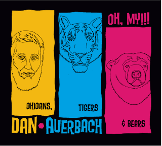 What a coe-inka-dink. This is one of three designs I submitted for "The Black Keys"s Dan Auerbach who just came out with a great new album. If you want to way on your favorite t-shirt designs visit my blog.

Wildsville : The art of Derek Yaniger - Published by Korero Books
I first found out about Derek Yaniger through Otto von Stroheim’s Tiki newsletter. His art harks back to the sketchy, loose line illustrations often found in cookbooks, maps, pamphlets and packages of the 1950s and 60s. It’s filled with references to hot rods, beatniks and tiki culture. It’s colorful, fun and always full of suprises.
Korero Books has just released this fantastic book entitled Wildsville: The Art of Derek Yaniger. The book is 112 pages and includes more than 140 full color images of Derek’s paintings and illustrations. I love Stuart Sandler’s (of font diner) description of Derek’s work in the beginning of the book.
“Mix together 1 part Jay Ward, 1 part Jethro Bodine, 2 parts Trader Vic, 1 1/2 parts Elvis ( the early years), 1 part Frankenstein and 3 parts Maynard Krebs, shake vigorously and strain gently over the sounds of vibraphone exotica, garnish with a little Sinatra, a rare marbled porterhouse and a dangerously dirty gin martini, and you’ll find yourself staring down the loaded double-barrel of a Derek shotgun ready to blow your mind!”
Grab a copy of the book while you can. It’s available at Korero Books and mister retro.


z


No Tags
Share This
New giveaways coming soon at Grain Edit ©2008 Grain Edit

By: Dave,
on 9/15/2008
Blog:
inspiration from vintage kids books and timeless modern graphic design
(
Login to Add to MyJacketFlap)
JacketFlap tags:
BOOKS,
illustration,
labels,
out-of-print,
retro,
vintage,
1960s,
1970s,
Found design,
ephemera,
sweden,
graphic-design,
czechoslavakia,
Add a tag
This is turning out to be Maraid day. She has an amazing collection of photography and ephemera, plus she always posts beautiful labels to our Mid Century Modern Sticker, Label and Stamp Club.
Get lost in her collection.
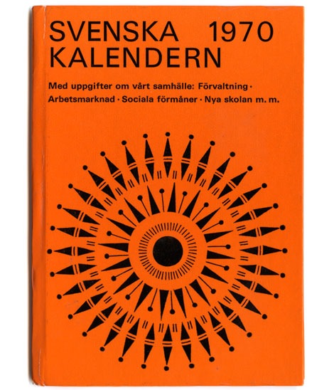
Swedish Almanac 1970
Thanks to Michael Murphy for reminding me just how awesome her collection is.
Also worth checking:
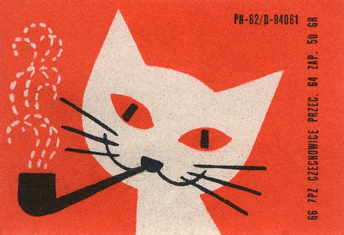
70s Czech Matchbox Label
70s Czech Matchbox Label part 2
No Tags
Share This
Congrats to JAN D you won the Raymond Savignac poster. Please email us to claim your prize. ©2008 -Visit us at Grain Edit.com for more goodies.

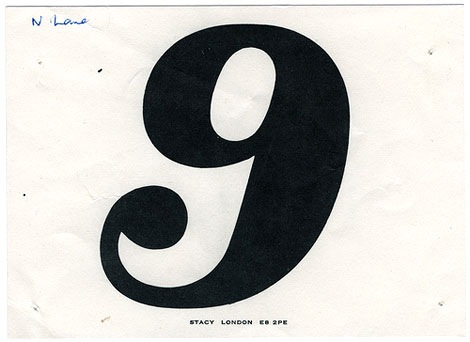
Race numbers from various UK based races
I love thick fat slabs of juicy numberage and Maraid is serving it up big time. Come get some of these vintage fatties here.
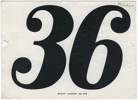
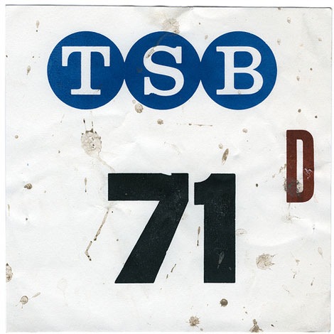
Also worth checking:
Telephone Numbers on letterheads
No Tags
Share This
Congrats to JAN D you won the Raymond Savignac poster. Please email us to claim your prize. ©2008 -Visit us at Grain Edit.com for more goodies.

By: Dave,
on 9/8/2008
Blog:
inspiration from vintage kids books and timeless modern graphic design
(
Login to Add to MyJacketFlap)
JacketFlap tags:
1950s,
retro,
vintage,
posters,
1960s,
Found design,
ephemera,
memorabilia,
rare,
archive,
travel,
UK,
Add a tag
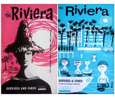
British Railways Services and Fares booklets for the Riviera (L) Sept 1962 (R) May 1959
Tony Hillman has put together an amazing collection of British Railways publicity material. His site features posters, menus, booklets, brochures, tickets, timetables and commercials. Put some time aside because there is plenty of good stuff too look at here.
(Huge round of thanks goes to Tika Viker-Bloss for sending this my way)
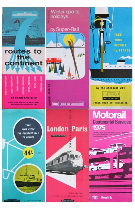
British Railways logo designed by Design Research Unit
Also worth checking:
British Airways Playing Cards.
No Tags
Share This
Congrats to JAN D you won the Raymond Savignac poster. Please email us to claim your prize. ©2008 -Visit us at Grain Edit.com for more goodies.

By: Dave,
on 9/2/2008
Blog:
inspiration from vintage kids books and timeless modern graphic design
(
Login to Add to MyJacketFlap)
JacketFlap tags:
magazines,
out-of-print,
retro,
vintage,
1960s,
1970s,
Found design,
graphic-design,
illustration,
Add a tag
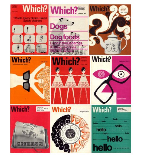
Which? magazine offers reviews and advice for various products and services. It looks like it’s a British version of Consumer Reports magazine. In addition, to the cool cover each issue features interesting information graphics and illustrations. Some of the illustrations remind me of the work of Bill Sokol. Anyone know who the art director for the magazine was?
You can check out some of the issues over at the always yummy Delicious Industries.
No Tags
Share This
Congrats to JAN D you won the Raymond Savignac poster. Please email us to claim your prize. ©2008 -Visit us at Grain Edit.com for more goodies.

By: Dave,
on 8/21/2008
Blog:
inspiration from vintage kids books and timeless modern graphic design
(
Login to Add to MyJacketFlap)
JacketFlap tags:
retro,
prints,
posters,
Found design,
USA,
lions,
graphic-design,
childrens,
illustration,
Uncategorized,
kids,
animals,
Add a tag
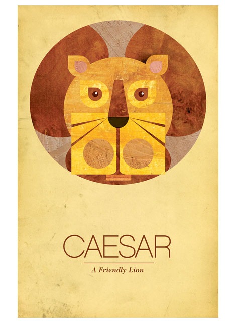
Seen above: Caesar the Friendly Lion, Dimensions 12.5 x 9
Able a design and branding firm outside of Philadelphia just put together a great animal poster series. The lion poster has a retro feel to it and reminds me of some the children’s book illustrations seen in the late 1970s to early 1980s.
You can see/ purchase the entire series at Able’s Etsy shop.
Also worth checking:
Petit Collage Animal Alphabet Poster
No Tags
Share This
©2007 -Visit us at Grain Edit.com for more goodies. 
By: Dave,
on 8/21/2008
Blog:
inspiration from vintage kids books and timeless modern graphic design
(
Login to Add to MyJacketFlap)
JacketFlap tags:
retro,
contemporary,
posters,
Found design,
USA,
environmental,
flyers,
graphic-design,
Typography,
Add a tag
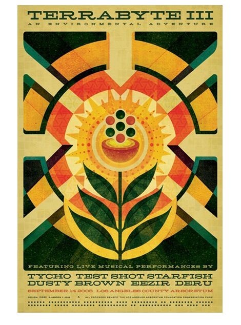
I’m a big fan of Scott Hansen’s (AKA ISO50) work and this new poster is a knockout. Love his use of Hellenic Wide for the type. The poster is for an upcoming show at the Los Angeles Arboretum.
No Tags
Share This
©2007 -Visit us at Grain Edit.com for more goodies. 
By: Dave,
on 8/13/2008
Blog:
inspiration from vintage kids books and timeless modern graphic design
(
Login to Add to MyJacketFlap)
JacketFlap tags:
illustration,
retro,
vintage,
airlines,
1960s,
1970s,
Found design,
israel,
ephemera,
graphic-design,
hotels,
Greece,
moder,
Add a tag
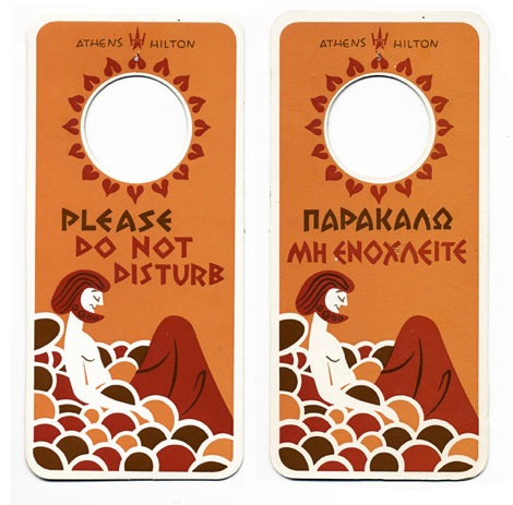
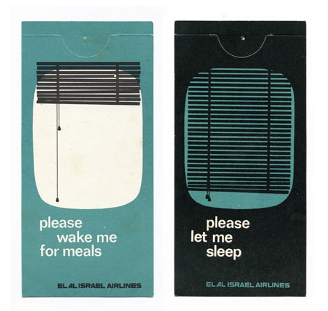
Athens Hotel door hanger + El Al Airlines hanger for sleepy time
Woah, Michael Lebowitz just posted an awesome collection of hotel door hangers.
also worth checking out:
Luggage label from Norway
Modern luggage label from Switzerland
No Tags
Share This
©2007 -Visit us at Grain Edit.com for more goodies. 
By: Dave,
on 7/31/2008
Blog:
inspiration from vintage kids books and timeless modern graphic design
(
Login to Add to MyJacketFlap)
JacketFlap tags:
Off our book shelves,
retro,
vintage,
netherlands,
1960s,
dutch,
ephemera,
analog,
booklets,
interfaces,
Add a tag
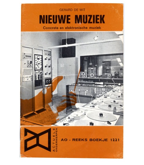
Nieuwe Muziek - Concrete en elektonische muziek by Gerard de Wit c1968
Great cover photo of a dutch recording studio from the 1960s. Check out all the vintage analog recording equipment! So many buttons, switches, knobs, reel to reels and dials. If your into 60s computer interfaces, tape machines and old mixing boards, I highly recommend you check out Stewf’s amazing Control Panel Flickr group.
Mucho thanks to Chris at Groove Merchant for hooking me up with the booklet.
No Tags
Share This
©2007 -Visit us at Grain Edit.com for more goodies. 
By: Dave,
on 7/31/2008
Blog:
inspiration from vintage kids books and timeless modern graphic design
(
Login to Add to MyJacketFlap)
JacketFlap tags:
BOOKS,
modern,
retro,
vintage,
brazil,
1960s,
Found design,
graphic-design,
book-covers,
Add a tag
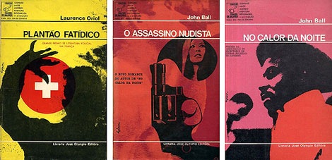
Plantão Fatídico é de c1967 -O Assassino Nudista c1968 - No Calor da Noite c1968.
Beautiful book covers by Brazilian designer/ illustrator Gian Calvi. Very similiar to the Penguin book covers of the same time period.
I’m very interested in Brazilian design from the 60s and 70s, so If anyone has any images or info please send it my way.
(via design ref’s wonderful flickr set)
also worth checking:
Japanese book cover art from the 1960s
No Tags
Share This
©2007 -Visit us at Grain Edit.com for more goodies. 
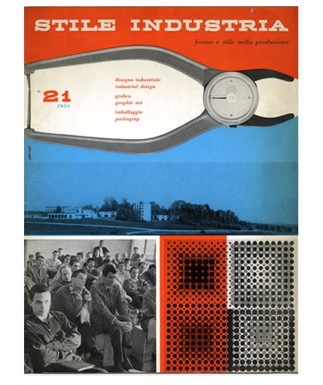
Magazine cover design for Italian industrial design magazine Stile Industria - March 1954
In 1940 Albe Steiner founded the Milan based studio Graphica Foto where he and his wife Lica experimented with Photography and design. Over the course of his career, Steiner designed for Domus, Agfa, Pirelli among others.
Cool book of his work here.
(Pictures via the Albe Steiner archive)
Also worth checking:
Aldo Novarese - Recta typeface
No Tags
Share This
©2007 -Visit us at Grain Edit.com for more goodies. 
By: Dave,
on 7/17/2008
Blog:
inspiration from vintage kids books and timeless modern graphic design
(
Login to Add to MyJacketFlap)
JacketFlap tags:
UK,
magazines,
out-of-print,
Off our book shelves,
modern,
retro,
vintage,
1960s,
graphic design. ken garland,
industrial-design,
Add a tag
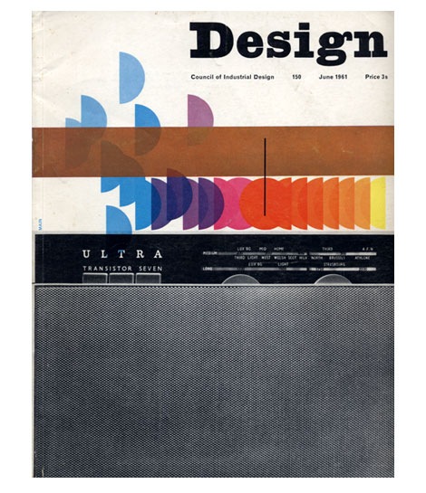
Design Magazine June 1961
Ken Garland served as art editor for UK based Design Magazine for six years. This is just one of many amazing covers that was conceived during his tenure.
also worth checking:
10 years of Vendre Magazine cover design
No Tags
Share This
©2007 -Visit us at Grain Edit.com for more goodies. 
By: Dave,
on 7/10/2008
Blog:
inspiration from vintage kids books and timeless modern graphic design
(
Login to Add to MyJacketFlap)
JacketFlap tags:
illustration,
cartoons,
videos,
animation,
Disney,
retro,
vintage,
1960s,
Found design,
Russia,
Add a tag
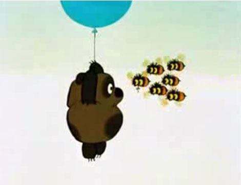
Winnie the Pooh has been around since the 1920’s. In the early 1960s the character was licensed to Disney for a series of features that debuted in 1966. The Russian version of this cartoon known as Vinni Puh aired in 1969. You can see an episode here.
It’s weird to see the Russian interpretation. I’m so used to the chunky orange American version. This guy looks like an Ewok.
Really enjoyed the video. Many thanks to Chris for sending this our way.
No Tags
Share This
©2007 -Visit us at Grain Edit.com for more goodies. 
View Next 10 Posts


Love ‘em! Looks so beautiful.