new posts in all blogs
Viewing: Blog Posts Tagged with: watercolor painting, Most Recent at Top [Help]
Results 51 - 75 of 195
How to use this Page
You are viewing the most recent posts tagged with the words: watercolor painting in the JacketFlap blog reader. What is a tag? Think of a tag as a keyword or category label. Tags can both help you find posts on JacketFlap.com as well as provide an easy way for you to "remember" and classify posts for later recall. Try adding a tag yourself by clicking "Add a tag" below a post's header. Scroll down through the list of Recent Posts in the left column and click on a post title that sounds interesting. You can view all posts from a specific blog by clicking the Blog name in the right column, or you can click a 'More Posts from this Blog' link in any individual post.
Here's a short video showing the making of my watercolor townscape in Bryan, Texas. (Direct link to video)
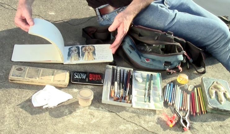
Camera:
The video is shot with a very compact point-and-shoot camera mounted to a street pole with a flexible tripod
 that can grab onto just about anything.
Paints:
----
Full length tutorial DVD from Amazon:
Watercolor in the Wild
HD download at Sellfy (Paypal) or
Gumroad (credit cards)

While I painted the house in Austin, Texas, I made this one minute video to show the basic sequence of steps. (Direct link to video)
----
Full length tutorial download "Watercolor in the Wild"
DVD available with exclusive slide show.
People told us to go see the weird side of Austin, Texas, so we walked around Sixth Street on Saturday morning. The dance clubs, comedy joints and sports bars had shills out front trying to lure people in with cheap drinks.
 |
| People sketches in Austin, Texas by Jeanette Gurney |
But they weren't getting customers. The street reeked of vomit and urine and spilled beer from the night before. There was a head shop with a window full of old clown toys, and a gift store with cute skeleton trinkets and a girl trying to sell tickets to the Museum of the Weird. But no one was buying.
 |
| Ballpoint pen sketches by Jeanette Gurney, "20% observation, 80% memory." |
There were too many tourists and the sun was blazing hot, so we walked east. We found some shade and quiet up on Seventh and Waller at a bus stop in front of a family services agency. Young mothers held their new babies. A few dads pushed strollers past us, stopping to smile when they went by, but not saying much.

I looked across Seventh to an average house. There was something strong and dignified about it that spoke to me. The owner came out at one point to pick up a couple of beer bottles that someone had left on his front lawn the night before.

Any house that you might choose at random is like a stage set for a thousand family dramas. Between its four walls play all the stories of life—the wonder of new love, the laughter and tears of raising children, the frailty of old age.

Big trees shaded the house, and wires connected it to the worries of the wider world. As I worked on my little painting, I tried to see the sketchbook page as its own little microcosm, a self-contained world.

I had to think about paint and the tools and techniques, but I was trying to ride those tools into the world of the picture. I was trying to pour cement on sidewalks so that a kid could skateboard on them, and build a porch so that someone could sit there to drink lemonade and escape the heat.
 |
| Waller Street, Austin, by James Gurney, watercolor, 5x8 inches |
For me the joy of painting is trying to get beyond the paint, to be able to enter the tiny universe of the image.

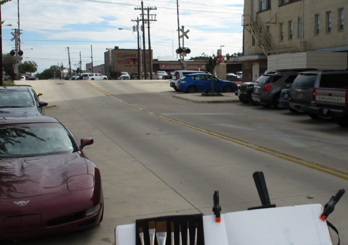
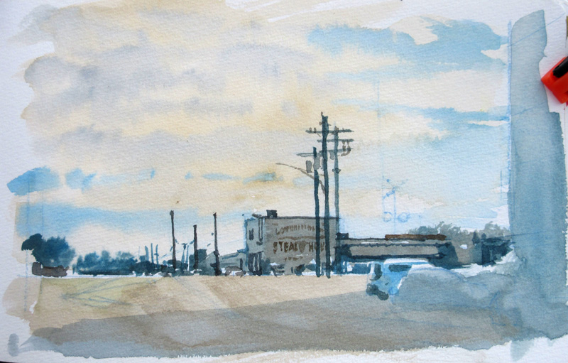
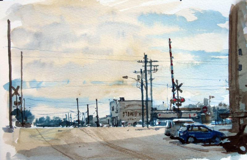
Here's a step-by-step watercolor sequence. I'm standing on the corner of 24th and Main in Bryan, Texas, looking east across the railroad tracks to the Longhorn Steakhouse.
The watercolor sketchbook is held up to standing height by a pochade easel on a fully extended tripod.
I'm attracted to the tight grouping of telephone poles and the gray light. The lay-in is drawn with a blue water-soluble colored pencil, which will partially dissolve. Note the eye level or vanishing point is below the level of the tracks.
I wet the entire sky, covering it with some overall warm color, then the light gray cloud shadows, and as it starts to dry up, the distant blue sky. Then I cover the big planes of the shadow, leaving a few white accents.
The poles and small details go in with Payne's gray and a round brush.
The whole painting takes an hour and a half. I shot some video, too, so I'll edit that and upload it next week.
Now...off to paint in Austin!
------
Materials:

Here's a video that I made while painting a row of shopfronts in Huntington, Indiana. (
Direct link to video)
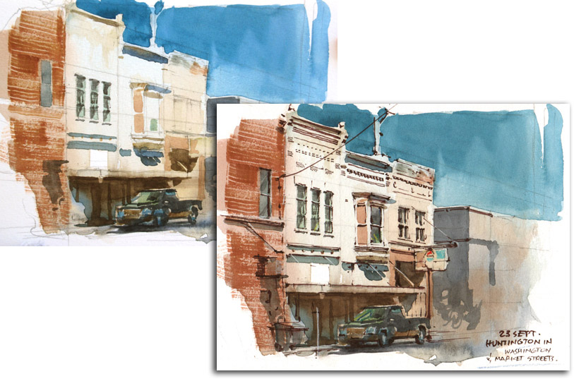
My first step is to first measure out a reasonably accurate perspective drawing in pencil. I cover the surface with a light ghost wash.
Then I place the watercolor tones with a flat brush. I start with the idea of doing a sepia sketch, but decide to bring in a cerulean/light red combination.
As time runs out, I switch to a brown fountain pen to describe the small, fine linear accents.
Since the fountain pen is water soluble, I can't add further watercolor washes without dissolving the lines. The reason for adding the penwork at the end of the process is that I was more interested in using the pen for selective small accents rather than for boundary lines.
-----
Materials:

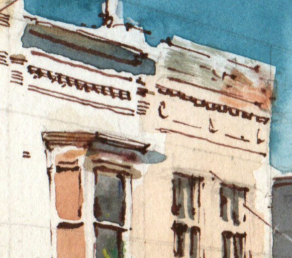
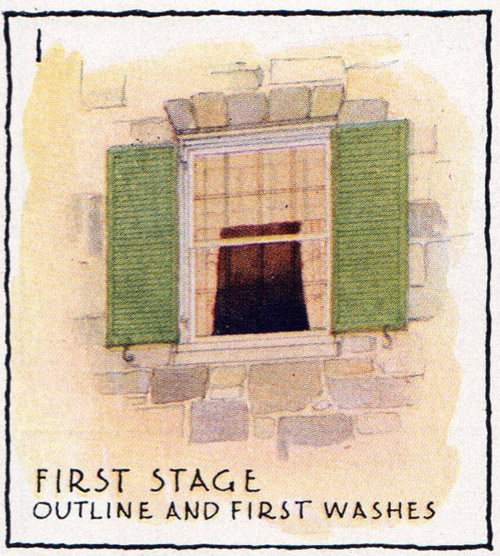
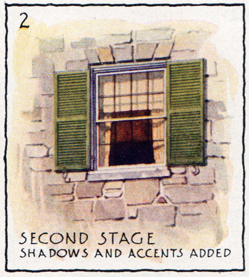
In 1935, Arthur Guptill demonstrated a sequential method frequently used by architectural illustrators for painting a window.
Guptill first draws the subject in pencil, giving careful attention to the perspective.
He rules the lines of the shutters very evenly. Then he lays down a warm wash in watercolor over the wall and the curtains, and sets up variegated flat colors for the stonework. He washes in the shutters in green.
The dark interior spaces are painted over the mullions, but not the sash. The dull orange color of the interior gives a feeling of depth and transparency.
Next come the shadows cast on the curtains and the shade from the sunlight coming from the upper left. He then adds the darks of the mullions and the outer moldings with a
ruling pen
.
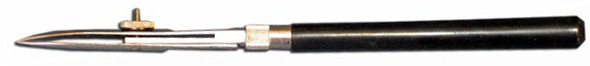
If you're not familiar with a ruling pen, it's a tool for drawing a line of constant width, usually guided by a ruler that's raised a bit off the surface. It has two sharpened metal tips that taper together. The spacing of the gap between the tips governs the width of the line.
That gap is controlled by an adjustable wheel on the side. Ink or watercolor, applied by an eyedropper, sits in the gap and flows by capillary action.
Guptill then draws mullions with the ruling pen filled with opaque white watercolor, slightly yellowed. The consistency has to be just right. Too wet and it puddles out; too dry and it won't flow at all. When a ruling pen works well, it's a joyful feeling.
-----
Arthur Guptill's classic book about rendering architecture in watercolor is called
Color in Sketching and Rendering
.
.

Here's Irish flutist
Kevin Crawford, sketched from life in a pub session. It's just a couple inches square drawn in watercolor and water-soluble colored pencils.
He's a wonderfully dynamic player, and in truth he looks a lot less cadaverous than I made him appear -- sorry Kevin!

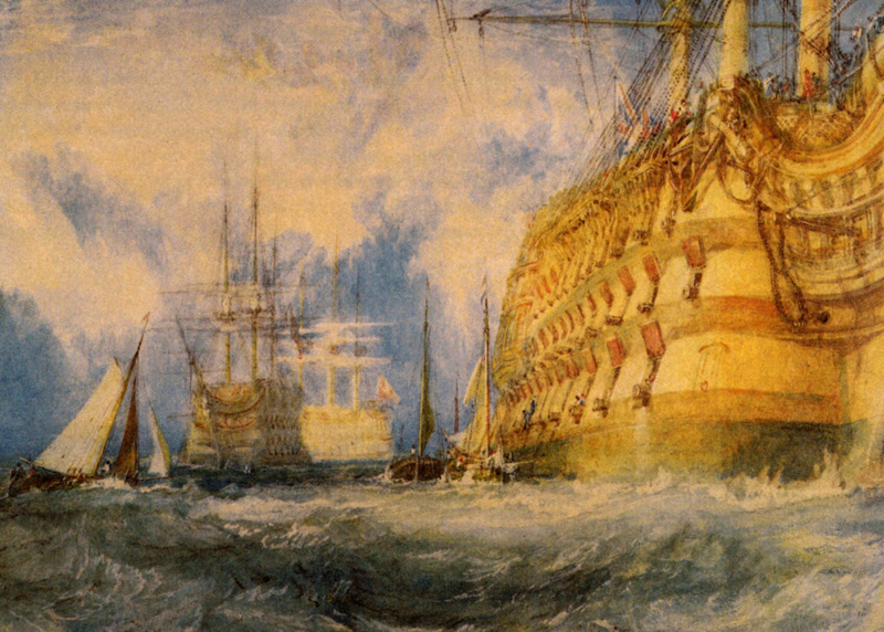
Once while staying as a guest at the estate of Walter Fawkes, J.M.W. Turner was asked to paint a watercolor of a British man-of-war.
His process of painting was extraordinary. According to an eyewitness, "He began by pouring wet paint onto the paper till it was saturated. He tore, he scratched, he scrubbed at it in a kind of frenzy and the whole thing was chaos -- but gradually, and as if by magic the lovely ship, with all its exquisite minutia, came into being, and by luncheon time the drawing was taken down in triumph."
Tomorrow —a new episode of Clementoons.

Francis Russell Flint (1915-1977) was the son of the more famous watercolorist
Sir William Russell Flint. He wrote a book called "
Water-Colour for Beginners
" which explains his suggested plein-air gear.
"There are many good types of easel available but I suggest the best is a small compact easel, not too light, and sufficiently strong not to be troubled by the wind. An aluminum or light wood easel may look very nice in a shop, but they are quite different in a strong breeze. The easel should have three telescopic legs with spikes at the ends, and at the apex of these a flat arm which can be firmly secured in any position, that will tip up and down on a hinge, and slide backwards and forwards."
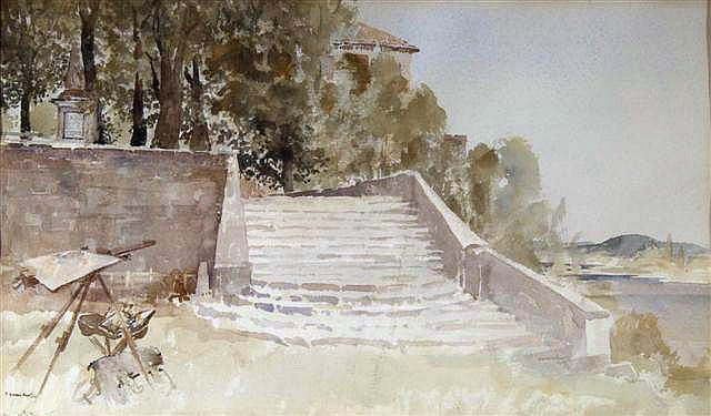 |
| Francis Russell Flint (1915-1977) 'Steps in the Sun ' St. Jean - de - Cole' |
He preferred to stand rather than sit, so if he brought a stool, it was generally to use as a place to lay out his gear if he was painting in a wet or muddy place.
He said that the thing to look for in a watercolor box is deep wells for mixing generous washes, and the wells or depressions in the mixing area should have the deepest part toward the center, so that colors don't get mixed up with each other. He used a large sable brush for broad washes and an aluminum flask for extra water.
It's probably a safe bet that the son modeled this setup after the father. A vintage British Pathe film (linked below) showing Russell Flint's palette, which also has three deep wells.
-----

Yesterday we went out to visit John Finley's cattle ranch, a half hour drive down a remote dirt road on the east fork of the the Wind River here in Wyoming.

John is a working cowboy and a scrimshandler whose grandfather established the farm over a hundred years ago, not far from Butch Cassidy's spread.
I set up my watercolor rig next to an old log cabin which was festooned with rusty coyote traps.

I was attracted to the way the traps were reflected in the window against the bright sky behind us. Since the reflection of the clouds was the lightest value, my first step was to run a wash over all the other whites, including the window mullions, the mortar, and shelf of mildewy old magazines seen through the window.
(link to Soundcloud audio track)
The traps speak to the constant life and death struggle of ranch existence. John told us a story of having to shoot a mountain lion as it was devouring one of his bottle-fed calves.

A week ago, a surveyor was found mauled to death by grizzlies not far from here. None of us artists are allowed to venture off without a bottle of bear spray.
The authorities relocate the Yellowstone man-killers in this remote area, on the fringes of the Wind River Indian Reservation. As another cowboy, John Phelps told us, "Grizzlies are no joke."
------
Biography of John P Finley
Painted in a Pentalic sketchbook with Schmincke watercolors using a Richeson travel brush set
Download Watercolor in the Wild video
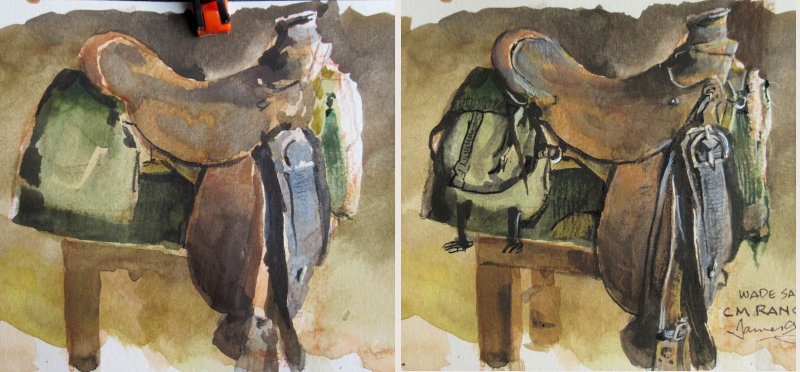
Here are two stages in the hour-long painting. On the left is the painting halfway finished, with the large color areas blocked in.
I then defined the smaller details and textures using water-soluble colored pencils and just a few touches of white gouache for highlights.
The time lapse is shot with a
GoPro Black
set at a two-second intervals. The GoPro is mounted on a DIY rig that uses two kitchen timers for a compound (pan and tilt) move.
-----
For 72-minutes of watercolor demos with voiceover, check out my video "Watercolor in the Wild":
HD download: (Credit Card) from Gumroad
HD download: (Paypal) from Sellfy
BONUS FEATURES (a half hour of additional bite-size inspiration)DVD: (NTSC, Region 1-North America) -----
If you like painting workshops, the
SKB Foundation has an emphasis on landscape and wildlife painting, with a half-dozen instructors in a beautiful setting and a congenial atmosphere.
Thanks to Hunter at the
CM Family Ranch in Dubois, Wyoming and to
artist Lee Cable for the info about the saddle.

Alone together. People doing social media at a café in Colorado Springs.

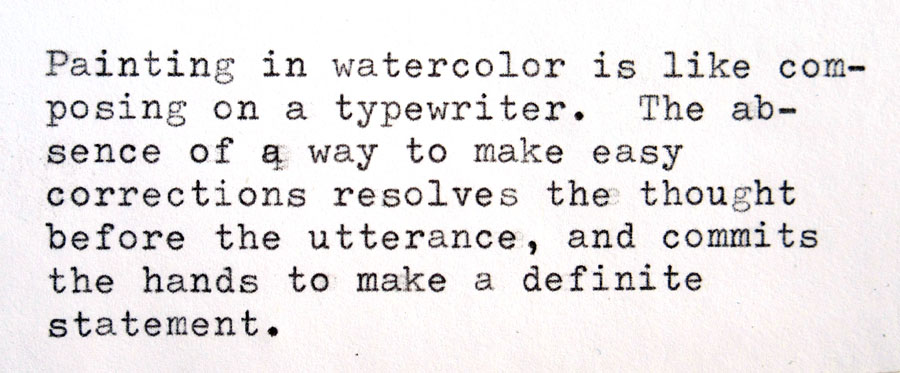
My son Frank has a collection of manual typewriters. I painted a portrait of one of them, an Olympia SG-1, the industry standard for office typewriters in the 1950s.
As I painted, I had the following thought:
Here is the sound of that very saying being typed on an Olympia SM-9, a portable version of the SG-1. You can hear the warning bell at the end of each line reminding me to return the carriage.
-----
And here are links to my new video on watercolor painting:"Watercolor in the Wild" HD download: (Credit Card) "Watercolor in the Wild" HD download: (Paypal)"Watercolor in the Wild" DVD: (NTSC, Region 1) 
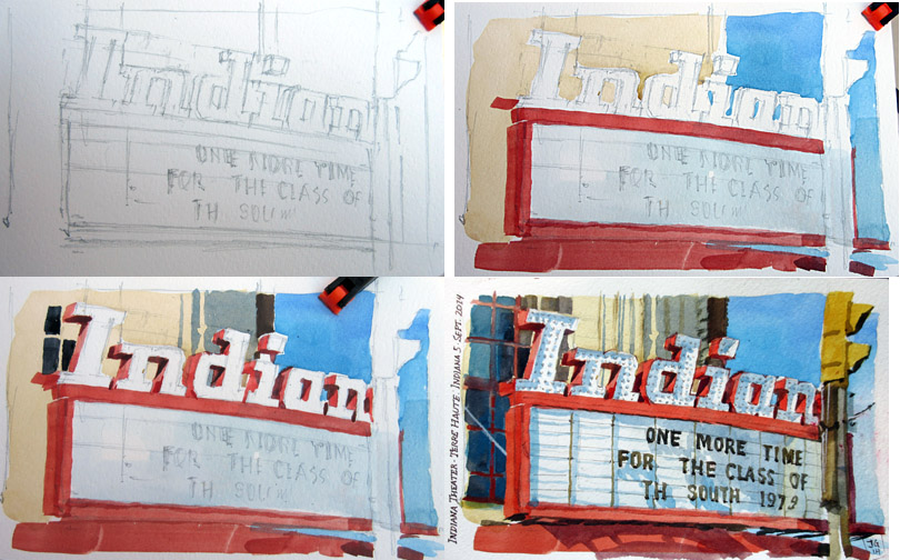
Yesterday I was standing on the sidewalk of Terre Haute, Indiana painting this watercolor of an old theater sign, when a gentleman came up and identified himself as Rob Lundstrom, the owner.
I recorded his greeting. Hopefully this audio will play for you.
(
Link to Soundcloud File)
It took about two hours to paint the image, and while we stood there, we met three other people, all artists. Two of them said they like to draw with their sons.
Here are four stages in the process: the pencil drawing, the big base colors, the shadows, and the finer details.

Blog reader Diego Conte says:
"I am a young self taught artist in Spain, and your books are probably the best resource I have ever found. And your watercolour video is amazing. I'm recommending them to every artist I know."
"I don't know if there is any article in your blog on this matter, but since there is a chapter on your book
Color and Light: A Guide for the Realist Painter
, I think it is not a bad idea at all to ask this question. How could I establish a good green harmony using watercolours? My mixes always end up looking muddy on the paper when I try to use green... it always look too cool If I need it to be warm or vice versa. I see a lot of great watercolor masters simply avoiding it using ochre or brown colour schemes instead. But I want to be faithful to my subject harmony. I don't know if it is an interesting topic for such a thing as an article, but any short tip or direction would be great."
 |
| Martín Rico y Ortega, watercolor |
Thanks, Diego. Good question. Greens can be wonderful in watercolor, and it's a good goal to be faithful to nature.
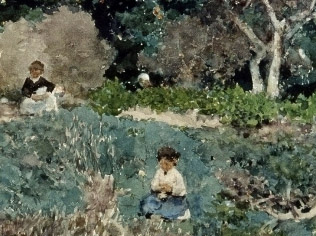
The Spanish painter
Martín Rico (1833-1908) is good to look at for how he uses greens. In this one he moves toward the blue-green hues. But it's not the hues, so much as the values that makes it work. He avoids muddiness by organizing the picture into three basic tonal areas: 1. light sky, 2. dark trees, and 3. middle-tone stream bank.
Simple, strong value schemes never look muddy. This is something Rico learned from Daubigny, one of the French Barbizon painters.
Here's a small detail of the same painting. He uses a variety of greens, including blue greens, grey greens, and yellow greens. That doesn't mean he necessarily had a lot of separate green pigments on his palette. It just means he was conscious of varying the chroma and hue of the mixtures. Rico was also interesting in the way he left little white dots on the picture, which gives it a little sparkle.
Some artists leave green off the palette altogether and mix their greens from yellows and blues, because that way there's always variety in the mixture. In foliage there is variety of green in each leaf, variety in each small group of leaves, and variety from one tree to another, and variety from foreground to background.
But all that variety must happen
within those simple tonal areas, and that's what's a bit challenging.
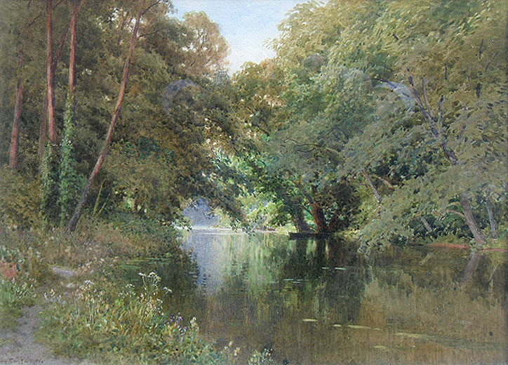
Here's another watercolor landscape, this time by an English watercolorist named
Harry Sutton Palmer (1854-1933). Even though his range emphasizes yellow-green, he uses a subtle variety of colors, which would be more evident in the original.
One of the secrets to both this painting and the last one is that they chose not to paint a bright blue sky. A bright blue sky behind bright green leaves might look good in a photo, but it can often be deadly in a painting. However, green foliage against sky filled with a high white cloud layer can be very attractive.
Here's one last watercolor by Harry Sutton Palmer. Those greens are all composite mixtures, and none of them are too high-chroma. They're probably muted quite a bit from what he actually saw. And he obviously worked hard to simplify his values to the general midtone of the leaves, the light sky and distant area, and the dark areas of the tree bases.
Diego, I hope that helps. Good luck with your greens. Enjoy them while they remain before autumn and winter come.

"Watercolor in the Wild has been getting some wonderful reviews. Here are some excerpts:
Henry Malt, Art Book Review"...His approach is very interesting. For a start, he allows himself about an hour for a painting. Each demonstration here – there are six, covering buildings, animals, people and landscapes – is edited down to about fifteen minutes and covers all the important bits without leaving you thinking, “hang on, what did he do just then?”. He begins, conventionally enough, with a pencil drawing, but then spends the next thirty to forty minutes putting in tones, values and shading. With a quarter of an hour or less to go, he gets to the detail. That’s not enough, surely? No, not for fine detail, but the point is he’s working on very solid foundations: the subject has structure and substance and he doesn’t paint the detail at all, just suggests what the viewer should be seeing so that they create the finer stuff for themselves. It’s very subtle and, although not unique in itself, certainly unusual in combination with so much preparatory work."
"The exception to the one hour approach is a painting of a sleeping foal. Young animals are rarely still and only for short periods and this one is no exception. A large chunk of this section is taken up with watching the creature running round, interacting with its mother and eating. Finally, it needs a nap and we get to work. The point of this demonstration is to show how you can capture the essence of a subject if you’ve already understood it before you lift a brush. I like the fact that, once again, James doesn’t tell you this, but shows you."
"This is an exceptional piece of work and amazingly good value."
Charley Parker, Lines and Colors blog"Gurney has a relaxed, conversational demeanor throughout — almost as though you had chanced upon him painting, asked about his materials and techniques, and found him more than happy to oblige. This is, of course, a superb approach for an instructional art video.
"The video production values are high, particularly in reproducing the sketchbook pages as the paintings progress, with lots of close-up views that show the renderings in detail....
"...One of the great things about these instructional videos by Gurney is the wealth of
supplemental material available on his blog. This includes relevant material from previous posts and
directly related questions answered afterward, all with lots of links to materials suppliers and other relevant resources.
"I now have several books and videos by Gurney, as well as being an avid follower of his blog, and I find a kind of synergy between his instructional materials, in that there is a basic underlying philosophy and systematic approach that comes from his considerable experience. I, for one, am hoping Gurney will follow up soon with a similar video on his techniques for opaque water media (gouache and casein). In the meanwhile, I’m finding transparent watercolor more pliant than I thought I would."
 Review from Jackson Sze
"Watercolor in the Wild affords us a privileged look into the working process of a modern day master. James Gurney will inspire you to go out and paint, to try and capture life the way an artist can.With thorough breakdowns of equipment and materials, any artist will be well informed about what he or she needs to get started. The demos are both exciting and educational. As a Landscape Painting teacher, I would highly recommend any artist to watch and learn from Mr. Gurney. Though painting outdoors can be challenging, having this DVD in your collection should provide a constant source of encouragement and motivation."
Jackson Sze - Senior Concept Illustrator at Marvel Studios
https://www.facebook.com/jacksonszeart
"Gurney is an experienced teacher and you can really see that come through here. He is thoughtful and informative, while being very brief and succinct. It's a great companion to his previous DVD “How I Paint Dinosaurs.”
Read the rest—Dan Dos Santos, Muddy Colors Blog
"James Gurney is making watercolor sketching from life accessible to anyone who's serious about taking on the challenge! (I'm in the process of begging and pleading with my digital students to learn to paint from life.)"
—Nathan Fowkes, Animation Artist-----

If you're experimenting with watercolor for the first time, a good way to get some practice is to do a study in sepia.
Here's a sketchbook page I did while waiting for a train in Italy about 20 years ago.
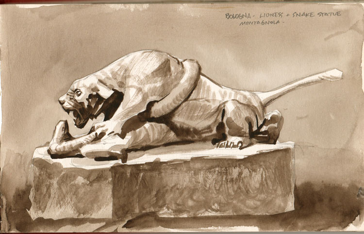 |
| Parco della Montagnola, Bologna, Italy. Sculpture by Diego Sarti |
By painting monochromatically, you remove the variables of chroma and hue. That lets you concentrate on the basics of the dampness of the paper, the amount of pigment on the brush, and the wetness of the brush. That's enough to think about.
Most subjects will call out for a variety of handling, including:
1. Large flat areas, such as the background of this painting. (I did that to simplify, or I would have missed my train)
2. Wet into wet blends, such as the shadow in the lower right,
3. Drybrush, such as along the cat's shoulder and the rock platform.
(I missed my train anyway.)
Here are three tips:
1. Do a fairly careful graphite pencil drawing first. It's especially hard in watercolor to correct mistakes in the initial drawing.
2. If you need to erase, test the effect of the eraser on the paper on another page by rubbing the eraser on a patch and running a flat wash over that area. Some erasers leave behind a little oil or grease that can affect a wash. You can erase after the painting is fully dry and avoid this problem.
3. When you're ready to paint, make sure you have both a big brush and a little brush, and make sure your watercolor set has a mixing well in case you need to mix a large amount of wash. You don't want to have to stop in the middle of a big wash to mix more.
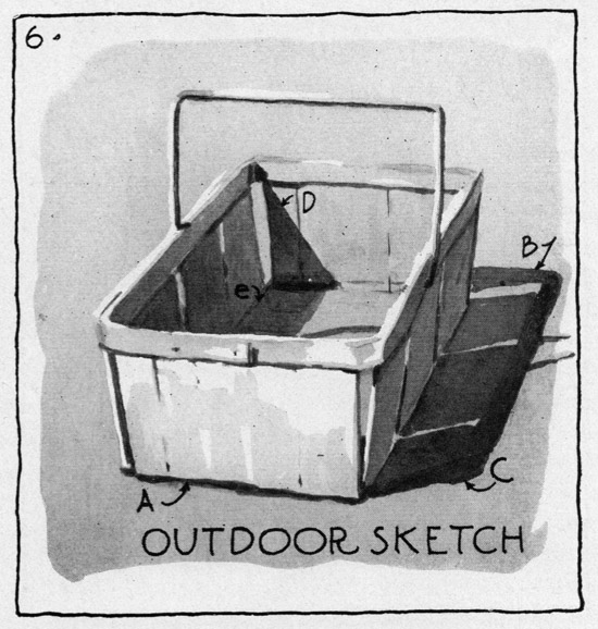
In Arthur Guptill's classic 1935 book
Color in Sketching and Rendering
, he demonstrates a few examples of commonplace objects painted in a monochrome watercolor wash. He recommends choosing an object that's white or relatively colorless, like this wooden basket. Painting it in actual sunlight, he noticed the darkness and sharpness of the shadow edge from C to B, the absolute dark accent at A, and the closeness of value at the plane change at (e) inside the basket.
This white china cup is an ideal subject because its faceted sides make the stepwise transitions from light to shadow abundantly clear. All these steps can be carefully modulated with the washes, and the process is immensely faster than charcoal. Plus the tones are smoother and purer. But it takes practice to do such an accomplished study, since you have to lay down the tone and leave it: you can't scrub on it or tweak it forever.
People through history seem to be conflicted about whether to call such a study a drawing or a painting, so they're often referred to as a "wash drawing." I love the fact that it's on the boundary line between drawing and painting.
Instead of sepia, you can use lampblack, ivory black, burnt umber, or Payne's grey, each of which has a slightly different character.
Watercolor in the Wild buyColor in Sketching and Rendering by Arthur Guptill (1935) Highly recommended, and it hasn't been reprinted.

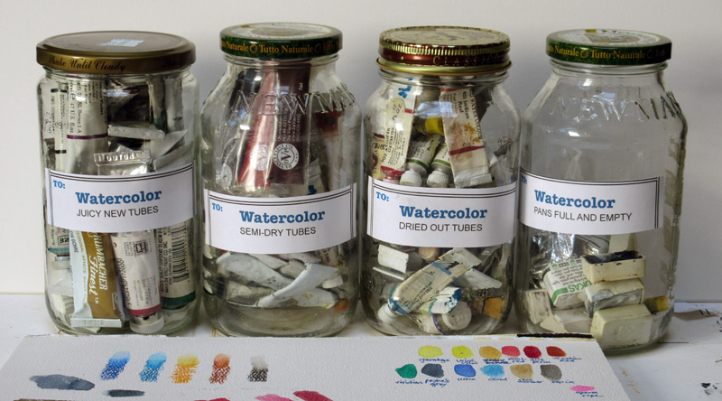
Instead, seal them in big glass jars. I've got mine in four jars: "Juicy New Tubes," "Semi-Dry Tubes," "Dried Out Tubes," and "Pans Full and Empty." The airtight jars keep the tubes from drying out any further.
I use the new tubes for refilling empty pans. If the semi-dry ones are still squeezable, they can work even better for refilling, because they don't drip liquid. You can cut open the dried out tubes with a sharp knife. The pigment is often tar-like in consistency and can usually be scraped out with a palette knife. A little water pressed in with an old spoon is usually enough to reactivate them. If you're handling toxic pigments with your fingers, remember to wear gloves.
My jar of pans is a graveyard of colors I've dumped from sets because I wasn't interested in them. Sometimes I change my mind and give those
refusés another try. Every six months or so, I change my palette selection to keep myself off balance.
If I'm sure I don't want an old pan color, I pry out the color so that I can fill the empty pan with a new tube color. After refilling it, I put it on the sill of a sunny window and let it dry out for a week or two. If it cracks after drying, just fill in the cracks with more liquid color and let it dry again (thanks Jobot).
-----
Check out my video:
Watercolor in the Wild by James Gurney Big
post about materials
I'd like to wrap up our extended Watercolor Workshop Week by talking a little more about a light effect that I mentioned on the video "Watercolor in the Wild."
While I was painting this carriage house on location, I tried to convey the feeling that the sky was both very blue and very bright. I wanted to simulate an effect that I have noticed in photography, where a bright sky bleaches out the camera's receptors and then spills over into small forms, making them take on the blue of the sky.
I painted a very light cool wash in the sky, and then laid in the turrets, tree trunks, and branches with a mid-range blue. I also used a blue-gray watercolor pencil for the branches.
The scene didn't actually look this way to my eye—the sky actually looked like a light to mid-range high-chroma blue, and the branches looked extremely dark. I had to consciously override what I was perceiving and paint an effect that I was imagining.
While I was painting the picture, I took a photo to see if the camera actually did see it that way, and sure enough, the small forms turned quite blue.
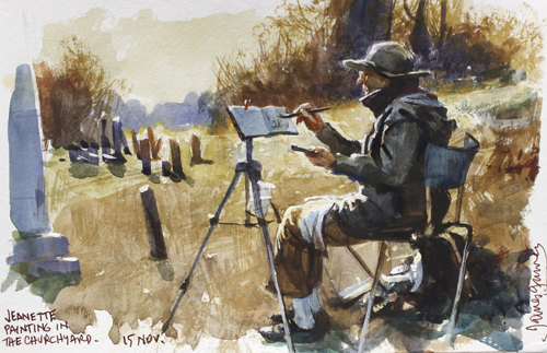
I used the same basic idea of colorizing small forms against a bright sky when I painted "Churchyard," the final demo on the video. This time, though, I wanted the sky to look warm, so I laid down a very light yellow-ochre wash and then drybrushed the branches using a dull orange watercolor.
----

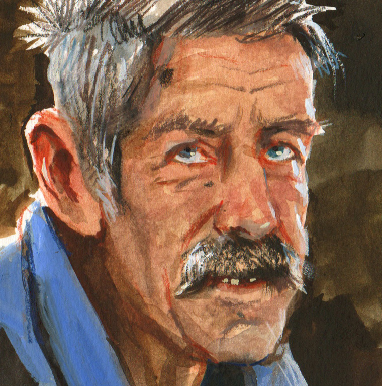
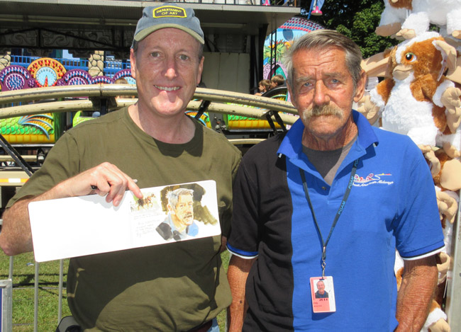
Yesterday I took my compact watercolor kit "into the wild" to the Dutchess County Fair in Rhinebeck, New York and painted an impromptu portrait of James "Fig" Newton, the oldest carnival worker at the fair.
He was assigned to a ball-toss game in Kiddie Land. A bucket of ping pong balls cost five dollars. The goal was to toss a ball into one of the glass bowls floating by on little rafts in a circular wading pool.
The game looked impossible and nobody was going for it.
I asked him if I could sketch him while he waited between customers, and he was glad for the diversion.
Fig is 71 years old. He has been in the carnival business for 48 years, working mostly in New York State. He has saved up money to help his nephew get started in glassblowing, and he just sent his daughter $500 so his grandkids could get outfitted for school.
He said when a family walks by he can tell right away who makes the decisions and who's got the money. Sometimes it's the dad, and sometimes it's the mom. I asked him if he had a good sales pitch to pull people in. "This game's not worth my barking," he said.
Every fifteen minutes or so a family would come up, pay the money, and a kid would toss the balls one by one.
Ping--Splash. Plip -- Splash. Dink, Dink -- Splash.
As each kid went away disappointed, Fig got up to his feet, leaned over the plastic pool, and scooped out the ping pong balls with a kitchen strainer.
The portrait took about an hour. I used watercolor and colored pencils, with a little gouache for the edge lighting, highlights, teeth and the blue collar. When I showed it to him, he shook my hand and said, "Good. You got my scowl."

Marque Todd says:
"I bought your WC video and have been avidly following all of the posts this week - a couple of things I am still grappling with for my kit and I hope you can answer:
"1) How do you protect your brushes from damage with all the jostling they get in a to-go pack? If they are loose in a container the tips can get damaged and that seems a pity particularly for expensive sable brushes. I am also having a problem finding something big enough for short handle brushes that isn't so long that it is hard to pack - any suggestions?"
Thanks, Marque. I keep my brushes loose in a box. The tips are safe as long as the box stays parallel to the ground, but in my belt pouch the box never tips on end. Sometimes if I'm worried about a delicate brush I keep the plastic protector from when it was new and slip that on. I keep the brushes all facing one end of the box. If one needs a good washing out later, I face it the other way in the box so that I'll recognize it right away.
I'm always on the lookout for a box that's just long enough for most short handled brushes but not too big, and one that opens quietly. If a brush is too long to fit in the box, such as an oil brush, I chop it down.
Jeanette uses a
brush holder
made of stiffened fabric. The brushes tuck into elastic bands, and the whole thing folds open to display the brushes while you're working. When in transit it rolls up and is held with Velcro. I like it except that it's a little too long for my belt pouch.
"2) If you are holding your sketchbook on your lap (vs. using the stiff board behind) how do you manage that with the landscape format? It is pretty floppy and somewhat of a balancing act. The only thing I could think of was to put a binder clip across the gutter/hinge area to help stabilize it."
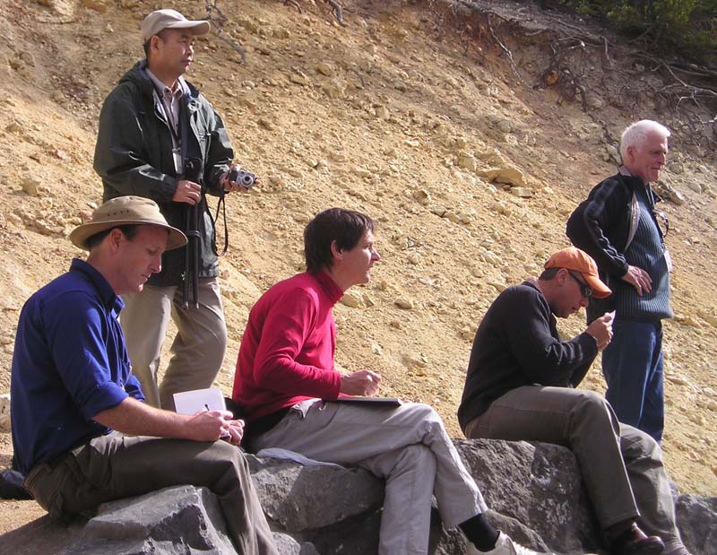 |
| Sketching at Yellowstone with friends from the ASAI |
I've used the binder-clip-across-the-spine idea, and that works fine. Otherwise I just try to rest the middle of the book's covers on the tops of my thighs to keep it from flopping. If I have to, I steady the book with my left hand.
Glenn wondered about the sketchbook pochade rig, asking if I countersunk the T- nuts (Those are the threaded nuts with a flange that fits through the plywood, holding it to your tripod.)
Glenn, Yes, I countersink the T-nut flange using a 3/4 inch spade bit, then glue the T-nut in with
Gorilla Glue
, so that it doesn't work its way loose. But since it's getting pulled tight from the back, it holds really well. If I was using 1/4 plywood for the backboard, I probably wouldn't countersink for fear of weakening the wood.
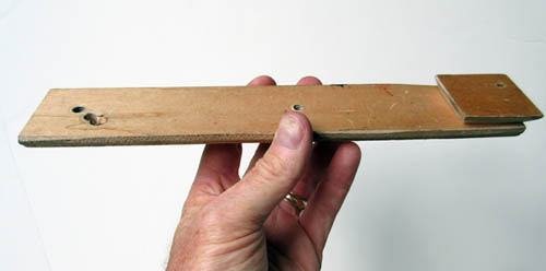
For you scratch builders, here's the pochade laid out flat. The red dots on the paint tray are magnet positions, which hold on the metal mixing trays or watercolor kits.

Here is the underside with two quick release plates attached. My new iteration of the rig has three T-nuts, one just right of center and one on each end. I use the central support point if I only have one tripod, and I use the two on the end if I need two tripods to keep the rig more stable when filming.
Here's how the rig looks set up. Every angle and slope is fully adjustable: diffuser, sketchbook, paint tray, and camera bar. The camera I'm using is a
Canon VIXIA HF
series. It shoots 1080p to flash memory and has the all the essential features: focus lock, custom white balance, and exposure controls, plus an external microphone jack that yields less noise than my DSLR. For a mike I use the inexpensive corded
Audio-Technica lav microphone
, sometimes clipping it to the sketchbook itself to pick up the scratchy pencil sound cues.
In this view you can see the two tripods. The diffuser panel, which is covered with white rip-stop Nylon, can slide right or left in its gripper to eliminate the direct sun. On the left is the
Mighty Bright HammerHead Book Light
, which clips on for night sketching.
And here's the the painting that's on the easel, the one that you can watch being painted in the "Watercolor in the Wild BONUS FEATURES" video, drawn with a brush and sepia watercolor in a museum.
Here are the links to that 28-minute video, available only as a download.

Here are the results of the Watercolor Pigment Poll, which closed yesterday. The poll asked you to: "Vote for your 8 Absolutely Indispensable Watercolor Pigments." Thanks for voting. There were 147 votes in all.
Most Indispensable Watercolor Pigments
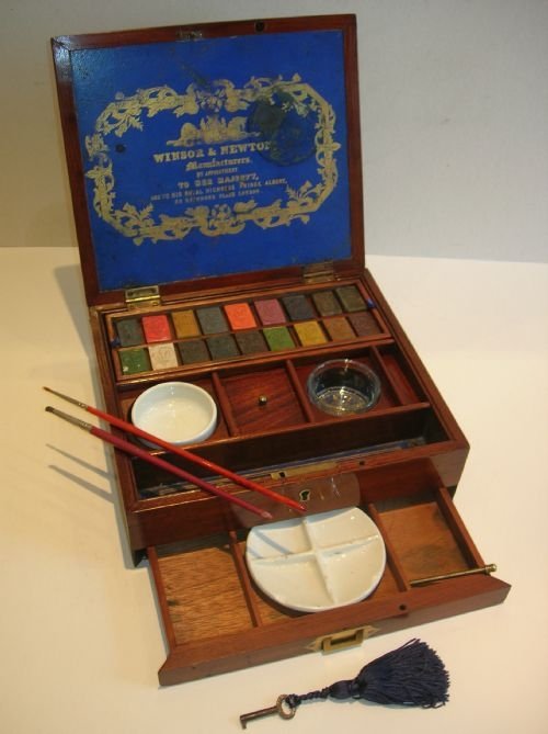 |
Antique English inlaid mahogany watercolour box made by Winsor & Newton around 1850.
|
1. Ultramarine Blue—109 votes (74%)
2. Burnt Sienna—76 (51%)
3. Alizarin Crimson—72 (48%)
4. Cadmium Red—68 (46%)
5. Cadmium Yellow—66 (44%)
6. Burnt Umber—58 (39%)
7. Yellow Ochre—57 (38%)
8. Lemon Yellow—48 (32%)
9. Cobalt Blue—45 (30%)
10. Paynes Grey—44 (29%)
11. Cerulean Blue—43 (29%)
12. Raw Sienna—35 (23%)
13. Opaque White—34 (23% (tie))
14. Sap Green—34 (23%)
15. Gamboge—30 (20%)
16. Phthalo Blue—28 (19%)
17. Quinac. Rose—26 (17%)
18. Prussian Blue—23 (15%)
19. Viridian—22 (14%)
20. Raw Umber—20 (13%)
21. Hansa Yellow—17 (11%)
22. Perm. Magenta—17 (11%) (tie)
23. Hooker's Green—16 (10%)
24. Sepia—16 (10%)
25. Bone or Ivory Black—16 (10%)
26. Phthalo Green—11 (7%)
27. Other (in comments)—10 (6%)
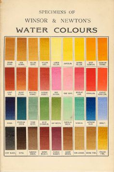 |
| Winsor and Newton color chart from 1910 |
Fewer than 10 votes
Pyrrole Red
Vermilion Red
Carmine Red
Venetian Red
Scarlet Lake
Cobalt Violet
Perm. Violet
Neutral Tint
Indian Red
Terre Verte
Emerald Green
Perm. Green
Manganese Blue
Lampblack
Conclusions
1. No greens made the top ten. Nor did black or white. Perhaps that's as it should be because it's quite easy to mix greens and blacks, and doing so offers the benefit of attractive variegation in the mixtures. And the question of whether, when, and how to use white—well, that's a whole 'nuther topic.
2.
Ultramarine was #1 by a wide margin, and for good reason. It's an extraordinary pigment, nowadays synthesized cheaply by modern chemistry. But centuries ago when they had to mine it in Afghanistan as lapis lazuli, it was more valuable than gold.
More about ultra's history here.
3. You could make a good palette out of the top 12. It would include warm and cool reds, warm and cool yellows, three fine blues, and some good earth colors. You could even get by with a palette made the top five.
4.
Alizarin Crimson was #3, but before you buy it, remember that true Alizarin (PR 83) is prone to fading. Read more at
this previous GJ post. But if you're painting in sketchbooks, you don't have to worry as much about lightfastness.
A Note about Cadmiums
Cadmium red and cadmium yellow both appeared in the top ten. The cadmium pigments have been the subject of some controversy, because of the toxicity of the pigments, the regulatory requirements governing the manufacture, and concerns over environmental impacts after disposal.
Usage has been dropping, and there have been proposed cadmium bans. Those bans have been successfully opposed in most regions, largely due to exemptions of art supplies from banned products lists, but that may change eventually.
There are worthy modern alternatives, such as pyrrole red and hansa yellow, but they're not as well known.
Previous Poll
I conducted a similar pigment poll back in 2008, without specifying the medium. Back then, most people probably assumed I meant oil paint. The top ten in that poll did include black and white, which are more commonly used by oil painters, but otherwise the results were fairly similar.
Results of the 2008 Poll (which didn't specify the kind of paint)
1. Ultramarine Blue 180
2. Titanium White 172
3. Yellow Ochre 161
4. Cadmium Red 158
5. Cadmium Yellow 150
6. Burnt Sienna 150
7. Alizarin Crimson 141
8. Burnt Umber 126
9. Black 98
10. Raw Umber 97
11. Raw Sienna 81
12. Cerulean Blue 79
13. Cobalt Blue 73
14. Viridian 64
15. Naples Yellow 60
16. Sap Green 56
------

In the 1830s,
J.M.W. Turner carried a watercolor sketch kit in a wallet. "It's a simple leather case with gauze that Turner would have literally stuck the pigments onto,"
says Julia Beaumont-Jones, Collection Registrar for the Tate Britain.
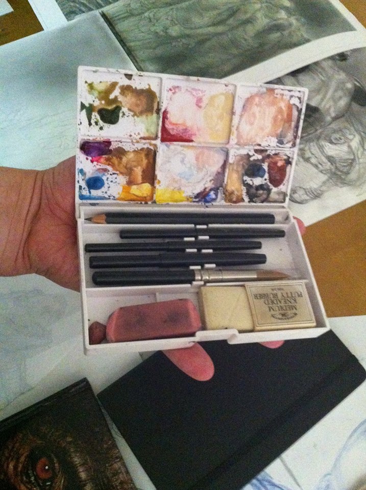
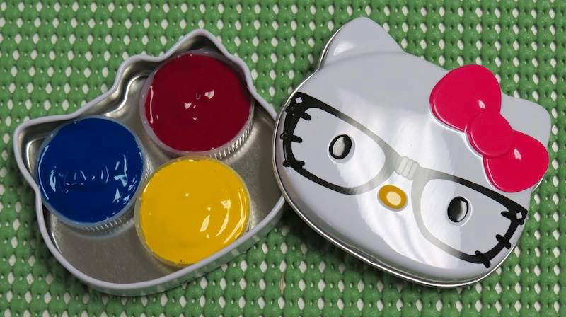
Some of you have been sharing the amazing sketch kits you've made.

Joe Ongle says: "This is my custom Altoids mini palette, using self-hardening clay and tube watercolors. Half pans work as well."

Chuck Pell says: "My kits are compact for pockets, using custom leatherbound archival sketchbooks and repacked watercolor chips...."
Michelle Spalding made one from a mint tin, "with a retractable cosmetic brush - keychain size with half-pans"
Carlos Huante adapted a cosmetic style brush kit. "I bought this set for 40 bucks back in the day and use it all the time."
Carole Pivarnik made one from a Hello Kitty tin: "It has just three primaries: perm yellow, magenta, and cyan. It uses water bottle caps for pans. They are essentially free, hold a generous amount of paint and with less adjacent edges than rectangular pans, there tends to be less color pollution. A little blue tack holds them in place. I would like to add a dollop of neutral tint in one corner for faster mixing of darks but I can mix just about anything with these three colors. I carry this tin, a mini waterbrush, a mini black Sharpie, and a short HB pencil in a little pouch. Very portable!"
Have you made an unusual watercolor kit? We'd all love to see it. Please share yours with a link in the comments.
Plus: I'm honored that Marc Holmes of Urban Sketchers wrote a
review of my DVD "Watercolor in the Wild."

During this "Watercolor Week," I thought I would share just two of the 5-minute demo segments (Tortoise and Zouave) from the new watercolor video "Watercolor in the Wild." If you have purchased the DVD or download, thanks!—and don't worry: I'll hold back the four remaining longer segments (Miniature Horse, Carriage House, Greenhouse, and Churchyard)—which actually translates to more than 3/4 of the running time that you can see only if you purchase the video.
Sharing these sample clips on the blog gives me a chance to amplify them with closeups, and it gives everyone an opportunity to comment and ask questions so that these blog posts can be more interactive.
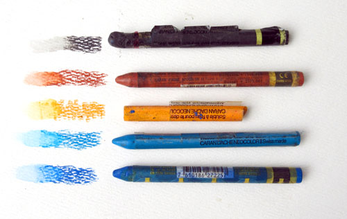
For example, yesterday in the comments after the art supply list, Irene mentioned that you can get woodless watercolor pigment sticks or crayons, something I didn't discuss in the video. Thanks, Irene. As she indicated, Derwent makes Aquatone Woodless Pencils , which are like pencils made of solid pigment, and square pigment sticks called Derwent Inktense Blocks
 . Caran d'Ache
 makes round water-soluble pigment sticks called Neocolor Pastels
 (shown above)
These are shorter than the colored pencils and a bit softer, like crayons. Lyra's have a bit more the feel of wax crayons. But they're all a good value because you get a lot of pigment for the price, and although I didn't use them on this drawing, I do use them occasionally for creating rough textures.

Whether you use the wood pencil or the crayon version of these water-soluble drawing tools, they offer three big advantages over a pure watercolor rendering.
First off, they're a fast way to get texture. I used the colored pencil dry over the first base layer of watercolor.
Secondly, as you can see in the little round scales above, you can add water later to soften or blend the pencil. That's how I made those smooth dots: just a touch of water on each. And I used the water brush to group them together into a shadow, as along the right side of the form.

The third virtue of the colored pencils is that you can draw lines with exactly the color you want. You're not limited to black or brown, as with most pen lines. In the case of the growth rings on the shell, the lines looked gray in the upper areas, and they got darker on the sides. So I switched the color of the pencils as I went down the side of the shell.

Some of you asked how I shot the video while doing the drawing. For the tortoise segment, I used one video camera and one tripod. I held the camera off to the side with a "camera extension bar" that I made out of 1/4 inch plywood. This holds the camera over my lap without getting in the way too much. I also used this for shooting the miniature horse sequence.
The camera extension bar has a wooden wedge on the side that fits the quick release slot of my tripod.
To learn more about the 72-minute video "Watercolor in the Wild":
HD download: (Credit Card) HD download: (Paypal) buyDVD: (NTSC, Region 1) 
(Link to video excerpt)
Here's a complete list of materials and a buyer's guide for plein-air watercolor painting.
This is a supplement to my instructional video "Watercolor in the Wild."
I carry these art supplies practically everywhere. The basic elements are pretty simple: a sketchbook, a paint box, a few brushes, watercolor pencils, a rag, and some water. They're all listed in detail below.
Watercolor Sketchbook
• I have often used the
Moleskine Watercolor Album (5 x 8.25 inches) 
I like the fact that it opens flat and I like the horizontal (landscape) format. It has 36 pages—72 if you paint on the facing pages. It has a fake leather hardbound cover, an elastic strap, and a pocket in the back. The paper is 90-pound weight, which is rather lightweight for very wet watercolors, but it's OK if you're doing mostly drawings rather than juicy paintings.
• I also recommend the
Pentalic Aqua Journal (5 x 8 inch)
, which is priced about the same as the Moleskine but has better paper — 140 lb (300gsm) cold press, acid-free paper. With the heavier paper, it has just 24 pages. But they'll hold up to wet washes or even light impasto, such as with casein. It has generous extras, such as an elastic strap, a back pocket, an elastic brush-holding sleeve, and a placeholder ribbon.
• The
Stillman and Birn Beta Hardbound Sketchbook (5.5 x 8.5 inches)
is a vertical book with 26 pages of cold press 180lb. archival paper. The paper is substantial, but it doesn't open flat easily. It can be held flat with clips. If you're thinking of working in casein, the heavier paper reduces the chance of impastos cracking.
• The
Pentalic Watercolor Field Book (7 x 10 inches)
, is well suited those who prefer a spiral binding. It's bigger, so check to make sure it will fit in your belt pouch or purse.
To decorate the cover, I use the oil-based
One-Shot Sign Painter's Lettering Enamel
, which is very opaque. Paint markers also cover fairly well, but they tend to wear off faster. I usually title the sketchbook with a phrase taken from the first page of the sketchbook.
Watercolor Sets
Quality Metal Pan Sets
Custom Sets Made from Empty PansYou can get exactly the colors you want by buying an empty metal box and filling it with colors that you choose. When the colors run low, you can refill the pans with tube colors.
Large size empty box. In my videos, I'm using an old Talens box from the 1960s. You can get a similar
large empty metal watercolor box, which holds 24 half pan colors or 12 full pans. This box opens up to 9 x 8 x 1 inches. You can combine half pans and full pans in the same box, using full pans for colors you use more often. Sometimes I put in two pans of the same color if I use them a lot.
Small size empty box (left). The
smaller empty metal watercolor box
opens up to about 5 x 8 inches, which fits the left side of a Moleskine or Pentalic sketchbook. This box will hold 12 half pans or six full pans.
Empty half pans. The most economical route is to buy plastic
empty half pans
and fill them with tube colors. The empty pans cost only 34 cents each. For students or anyone on a tight budget, you can get the
12 Tubes of Student Grade Winsor and Newton Watercolor Tubes
for just $30.00. If you have dried up watercolor tubes, don't throw them out; cut them open and scrape out the tar-like pigment to fill empty half pans. Even if they're dried hard you can reactivate them with water once you cut the tube open.
Alternately, you can fill your box with factory-filled pans.
Colors--Here's a basic set of 12 half pans. These are really all you need.
Eight more classic colors if you have room for them.
Economical options
If you're looking for a super-compact pocket rig, or if you're a student, a first-timer, or on a budget, I recommend the
Winsor and Newton pocket watercolor set with 12 colors
, which you can get for around $15.00. This has a plastic box containing
Cadmium Yellow Pale Hue, Ultramarine, Yellow Ochre, Cadmium Yellow Hue, Cobalt Blue Hue, Burnt Sienna, Cadmium Red Pale Hue, Sap Green, Burnt Umber, Alizarin Crimson, Viridian Hue, and Chinese White. That's a pretty good assortment, and the quality of the paint is OK. Note that when it says "hue," they're replacing an expensive pigment with a cheaper pigment of a similar hue.
A lot of field artists and urban sketchers love the
Sakura Koy 12-Color Field Set with Water Brush
, which is under $20. It includes the brush and fits in your pocket. The case is made of plastic, so you can't use magnets on it, but the lid has mixing wells, which helps if you're laying down larger washes. Two cautions: the lid doesn't open all the way flat, and when the colors are wet they can spill over into each other.
There's kind of an arms race for small sets. Some of the smallest watercolor sets are the size of a business card, and easily fit into a pocket. At left is the
Pocket Palette by Expeditionary Art. The metal pans can be filled with tube colors, and they're held in place by a magnetic backing inside the case. The flip-up metal lid has a white surface for mixing colors. The downsides are: 1. The lack of mixing wells to hold wet washes, 2. The reflective metal, which can be blinding on bright days, and 3. The overlapping flange on the left side that covers part of the pans.
At lower right is a 30-year-old Winsor and Newton "Bijou Box," which they no longer make. It has an enameled steel case with 18 colors and a tiny travel brush. The pans are tiny, and I think there are more colors than necessary. I'd rather see 6 or 8 for a box this size. The lid has four mixing wells, which is a big plus. If you can find one of these used for a good price, grab it, but a comparable super-mini set that you can get in USA is the
Winsor and Newton Cotman Water Color Mini, or you can make your own equivalent of the Bijou with an old Altoid tin, some spray enamel paint, and some extra half pans.

Water Cup and Rags
I keep a second jar with clear water handy, and often just a regular drinking water bottle, and I use an old plastic "Tupperware" basin or yogurt cup for a brush cleaning bucket when I'm painting with the tripod easel.
I cut up old cotton T-shirts for paint rags, or use paper restaurant napkins or paper towels.
BrushesHere's a good inexpensive starter set of brushes:
Richeson Sable Hair Watercolor Brush Set/5
I like sable flat brushes, such as:
1/2-Inch Sable Brush 3/4-Inch Sable Brush
I also use a
1/4-Inch Synthetic Watercolor Flat Brush
, which work well for architectural detail.
For laying bigger washes and wetting the paper, a
Cat's Tongue Wash Brush is a good tool. It has a flattened ferrule similar to a filbert brush.
Round Kolinsky sables (note: some brands may become discontinued in the U.S. as the
Kolinsky ban exhausts stock on hand):
Winsor and Newton Series 7  Richeson Siberian Kolinsky brushes
 Escoda Optimo KolinskyDa Vinci Maestro Series Kolinsky Red
If you have a very compact kit and can't carry a box of brushes, you might want to use a
Sable Round Travel Brush
, which safely stows the brush tip inside the handle.
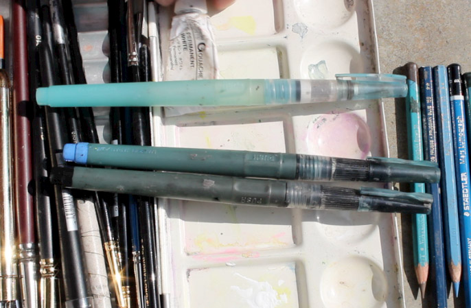
Water BrushesI always try to carry four
Niji Water Brushes with large round tips
. They're the best brand I've found, and stand up to a lot of hard use. For info about filling them with ink, please scroll farther down this post.
I also carry a tube of

white gouache, such as
Holbein Permanent White Gouache.
Winsor and Newton is also good. Sometimes I bring a whole set of
gouache colors to supplement the transparent watercolors, but gouache will be the topic of future posts.
Plastic clampsHere's a
2-Inch Plastic Clamp
and a
3.75-inch Clamp
. Of all the clips and clamps that I've tried, these seem to be the most versatile for holding the book open or clipping the watercolor box to the easel.
Sharpener
I use a
Kum Pencil Sharpener
, which not only catches the shavings, but also has a little flap that covers the hole, so the shavings don't leak out and pollute the pages of the sketchbook.
Eraser
Water-Soluble Colored PencilsThese add a lot of options and variations to traditional watercolors. I recommend trying a few test pencils from several different brands to see which ones you like. My favorite brand is
Caran D'ache Supracolor
, but I also like
Derwent Inktense Pencils
for rich, saturated colors.
I started with a
Caran d'Ache Supracolor Set of 18
. Over the years I have added and subtracted individual colors from the standard set. Below are the colors I take with me most often. It emphasizes warm colors that I like for portraits and animal drawing.
Caran d'Ache Supracolor watercolor pencils
#001 White
 Pencil Box
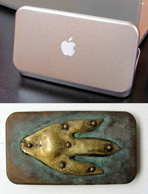
The pencil box I use was customized by armorer
Tony Swatton. It began as a metal box I bought at a Japanese bookstore called
Kinokuniya in Los Angeles. (I painted the
Apple logo as a gag.)
Tony then added the hammered brass piece with rivets and I aged it with paint.
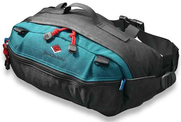
Waist Pack / Fanny Pouch / Belt Bag
[The Explorers] Multi-Purposes Fanny Pack
looks pretty similar. I recommend that you buy the pack at an outdoor store
after you select the contents to make sure everything fits. A quiet zipper and minimal Velcro is a consideration if you plan to sketch in quiet places where you don't want to attract attention.
I use a
Velbon CX-444 Tripod
because it's lightweight, folds small, and reaches up to a reasonable standing height when fully extended.
Three legged stoolA
Tripod Stool
is something I carry in the car or in a backpack when I plan to sit. Sometimes I bring an extra to use as a field taboret for art gear.
Sketchbook Pochade The simplest sketchbook holder is a piece of 1/4 inch or 5/16 inch thick plywood cut to the dimensions of the sketchbook opened up flat. I call it a "sketchbook pochade." I drill a hole in the back of the panel and insert a
1/4-20 Tee Nut
which will attach to the tripod and securely hold the plywood. The sketchbook attaches to the plywood base with rubber bands or plastic clamps.
Homemade EaselI made this device, which I call a Sketchbook Pochade Easel to hold the paint set, the water, and the sketchbook. I also use this for gouache and casein. The diffuser frame attaches to the top, and it uses
White Rip-Stop Nylon Fabric
that I sewed onto an old aluminum Pendaflex file folder frame, a holdover from the dinosaur era.
Here's a clearer shot of the sketchbook pochade. It attaches to the tripod (I use a
Velbon CX-444 Tripod) with a
Tee Nut, and uses a
Southco SC-773 Adjustable Torque Hinge and a furniture slider to hold the parts at the proper angle. The "camera bar" for holding the video camera swings out from the front, held at a constant position by a piece of brass furniture hardware called a
Friction Lid Support.
The palette area is made from the lid from a pencil box, primed and then spray-painted with white enamel, and held on with Velcro. That way it can be removed for cleaning, especially when I use it for casein or gouache.
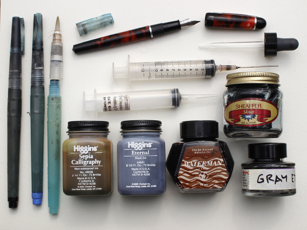
 Refilling Water Brushes and Fountain Pens
Water Brushes I've tried several brands, but none seem as reliable as
Niji Water Brushes. I recommend the ones with
round tips, but you can also get them with
a 12mm Flat Tip
. I normally carry between three and five water brushes. One is filled with water, which fills easily under a normal faucet by unscrewing the handle and squeezing the barrel.
The others are filled with blue, black, brown, and gray. I mix the gray myself, put it in an empty bottle, and mark the bottle. To identify which water brush is which, I paint the back end tips with acrylic (see lower left of photo above).
InkThe ink in a brush pen should be water-soluble so that it doesn't clog the brush fibers. I use
Higgins Eternal Ink
0 Comments on
Watercolor in the Wild Materials as of 8/11/2014 10:58:00 PM


.jpg?picon=1009)


