What is JacketFlap

  • JacketFlap connects you to the work of more than 200,000 authors, illustrators, publishers and other creators of books for Children and Young Adults. The site is updated daily with information about every book, author, illustrator, and publisher in the children's / young adult book industry. Members include published authors and illustrators, librarians, agents, editors, publicists, booksellers, publishers and fans.
    Join now (it's free).

Sort Blog Posts

Sort Posts by:

  • in
    from   

Suggest a Blog

Enter a Blog's Feed URL below and click Submit:

Most Commented Posts

In the past 7 days

Recent Comments

Recently Viewed

JacketFlap Sponsors

Spread the word about books.
Put this Widget on your blog!
  • Powered by JacketFlap.com

Are you a book Publisher?
Learn about Widgets now!

Advertise on JacketFlap

MyJacketFlap Blogs

  • Login or Register for free to create your own customized page of blog posts from your favorite blogs. You can also add blogs by clicking the "Add to MyJacketFlap" links next to the blog name in each post.

Blog Posts by Tag

In the past 7 days

Blog Posts by Date

Click days in this calendar to see posts by day or month
new posts in all blogs
Viewing: Blog Posts Tagged with: tutorial, Most Recent at Top [Help]
Results 26 - 50 of 67
26. Photoshop - Using Photos to Create Texture Brushes

I like creating my own texture brushes from all sorts of things. This tutorial will show you how to create texture brushes from your own photos.

Texture hunting makes for a fun afternoon. If you have little kids, it can be a fun family project. With digital camera in hand, and start looking for interesting patterns and textures. Rocks, trees, carpets, clouds are just a few things that can make neat texture brushes.

Once you have a some photos,upload them and open in Photoshop. This is a photo I took on vacation of a rock outcropping in Central Park...


This photo was already fairly monochromatic but that's not always the case, so the first thing I like to do is desaturate the image (Images->Adjustments->Desaturate). Then I create a levels adjustment layer. I want to boost the contrast in my image to make the texture more noticeable in the final brush.

Altering the levels isn't mandatory, you can leave more gray tones in your image, it will just mean that the textures will be more subtle. Experiment and see what works for you.

Next I use the round marquee tool to select a circle out of the middle of my photo. I then click Select->Modify->Feather and feather the edges of my selection about 10 or 15 pixels.

I then copy and paste my selection to a new file. So I have something like this...


Now I can create a new brush by clicking Edit->Define Brush Preset. This is what it looks like when I try and paint with it.


It's okay but I think modifying the brushes characteristics will make it a lot better. So I open the Brushes Palette and make a few modifications. First I increase the spacing. Right now some of the texture is getting lost in the overlay of the individual brush strokes. By increasing the spacing a little the texture will show through better.
0 Comments on Photoshop - Using Photos to Create Texture Brushes as of 1/1/1900

Add a Comment
27. diModule | Adding texture to a brush

Adding texture to a brush | This process simulates how a textures surface such as canvas or gesso influence the texture.

diModule Contents page

Applying a texture to the brush

  1. add a texture [diModule | Creating texture]
  2. open the brushes pallett  | Menu Bar > Window > Brushes
  3. select texture options | Brushes Pallett > Textures
  4. choose a texture | Brushes Pallett
  5. select a mode | Brushes pallett > Multiply
  6. paint

Experiment with the brush mode


diModule Contents page

0 Comments on diModule | Adding texture to a brush as of 1/1/1900
Add a Comment
28. Photoshop Brushes - Flow Vs Opacity

I'm giving a presentation next month with my friend Carlyn Beccia at the New England SCBWI conference. I get to speak about Photoshop painting techniques. And I thought this would be a perfect time for me to really look at some of the features of the Photoshop brush tool.

When you click on the brush tool you have an option to set the flow and opacity of your brush. This is one of those things that I found very confusing in Photoshop. What the heck is the difference between Flow and Opacity? They both have to do with the transparency of the brush strokes, but depending on the brush you are using they can seem to do pretty much the same thing. But there are some difference between the two.

According to the Photoshop help file, flow sets the rate at which color is applied as you move the pointer over an area, where as opacity sets the transparency of color you apply. Umm, I don't know about you, but that really didn't help me a whole lot.

So let's take a closer look at each options. Let's select the hard round default brush. If we draw with this brush it looks like a think solid line but when we open the brush palette and increase the spacing we notice that this brush is lots of circles being laid down really close to one another, if you lay them down close enough together they look like one continuous line.


So for now let's leave the spacing kind of wide so the individual circles are touching slightly, somewhere around 70%. Now if I set the opacity to 100% and the flow to 100% and draw a line with this brush I get a sort of rippled solid blue line. No surprise there. If I leave the flow at 100% but reduce the opacity to 50%, I get the exact same ripply line only 50% lighter. But if I reverse it and leave the opacity at 100% and reduce the flow to 50% I get something a little different. Now, each little dab of the brush is reduced to 50% but where those little dabs overlap the paint coverage is actually darker than 50%.


Okay so that's not too confusing. Now what happens if I start reducing both the opacity AND the flow? This is where is can start hurting your head.

I like to think of opacity as being the main transparency governor. If I set the opacity to 75% then no part of my stroke will ever be stronger than 75% transparency. Within that 75% range I can decide how transparent each dab of the brush will be from 1 to 100%. So let's say my opacity is set at 75%, even if I set my flow to 100% my stroke will still only be 75% of the original color.

Right now you might be saying, well, that's great, but how is that going to help me with my painting? Look at these four samples. In each one, I scribbled around and around in circle until I could go no darker. As you can see the center of each dot is the same color (75% opacity) but you can see when I used a lower flow rate, I needed more little dabs of paint to get to that color. At 5% flow I was scribbling quite a lot longer than I was at 100% flow. So flow gives you a way to gradu

0 Comments on Photoshop Brushes - Flow Vs Opacity as of 1/1/1900
Add a Comment
29. Photoshop Tutorial - Watercolors (sort of)

When it comes to digital art, there is a school of thought that feels that the more digital artwork mimics traditional mediums the better. Unfortunately, anyone who has tried to replicate watercolors knows that a computer tends to fall short when it comes to copying those "happy accidents" that are inherent in watercolor painting. So I say, why try? Instead of slavishly trying to replicate watercolors, this technique takes inspiration from a loose airy style of watercolor painting and incorporates it into something new and a little different.


This illustration started off by scanning in a finished pencil drawing. I sometimes do my final line work in Photoshop using various grainy brushes, but sometimes it just feels good to pick up a pencil and paper.

After I scanned in the drawing, I selected Image/Adjustments/Desaturate to convert the image to black and white. The paper I was using had a slight yellow cast to it and I didn't want that showing up in the final art. Next, I selected Image/Adjustments/Levels. I clicked on the white eyedropper and then clicked on the white of the paper to make paper really white. Next I selected the middle slider under the Input Levels graph and slid it slightly to the right to darken the pencil lines just a bit.

Once the pencil drawing was adjusted and looking right, I moved it to a layer above the background layer. The way I do that is to open the Layers windows and click and drag the background layer down to the "new layer" icon at the bottom of the layer window, it's the icon next to the trash can. This creates a duplicate of the background. Name this new layer, "outlines." Set the blend mode of this new "outlines" Layer to "Multiply" Next I select the background layer and click Select/All and fill the whole background with white. So now my image looks like this...


And my Layers window looks something like this...


Next I create a new layer between the background layer and the outlines layer and name this new layer "colors".

On the new "colors" layer I select the paintbrush tool and using a hard round brush and 100% opacity I start coloring in the picture. I purposely leave gaps here and there to leave bits of white showing between the colors just as if I was painting wet watercolors next to each other. If you aren't seeing the colors, make sure you have the outlines layer blend mode set to "multiply."

So now the image looks like this...

0 Comments on Photoshop Tutorial - Watercolors (sort of) as of 1/1/1900

Add a Comment
30. The Making of a Picture Book 5

Art Eating Bindings

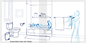
Don’t forget you illustration’s end result will be a bound book and thus some of the image in the center of the spread where the binding is is going to get lost. If an item goes into the binding it should also come out the other side. It’s more than a little unnerving to readers when the page seems to swallow things. So it’s a good idea not place anything important (ie. characters, text or objects important to the story) in the center inches of the spread. This makes for better compositions and makes sure your reader doesn’t miss anything important.

If the pages for the book are going to be full bleedFull bleed is a printing term that refers to printing that goes beyond the edge of the sheet after trimming. The bleed is the part of your illustration that extends out from the image cut line and allows the printer that small amount of space to move around paper so no white appears by accident. adding 1/2 an inch bleed all the way around image is a good idea. Don’t put anything important there since it’s going to be cut off but also don’t leave it highly unfinished or blank either.

Bleed and Binding Guides

Breaking Perspective

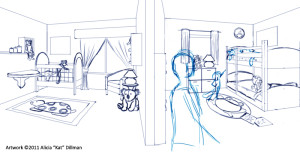
Sometimes you have to break the rules to show all that’s needed in a scene. Like this dual two-point panoramic shot

Panoramic 2-point

or this dramatic warped perspective shot.
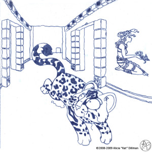
Dramatic Warped Perspective
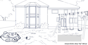
When making a story with true to life environments its a good idea to stick to the rules of linear perspective and only break them when it will further the story in some way. Good examples for breaking the rules of perspective are:

  • To express heightened emotions like fear, anxiety or wonderment.
  • To show multiple locations or angles not normally scene in true linear perspective.
  • To add interest to an otherwise uninteresting scene or location.

Painter Tool Tip

Under Edit > Preferences > Brush Tracking is a handy little customization tool. Each time you turn on Painter you should open up this tool and drag your style across your tablet. The Brush Tracking will record the way you in particular use a stylus and adjust your brushes accordingly. When I switch from pencil, to ink, to paint I redo my tracking. It only takes a second and can make a world of different in your artwork.

This concludes the fourth segment of The Making of a Picture Book. Thank you for joining me on this journey and I hope you will join me again for further installments.

More The Making of a Picture Book Posts

0 Comments on The Making of a Picture Book 5 as of 2/21/2011 1:22:00 PM

Add a Comment
31. Coloring Pencil Drawings - Arthur Rackham Style


I thought it was time for another Photoshop tutorial. This tutorial will show how to color a drawing to give it an Arthur Rackham type feel. Now, before you say it, I know, I'm no Arthur Rackham. I just want to show how to give a drawing that aged sepia tone sort of look that he was known for.

The technique I'm going to use is very similar to the one I showed a while ago with Coloring Line Drawings in Photoshop, but with a few extra steps. So you might want to go back and take at look at that tutorial first if you are a Photoshop newbie.

This image started out as as a pencil drawing that I scanned into Photoshop. You could also start with a pen and ink drawing, charcoal, whatever you want. Below is exactly how it was scanned in, and I don't know if you can see it, but the whole image has a pinkish cast and lots of pencils smudges.


The smudges I'm going to leave, I think they will add to the feeling that I'm going for. But I want to get rid of that pinkish tint to the paper. So I click Image->Adjustments->Desaturate (or SHIFT-CTRL-U) That converts the image to greyscale.


For this technique you need to have the line drawing on a layer above the background layer. The way I do that is to create a copy of the background layer. You can either right click on the background layer and select "duplicate layer..." or you can drag the layer down to the little "new layer" icon right next to the trash bin. Rename this new layer, "Line Drawing". Now, go back to the Background level and select all (CTRL-A) and fill with a solid tan color. Your image won't look any different yet, but your layers window will look like this...


Click again on the "Line Drawing" layer and create a new adjustment layer (the little icon at the bottom of the layer window that looks like a black and white cookie.) We're going to create a "gradient map." Experiment a little with the gradients, you'll find that you can tinker with it in all sorts of ways to get lots of neat effects. You can see that I chose a gradient that goes from dark brown to

1 Comments on Coloring Pencil Drawings - Arthur Rackham Style, last added: 2/9/2011
Display Comments Add a Comment
32. How to Turn Your Photos Into a Graphic Novel

Ever wish your life was more like a comic book? With Photoshop, you can turn your photo album into a graphic novel.

Using the YouTube tutorial embedded above, you can use Photoshop to turn your digital photos into black and white images that look like comic book sketches.

What type of stories would you tell with your graphic novel?

New Career Opportunities Daily: The best jobs in media.

Add a Comment
33. The Making of a Picture Book 4

Don’t Forget the Text

Though I can’t show you the text I can show you were it is going to go. One of the tricks in illustrating a picture book is the leave space for the text without leaving a gaping whole in your illustration.

Spread 6

When I plan out an story illustration I always have a layer with the text on it in the size the publisher has said it will be. This way I don’t have to guess and hope it will fit in the end. This also goes for book covers. Where the text is going to appear you also want the colors to be low contrastThis means that the value of the colors in a particular area are relatively the same value so either dark with light text or vice versa.

Zooming in for Effect

When illustrating a picture book you don’t always have to have crazy angles for every shot. Take a queue from the film industry and go in for some close ups. If your working on a computer you don’t even have to re-sketch your scene just use a free-transform tool to expand your image. I wouldn’t advise doing this with a painted image in most cases because of pixelationPixelation is when you blow up or expand an image and the pixels, the bits of color information that make up your image, become jagged and much more visible..

Spread 5

Digital Tool Tip

When using the free-transform tool in Painter or Photoshop remember to hold down shift while moving the arrows on the box the tool creates. This will ensure your image scales proportionally.

Free-transform tool in action

This concludes the fourth segment of The Making of a Picture Book. Thank you for joining me on this journey and I hope you will join me again for further installments.

More The Making of a Picture Book Posts

Post 1
Post 2
0 Comments on The Making of a Picture Book 4 as of 1/27/2011 1:22:00 PM

Add a Comment
More from this Blog | Email This | Add a Tag
34. How to Draw a Dog
Blog Icon
Add/View Comments | Previous | Top | Next
By: admin, on 12/1/2010
Blog: Bob Ostrom Studio (Login to Add to MyJacketFlap)
JacketFlap tags:  FREE Art Lessons, how to draw, Videos, tutorial, Add a tag

I just finished my latest video shoot and will have a bunch of new free videos coming out very soon. I can’t wait to share them with you. In the meantime here’s a little video tutorial I did a while back about drawing a dog. Have fun. When you are done with your drawing and would like to see it on the fan art page just send me a copy.

For this lesson you will need:

Share

Add a Comment
More from this Blog | Email This | Add a Tag
35. How to post a podcast/recording on your website
Blog Icon
2 Comments | Previous | Top | Next
By: Candy Gourlay, on 11/28/2010
Blog: Notes from the Slushpile (Login to Add to MyJacketFlap)
JacketFlap tags:  Tutorial, Add a tag

Posted by Candy Gourlay This is a quickie tutorial on how to put a podcast (a.k.a. a sound file such as you reading aloud from your book!) Yes, this could be you! I've just posted a recording of me reading from Tall Story on my other blog (it's on the sidebar, helpfully titled "Listen to me read an excerpt from Tall Story"). Do let me know what you think. What you need to create a podcast: 1

2 Comments on How to post a podcast/recording on your website, last added: 11/29/2010
Display Comments Add a Comment
More from this Blog | Email This | Add a Tag
36. spooky stamped garland tutorial
Blog Icon
6 Comments | Previous | Top | Next
By: Frizz, on 10/3/2010
Blog: Frizzelstixs (Login to Add to MyJacketFlap)
JacketFlap tags:  halloween, tutorial, stamps, Add a tag

i whipped some halloween garland using my new spooky stamps. i've also included a tutorial so you can make some too. they are quick, easy and fun. enjoy!!(click tutorial to enlarge)

6 Comments on spooky stamped garland tutorial, last added: 10/7/2010
Display Comments Add a Comment
More from this Blog | Email This | Add a Tag
37. How to sew a pillow with piping, a zipper and a lining
Blog Icon
2 Comments | Previous | Top | Next
By: Claire Louise Milne, on 9/1/2010
Blog: Needle Book (Login to Add to MyJacketFlap)
JacketFlap tags:  tutorial, sewing, piping, cushion, lining, Add a tag

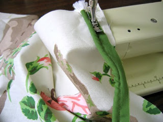
So I was looking this up online and I could find pillow tutorials with a couple of these features but not all three. I took some time to figure it out and now I'm going to show you how I did it!

Just one note, I did it with 1. a regular zipper and 2. a regular zipper foot. It's also put together with materials I had already. So there are other ways to do it, such as with an invisible zipper, but in the end I was really happy with the results.
First of all, the fabric. I had a beautiful end piece of hand printed chintz that I found at the Textile Museum Sale. It's a gorgeous 1920s Scalamandre pictorial print called China Rose, and there was actually just enough to make two large covers, the same size as the existing cushions I had on the couch.

Here's my trick for cutting out matching cushions with a pictorial print. Arrange the two halves of fabric so that the print is aligned then cut out two matching front pieces and two matching back pieces. The front is different from the back on each pillow but the two pillows match. Just a nice little detail.

To make your piping cut narrow strips of fabric on the bias and use it to cover a length of cord. You can buy cord for piping by the yard at fabric stores. You can use ready-made bias tape to cover your cord, the same fabric as your cushion, or a contrasting solid or print fabric. I used an olive green that matched the leaves in the print.

Despite the fact that this is a very nice fabric, it was a little bit thin for pillows. This means that without a lining the pillow wouldn't have a nice smooth luxurious look that does justice to the fabric. So I cut out two more squares of sturdy white cotton fabric for the linings.
Now that you have all that prepared you're ready to put it together.
STEP 1. Using your zipper foot, attach the

2 Comments on How to sew a pillow with piping, a zipper and a lining, last added: 9/2/2010
Display Comments Add a Comment
More from this Blog | Email This | Add a Tag
38. Photoshop and Wacom Tablets
Blog Icon
2 Comments | Previous | Top | Next
By: Jennifer E. Morris, on 5/27/2010
Blog: Jennifer E. Morris (Login to Add to MyJacketFlap)
JacketFlap tags:  wacom tablet, Tutorial, Adobe Photoshop, Add a tag


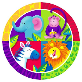
When I first started using the computer to create illustrations I primarily used Adobe Illustrator. This paper plate design was the first image in which I used Photoshop. I also used a mouse to create all my work (yep, I did that jungle plate with a mouse.) Wacom tablets were/are expensive, and I thought $400 was a ridiculous amount to pay for one. Oh, did I mention that I'm a cheap skate?

But then a friend of the family, who happened to be a graphic designer came to the house and saw my workspace. And she said, "you idiot, go buy a pen tablet!" I'm sure she said it much more diplomatically than that, but that was the gist. And she was right. If you want to use Photoshop for painting, a mouse will only take you so far. You really need to invest in a tablet. The good news is they have come down considerably in price.

The really difficult part of using a tablet is that you draw in your lap but your brush strokes show up on the monitor. That incongruity takes some getting used to. And honestly, I never found it as natural as drawing with paper and pencil, although I know some artists that don't have a problem. But a couple of years ago I upgraded to a Cintiq. The Cintiq is basically the Cadillac of the Wacom line. It's a monitor with a Wacom tablet built into it, so instead of drawing on a separate tablet you draw directly on the monitor. Sound cool? It is wicked cool, and much more natural feeling to me. I can't tell you how much I love my Cintiq. One of the function buttons was sticking the other day on my precious baby and I was fretting as if one my real children had come down with the flu. What would I do if my poor Cintiq became ill?! Luckily it recovered on it's own. Phew!

Programming the Wacom Function Keys

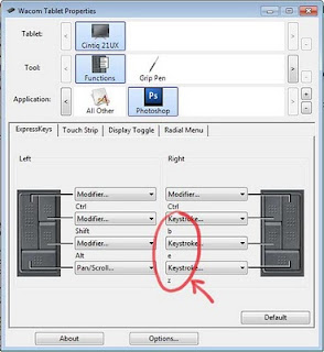
When I first started using a Wacom tablet I didn't make good use of the available funtion keys. I still had one hand on the keyboard to do things like hit "b" (the hotkey for the brush tool) and "e" for the eraser tool and my all-time favorite "CTRL-ALT-Z" for undo. But I have since started programming my Wacom for the way I work and it has definitely streamlined up my work flow.

Think about the tools that you use most in Photohsop and try bringing that functionality down to the tablet. I spend most of my time switching between the brush tool and the eraser tool. So in the Wacom preference utility, I set the left function keys to "b", "e" and "CTRL-ALT-z". The preference utility can be accessed in Windows by going to "Programs -> Wacom Tablet -> Wacom Tablet Properties" Notice how I can specify that the keys only have this behavior within Photoshop. You can set up different behavior for use in other applications (Illustrator for example)


The other thing that I have found very useful is to reprogram the buttons on the actual Wacom pen. I have set the top one to the left bracket and the bottom one to a right bracket. "[" and "]" are hot keys that are used in conjunction with brush tools. The they will resize the paint

2 Comments on Photoshop and Wacom Tablets, last added: 5/27/2010
Display Comments Add a Comment
More from this Blog | Email This | Add a Tag
39. Quickly Creating Patterns in Photoshop
Blog Icon
2 Comments | Previous | Top | Next
By: Jennifer E. Morris, on 5/21/2010
Blog: Jennifer E. Morris (Login to Add to MyJacketFlap)
JacketFlap tags:  Tutorial, NESCBWI, Adobe Photoshop, NESCBWI10, Add a tag

As I was unpacking my materials from the NESCBWI conference this week I realized that I completely forgot to cover one of my presentation topics. I'm so annoyed with myself, because I thought it was one of the neater things that I was going to cover. I can't believe I forgot it. Oh well, at least I'll post it here on my blog. Better late than never, right?

I discussed this technique a while ago in the context of creating polka dot patterns but I think it's worth repeating. Many folks like to create collage images but are concerned about the copyright implications of using other people's fabric or paper designs in their work. This is a quick way to create all sorts of repeating pattern of your own in Photoshop.

First create a new document in Photoshop. It doesn't matter what size you make it as long as the height and width are an even number of pixels. I'm going to make mine 200px wide and 200px tall. Make note of the size, you will need it later.

Next draw something. The only rule is that you can not touch the document boundaries with your drawing. You can change the background to different solid color if you want, but make sure your drawing does not touch the edges of your image.

You can add textures, shadows, what ever, get as fancy with this as you want. Here I set the background to a light blue and drew a flower.


Now I could stop right here. If I click "Select -> All" and "Edit -> Define Pattern" I will get a pattern that will look something like this...


It's not bad but I want something less grid-like. So I'm going to modify it. First if you used more than one layer to create your image (which I did) you will need to flatten it into one layer. Next, select "Filter -> Other -> Offset" You will need to set the horizontal offset to one half of the total width of your image. In my case that would be 100 pixels. You will also set the vertical offset to half of the total height, again, in my case, that will be 100 pixels. Lastly, you will check "Wrap Around" for the undefined areas. If you click on the other options you will quickly see the difference. Once I run the offset filter I have something like this...


Now I can again draw something in the middle. But again don't touch the edges of the document. I can even draw over my original drawing and modify it just as long as I stay away from the document bounds. I drew another flower and one of the green curly cues overlap my original flower.

2 Comments on Quickly Creating Patterns in Photoshop, last added: 5/21/2010

Display Comments Add a Comment
More from this Blog | Email This | Add a Tag
40. Creating a Texture Brush in Photoshop
Blog Icon
2 Comments | Previous | Top | Next
By: Jennifer E. Morris, on 5/11/2010
Blog: Jennifer E. Morris (Login to Add to MyJacketFlap)
JacketFlap tags:  Tutorial, Adobe Photoshop, Add a tag


I'm working on a Photoshop techniques presentation for the New England SCBWI conference this weekend and I thought I'd share with you one of the techniques I'll be discussing on Sunday. The following tutorial will show you how to create the texture brush I used to create the image above.

This is a fun technique for creating custom brushes that will add texture and interest to your images. By the way, I'm using Photoshop version CS3 in this demonstration.

First get some white paper and some black paint (yep, I said paper and paint) I used some copy paper and cheap black acrylic craft paint. Then I used sponges, Saran wrap, leaves and anything else I could find to make irregular shaped blobs on the paper. You can even get your kids to help with this part.

Once it all dried, I scanned in some of my blobs. Here's one that I created with a wadded up piece of Saran wrap dipped in paint.


I selected the blob using the marquee tool and then clicked Edit -> Define Brush Preset and hit OK.

If I then use the brush tool using my newly created brush, I get something like this...


It's interesting, but too mechanical and repetitive for what I want to do. So I'm going to open the brush palette (Window -> Brushes) and make some changes.

I clicked on the Shape Dynamics on the left-hand side of the dialog to open the shape dynamic options. The first thing I change is the size jitter, I set the Control to pen pressure. But I don't my brush size to vary too much in size, so I set the minimum diameter to 70%.

Next I set the Angle jitter to 100% and also check Flip X jitter and Flip Y jitter. This will give it a more random look, like I was dipping a sponge in paint over and over again twisting the sponge as I went.


As you can see from the preview window in the bottom of the brush dialog this is looking a lot more random now. Of course I encourage you to play around with all the brush settings and see what sorts of effects you can come up with.

It's very important to remember that once you change the brush set

2 Comments on Creating a Texture Brush in Photoshop, last added: 5/11/2010
Display Comments Add a Comment
More from this Blog | Email This | Add a Tag
41. Mark McDonnell Tutorials
Blog Icon
2 Comments | Previous | Top | Next
By: mike r. baker, on 3/3/2010
Blog: Monday Artday (Login to Add to MyJacketFlap)
JacketFlap tags:  mike r baker, tutorial, Add a tag


Mark McDonnell teaches life drawing at Disney and Dreamworks and shares some of his tips and lessons at his YouTube channel. Here's gesture drawing warm-up part 2. - via Drawn!

This video is a lesson in gesture drawing. Gesture is usually used by animators but is a very useful method for any artist. The style he uses is Disneyesque but you can do this in your own style. It's great to do at cafes, on the bus, at the zoo, etc.

 Subscribe in a reader

2 Comments on Mark McDonnell Tutorials, last added: 3/3/2010
Display Comments Add a Comment
More from this Blog | Email This | Add a Tag
42. Wool lace wallet tutorial
Blog Icon
6 Comments | Previous | Top | Next
By: Claire Louise Milne, on 2/8/2010
Blog: Needle Book (Login to Add to MyJacketFlap)
JacketFlap tags:  tutorial, sewing, wallet, wool, lace, Add a tag

So this is the new wallet that I mentioned in my last post. I made it from a thick piece of wool fabric and I think that was a nice way to make it sort of soft and cushy without using any interfacing or such. The tricky part was really just figuring out the steps to sew a wallet together.
If you want to make one in this style, just measure the size you would like the wallet to be, ie. the main panel, and decide how many compartments you need to fit the things you need. You'll need to have fairly good sewing skills to follow this, ideally you'll have made similar types of things. Then here are the general steps:

Get started
Create your pattern pieces with paper or cardstock (so you can make another one later!) then cut out the fabric, I recommend linings for the pockets to add structure and give a nice finished look. Embellish the outer panel of the wallet as you wish. I added lace, you could add an inset quilted panel, applique, or anything you like.
Bottom cards section with large slip pocket
1. The card dividers should all be the same height to fit your cards, and the same width as the main panel of the wallet. Attach each to its lining at the top side, turn right side out and press.
2. Attach main slip pocket to its lining, turn right side out and press.
3. Attach card dividers onto main slip pocket. Attach the top divider first, stitching the sides and bottom so that the cards will stay in place with the top of the card showing. Then layer extra dividers on top, each one lower than the last.
4. Stitch a dividing column down the middle.

Top zipper pocket section
1. Create the main slip pocket, sew to its lining, turn right side out and press
2. Sew the zipper to the front of the zipper pocket pieces and its lining
2. Fold in the bottom of the zipper pocket (the outside and lining) and top stitch onto slip pocket.
Closure
1. Sew tab to its lining, at the sides and bottom, turn right side out and press, the tab can be square or rounded
2. Top stitch tab (if you wish) and add a snap
3. Attach the tab to the outer panel of the wallet
4. Add the other half of the snap to the outer panel of the wallet
Finish
1. Attach bottom pocket panel and to

6 Comments on Wool lace wallet tutorial, last added: 2/10/2010
Display Comments Add a Comment
More from this Blog | Email This | Add a Tag
43. How to Draw a Cat
Blog Icon
Add/View Comments | Previous | Top | Next
By: admin, on 1/23/2010
Blog: Bob Ostrom Studio (Login to Add to MyJacketFlap)
JacketFlap tags:  bob ostrom studio, Bob's Free Art Lessons, bobostromstudio.com, FREE Art Lessons, how to draw, Burning oak Studios, illustration, Uncategorized, Videos, tutorial, video, cartoon, free, Add a tag

This was a video I shot last summer at Burning Oak Studios. I posted a link to it earlier but I don’t think I ever actually posted the video itself…. so in case you missed it here you go. Have fun.

Click here to view the embedded video.

If you draw along with me please email me a copy of your drawing so I can post it on my fan art page. Have fun happy cartooning.

Share/Save/Bookmark

Add a Comment
More from this Blog | Email This | Add a Tag
44. 2010 Bob Ostrom Studio Class Schedule.
Blog Icon
Add/View Comments | Previous | Top | Next
By: admin, on 1/6/2010
Blog: Bob Ostrom Studio (Login to Add to MyJacketFlap)
JacketFlap tags:  Youtube, bob ostrom studio, Jerry's Artarama, Ustream, Class Schedule, Jerry's, Appearances, Videos, tutorial, learning, Classes, Add a tag

PC220013It’s 2010 and time to post the new class schedule. Looks like another busy year. I’ve scheduled a whole bunch of  kids classes with Jerry’s Artarama in Raleigh again this year and am really looking forward to those.

Classes:

For more info on the classes at Jerry’s please check out their website

Appearances: As of the moment my schedule is full. I will be adding appearances later in the year.P8180123

Videos: I am doing some more videos with the fabulous group of folks down at Burning Oak Studios this year. There are a few in production right now and we are in the process of scheduling another shoot. If you haven’t seen any of the vids yet please check them out at the Jerry’s Artarama site or you can find them on Youtube.

Ustream: For those of you who do not live in the area or would prefer to watch me on line…I’ve also added a Ustream channel. Yep, now you can watch me live on my very own Ustream channel. If you’ve ever wanted to see how a professional naps at his desk…..er works then you’re in luck…. this is the place for you.

What’s coming up: For those of you who are super-serious about learning art I’ve been working on a series of courses just for you.

Later this year I am planning to open up a subscription site with advanced classes and tutorials. These classes will not be free but they will be filled to the brim with amazing amounts of Bob Ostrom Studio artistic know how. You won’t want to miss them. I’ll have more about these at a later date.

Share/Save/Bookmark

Add a Comment
More from this Blog | Email This | Add a Tag
45. How to Arrange Your Swatches in Adobe Photoshop CS4
Blog Icon
Add/View Comments | Previous | Top | Next
By: admin, on 12/21/2009
Blog: Bob Ostrom Studio (Login to Add to MyJacketFlap)
JacketFlap tags:  CS4, bob ostrom studio, .psd, Adobe Photo-shop, swatch, swatch pallet, Photoshop, tutorial, Add a tag

Picture 1I work in Adobe Photoshop almost every day and my swatch pallet is a mess. I tend to add my swatches as I go, randomly and in no particular order. I’ve always wanted to put my pallet in better order but just wasn’t sure how. I know it would help speed things up but it always seemed like a good idea for the next time.

Today I finally stopped what I was doing, put my project aside for five minutes and did a little research. Now my colors are in perfect order and I’m twice as fast as I was ten minutes ago. Turns out that rearranging your color palette in CS4 is quite easy. Who knew?

Here’s a quick tutorial on how it works…

Just click on the images below to enlarge or begin a slide show.