new posts in all blogs
Viewing: Blog Posts from the Illustrator category, Most Recent at Top [Help]
Results 67,926 - 67,950 of 156,698
How to use this Page
You are viewing the most recent posts from blogs in the Illustrator category in the JacketFlap blog reader. These posts are sorted by date, with the most recent posts at the top of the page. There are hundreds of new posts here every day on a variety of topics related to children's publishing. Scroll down through the list of Recent Posts in the left column and click on a post title that sounds interesting. Click a tag in the right column to view posts about that topic. You can view all posts from a specific blog by clicking the Blog name in the right column, or you can click a 'More Posts from this Blog' link in any individual post.
 (Written and Illustrated by Thomas James)
Some Illustrators choose to display the image gallery on their website with a sleek, automated slideshow format. Ever wondered if you should do the same? Here’s a look at the pros and cons of each approach.

For the purposes of this article, the focus will mostly be on the experience of the user. In other words, we’ll be looking at the way that an Art Director or other potential client interacts with your site and browses the work in your image gallery.
Pros
They’re professional.
Presenting your work in a slideshow can give it a slick, professional feel with little or no effort, which is never a bad thing.
They’re cool.
Let’s face it, slideshows are pretty cool looking, and they can be very tempting to use, especially if you’re setting up your portfolio website for the first time.
They protect your work (sort of).
Images in a slideshow are often slightly more protected in that people usually can’t simply drag and drop the art onto their desktop. Of course, they can always take a screenshot of the image, but their chances of getting a high-quality version to use anywhere they want are diminished.
They make navigation easier.
Slideshows usually include handy forward and backward arrows to lead the viewer through the work (although they are sometimes hidden unless the cursor hovers over the correct area).
They highlight the work.
Slideshows isolate your Illustrations by dimming (or completely blacking out) the background and putting all the focus on the images themselves. This allows the viewer to appreciate the work without any distractions or the possibility of any competing design elements on your website.
Cons
The user loses control.
Even with the handy arrows to guide the way, some people prefer to pick and choose which image they’d like to look at next based on the thumbnail that intrigues them, and they may get annoyed if you take the control out of their hands.
They disable other menu options.
Even though it’s not too difficult to get back to the main site, a slideshow generally hides your site’s navigation menu, which temporarily prevents your visitor from perusing other areas of your site. This is more of a problem for less tech-savvy users who might have trouble figuring out how to leave the slideshow.
They limit sharing and bookmarking.
Some Art Directors say that they dislike slideshows because it prevents them from bookmarking or downloading an image, or even saving an image’s individual location for further reference or sharing with a colleague. This takes away a handy tool that would otherwise help them to remember you for a future project.
Best of Both Worlds
If you choose to present your work in a slideshow format, I highly recommend making both options available. That way, you get all the benefits of the sleek presen

Hi guys,
here is a piece I did for the Year of the Rabbit, because I am a rabbit!
would love to hear your feedback.
Cheers
K
.jpg?picon=3687)
By: Bowie Style,
on 1/13/2011
Blog:
print & pattern
(
Login to Add to MyJacketFlap)
JacketFlap tags:
Add a tag
the wonderfully talented designer becky carr of owaboo will be launching several new card ranges at top drawer next week. carnival, the different range, and pattern will all be on display at the show in london's earls court this weekend. also new this season will be owaboo posters.
By: Bowie Style,
on 1/12/2011
Blog:
print & pattern
(
Login to Add to MyJacketFlap)
JacketFlap tags:
Add a tag
i dont know where i've been but i have only just discovered the work of camilla lundsten and her super cute brand littlephant. camilla is a designer, illustrator, and author who runs her own design studio in stockholm, sweden. her 'littlephant' branded products include books, graphic prints, and postcards, but the product range will also include interior fabrics and products for the home, as well
By: Bowie Style,
on 1/12/2011
Blog:
print & pattern
(
Login to Add to MyJacketFlap)
JacketFlap tags:
Add a tag
the terrific selection of waterproof fabrics in etsy shop felicity siu caught my eye recently. for example the amount of illustration work that has gone into the design above & below is incredible. unfortunately the designers and fabric companies arent named but its well worth seeing the variety of lovely prints in this online shop. all seen online at felicity fabrics.
By: Bowie Style,
on 1/12/2011
Blog:
print & pattern
(
Login to Add to MyJacketFlap)
JacketFlap tags:
Add a tag
ARLO & HIS SISTER, LOLA (SHE'S ON THE RIGHT) OH, & JUNEBUG IS IN THE BACK WONDERING WHEN THESE TWO MUPPETS ARE GOING TO LEAVE OUR HOUSE!

Above: Tracy McGuiness and her son Roy, at work on a mural at Roy’s school in the U.K.
Eight years ago when I was first in Nepal volunteering at Sunshine School, the students and I created a 60′ mural in their playground on a brick wall. I didn’t have any paint supplies and ALL that was available was big pales of white paint and teeny dyes of primary colors. Still, we did our best and had a really fun time. And it was the perfect activity to practice English. Sadly, the dyes were no better than food coloring, and the mural slowly washed away with the monsoon rains. :)
Kid art has always been a HUGE inspiration to me. They are so free spirited and see no rules or boundaries. When Tulsi started coloring, I gave her a 3′x4′ sheet of foam core and she would sit in the middle and twirl around, coloring with two crayons at once. She seemed to be sculpting her world as she felt it. It was amazing to watch.
Have you ever heard Picasso’s quote, “All children are artists. The problem is how to remain an artist once he grows up.” It’s such a huge responsibility to ‘let them be’ with their art, don’t you think? To inspire without drowning their spirits. They are such sacred years.
I’ll never forget when I first sat in on an “art class” in Nepal. The 4th graders were at their desks copying exactly what the teacher was ‘attempting’ to draw on the large black board: Mickey Mouse. My heart literally sunk. I had never “taught” art before then, so I looked to my favorite instructors for inspiration. The first thing I did with them was to leave the school grounds. The rooms were small, stuffy and dark and way too small to stretch out. We walked around their ancient village and just looked at the intricate, wood carvings on the temples and the old palace and all its sculptures. And we drew “on location” — my FAVORITE painting class in art school. I honestly don’t think the kids had ever drawn from their own eyes before because they stared blankly at their paper and pencils and asked, “How should we draw the temple?” I don’t remember what I said, but I’m thankful I didn’t say too much. And truly beautiful, unique interpretations came to life that were ALL different. I’ll never forget Bina’s temple that reminded me of an ornate wedding cake and Niraj’s very circus-like houses and temples patterned with jester-type clothing. Watching these kids discover how they saw and find joy in expressing themselves was just awesome. I’ll never forget it.
Whew. I didn’t know I was going to write about that when I started this post, but my friend Tracy’s mural photos brought up those memories. Tracy is a painter/illustrator/mother in the U.K. who I knew from way back at Hallmark. I liked her instantly, especially her free spirit and vision. She has sent me quite a few quirky photo shoots with her son in hand-made costumes and his drawings of robots and monsters that always get my own imagination going. Sometimes she sends her illustrations inspired by his drawings. She recently sent me these photos of a mural project she created at her son Roy’s school (which she and her own mum also went to as kids). The coolest thing about this mural is how she collaborated with the kids, collaging their art with her’s. Check out all the photos of the process and details on her site here. She explained how they “coated local ne
It's a new year and a new look for my blog. After making a few different illustrations (with much indecision), I decided on this one. I hope you like it and find it fitting. Please let me know what you think, I would love to know.
The mainstay of my blog will continue to be the art and artists of vintage children's picture books. But I will be adding other things that I hope you will find interesting such as crafts, design, art etc....
Not your everyday fishing story...
Crystal Kite Member Choice Awards
The Crystal Kite Member Choice Awards will be given annually for best book as chosen by the members of each SCBWI Regional Division beginning in 2011 for books published during the 2010 calendar year. To be eligible be sure to update your member profile with the publication information about your book published in 2010 by a P.A.L. publisher. Questions? Email Christopher Cheng, SCBWI Crystal Kite Member Choice Award Coordinator.
Domestic Divisions
· California/Hawaii
· Washington/Oregon/Alaska/Idaho/Montana/Wyoming/North Dakota/South Dakota
· Nevada/Arizona/Utah/Colorado/New Mexico
· Minnesota/Iowa/Nebraska/Wisconsin/Illinois/Michigan/Indiana/Ohio
· New England (Maine, Vermont, New Hampshire. Connecticut, Massachusetts, Rhode Island)
· New York
· Texas/Oklahoma
· Pennsylvania/Delaware/New Jersey/Wash DC/Virginia/West Virginia/Maryland
· Kansas/Louisiana/Arkansas/Mississippi/Tennessee/Missouri
· Kentucky/Florida/Georgia/South Carolina/North Carolina/Alabama
Continental Divisions
· UK/Europe
· Africa
· Middle East/India/Asia
· Australia
· The Americas (Canada/Mexico/Central & South America)
Rules & Procedures
1. For purposes of voting, SCBWI Regions have been grouped into Divisions based on member count.
2. Books entered in the competition must be first editions published within the previous calendar year (January 1st – December 31st.)
3. Deadline to submit title is January 31st.
4. Members enter the competition voluntarily by posting their books published in the current calendar year on their Manage Profile page at SCBWI.org, choosing the publisher from the drop-down menus and clicking the opt-in button to enter their book in the Crystal Kite competition. (If multiple books are published in the competition year, each book may be entered.)
5. Voting will open the first week in February, and take place in two rounds over six (6) weeks:
a. Round 1 voting open the first weekday of February, and close the final weekday in February.
b. The five (5) books in each SCBWI Division that receive the highest number of votes in Round 1 will move on to the second round of voting as finalists.
c. Round 2 voting will take place during the first two weeks of March, beginning the first weekday in March and closing on March 15th.
d. The book with the most votes in each SCBWI Division will be named the winner of the Crystal Kite Award for that division.
6. One vote per SCBWI member in each round of voting. (One vote for a book in the first round, and one vote for a book in the final round.)
7. Members may vote only within their division of residence.
8. Votes should be based on personal opinion and not influenced by campaigning of any kind. No spamming, vote campaigning, or third-party marketing/campaigning for a members’ title(s) will be tolerated. Participation in such activity is grounds for disqualification.
9. Winners will be announced on April 30th press release from SCBWI Headquarters.
Award & Publicity
1. Press release from SCBWI Headquarters will go out on April 30th each year.

By: John Hendrix,
on 1/12/2011
Blog:
Drawing On Deadline
(
Login to Add to MyJacketFlap)
JacketFlap tags:
Add a tag
Nick Jehlen from
The Progressive gave me a fun assignment last week, the cover for the February issue about the visually gripping concept of
plutocracy. It is an idealistic, if not academic, piece by Bill Moyers, about the dangers of a society controlled by wealth. Despite feeling like it would better fit in
The Economist, sometimes these kinds of articles can yield fun, broad metaphors.
I'm happy to give Nick credit for suggesting the idea that 'a rising tide lifts all boats' as a way to think about the plutocratic rationality. Unfortunately for some, their boats are chained to the bottom.
I set out to construct a little collage, assisted by Professor Photoshop. The blue paper is a high end colored paper, and I built the waves in multiple layers and intentionally emphasized the shadows behind each layer. A few details.

By: Paul Schmid,
on 1/12/2011
Blog:
Paul Schmid studio
(
Login to Add to MyJacketFlap)
JacketFlap tags:
Add a tag
Those wonderful people down at The Secret Garden Bookshop in Ballard are hosting a gathering to celebrate the publication of A Pet for Petunia, my first work as an author/illustrator.
Everyone is welcome, there will be foodstuffs and libations, I will sign books and be shy and nervous all evening.
Here's the nitty-gritty:Thursday, January 27 at 7 pm
2214 Northwest Market Street
Seattle, WA 98107-4024
(206) 789-5006
Stop in and say hello!

By: Maxwell Eaton III,
on 1/12/2011
Blog:
Maxwell Eaton III
(
Login to Add to MyJacketFlap)
JacketFlap tags:
Add a tag
A few more shots from outside of my wife's office just hours before the President speaks in Tucson.


meet towers the giraffe and his bestest buddy bailey the bear cub. they do everything together...despite their height differences;)
i am so glad i got this done today despite some spasms in my neck still due to the cerviccal fusion a few months ago:( but, the show must go...
yrou can find it FOR SALE here in my etsy shop http://www.etsy.com/listing/65807564/youre-never-too-tall-for-a-bear-hug and very soon in my zazzle shop at www.zazzle.com/enchantedeasel on different products.
next up...the piece i am doing for the charity http://www.thebeatgoeson.org/ for a sweet little girl named josie.

i can't wait to start painting this...:)

By: Amy June Bates,
on 1/12/2011
Blog:
Amy June Bates
(
Login to Add to MyJacketFlap)
JacketFlap tags:
Add a tag
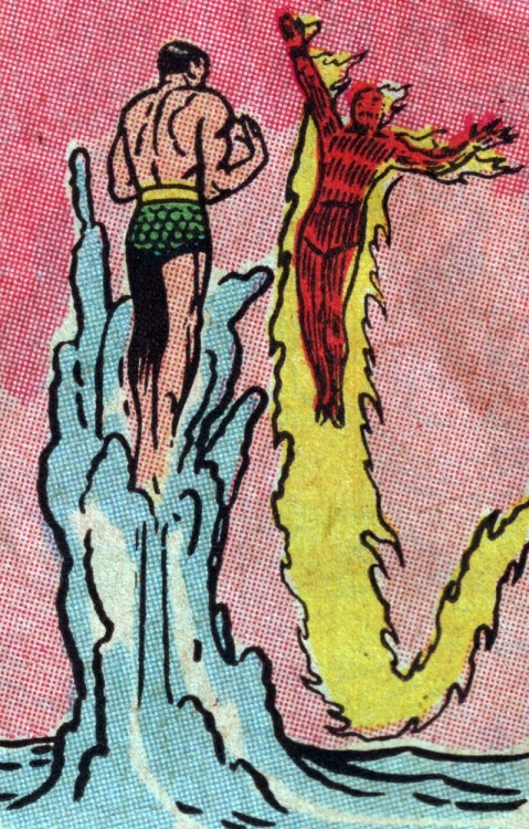
4CP | Four Color Process - adventures deep inside the comic book
4CP is a blog that romanticizes the dot-pattern world of old comic books. Don’t miss the heady love letter to ink and pulp, In Defense of Dots:
Dots emit radiation. As you get closer to them, they begin to vibrate and pulse. Moving closer still, the color separations become dramatically separate: Solids become very solid and the black ink holds together, while the CMY dots fly apart. Foreground and background, positive and negative space, reverse unexpectedly. Orange, green, brown, and fake gray give up their secrets, and the basic building blocks of a universe reveal themselves. Unstable molecules, built of primary colored atoms, buzz at different frequencies. Vectors of visual force, experienced implicitly at original size, become intense. Behind everything is wood pulp paper, a still deeper layer of creation, with its own unstable properties.
(Good to know purple prose is still purple, even if it’s made up of tiny magenta and cyan dots)

View Next 25 Posts


 2 Comments on The Dagger Quick, last added: 1/13/2011
.jpeg?picon=3675)

Personally, I use both, I have a slideshow at the page top and then a more indepth pop up view which more information below. The on certain images I have a more information button to go to a one page case study on the work. It offers the best of both worlds.
That’s interesting. I always like it when an artist offers more information on the creation of the work. Thanks for sharing.
The issue of AD’s not being able to bookmark a single image on a slideshow has crossed my mind. This is why I made sure to implement the kind of slideshow where you can right-click to see the image in a new window.
After reading this post, however, I might put a little note at the top of the slideshow to enlighten less savvy viewers that they have that option.
I have a theme called ePhoto from Elegant Themes for my WordPress hosted site which includes: a slideshow in which images can be clicked to expand with more information and a series of thumbnails on the main page, as well as a Catagories button from which a menu drops down with options to go to the entire portfolio or subcategories.
I’m just starting out (could really use feedback actually on how easy it can be navigated) but I _think_ it hits all of these needs.