JacketFlap connects you to the work of more than 200,000 authors, illustrators, publishers and other creators of books for Children and Young Adults. The site is updated daily with information about every book, author, illustrator, and publisher in the children's / young adult book industry. Members include published authors and illustrators, librarians, agents, editors, publicists, booksellers, publishers and fans. Join now (it's free).
Login or Register for free to create your own customized page of blog posts from your favorite blogs. You can also add blogs by clicking the "Add to MyJacketFlap" links next to the blog name in each post.
Viewing: Blog Posts from the Illustrato category, Most Recent at Top [Help]
Results 90,776 - 90,800 of 156,698
How to use this Page
You are viewing the most recent posts from blogs in the Illustrato category in the JacketFlap blog reader. These posts are sorted by date, with the most recent posts at the top of the page. There are hundreds of new posts here every day on a variety of topics related to children's publishing. Scroll down through the list of Recent Posts in the left column and click on a post title that sounds interesting. Click a tag in the right column to view posts about that topic. You can view all posts from a specific blog by clicking the Blog name in the right column, or you can click a 'More Posts from this Blog' link in any individual post.
I have no love for Cartoon Network these days, but I will not let that stop me from trumpeting the forthcoming debut of Pendelton Ward’s animated series Adventure Time (it’s official title is Adventure Time With Finn and Jake but I will only prefer to call it Adventure Time). The on-air promos have started playing and the production blog is loaded with art. I’m excited!
I have no love for Cartoon Network these days, but I will not let that stop me from trumpeting the forthcoming debut of Pendelton Ward’s animated series Adventure Time (it’s official title is Adventure Time With Finn and Jake but it’ll always be simply Adventure Time to me). The on-air promos have started playing and the production blog is loaded with cool artwork. I’m excited!
Awesome. Everyone looks like a dork in 3-d glasses. I like your team fortress guy on your blog also. It looks like you took a render from the game itself. Nice work.
well, unfortuneatley, time did not permit me to be able to submit a finished painting for this week's i.f. theme of "wilderness":( however, i was so excited to be able to have SOME time to participate in it again (since i've been CRAZY BUSY these last few months w/custom work) that i didn't want to skip out on it this week. i figured the ROUGH pencil/pastel sketch here was better than nothing at all! although, i do have every intention of making a finished piece out of this...one day SOON i hope! enjoy:)))
2 Comments on "wilderness"~sketch for illustration friday 1/15/10, last added: 1/23/2010
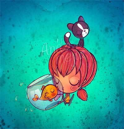
I was moving furniture around today and Mattie was watching over me. I'm sure she was thinking: what's this crazy lady doing moving this stuff around...again!
while I was moving stuff around I was baking some cinnamon rolls and they turned out oh so yummy! I was really happy when I heard the timer go off.
5 Comments on Cute Kitty Cat, last added: 1/23/2010
I'd like to say it's engraved on Turkish boxwood but it's actually a plywood offcut from Homebase. Woodcut with digital colour. 35mm x 40mm. Click to enlarge.
No matter how quick your sketches are, you have this amazing ability to dress your subjects so beautifully and perfectly. It takes an otherwise normal looking picture to a WHOLE new level! Immediately providing great atmosphere.
The yellowish picture was taken when it was hailing and all of these poor pelicans and seagulls were flying around helter skelter...We have had A LOT of rain in recent days...tomorrow it clears up for the weekend.
If you haven’t been to Hey Oscar Wilde! … It’s Clobberin’ Time – the illustrations of literary figures blog – in a while, now’s probably a good time to check back there. Blogger, Steven Gettis has updated with tons of great illustrations (including the above/scary Lord of the Flies illustration by Sam Weber – PS. Johnny wrote more about that project here).
Awards are always nice to receive, but most importantly they give a good book much needed publicity, so that others can discover and enjoy it. Thanks very much to all those involved.
Our Austin, Texas chapter of the Society of Children’s Book Writers (SCBWI)is a little dazed after last weekend’s 2010 award announcements. Austin’ s Jacqueline Kelly received a Newbery Honor for her YA novel The Evolution of Calpurnia Tate about a girl growing up at the turn of the 19th century. The picture book poem All the Worldpenned byLiz Garton Scanlonof Austin and illustrated byMarla Frazee was named one of the two Caldecott Honor books. (Frazee’s second Caldecott Honor.)
"All the World" by Liz Garton Scanlon, illustrated by Marla Frazee
And The Day-Glo Brotherswritten by Chris Barton of Austin and illustrated with retro lines and Day-Glo colors by Tony Persiani won a Sibert Honor for children’s nonfiction. (From the ALA – “The Robert F. Sibert Informational Book Medal is awarded annually to the author(s) and illustrator(s) of the most distinguished informational book published in English during the preceding year.”)
Our SCBWI chapter claims all three of these writers and we’ll claim Frazee, too. So that makes four.
All four, as it just so happens had been scheduled to present at the Austin SCBWI regional 2010 conference “Destination Publication” next weekend (January 30) with an already honors heavy line-up of authors, editors and agents. Marla is giving the keynote address along with Newbery Honor author Kirby Larson (Hatti Big Sky)
Another Texan,Libba Bray won the Michael L. Printz Award
1 Comments on ALA honors for Austin authors; SCBWI conferences and illustration classes for you, last added: 1/24/2010
These are a few of my favorite things (that people said, on 1/24/2010 5:37:00 AM
[...] To Be A Children’s Book Illustrator: ALA honors for Austin authors You read that right: All three Austin authors with ALA-honored books, plus Caldecott Honoree Marla [...]
So I was taking a break today to congratulate Kekla Magoon for winning this year’s John Steptoe Award where I noticed her book has also been nominated for an NAACP image award. I then noticed that OUR CHILDREN CAN SOAR has also been nominated in the “Outstanding Literary Work for Children” category. Hot dang! How cool is that? You can also see OUR CHILDREN CAN SOAR in “Ebony Magazine” this February.
I’m not surprised in the least, Shadra. Ever since you shared your wonderful presentation at NCTE, I’ve bought several copies of this book to give to all my friends. It is spectacular. Congratulations!
Claudia
Today I got my royalty statements through from Gullane - always exciting, as they publish the majority of my titles, and also most of the ones that have sold beyond the advance.
For those who don't know how it works: authors and illustrators get paid an 'advance' before the book is published, so that we don't starve to death, waiting all the years it takes for the books to get out there and gradually earn money, a few pence at a time (we get a tiny percentage of what you pay for each book).
Illustrators receive this advance in stages, usually 4 bits: a little on signing the contract, a big chunk on finishing the roughs, an even bigger chunk on delivery of artwork, and then a small amount on publication day.
From then on, you get royalty statements every 6 months, to tell you how sales are going and how much of your advance the publisher has earned back. Unfortunately lots of books never earn enough to quite match the advance, but that's OK - you don't have to pay anything back (phew)!
Once you have sold enough books for your pennies to mount up to the value of your advance, you start to earn royalties: which means that every 6 months, when the royalty statements arrive, the publishers pays you whatever your percentage has amounted to.
Which might sound straight forward, but the big snag is that royalty statements are generally written in publisher's code and often virtually intelligible (grrrrr...). So, well done and a huge thank you to Gullane, for re-designing their statements recently, so they are totally clear and author friendly!!
4 Comments on Royalties and Advances, last added: 1/22/2010
this is making me feel like a dope. lol. just signed a contract with a vanity press to illustrate a book. I've been illustrating for 15 years- but never did a book, so didn't feel I had the right to demand anything. I think I may be getting... er... for a lack of a better term... boned! lol. Thanks for sharing this info. I love your blog and learn so much from it.
What an interesting process...I hate getting paperwork that, though written in english, feels like it may as well be written in another language altogether.
Lisa - I would very strongly recommend that you join whatever the US equivalent of our Association of Illustrators is. They should be able to give you detailed advice on what you can charge for different kinds of work and guide you on how to go about it.
It's so important that you don't undervalue yourself and our work. I don't know what products you have been illustrating for, but I worked for over 4 years as a freelance giftware illustrator and then a further 7 in editorial (so all one-off small jobs and no books involved) but each one still paid a fee and it was possible to make a living.
There are also plenty of on-line groups who will help you with free advice: join some illustrator's groups on Facebook - there's nothing like swapping experience with fellow illustrators for getting clued up!
So here's my next batch of batts. I had trouble coming up with the right colour combination but I love how they turned out in the end. I think I have about 100g.
First of all I had a medium bright blue braid that was a bit dull. Also it was kind of compacted and dense so it was going to be hard to draft. The best solution for this is to divide the roving lengthwise a few times then pre-draft if you need to. But putting compacted fibre through a drum carder will fluff it right back up (you do have to pick it apart a bit).
So I turned that blue braid into the first batt. Then I had a pale minty green braid that I turned into the second batt. I had over-dyed some of the blue with dark brown but when I tried blending the three colours, the results were disappointing.
So I picked a small ball of yellow roving that I had on hand and blended that with the medium blue and pale minty blue batts. Adding yellow to the bright blue was a great way to make it harmonize with the minty (more turquoise) blue. It looks kind of white in the photo... it's just so pale the little tint of colour doesn't show up very well.
The fibre I used for these batts was all merino. I'm starting to be able to tell the difference between fibres. Corriedale in a braid sometimes feels just as soft as merino. But after putting batches of each through the drum carder I can feel that the merino is softer, and also tends to "cling" a bit more. It's hard to describe but I think it's just that the fibres are more delicate. I find I have to be a bit gentler so as to prevent tangles - just turn the handle of the drum carder more slowly and put less fibre in at a time.
I'm calling this colourway Sailboat. I'm not sure why I keep naming my fibre when I'm planning to spin it myself but I just like to do it...
2 Comments on Sailboat batts, last added: 1/22/2010
Today I will be traveling a bit (no kidding, in Portland this time). This afternoon I’ll be downtown and later in the evening I’ll be hanging around on Alberta in the Concordia area (likely near 33rd Ave).
If you want to check in on my whereabouts and say hello, I’ll be updating on Twitter. I hope to see you around.
By the way, I just realized that this all sounds like “Sisterhood of the Traveling Pants.”
Thanks so much to all of you for your insightful comments and votes on yesterday’s post about the cover design for the upcoming book on color and light.
In this post I wanted to tell you more about how I came to write the book, and what’s in it.
When I was in art school I took a color class that consisted of painting a lot of flat swatches, cutting them out with a sharp knife, and pasting them down into color wheels and gray scales. I spent months learning how to paint perfectly smooth swatches and trying to get the steps between them exactly even.
At the end of each day I would leave the classroom and look up at the colors of the sky, the trees, and the water around me. The sky was not composed of adjacent flat colors, but rather of an infinite variety of gradating hues. Why did dark colors turn blue as they went back toward the horizon——except in a few instances, such as in the photo below, when a setting sun casts the far vista in orange light? Why did the leaves have a sharp yellow-green color when the light shined through them, but a gray-green color on top?
In school I was learning valuable skills about how to see and mix color, but I had no idea how to apply this experience to real-world painting problems. Color theory seemed more like a branch of chemistry or mathematics, a separate science that had little to do with making a realistic painting. I felt like a piano student who had played a lot of scales, but had never gotten around to the melody.
If there were answers to my questions about how color interacts with light, atmosphere, water, and other materials, I would have to find them in fields like physics, optics, physiology, and materials science. I started digging back into art instruction books from more than 75 years ago, when it was taken for granted that artists were trying to create an illusion of reality. Artists as far back as Leonardo da Vinci were struggling to explain the workings of the visual world around them. Each old book had its vein of gold, but the information needed to be translated and updated for our times, and the old theories needed to be tested against recent scientific discoveries.
I investigated recent findings in the field of visual perception and found that many of my assumptions, even about such basic things as the primary colors, were mistaken. I learned that the eye is not like a camera, but more like an extension of the brain itself. I learned that moonlight is not blue, it only appears blue because of a trick that our eyes are playing on us.
During the last few years, since the release of Dinotopia: Journey to Chandara, I have taught workshops at a lot of art schools and movie studios. I have also kept up this blog, which explores the working methods of contemporary realists, academic painters, and Golden Age illustrators. I adapted some of the blog content into my recent book, Imaginative Realism: How to Paint what Doesn’t Exist. As I assembl
29 Comments on More About the New Book, last added: 1/25/2010
It continues to impress me that you could apply all this learning to your own projects without ever going to the time and effort of sharing it on the blog and in the books. Thanks for your generous spirit.
Let us know when we can get in line to preorder...
Okay.I'll wait. But it better be worth it. ;) I love Imaginative Realism, thank you for writing the books. It's so great that all this knowledge will never die thanks to people like you. Imagine that: Today people read A. Loomis, in 50 years they'll be reading J. Gurney! How cool is that, man?
There's a lot of passion in this 'confesion of an artist'. It might work well as an 'artist statement' on an introductory page for the book. (at last, an artist statement that wasn't "fabricated", but came from the heart!)
Really looking forward for the book. I cannot deny that these are the themes I somewhat missed in the first book, but hey - how thick can a book be?
When you talk about paints and pigments will you include brands so as to be more specific?
My first in-depth practical guide to color was through Stephen Quiller's book Color Choices where he mentioned brands that gave him the best color harmonies. Up until that book people always talked like color X is always color X no matter who makes it, but it's not the case I've found.
Also some paint colors don't reproduce well in print. It may be off the subject of color & light...but it would be nice to hear more on your experience and what adjustments you've made.
I'm really looking forward to the new book! Lighting is one of those things I seem to struggle with getting right in every painting and yet never seem to find information that explains it to me in a way that makes perfect sense. You do such a beautiful job with lighting (among many other things!)so I'm sure I'll learn lots from the book.
Fantastic! I can't wait until I can get my grubby little mitts on it. Thank you so much, James, for sharing your thoughts and findings with the rest of us. See you at Delaware Art Museum for some hands-on help! (And thanks for the materials note!)
I have a full height, full wall set of bookshelves in my study or computer room. One whole section has numerous books relating to art and digital art. Your last book takes pride of place and is by far the most inspirational and informative. I eagerly await this next one. Although your imaginative realism book was anchored in traditional oil painting it contains valuable insights for any media including new-fangled digital stuff.
very exciting! also why wasnt that photo of the dinosaur scene and sunset in the voting poll, what a fantastic image and what a great image to have on your cover?
As a 3D digital art tutor, I find it a constant struggle to make my students realise the vital importance of colour and light when producing renders. (All the stuff, like yourself, I've had to piece together from so many sources and careful observations and imitation.) They often produce wonderful looking 3D models and then fail to take the time to set up the materials, colour and lighting rig. The resultant renders are flat and dull.
I'm so looking forward to the next book and also the valuable addition it will make to College's library and the students' must get/have reading list.s
Great news! Imaginative Realism is definitely one of my favorite art books of all time and I am sure this one will be right up there. I just hope one day there will be James Gurney School of Illustration Art!
How very appropriate! I've started this quest last year, but my aim this year is to understand light better, this book will come in perfect timing. Until it comes out I will be using the first one as much as possible to progress.
I really must schedule some outdoor sketching, I keep meaning to then get caught up with other jobs. I also noticed that "speed painting" in Photoshop helped me immensely in understanding light and colour. Doesn't replace the real thing but it works.
I voted on the cover but didn't have time to comment. I liked the montage one, but voted for the dino one. I think it's more "you". Even though the book will be more about theory, I would say that your name is what will draw people's attention first. And the dino pictures sums it all up, who you are and the notions of light and colour. I really love that image by the way
Maybe it's also because it shows what I am struggling to "understand". I get the theory but can't really apply it. I mean all the little things that happen around a subject. Lighting the shapes seems easy enough but the reflections etc are still a bit of a mystery. I need to study reflections and diffraction again too.
I know, without a doubt, that this is the art book I need far and above any other books I have read on anatomy, perspective, composition or whatever else.
The selection and interaction of color, in the context of blending and lighting a scene, has always proven difficult for me as a mostly self-taught artist.
Woohoo! Can't wait! I agree fall seems so far away. Here's an idea how about a "Preview/review" contest/raffle for some of your blog readers to get the chance to read it early to build hype and good reviews.
Man, I'm speechless. I've found a blog of the guy who made the book of my childhood (and nearly launched me towards becoming a paleontologist, but hey, I chose linguistics and drawing instead) - AND he's making a book on color theory. In the style of his awesome blog. You. Rock. No, I really am speechless. These words are an illusion my happiness projected here. Cheers!
There's a wonderful book by the astronomer Marcel Minnaert called, "Light and Color in the Outdoors" which is a brilliantly enthusiastic investigation into everything that light can do outside. For the theory on why things behave as they do it can't be beat and it's great reading for artists, scientists and artist/scientists alike.
Thanks so much, everybody. Mr. Atrocity, I second that recommendation for Mr Minnaert's book, not just for artists, but for observant non-artists who are curious about atmospheric phenomena. I think I found out about it from a blog commentator.


.jpg?picon=1679)


.jpeg?picon=1639)

.jpeg?picon=2861)


.jpg?picon=1009)


Awesome. Everyone looks like a dork in 3-d glasses.
I like your team fortress guy on your blog also. It looks like you took a render from the game itself. Nice work.
Thanks, Mr. T!
By the way, I really liked your Fight Club painting. It actually inspired me to want to try out more painterly styles.