new posts in all blogs
Viewing Blog: The Ballyhoo, Most Recent at Top
Results 26 - 50 of 81
.jpg)
Blog for writers & illustrators
Statistics for The Ballyhoo
Number of Readers that added this blog to their MyJacketFlap: 16

By: Carlyn Beccia,
on 9/17/2008
Blog:
The Ballyhoo
(
Login to Add to MyJacketFlap)
JacketFlap tags:
Add a tag
2 more days to head over to Scandalous Women and enter to win a copy of The Raucous Royals. Entering is as easy as losing your head in Henry VIII's court. Just comment on the Jane Boleyn post and...Voila you're in.
By: Carlyn Beccia,
on 9/4/2008
Blog:
The Ballyhoo
(
Login to Add to MyJacketFlap)
JacketFlap tags:
Add a tag
 Throw on your petticoat, grab your parasol, button up your britches and rush on over to Picture Book Junkies to enter to win a FREE signed copy of The Raucous Royals.
By: Carlyn Beccia,
on 8/20/2008
Blog:
The Ballyhoo
(
Login to Add to MyJacketFlap)
JacketFlap tags:
Add a tag
 The Ballyhoo has been “hearted” by the amazing, death-defying talents of krisztina maros at sketch pause.
Here are my 7 blogs that may change your life in no particular order
1. Barbara Johansen Newman’s always feisty blog – Cats and Jammers Studio
2. Author and blogger extrordinaire
Cynthia Leitich Smith whose recent vampire book,
Tantalize and
spooky blog will leave your hair permanently standing on air.
3.
Linda Silvestri whose blog has received countless blogging awards and still deserves 10 more for making me laugh on a regular basis.
4 & 5.
Kathy Weller and
Monica Lee for making me want to tap into to my innocent, whimsical and far less darker, vodka-drinking child.
6. The World Famous Circus Star,
Adam Rex whose work makes me as giddy as school girl with a Jonas Brothers crush.
The rules for this award-takeaway are:
1. The winner can put the logo on their blog
2. Link the person you received your award from
3. Nominate at least 7 other blogs
4. Put links of those blogs on yours
5. Leave a message on the nominee's blog letting them know about their award


The very talented Brian Demeter has some new original paintings for sale. His art always sells out fast
so hurry on over.

I just got myself this ADORABLE frog for my daughter's room.
© 2008 Brian Demeter
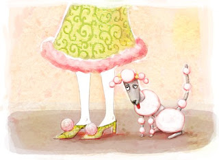
Count the poufs. I got a little carried away.
By: Carlyn Beccia,
on 7/29/2008
Blog:
The Ballyhoo
(
Login to Add to MyJacketFlap)
JacketFlap tags:
Add a tag
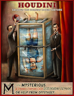 I have not posted a circus image in a while so I couldn't resist showing an illustration of the man who truly knew how to get out of a can. This picture is from Who Put the B in the Ballyhoo? and depicts Houdini's Chinese Water Torture Cell. Read more about other escapes from tight places like the infamous Milk Can Escape.
By: Carlyn Beccia,
on 7/25/2008
Blog:
The Ballyhoo
(
Login to Add to MyJacketFlap)
JacketFlap tags:
Add a tag
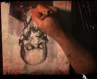 Visit Sketch Theatre to see artists create their illustrations under a high speed camera. I thought it was especially interesting that Michael Broom creates this spooky character UP SIDE DOWN.
By: Carlyn Beccia,
on 7/15/2008
Blog:
The Ballyhoo
(
Login to Add to MyJacketFlap)
JacketFlap tags:
Add a tag
 Raindrops on roses and whiskers on kittens
Bright copper kettles and warm woolen mittens
Brown paper packages tied up with strings
These are a few of my favorite things
La La La. My daughter has a music box that plays this song. She recently has decided that sleep is overrated and the purpose of a crib is to repeatedly bang your head against its wooden sides. So I have been playing this song constantly in the hopes of brainwashing her into believing Julie Andrews is just over the hilltop beckoning her into naptime. I have really only succeeded in getting this song stuck in my head all day long.
Hopefully, this list of my favorite art things can reprogram my brain…
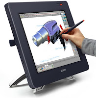 Wacom Cintiq Tablet
I have been using the Cintiq since 2005 and I don’t know how I ever got by without it. If you are a digital artist, it really will change your life. ok I might be being a bit dramatic. It might not change your life, but it will change the way you paint. Wacom tablets are ok but nothing beats painting directly on the screen. I found my art started to look less digital after I made the switch. And if you are worried about the cost then you can always justify it by remembering how much faster you can paint on the screen.
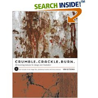 Crumble, Crackle and Burn: 60 Stunning Textures for Design & Illustration
by Von Glitschka
Yes, I know we all are getting a little sick of the texture overload on graphics. But you know clients tend to be behind the design curve so someone is bound to ask you to put a little texture in your art. With this book you can tell your clients that you slaved away for hours and hours taking photo shoots of perfectly weathered concrete and the bark of a 300 year old birch tree when all you really did was drag and drop from Crumble, Crackle and Burn’s collection of scanned textures.
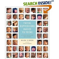 Facial Expressions Babies to Teens and Facial Expressions by Mark Simon
These two books are a must have for anyone trying to capture that perfect 10- year old supercilious disdain. Maybe over-the-top fear is what you are after. Mark Simon’s book has you covered with every possible facial expression. He gives different rotated views of the same character too so you can illustrate a wide spectrum of facial expressions using the same faces.
Corel Painter Magazine
I have heard from many artists that the reason they don’t use Painter is because they find it too complicated. Come now. The real reason is that we are a bunch of die-hard, Photoshop dogs afraid to learn some new tricks. Learning a new program is always tough and those software textbooks are b o r I n g. Corel Painter Magazine makes it easy to pick up tips and tricks by focusing on a different brush tool in Painter each month. They also offer tons of inspirational paintings done by leading Painter artists.
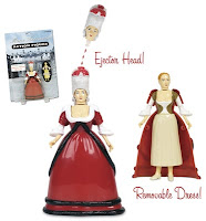 Marie Antoinette Action Figure with Removable Head
Everyone should have at least one toy in their office that counts as a stress reliever. Mine is my Marie Antoinette action figure. With just a push of a button….off pops her head. Mad at a client? Marie had suddenly morphed into that dreaded client and…dang, “oh dear...where did my head go? I can’t make stupid comments without my head.”
Boxing Gloves, punching bags, stress balls, dart boards can also work wonders.
That’s all I can think of for now. Feel free to share some of your favorite art things or any advice for sleep-deprived new parents.
By: Carlyn Beccia,
on 6/21/2008
Blog:
The Ballyhoo
(
Login to Add to MyJacketFlap)
JacketFlap tags:
Add a tag
By: Carlyn Beccia,
on 6/21/2008
Blog:
The Ballyhoo
(
Login to Add to MyJacketFlap)
JacketFlap tags:
Add a tag
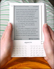 A few weeks ago, my husband gave me an Amazon Kindle to amuse me during my recoup after surgery. When I first held this strange, paperback-sized device my immediate reaction was – “why would I want to read a book on an electronic device followed by…you spent what on that thing ????”
Honestly, I am usually what the marketing folks call an “early adapter”, but NOT when it comes to books. I love the smell of books and the beautifully, solid feel of a book in my hands. I get lightheaded when I see a book with embossing, a well placed varnish or anything shiny. All of these things are part of the sacred reading experience and there was no way I was giving them up. I was so wrong.
Reading for the page-turning impaired.
First off, I thought that it was going to be like reading on a screen which my senior eyes just can’t take any more. But the kindle looks like paper…sort of a grayish paper. You turn the pages by hitting the next or previous button. Super easy. I know you might be thinking….you’re too lazy to turn pages? Trust me. Buttons are a tremendous asset if you ever find yourself stuck in bed, drooling on yourself, with your arm encased in a refrigerated sling. And really it’s not just useful for one-armed gimps like me. Let’s say you are one of those poor slobs that ride the train every day to get to your soulless job trapped in a cubicle. Well, now your soulless trip does not need to involve elbowing your neighbor to read your book. You can even read standing up with one sweaty hand on the seat handles and the other clutching your kindle. And best of all, your neighbor will never know you are reading that biography on your favorite Golden Girl, Bea Arthur. It is the ultimate private reading experience.
Reading for the Psychologically impaired
Aside from the joy of buttons, you can also take notes and annotations easily as you read. In my pre-Kindle days, I would tag pages with sticky notes or if I was really feeling frisky….write on the book. (gasp) Writing on a book gives me painful flashbacks of Catholic school in the third grade. Even a harmless underline could earn you the stern disapproval of the nuns. To this day, I have serious Catholic guilt when it comes to taking notes on a book. With my kindle, I just type my notes on the key pad and they are all saved within each book.
Reading for the Visually Impaired
For those of you that walk around with a cane and are known to occasionally mutter how you remember when gas cost a dollar, then you will really appreciate the text options in the Kindle. With just a click of the button, you can increase or decrease the size of your type. Voila. No more hurt eyes.
Reading for the Drug Impaired
After you get used to the Kindle’s features, the device becomes as transparent as any other method of reading. Several times, I reached for the corner of my Kindle to turn the page instead of using the buttons. I had actually forgotten that I was reading a book on a device. (ok I admit that I was drugged up on pain killers at the time, but I wouldn’t be surprised if other people do the same thing).
Reading for People with Really Big Thumbs
My one complaint with the Kindle is that the buttons on the sides are way too long. Amazon’s product focus group must have been a room full of big handed chimpanzees because there is no way that anyone needs buttons that large. At first, I kept accidentally hitting the next and previous screen buttons because they are just so honking big. Amazon needs to rethink their target market’s average thumb size for V2 of the Kindle.
But other than the giant buttons, I am really enjoying my new toy. Now if only I could get it to have that new book smell.
By: Carlyn Beccia,
on 6/2/2008
Blog:
The Ballyhoo
(
Login to Add to MyJacketFlap)
JacketFlap tags:
Add a tag
 A few weeks ago, my husband gave me an Amazon Kindle to amuse me during my recoup after surgery. When I first held this strange, paperback-sized device my immediate reaction was – “why would I want to read a book on an electronic device followed by…you spent what on that thing ????”
Honestly, I am usually what the marketing folks call an “early adapter”, but NOT when it comes to books. I love the smell of books and the beautifully, solid feel of a book in my hands. I get lightheaded when I see a book with embossing, a well placed varnish or anything shiny. All of these things are part of the sacred reading experience and there was no way I was giving them up. I was so wrong.
Reading for the page-turning impaired.
First off, I thought that it was going to be like reading on a screen which my senior eyes just can’t take any more. But the kindle looks like paper…sort of a grayish paper. You turn the pages by hitting the next or previous button. Super easy. I know you might be thinking….you’re too lazy to turn pages? Trust me. Buttons are a tremendous asset if you ever find yourself stuck in bed, drooling on yourself, with your arm encased in a refrigerated sling. And really it’s not just useful for one-armed gimps like me. Let’s say you are one of those poor slobs that ride the train every day to get to your soulless job trapped in a cubicle. Well, now your soulless trip does not need to involve elbowing your neighbor to read your book. You can even read standing up with one sweaty hand on the seat handles and the other clutching your kindle. And best of all, your neighbor will never know you are reading that biography on your favorite Golden Girl, Bea Arthur. It is the ultimate private reading experience.
Reading for the Psychologically impaired
Aside from the joy of buttons, you can also take notes and annotations easily as you read. In my pre-Kindle days, I would tag pages with sticky notes or if I was really feeling frisky….write on the book. (gasp) Writing on a book gives me painful flashbacks of Catholic school in the third grade. Even a harmless underline could earn you the stern disapproval of the nuns. To this day, I have serious Catholic guilt when it comes to taking notes on a book. With my kindle, I just type my notes on the key pad and they are all saved within each book.
Reading for the Visually Impaired
For those of you that walk around with a cane and are known to occasionally mutter how you remember when gas cost a dollar, then you will really appreciate the text options in the Kindle. With just a click of the button, you can increase or decrease the size of your type. Voila. No more hurt eyes.
Reading for the Drug Impaired
After you get used to the Kindle’s features, the device becomes as transparent as any other method of reading. Several times, I reached for the corner of my Kindle to turn the page instead of using the buttons. I had actually forgotten that I was reading a book on a device. (ok I admit that I was drugged up on pain killers at the time, but I wouldn’t be surprised if other people do the same thing).
Reading for People with Really Big Thumbs
My one complaint with the Kindle is that the buttons on the sides are way too long. Amazon’s product focus group must have been a room full of big handed chimpanzees because there is no way that anyone needs buttons that large. At first, I kept accidentally hitting the next and previous screen buttons because they are just so honking big. Amazon needs to rethink their target market’s average thumb size for V2 of the Kindle.
But other than the giant buttons, I am really enjoying my new toy. Now if only I could get it to have that new book smell.
In this tutorial, I am going to cover the basics of using Painter’s digital watercolor brushes using last week’s experiment. I have to say up front that if you are looking for watercolor inspiration then this is not the place. I find watercolors one of the hardest mediums to work in and probably my least favorite. But people who make the switch to digital painting usually like Painter’s watercolor brushes the best.
Digital watercolors do allow you to experiment in a way that allows more freedom than traditional watercolor medium. (Those of you that have worked in watercolors know how unforgiving it can be.) The digital medium works the same as the traditional medium so I am not going to go into any watercolor techniques.
 First we start with a sketch. Watercolors are the only medium where I will start on a white piece of paper. I find this utterly terrifying because you cannot set a cool or warm mood with the color of your paper. But just like in traditional watercolor, the brightness of the paper becomes your base color.
There are two types of watercolor brushes in Painter. There are the regular old “watercolor brushes” that have been in Painter for ages and there are the “Digital Watercolor brushes”. The watercolor brushes are better for sweeping in washes of color in backgrounds, but you will need tons of memory to use these without grinding your machine to a halt.  The digital watercolor brushes work much more efficiently. You can select one of the digital watercolor brushes from the brush menu by clicking on the small arrow next to the brush.

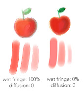 Next you want to choose a kind of digital watercolor brush and customize it to your needs. I prefer to start with the “Wash Brush.” The real magic in this brush is controlling the “Wet Fringe” and “Diffusion.” In this sample, the left doodle has a Wet Fringe of 100% with a 0 Diffusion. You can see that this creates a brush strokes that goes on wetter because you can really see the color accumulating on the stroke edges. On the right the Diffusion is kept at 0 and the Wet Fringe is 0. This creates a smoother almost marker feel. To me, it looks more like what you can get out of Photoshop which I personally think looks more "digital."
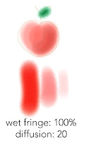 In this next example, the Wet Fringe is kept at 100% and the Diffusion is put at 20. This creates a very watery fluid brush which might not be the right brush for objects, but would look fabulous as a watery backgrounds.
Another interesting brush is the “Wet Eraser” under the same brush grouping. This brush allows you to easily correct your mistakes with literally a wet erase. Something that is difficult to do with traditional watercolors. (Note: the wet eraser only works on layers. Once you drop your layer down you will want to go back to the regular eraser.) 
At this point, the painting just has some light washes. I like a little texture so I always go over my watercolor paintings with some pastels using different textured paper. And that is what you can see in the
final.
 Another tip:
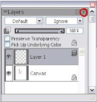
 Use lots of layers with watercolors. You can create a new layer in the same way that you do in photoshop by clicking on the small right triangle and selecting “new layer.” If you paint each wash on a seperate layer then you can lower the opacity as you go to and slowly build color. I drop the layer once I get it looking how I want it. (You drop the layer by clicking on the arrow to the right and selecting “Drop.” The drop is the equivalent to the "merge down" command in Photoshop)
I will cover Painter's pastel brush in another tutorial. I also plan to cover painting with a watercolor brush in Photoshop. The steps are a little less intuitive, but it can be done. Let me know if there is something in particular that you would be interested in seeing.
By: Carlyn Beccia,
on 5/15/2008
Blog:
The Ballyhoo
(
Login to Add to MyJacketFlap)
JacketFlap tags:
Add a tag
In this tutorial, I am going to cover the basics of using Painter’s digital watercolor brushes using last week’s experiment. I have to say up front that if you are looking for watercolor inspiration then this is not the place. I find watercolors one of the hardest mediums to work in and probably my least favorite. But people who make the switch to digital painting usually like Painter’s watercolor brushes the best.
Digital watercolors do allow you to experiment in a way that allows more freedom than traditional watercolor medium. (Those of you that have worked in watercolors know how unforgiving it can be.) The digital medium works the same as the traditional medium so I am not going to go into any watercolor techniques.
 First we start with a sketch. Watercolors are the only medium where I will start on a white piece of paper. I find this utterly terrifying because you cannot set a cool or warm mood with the color of your paper. But just like in traditional watercolor, the brightness of the paper becomes your base color.
There are two types of watercolor brushes in Painter. There are the regular old “watercolor brushes” that have been in Painter for ages and there are the “Digital Watercolor brushes”. The watercolor brushes are better for sweeping in washes of color in backgrounds, but you will need tons of memory to use these without grinding your machine to a halt.  The digital watercolor brushes work much more efficiently. You can select one of the digital watercolor brushes from the brush menu by clicking on the small arrow next to the brush.

 Next you want to choose a kind of digital watercolor brush and customize it to your needs. I prefer to start with the “Wash Brush.” The real magic in this brush is controlling the “Wet Fringe” and “Diffusion.” In this sample, the left doodle has a Wet Fringe of 100% with a 0 Diffusion. You can see that this creates a brush strokes that goes on wetter because you can really see the color accumulating on the stroke edges. On the right the Diffusion is kept at 0 and the Wet Fringe is 0. This creates a smoother almost marker feel. To me, it looks more like what you can get out of Photoshop which I personally think looks more "digital."
 In this next example, the Wet Fringe is kept at 100% and the Diffusion is put at 20. This creates a very watery fluid brush which might not be the right brush for objects, but would look fabulous as a watery backgrounds.
Another interesting brush is the “Wet Eraser” under the same brush grouping. This brush allows you to easily correct your mistakes with literally a wet erase. Something that is difficult to do with traditional watercolors. (Note: the wet eraser only works on layers. Once you drop your layer down you will want to go back to the regular eraser.) 
At this point, the painting just has some light washes. I like a little texture so I always go over my watercolor paintings with some pastels using different textured paper. And that is what you can see in the
final.
 Another tip:
 Use lots of layers with watercolors. You can create a new layer in the same way that you do in photoshop by clicking on the small right triangle and selecting “new layer.” If you paint each wash on a seperate layer then you can lower the opacity as you go to and slowly build color. I drop the layer once I get it looking how I want it. (You drop the layer by clicking on the arrow to the right and selecting “Drop.” The drop is the equivalent to the "merge down" command in Photoshop)
I will cover Painter's pastel brush in another tutorial. I also plan to cover painting with a watercolor brush in Photoshop. The steps are a little less intuitive, but it can be done. Let me know if there is something in particular that you would be interested in seeing.
By: Carlyn Beccia,
on 5/10/2008
Blog:
The Ballyhoo
(
Login to Add to MyJacketFlap)
JacketFlap tags:
Add a tag
 For a limited time only! Get your Dr. Horne's Electric Belt. (Batteries sold separately).
btw, I will have a new tutorial up next week. I dislocated my shoulder while wearing my new vibrating belt. Long posts are a bit tricky right now.
 With this week's topic, I had a childhood memory of how I used to always wonder where the seeds from a flower would plant themselves when you blew them into the wind. (I know...totally corny!) I am sure my neighbors could have done without me blowing weeds into their yard.
Here is a quick experimentation with Painter's digital watercolor brushes and Hard Pastel on Rice paper. I have not used Painter's watercolors in awhile and I had forgotten how wonderful the brushes are for showing fluid movement. (the seeds blowing out of the dandelion are the "Spatter Water" brush.) When I worked traditonally, I could never control my spatters and would always end up with a muddy mess.
If people like this experimentation then maybe I will do a tutorial next on painter's watercolor and pastels tools. Let me know if you are interested...
By: Carlyn Beccia,
on 5/4/2008
Blog:
The Ballyhoo
(
Login to Add to MyJacketFlap)
JacketFlap tags:
Add a tag
 With this week's topic, I had a childhood memory of how I used to always wonder where the seeds from a flower would plant themselves when you blew them into the wind. (I know...totally corny!) I am sure my neighbors could have done without me blowing weeds into their yard.
Here is a quick experimentation with Painter's digital watercolor brushes and Hard Pastel on Rice paper. I have not used Painter's watercolors in awhile and I had forgotten how wonderful the brushes are for showing fluid movement. (the seeds blowing out of the dandelion are the "Spatter Water" brush.) When I worked traditonally, I could never control my spatters and would always end up with a muddy mess.
If people like this experimentation then maybe I will do a tutorial next on painter's watercolor and pastels tools. Let me know if you are interested...
By: Carlyn Beccia,
on 4/18/2008
Blog:
The Ballyhoo
(
Login to Add to MyJacketFlap)
JacketFlap tags:
Add a tag
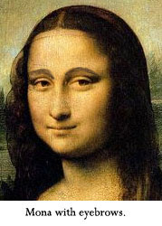 As with most people, I love the image of Mona Lisa and her enigmatic smile. But it has always bugged me that the woman is missing eyebrows. I love a good full brow as seen in my header image above. As a child, I used to draw brows on Mona Lisa’s face (still doing it!) Later, I discovered that plucking eyebrows was not in fashion until years after Mona Lisa was painted and I was left wondering…where did her eyebrows go?
Now the mystery of the missing brow line is finally solved. Pascal Cotte, a French engineer and inventor, used a high-definition camera to discover the lost hair in the famous painting. Turns out that good old Mona got over plucked by either the ravages of time or a few overeager attempts to restore her image. You can read more about it here.
By: Carlyn Beccia,
on 4/13/2008
Blog:
The Ballyhoo
(
Login to Add to MyJacketFlap)
JacketFlap tags:
Add a tag
 In this tutorial, I am going to show how to use Photoshop styles to create depth and as a base for your paintings. Styles sort of get a bad rap because most designers and illustrators think of those glass buttons that the mac folks made so popular a few years ago. I remember every client was asking for “glass buttons” during that time and styles started to make me peevish too. But they do have their uses. Photoshop styles helped me whip out the name plate in last week’s tutorial without much fuss.
Here are the steps
1. Select the rounded rectangle tool from the Photoshop tool palette and set the radius to about 10. Pick some sort of goldish color. Click and drag to make a square with rounded corners.
figure 1

2. Next, we are going to create rounded circles jetting out from the square. Select the eclipse tool in the tool bar. We don’t need to create a separate shape here. It will be much easier to edit as one path. So to do this we will go to the top bar in photoshop and select the compound path option (figure 1)
figure 2
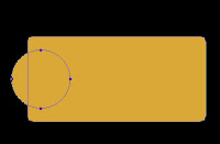
3. Next, hold down the shift key and draw a circle to the left side of our square (figure 2). (holding the shift key constrains the proportions of the circle)
4. Now we obviously want both sides to have the same size circles so we will select the path selection tool (figure 3) and select the circle that we already drew.
figure 3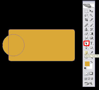
Hold down first the alt key and then the shift and drag the left circle over to the right.
figure 4
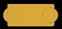
(The alt key makes a duplicate and the shift key makes sure that the second circle is aligned with the first). You will now have one fully editable shape. (figure 4)
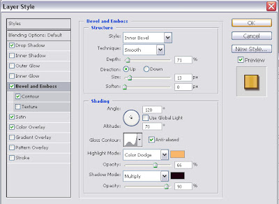
5. Now the fun part. We can apply styles to create the depth. Hit the small “f” key at the bottom of your layers palate or double click on the right side of the layer. This opens up the styles palate. Styles are something that you really need to play around with to get the most out of them but I used the following settings for the plate:
Check the following Layer Styles:figure 5
 Drop Shadow:
Opacity 51, set to multiply, distance: 13 Size: 8
Bevel and Emboss: (see figure 5)
Satin: ( see figure 6)
Color Overlay :
Set to orange, Normal blend mode, 100%
figure 6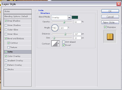
If you want a rougher metal texture then you may want to play around with the pattern styles too.
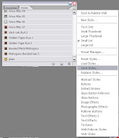
And when you are done, in the styles palette, click the small right button and select “save styles” (right). Now you can use it again for creating more metal plates.
By: Carlyn Beccia,
on 4/13/2008
Blog:
The Ballyhoo
(
Login to Add to MyJacketFlap)
JacketFlap tags:
Add a tag
 In this tutorial, I am going to show how to use Photoshop styles to create depth and as a base for your paintings. Styles sort of get a bad rap because most designers and illustrators think of those glass buttons that the mac folks made so popular a few years ago. I remember every client was asking for “glass buttons” during that time and styles started to make me peevish too. But they do have their uses. Photoshop styles helped me whip out the name plate in last week’s tutorial without much fuss.
Here are the steps
1. Select the rounded rectangle tool from the Photoshop tool palette and set the radius to about 10. Pick some sort of goldish color. Click and drag to make a square with rounded corners.
figure 1

2. Next, we are going to create rounded circles jetting out from the square. Select the eclipse tool in the tool bar. We don’t need to create a separate shape here. It will be much easier to edit as one path. So to do this we will go to the top bar in photoshop and select the compound path option (figure 1)
figure 2

3. Next, hold down the shift key and draw a circle to the left side of our square (figure 2). (holding the shift key constrains the proportions of the circle)
4. Now we obviously want both sides to have the same size circles so we will select the path selection tool (figure 3) and select the circle that we already drew.
figure 3
Hold down first the alt key and then the shift and drag the left circle over to the right.
figure 4

(The alt key makes a duplicate and the shift key makes sure that the second circle is aligned with the first). You will now have one fully editable shape. (figure 4)
5. Now the fun part. We can apply styles to create the depth. Hit the small “f” key at the bottom of your layers palate or double click on the right side of the layer. This opens up the styles palate. Styles are something that you really need to play around with to get the most out of them but I used the following settings for the plate:
Check the following Layer Styles:figure 5
 Drop Shadow:
Opacity 51, set to multiply, distance: 13 Size: 8
Bevel and Emboss: (see figure 5)
Satin: ( see figure 6)
Color Overlay :
Set to orange, Normal blend mode, 100%
figure 6

If you want a rougher metal texture then you may want to play around with the pattern styles too.
And when you are done, in the styles palette, click the small right button and select “save styles” (right). Now you can use it again for creating more metal plates.
By: Carlyn Beccia,
on 4/7/2008
Blog:
The Ballyhoo
(
Login to Add to MyJacketFlap)
JacketFlap tags:
Add a tag

I have a new blog and site up on gossip and rumors surrounding royal rulers. Check it out and let me know what you think:
The Raucous Royals and the Raucous Blog
By: Carlyn Beccia,
on 4/7/2008
Blog:
The Ballyhoo
(
Login to Add to MyJacketFlap)
JacketFlap tags:
Add a tag

I have a new blog and site up on gossip and rumors surrounding royal rulers. Check it out and let me know what you think:
The Raucous Royals and the Raucous Blog
View Next 25 Posts


Fantastic blog,
Love the flavor.
-c.g.young