What is JacketFlap

  • JacketFlap connects you to the work of more than 200,000 authors, illustrators, publishers and other creators of books for Children and Young Adults. The site is updated daily with information about every book, author, illustrator, and publisher in the children's / young adult book industry. Members include published authors and illustrators, librarians, agents, editors, publicists, booksellers, publishers and fans.
    Join now (it's free).

Sort Blog Posts

Sort Posts by:

  • in
    from   

Suggest a Blog

Enter a Blog's Feed URL below and click Submit:

Most Commented Posts

In the past 7 days

Recent Comments

Recently Viewed

MyJacketFlap Blogs

  • Login or Register for free to create your own customized page of blog posts from your favorite blogs. You can also add blogs by clicking the "Add to MyJacketFlap" links next to the blog name in each post.

Blog Posts by Tag

In the past 30 days

Blog Posts by Date

Click days in this calendar to see posts by day or month
new posts in all blogs
Viewing Blog: Jacket Whys, Most Recent at Top
Results 26 - 50 of 124
Visit This Blog | Login to Add to MyJacketFlap
Blog Banner
I am a librarian and former graphic designer who enjoys “The Book Design Review,” a blog by Jack Sullivan. I’ve subscribed to for several months and always look forward to new posts. I wished there was a similar blog for those of us who focus on children’s and young adult books. It occurred to me that I could write one myself - so here it is.
Statistics for Jacket Whys

Number of Readers that added this blog to their MyJacketFlap: 7
26. Hardcover vs. Paperback

When I first saw the hardcover jacket for Swim the Fly by Don Calame (2009), I thought it must be a draft. It didn’t have the look of a finished cover – none of the pieces seem to fit together very well. I’ve talked about green before – here’s one of those places where the green just doesn’t work well. One blog review said “If you are a boy, have boys, know boys, or enjoy boys … this book is for you!,” but I don’t imagine this cover was much of a magnet for boys.
But then what do I know? Another blog saysWe love the final look–represents the contents very well and should be eye catching on the bookstore and library shelves for its target audience.” Hmm.
Fortunately, the paperback cover is much better. I like the water & bubbles effect. Colors are good too, orange and red – warm colors – against the cool blue of the water. Far more pleasing to this artist’s eye…

Swim the Fly: Swim team members and best friends Matt, Sean, and Coop, set themselves the summertime goal of seeing a live girl naked, and while the chances of that happening seem very dim, Matt’s personal goal to swim the one-hundred-yard butterfly to impress the new girl on the team seems even less likely to happen. Ages 12+. Reviews 1, 2, 3, 4, 5.


4 Comments on Hardcover vs. Paperback, last added: 4/17/2010
Display Comments Add a Comment
27. New Press, Different Design

I just found the great cover below. This is a refreshingly different slant on the “face cover.”  There’s a lot of emotion conveyed with the pose and cropping choices. Barbed wire to let us know that there’s trouble, and the pinkish-tinted dove to hint at peaceful resolution.  Abe in Arms by Pegi Deitz Shea will be published by PM Press in June. I hadn’t heard of this publisher, and still don’t know much after reading their “About” page, but clearly they are paying attention to design. Will teens pick this up without a well-dressed teen model on the cover?

Abe in Arms: Age 12+. Reviews: none yet.


2 Comments on New Press, Different Design, last added: 4/17/2010
Display Comments Add a Comment
28. Raised by wolves, looks like chicklit

Okay, so does every book have to look the same now? Even this book, Raised by Wolves by Jennifer Lynn Barnes (Egmont, June 2010) has chicklit written all over it.
Despite my aversion, it looks like I’m in the minority. Around the blogiverse I found lots of cover-love (here, and here, and my friend at YABooknerd rates it pretty highly as well).

Browsing through other werewolf books for teens, I see that this standard werewolf cover fare. For my money, I’d rather see something werewolf-y on the cover of a book like this. But maybe that would mean it’s written for boys…?
It’s definitely not the designer that irks me – I like all of the other Sammy Yuen covers shown here!

Raised by Wolves: A girl raised by werewolves must face the horrors of her past to uncover the dark secrets that the pack has worked so hard to hide. Ages 12+. Reviews 1, 2, 3, 4.


8 Comments on Raised by wolves, looks like chicklit, last added: 4/19/2010
Display Comments Add a Comment
29. Book Covers as Homework

I’ve been away (CSLP Conference in Tacoma) and haven’t had enough time to put together a real post. Instead I’m linking you to another cool book cover related thing – students assigned to redesign a book cover, endpapers, titlepage, and bookplate for a special edition novelization of The Wizard of Oz. Great assignment – and some good designs. I like the one on the top the best, and also the one with the upside-down house. Which do you like the best?


3 Comments on Book Covers as Homework, last added: 4/13/2010
Display Comments Add a Comment
30. Spot the Photo

Way back when I was in school for graphic design, we learned to make many thumbnail potential designs for the client. In my real life, I’ve worked with professional graphic designers a couple of times, and have been surprised that we were not offered many choices (or the choices were all on the same basic idea). So what I just love about the blog Beyond the Covers: Work and Musings from Ian Shimkoviak of theBookDesigners is that we get to see many possible choices for a cover that the designer is working on. Covers posted are usually for adult books – and this is the set for a book called Emma and the Vampires. I’m posting it because there’s something very familiar here…. see if you can find it [big grin].


5 Comments on Spot the Photo, last added: 3/30/2010
Display Comments Add a Comment
31. Trees & Climbers

I don’t have much to say, other than since I love trees, this is a set I really enjoy. And do you see how I arranged the top row? Kind of like my previous post [grin].
Here are:  Breathing by Cheryl Renee Herbsman (Viking 2009),  A Very Fine Line by Julie Johnston (Tundra 2006), Love, Aubrey by Suzanne LaFleur (Wendy Lamb 2009), Out of the Shadows by Sarah Singleton (Clarion 2008), Eli the Good by Silas House (Candlewick 2009) and Ways to Live Forever by Sally Nicholls (Scholastic 2008).

Breathing: With a new boyfriend, asthma attacks that come when least expected, and a pesky younger brother, fifteen-year-old Savannah’s summer vacation takes many unexpected twists and turns. Ages 12+. Reviews 1, 2, 4 Comments on Trees & Climbers, last added: 3/23/2010

Display Comments Add a Comment
32. Challenge

I would really love to see someone do this with YA book covers.


5 Comments on Challenge, last added: 3/23/2010
Display Comments Add a Comment
33. New to Me

An author/publisher asking for cover design input from you before making a final decision… hmmm. I wonder if we’ll begin to see more of this as more and more bloggers and reviewers talk about the importance of cover design. Here’s the arc cover of The Duff by Kody Keplinger (Little, Brown 2010). The comments here are pretty interesting if you read through them all (obviously people like getting a chance to comment ahead of publication).

Duff: Seventeen-year-old Bianca Piper starts sleeping with Wesley Rush, a notorious womanizer who disgusts her, in order to distract her from her personal problems, and to her surprise, the two of them find they have a lot in common and are able to help each other find more productive ways to deal with their difficulties. Age 12+.


2 Comments on New to Me, last added: 3/21/2010
Display Comments Add a Comment
34. 21st Century Cover Design in a Nutshell

I found this fascinating for a lot of reasons – one of which being the fact that when I was in art school, we didn’t have computers. The process is so completely different now that it’s really pretty stunning to watch.

Thanks to the Blurberati Blog’s “How the Pros Design a Book Cover” for the video.


0 Comments on 21st Century Cover Design in a Nutshell as of 1/1/1900
Add a Comment
35. Simplicity Rules!

I ran across both of these new books online today and the contrast was outstanding enough to make me stop and think. Simplicity vs. intense busy-ness. Which works better?
Admittedly, my bias is the old cliche “less is more.” Sharon M. Draper’s book, Out of My Mind (Atheneum 2010) is a peaceful blue with a nice complementary orange for a focus point. The simple image says a lot, though. Fish out of water… breaking free of things that bind you, etc. It usually irritates me when the author’s name is bigger than the title – but it works here. Draper’s name is subtle enough as not to distract. The white title attracts the eye if only because it’s white against so much blue. I like how “a novel” delineates the goldfish’s path out of the bowl. The bubbles add visual interest.
A Small Free Kiss in the Dark by Glenda Millard (Holiday House April 2010, Allen & Unwin 2009) – I don’t know why the Yiddish exclamation “OY VEY!” comes to mind – but OMG! Too much, too much, too much. And if that’s not enough, the strange font, outlined in white and placed strangely in the layout, further complicates a cover that is already way to busy with text and mixed images. Maybe all this mishmash will draw kids? It’s only the plot summary here that might pull me in.

Out of My Mind: Considered by many to be mentally retarded, a brilliant, impatient fifth-grader with cerebral palsy discovers a technological device that will allow her to speak for the first time. Ages 10+. Reviews 1, 2, 3, 4, 5. Reading Group Guide.
Small Free Kiss in the Dark: Skip, an eleven-year-old runaway, becomes friends with Billy, a homeless man, and together they flee a war-torn Australian city with six-year-old Max and camp out at a seaside amusement park, where they are joined by Tia, a fifteen-year-old ballerina, and her baby.  Ages 12+. Reviews 1, 2, 3, 4, 5.

4 Comments on Simplicity Rules!, last added: 3/11/2010
Display Comments Add a Comment
36. Green Covers

Carol Brendler over at Jacket Knack has a post about green book covers – do they sell? I’d been brewing a similar post, but hadn’t been able to find an article I’d read and wanted to link to, about the use of green in print. So the post sat in my queue collecting examples. Since I don’t have anything much to add to what Carol said, and I still haven’t found that article – I thought I’d just display some of the green covers I’ve collected.

So does green sell? Personally – it’s my favorite color (though perhaps not these particular hues of green). Stink City by Richard W. Jennings (Houghton Mifflin 2006) and Thumbelina, Tiny Runaway Bride by Barbara Ensor (Schwartz & Wade 2008) have not come out in paper (maybe Jennings just has trouble getting released in paper?). Does that mean they didn’t sell? Maybe The Last Mall Rat by Erik E. Esckilsen (Houghton Mifflin 2003) did okay – the paperback has same cover as the hardback.
Frank Peretti’s Hangman’s Curse (Tommy Nelson 2001) was released again two years l

8 Comments on Green Covers, last added: 3/1/2010
Display Comments Add a Comment
37. London Book Displays

Last week in London, one of the fun things I did was look at children’s/YA book displays in Waterstone’s in London. There was lots to like. Here are some photos I took there.

Of note here – Neal Shusterman’s Unwind – way different from the U.S. version.

Just loved these Series of Unfortunate Events covers (here’s an example of the U.S. paperbacks)

A completely different Scat by Carl Hiaasen.
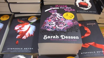
Twilight copycat – Dessen in black? Her covers tend to be white in the U.S.

Great Percy Jackson covers, but the Wimpy Kid remains the same. Compare the new U.S. paperback of Lightning Thief.

Knife of Never Letting Go? Maybe this one is better in the U.S.


4 Comments on London Book Displays, last added: 2/28/2010
Display Comments Add a Comment
38. Make Your Own Romance Cover


Put your own face on a Romance Novel cover here. Thanks to The Rejectionist for the link.
I’m off travelling for a week – so no posts until I get back!

1 Comments on Make Your Own Romance Cover, last added: 2/17/2010
Display Comments Add a Comment
39. A Cryin’ Shame…


One of the many art blogs I read led me to the Society of Illustrators 2010 Student Scholarship Competition today, where I got lost in taking a virtual trip through the show. Try it yourself, and you will feel sad, as I do, that we’ve gone all photography all the time (okay, not all the time, but most of it) for book covers. Oh to have some of these artists working at cover illustration.

1 Comments on A Cryin’ Shame…, last added: 2/16/2010
Display Comments Add a Comment
40. Perkins’ Poll and AIYLA


I was wondering what Mitali Perkins’ PoC Faces on Book Covers poll was going to find. Here it is. Not surprising.

I’ve been thinking about something related to Perkins’ poll, but only tangentially related to book covers… The  American Indian Youth Literature Awards for 2010 were announced at ALA Midwinter. I know Debbie Reese has been a voice for representation of Native Americans in children’s literature and she may have written something about this (I haven’t seen it). What I notice each time the AIYL Awards are announced is that they can be hard to get because they are published by very specialized presses often not easily available through the regular library sources. My comment is not meant to detract from the work of any small press. But I wonder if it is a phenomenon of this particular award? Or is it just that there are so few books published by mainstream publishers? For example – if you look at the Coretta Scott King Awards, Pura Belpre Awards or the Asian-Pacific American Literature Awards- it’s mostly mainstream publishing. With all the downside of publishing PoC, is it worst for American Indians?

Here’s the 2010 YA winner of the American Indian Youth Literature Awards, published by a Hawaiian press that appears to be run by a school system (the website says “a division of the Kamehameha School System“). The book does not appear in the Library of Congress Catalog, and little information can be found at Barnes & Noble or Amazon.
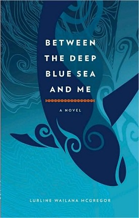
Here’s where I’ll get my cover reference in. Blue seems to work very well on book covers. This one is very soothing. The whale shape is attractive and reminds me of the artistic style of the tribes of the Northwest. The title text is not exciting – a larger and swirlier font could work well. It’s very formal-looking. But perhaps this is what best suits the text.
I’m not sure the cover of Between the Deep Blue Sea and Me by Lurline Wailana McGregor (Kamehameha Publishing 2008) will attract teens – but it could. I’ll be purchasing this for our teen collection, and it’ll be one of the books I’ll read this year.
Between the Deep Blue Sea and Me: Reviews 1, 2, 3, 4.

1 Comments on Perkins’ Poll and AIYLA, last added: 2/7/2010
Display Comments Add a Comment
More from this Blog | Email This | Add a Tag
41. Best Book Covers of 2009 – Final Four, Finally!
1 Comments | Previous | Top | Next
By: L., on 2/2/2010
Blog: Jacket Whys (Login to Add to MyJacketFlap)
JacketFlap tags:  Uncategorized, Add a tag


I’ve been dragging my feet on this last four “Best Ten” covers. The first six were easy. After that I had another 20 in a document on my desktop. I looked at them nearly every day, and could not settle on four.
Several years ago, I wrote an article for VOYA about summer reading. The article stemmed from watching kids in the library, as they tried to decide on a book from their summer reading list – usually about a week before school started. Kids who might otherwise read, hadn’t read anything yet, because they didn’t want to read what they were supposed to read for school. I could feel their resistance to reading, based on the fact that they were being told they had to.
This last post felt very much like that for me. The “had to” was self-imposed. And I resisted posting anything else here until I put up this last set. I almost ended up throwing in the towel and giving up the blog, because it worked it’s way into a such a sense of dread (and I’m doing this for fun!). Today I’m pulling myself up by the bootstraps and rather than give up blogging… I’m biting the bullet. I’ve made my final four selections for 2009, but without the same conviction I had with the first six. In the end, it’s staying power that brings these to the top.

For Sacred Scars by Kathleen Duey (Atheneum), it was just an image that stuck. An unusual mix of photography and illustration (I think). The jumble of tree branches, the very red hair, the designs on the straps that bind – all mix well. The color is wonderful.

I think the best thing about Lips Touch: Three Times by Laini Taylor (Scholastic) is the colors chosen. The mostly black and white image, and the beautiful shade of a very light blue for the eyes and title make for a very cool image. That cool image, set against a nice shade of red, makes this cover memorable.

Again – the hot and cold colors. It’s such a pleasing mix. I love the geometrical title treatment on Monster’s Proof by Richard Lewis (Simon & Schuster). And the monster behind the fabric sheet? Scary.

Here’s an idea I haven’t seen much of. Using a photo negative image creates an ominous feeling. The use of hot pink/purplish lettering with lots of flourish works well mixed in with the tangle of tree limbs. That busy-ness, juxtaposed with the black hole underneath – what lies beyond, in that dark space?

1 Comments on Best Book Covers of 2009 – Final Four, Finally!, last added: 2/3/2010
Display Comments Add a Comment
42. POC on Book Covers


I am really struggling with the last four in my 10 Best Book Covers of 2009 list. Can you tell?
Meantime I’m off reading other peoples cover posts. And the plot thickens… Bookshelves of doom has found another one.
AND Bloomsbury has temporarily stopped selling Magic Under Glass while they fix it up with a new cover.
Now that we are all sensitized to this, I wonder what else will crop up.

1 Comments on POC on Book Covers, last added: 1/22/2010
Display Comments Add a Comment
43. Oh, no. Not again!


So I guess there’s another Bloomsbury “coverfail” or “racefail” or whatever kind of fail you want to call it.

If you, like me a few minutes ago, haven’t caught wind of Chapter 2 get introduced here:
Really Bloomsbury? I’m Done. The Publishing World Needs to Take Note at Reading in Color.

Unlike some of the people who have blogged about the fail, I do not like this cover – it’s a run-of-the-mill, assembly line cover just like many, many other covers. It seems some marketing departments figure they’ve discovered the formula for selling lots of books. Boy, I like to think it’s not true.
Some have asked “where is the outrage” on this issue. I thought there was plenty of outrage with the first blog outing of a “racefail” cover. I guess not enough. I’m hoping this second run does the trick.

I, for one, will be looking to see/highlight people of color on more book covers. And real people, not just the beautiful ones.

6 Comments on Oh, no. Not again!, last added: 1/20/2010
Display Comments Add a Comment
44. Best Covers of 2009 – Part 2


About a year ago, I attended a function at the University of Connecticut’s Thomas J. Dodd Research Center. There was an “art book librarian” there, who showed us some of the kinds of books she collects for the University. I had never heard of “art books” – meaning books that are art, not books about art.
In my first “Best of 2009″ post, I talked about how e-book covers can never be quite the same as hardcopy books because of printer effects. I got to thinking about the difference between “art books” and regular books with great design. It will be a sad thing for me, I think, if the book goes completely E. The art books I saw were really amazing! But you had to be really careful if you wanted to touch them. And they were expensive, so you probably wouldn’t own them. And their purpose was pretty specifically visual.
There’s something very satisfying about the combined experience of something graphically appealing that can also deliver something beyond the visual. I’m hoping books don’t become extinct. They’re so much fun to look at…
With that, I present you with another set of three, books with visual benefit beyond what the text delivers.

The special printing effects on Ice by Sarah Beth Durst (Margaret McElderry- jacket design by Debra Sfetsios and jacket illustration by Cliff Nielsen) are subtle, but stunning. Metallic inks are used to great effect on the title – an icy blue-silver color – and perhaps mixed in with the other inks on the rest of the cover and cover flaps. The result is a look, surely intended, like the beautiful frost effects you find on your windows every so often here in the northeast.
While the cover is mostly monochromatic, the girl’s red hair and pink/green highlights on her face add a pleasing warm glow. A pure visual treat.
As on some of the other choices I’ve made this year, the design doesn’t end at the cover. Take a look at the page that faces the title page. The frost effect is repeated again, even without the addition of colored inks, by an almost imperceptable printing of a frosty, swirly design on that page. Beautiful.

If you are a regular reader, you know that I’m not a huge fan of the face cover. The Crimson Cap by Ellen Howard (Holiday House- jacket photograph by Marc Tauss, no designer named) is an exception. This face has soul. Again a mostly monochromatic cover, but the whites of those green eyes – they mesmerize. Why the tattoos? Who is this?
It seems as if most of the historical fiction – this takes place in 1684 – that is published now has to masquerade as something else. While this falls roughly in line with that trend, I don’t think this one is anachronistic. I’m thinking the ribbed cap was possible in the 17th century? Any historians out there?
The title treatment gives a genre hint, the face is mys

4 Comments on Best Covers of 2009 – Part 2, last added: 1/13/2010
Display Comments Add a Comment
45. Intermission


Still working on the top ten… but here’s something to take a look at in the meantime. Not sure I would agree with the choices – but it’s a pretty big order. Just trying to cover all the YA books published in one year is a daunting task. I’m not sure how many covers you’d have to look at to find the 50 Most Captivating Covers of All Time!

2 Comments on Intermission, last added: 1/8/2010
Display Comments Add a Comment
46. Best Book Covers of 2009 – Part 1


There’s been a lot of talk this year about e-books replacing traditional books and I have wondered what it means for book jackets and book design. Will an image on a screen be the book cover of the future? Will it matter?
The current year’s crop of excellent book jackets beg my own answer to that question – a resounding YES! It will matter! I’ve posted here digital representations of three of my favorite book covers of the year, and two of them are jackets you must see for yourself to truly appreciate. Printing techniques – embossing, metallics, various varnishes that change the look of the light reflection – you simply cannot get a sense of the artistry here without feasting your eyes on the hardcopy.

This book may be my number one pick for the year. Not just the cover, but the whole book design. The Monstrumologist is historical fiction/horror by Rick Yancey (Simon & Schuster). It poses a true dilemma for me. The cover has a magnetic pull I find it difficult to resist – and the reviews tell me it is not the kind of book this squeamish reader can stomach. So what is a reader to do? The book has sat in my reading pile for weeks  now, begging me – “just give it a try,” the small quiet voice says. “You can stop the minute it gets too gory,” it tells me…
Then the guy on the other shoulder reminds me of how distressing I find this kind of book. Blood, guts, gore is a no way, no how read for me. So the book remains in my pile. Waiting. Daring me. Will I have the courage?
The eerie lighting, the mysterious backlit life in a jar. Where are we? Whose hand? What is that in that jar?
Historically many of us have scoffed at the use of metallics on books as gimicky. The raised, slightly tarnished gold rectangle of the title is not gimicky here. It is in perfect keeping with the design, looking like a plaque on the picture. A blood-smudged plaque…
The cover photograph is by Jonathan Dorfman. The book was designed by Lucy Cummins, and the design doesn’t end at the cover. Many small details add to the total package. End papers support the eeriness with small medical drawings of various body parts and organs. The ink drawings are depicted in the negative – white against a black (or dark grey) background. Chapter headings are interesting, and random pages include drawings of medical instruments in the white margins, bleeding out to the edge of the page.
The UK version – ICK! I would pass this by in a heartbeat! Maybe the lesson here is that what you don’t tell on a cover can be more effective than what you do. When I was looking for links for this book, I found a blog posting where two of the three titles listed in this post were mentioned – both in regards to the more interesting covers to be had here in the U.S. What’s left to the imagination is creepier by leaps and bounds.

0 Comments on Best Book Covers of 2009 – Part 1 as of 1/1/1900

Add a Comment
47. Deliciously Creepy!


2009 - Smith - Tentacles - spineI came across this cover online recently. It was an instant attention grabber and I ordered it ASAP. It went directly to my shortlist for best 10 of the year. The designer/ illustrator, Phil Falco has been added to my watch list. Turns out I was already a fan – just hadn’t connected the dots yet.
When I received the book, I wished the art was a little bit better, or maybe just reproduced better, or maybe just a little less muddy? The cover representation I’ve seen on a few websites is much brighter and bluer – and better – than it is on the actual book. And that’s why I’m featuring it here, but not on my top ten list (close!).
I think this will grab readers’ attention. I like the lighting. It’s mostly dark, but backlit part of the tentacle is a nice glowy red. I love the tentacle rising up from the bottom of the page and the sense of the water disturbance. The juxtaposition of title text with the composition is super – and it’s carried through the design of the inside of the book. I’m not sure if I risk serious copyright infringement by showing it here, so I won’t. But the title page is uniquely designed. The page is printed black, with the same tentacle art coming in from the left side. The suction cups and the title are the only thing that are light in color.
One of the pages preceding the first chapter has an illustration of a giant squid. And the contents page is really different, divided vertically by “Parts.” I know this description isn’t describing the design clearly enough – so find this book and take a look!
Had to show the spine as well. I think this one will show up on the shelf.

Tentacles by Roland Smith (Scholastic 2009): After the mysterious disappearance of their parents, Marty and Grace go to live with their scientist uncle and accompany him on, what soon becomes, an increasingly dangerous expedition to New Zealand to track a giant squid. Ages 9+. Reviews 1, 2, 3, 4. Sequel to: Cryptid Hunters.

1 Comments on Deliciously Creepy!, last added: 12/20/2009
Display Comments Add a Comment
48. How to Digitally Modify a Stock Photo


One of the things that drives me crazy is when a designer chooses a couple of stock photos that may (or may not) relate to the book, and superimposes one upon the other. Usually it just looks like a kooky double exposure to me.

This post on David Drummond | Covers is a thoughtful digital modification of a photo. In this case, it was an author recommended photo, not stock. But the same works for stock.

0 Comments on How to Digitally Modify a Stock Photo as of 1/1/1900
Add a Comment
49. Deliberating…


I’ve been deliberating… over the year’s YA book covers. I tend to consider myself a cover cynic – but I’ve really had to work to choose a shortlist of 30. Traditionally I choose ten top favorites of the year, but I’m not ready to eliminate 20 from my shortlist yet! I need time to think it over. So stay tuned.

Since I started this blog, it seems more and more blogs/booksites are choosing bests, or offering choices for your vote. Amazon’s contest really caught fire this year. Many blogs linked to it. Their lists were by category, so there were some teen books to vote on. Did you vote? Most posted links to the contest, but here’s a blogger who posted commentary on Amazon’s choices.
Joseph Sullivan at The Book Design Review asked independent bookstore owners to nominate their favorites. You can vote on them (bookstore by bookstore) at his blog – here’s Part I. 2 picture books and 1 YA (Pure by Terra McVoy) made the first group of faves.  And here’s Part II. 2 picture books here, but no YA.
The Book Cover Archive has the Top Ten Covers of the ’00s (one for each year,  including 2009)  And how about this one: Suburban Vampire is asking for nominations for the best vampire covers in several categories.

Do you have a 2009 YA book cover you feel strongly about? I invite you to post your own favorites in the comments.

5 Comments on Deliberating…, last added: 12/11/2009
Display Comments Add a Comment
50. Hide Me, Quick!


When I was three years old, my dad took me trick-or-treating for the first time. I loved candy. Even so (the story goes), when I got home I dumped all my candy on the rug and separated it into piles, like with like. I couldn’t eat it until it was all sorted out.
This may have been the first hint that I would ultimately end up being a librarian. I loved categorizing and sorting things. Couldn’t play with them (or eat them) until they were in their proper order.
I’m guessing this is the same compulsion that pushes me to categorize book covers. The brain is a mysterious organ.
So I present you with another set – another mini-trend. It is a sly way to do the partial face thing – make the face unrecognizable by hiding a part of it behind a book (or a notebook, or a letter). The books: Sucks To Be Me by Kimberly Pauley (Wizards of the Coast 2008), The Rule of Won by Stefan Petrucha (Walker 2008), Does This Book Make Me Look Fat? edited by Marissa Walsh (Clarion 2008), and You’ve Got Blackmail by Rachel Wright (Putnam 2009).

I rarely see a book review blogger comment much on the cover, but a 20-something reviewer of Rule of Won had this to say: “I’ve always made a concerted effort to not judge books based on their jacket art, but I’m ashamed to admit that the cover of The Rule of Won is so uninspiring that I just couldn’t help it.” This reviewer was turned off by the brown-ness of the cover but is “happy to report that the contents of the novel are more appealing than falling in a puddle of sloshy mud.” (My advice to the reviewer: No need to be ashamed. Everyone does it…).

For so

0 Comments on Hide Me, Quick! as of 1/1/1900
Add a Comment

View Next 25 Posts